Emergency Torch

Unit three of the course dealt primarily with design from a user perspective, the torch project was an exercise in applying the design process to an every-day object with particular regard to emotional and functional considerations.

This project began with a simple, incredibly open brief, summarised by it’s title; that is “to design an Emergency Torch”. Being a shift away from previous project which focused on practical manufacturing knowledge, this contextual study left the door completely open for use to define what an “emergency” constitutes, and justify a design response.

An early design concept for a tubular light which holds a position decided by the user.

At the beginning of the project I was of two minds, on the one hand this task was to design within a typology that already exists, and necessitated finding a problem within that typology rather than starting with an identified problem and finding the most appropriate solution. In other words, it is what some would call ‘traditional product design’, object-orientated and consumer lead.

On the other hand, the emphasis on technical competency and refinement of function was very similar to what I was familiar with from the SQA’s preferred methods. This was a chance to really push and refine particular skill sets.

In addition, it offered an opportunity to identify a real problem and conceptualise a design solution which could, if actualised, help people in a genuine way.

old model of a display stand
In Scotland, engineering practice starts early. This is one of my earliest pieces of design work, a multi function display stand, produced at 13 years old.

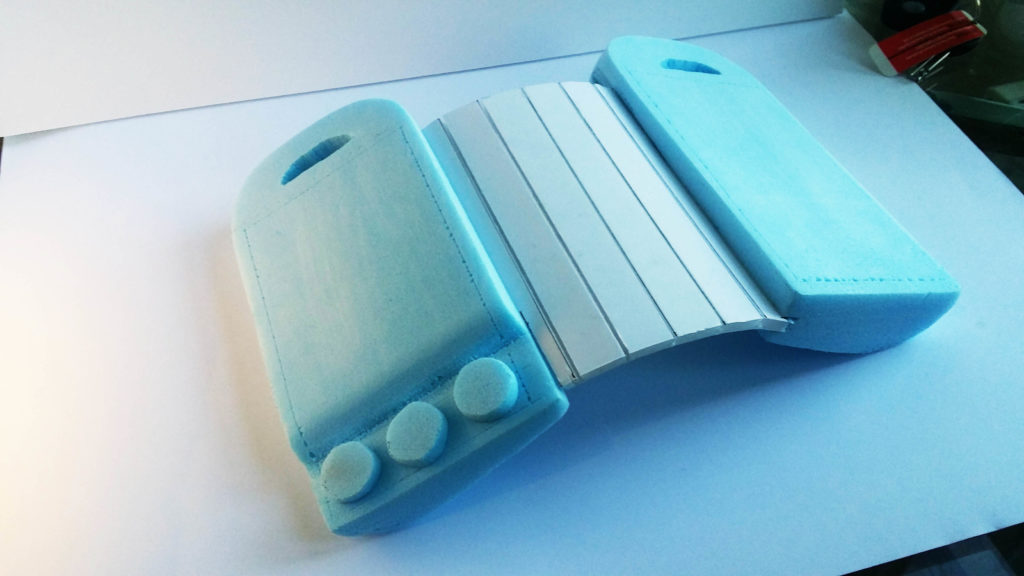
My final design solution looked to provide an all-in-one device for survival situations where a torch may be all that the user has left, for example a vehicle crash or sudden natural disaster in a remote region.

Through research I identified four essential resources to have in such situations as being: Ability to start a fire, A survival knife or basic tooling, Energy generation (if any other electronics survived) and, by extension, light.

My final design functioned primarily as a torch with functionality built in to generate thermos-electric power and start fires using solid-state functionality.

exploded diagram of parts annotated
promotional image
Final Presentation Board
sticky patch based idea
Second Final Presentation Board

Reflecting back on the project I was pleased overall with the outcome, particularly with the iterative development of the products functionality and form, however the end solution was a bit ‘Jekyll-Hyde’ in that several typologies had been hybridised rather than their concepts synthesised.

Rather than create a combination of a survival knife and torch’s functionality, I had simply designed a survival knife with a light on the front. In addition, questions could be asked about the efficiency of the thermos-electric generator and the specification of the LED’s used.

I may revisit this concept in the future and take these considerations into account but over-all, the project was a good exercise and extension of the basic skills involved in physical product design.

Tri-D Chess Set

A replica of a common background prop in the Star Trek series created for my brother as a gift.

A break from my usual design format, this board was created over a month for my brothers Christmas present after he took an interest in the prop seen often throughout multiple series of Star Trek.

images from various 'star trek' series as reference
A collection or reference images used to try and inform the re-design.

The board first appeared as a plot device on the original series in the 1960’s but generated fan interest amongst fans, later appearing mostly as background set decoration. Toy boards were sold but are exceedingly rare today, as a result I undertook the task of researching what documentation I could find and designing aspects of the construction and ergonomics.

CAD drawing to develop dimensions
Using a mixture of research data, anthropometric data and design choices, a layout which was function and aesthetically consistent with the original was designed.
fitting the base during manufacture
Using a mixture of research data, anthropometric data and design choices, a layout which was function and aesthetically consistent with the original was designed.

The frame was originally going to be made of tubular steel, forged in my high school’s workshops into the desired curve. After bending the first tube, this proved too time-consuming and so a wooden frame was jig-sawed. The base was cut to resemble Starfleet insignia imagery.

The boards are laser cut polymethacrylate sheets with ‘white’ squares represented by a rastering effect. The small 2 x 2 boards are mounted on tubular aluminium as they are intended to move. The unit assembles with no screws, slotting into place.

game board acrylic detailing
Board details near the end of assembly.
second presentation shot
The final design laid out on the dining table for Christmas morning.

This was a fun project even if the design was somewhat prescript, I feel it gave an appreciation of craft-based design at a time when I was focusing on engineering methods and hypothetical design.

If I were to do this project again or make more as part of a series I would like to change the way the mini boards attach given that they are not as robust as I would like, relying on adhesives and also, I would have liked to pursue the metal frame beyond the minor forging I was able to do.

Victorophone

Every year the innovation platform Jovoto hosts a challenge to design a limited edition swiss army knife casing design for Victorinox.

The competition is one of the most well-known repeating challenges on the site with little to no restrictions place on the aesthetic theme or outcome. In recent years a general theme has been defined but for the 2015 competition it was left open.

The Victorinox Logo.

I decided this was a good chance to branch into an area of product design which was new for me at the time. The challenge is purely graphical, you cannot change the function or materials of the knife and the logo must remain in the same location.

painting the second design manually
The original design for ‘A tool for all people’ before scanning and editing.

Two of the designs were created using manual techniques which were then scanned and adjusted for use in the final design, the third was created entirely digitally.

two ideas promotional posters
One of the promotional images for each of the three ideas.

The first of my designs played on the idea of smart devices (amongst other products) being compared to the Swiss army knife to describe them as versatile and useful, eg “This phone can do anything, it’s the Swiss army knife of modern phones” by representing each of the functions of the knife as an ‘app’ icon on a phone graphic.

The next (top left) looks at trying to capture motion and energy through use of blown inks and fast, un-coordinated brush strokes.

The last design is similar in that it uses a bright spectrum of colours to convey dynamism. The design uses they symbolism of a rainbow or spectrum to represent diversity of people. This is to push the idea of social acceptance and accessibility as the colours connect the design to the LGBTQ flag but do not make a direct connection.

In hindsight, it may have been prudent to make the LGBTQ connection stronger to cement the message but I wanted to keep interpretations for the design as open as possible.

NAT5 Course Material

In my fifth year of high school I contributed to a course redesign by supplying an exemplar project.

In my senior year, the ‘Intermediate’ courses were being replaced with the new National 4 / 5 courses (equivalent to GCSE’s). In this roll out, new materials and methodologies had to be designed. For Product design (now Design and Manufacture) this involved a research – oriented project for which I was asked to create an archetype to be used for demonstration purposes.

The brief was an introduction to research to inspire an interest in developing fields and technologies as well as an interest in research as a functional and recreational activity.

This is something I very much agree with and so was excited to participate in the creation of this new project.

screenshot of Lockheed Martin's site in 2014
The landing page for Lockheed Martin’s fusion project.

At the time, Lockheed Martin was making headlines with their ambitious claim that they were five years away from achieving a sustainable fusion reactor. This was exactly the sort of thing the brief was indenting to look at.

icon development
At the time I was unfamiliar with vector-based programs, I created logos by designing shapes in Inventor and drawing over them with the colour select tool in Photoshop.

To visualise the research I utilised newly – learned ideas about graphic design, flat design and visual presentations.

final poster
Final Poster Design

Utilising some previously devised archetypes and new techniques,this was the final design which was well accepted by the technical team for use in the project.

Zeiss Zugriff

The Zugriff (German word for bridge) is a conceptual product imagining if the opto-electronics Goliath Carl Zeiss AG moved into the field of portable audio.

a collage of ziess products
A moodboard of various Zeiss products / promotional imagery.

Carl Zeiss AG has been a sector leader for over 100 years, manufacturing lenses, optical products and specialising in the manufacture of micro-electronics (by way of their optics). A large and sterile brand, their ‘image’ is quite hard to place, certainly they wish to put forward an image of loyalty, stability and enabling but how much of that actually shines through their work?

early hinge development sketches
Zeiss leads absolutely in the sectors in which they operate, they set the standards and often have a unique presence despite attempts at copying. It was important that this speaker embody that distinction.

I decided that in the highly unlikely case that Zeiss broke form their optics-only model, such a speaker would want to embody the values of versatility, perhaps linking to their large sports-optics range. It should embody a ‘quirky’ high technology functionality and should embody the stability, balance and engineering associated with other Zeiss products.

blue foam scale model
The final block model put across the physical feel of the device despite not having a ‘proper’ hinge.

The final designed carried through a mirrored 360 hinge mechanism to allow differing modes of sound output (direction vs ambient). The unit is highly durable, made of an experimental fibre mesh aluminium and designed to compliment Zeiss’s sports optics range.

features of the product annotated
An annotated render from my presentation showing key points of functionality.
conceptual renders of the model showing different use cases
A final render series showing the device in a range of intended locations.

In reflection I found this project very challenging, after all Zeiss isn’t what I’d call a flexible brand. I enjoyed the chance to broaden my scope on branding and to consider the semiotic meanings and associations embodied by brands beyond simple aesthetic surface-level messaging.