Mosaic

When I first started out in design, my only motivation was to contribute something, to ‘save the world’. For my final year project I forewent personal comfort to platform an issue that affects so many of my community on a deep personal level.

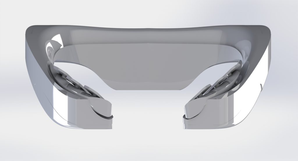
Mosaic Voice is a consumer-viable Electroglottograph (EGG) designed to help transgender people (specifically trans women) perform voice therapy training.

Comprising of two parts, a wearable EGG, and a supporting app, Mosaic was conceptualised as an extensible system, providing the basic software, while region and use-case specific needs could be met via a library of plug-ins.

This was based on first hand experience and extensive research which indicated that any solution would be region-specific and require outside experience for each subsequent location / context it was to be applied to.

Voice Therapy Training

Voice therapy training is a sensitive and highly personal process which poses significant practical difficulty and emotional strain for trans people with vocal dysphoria. Resources are scarce and sparse; embarrassment pervades around stigma about adults performing vocal training.

Democratised design can facilitate this process by creating assistive tools and means to alleviate the emotional difficulties incurred.

Voice therapy training (VTT) is a broad term for practices and training regimes designed to modify the voice to take on a different appearance. It can be utilised by singers and actors but also by people recovering from injury and trans people, in particular trans women such as myself, who’s voices are not affected by hormone replacement surgery.

Issues with Specialist Help

Specialist tutors & therapists exist to help with this process, offering guidance, techniques, coaching and so on, usually over a long period of time. I personally make use of the excellent service by Christella Antoni, who takes a holistic approach to sessions, integrating social aspects and involving the client in the process. It should be noted that I am not affiliated with Christella Voice, my opinions are my own and genuine.

This works well to tackle the individualised nature of voice and offer professional guidance, the issues arrise with the fact that so few people actually perform this service. People travel from across the country to attend sessions because there’s nowhere closer, the cost of travel tickets exceeding the sessions. And even then, one person can only see so many clients.

There’s also the issue that many trans people are, for lack of a better term, broke.

Trans people are massively discriminated against in work, promotions, housing and healthcare, among other things. This leads to a significant majority living bellow the poverty line. This works to make access to services like Christella’s difficult for some to manage, then additionally, you must consider the viscous cycle that one’s ability to “pass” is largely dependant on voice, which has a compounding effect on discrimination faced, which leads to more poverty, and so on.

This leads to many of us (if not most at some point), turning to the idea of doing it yourself…

Issues with DIY

Many people turn to resources on the internet such as YouTube videos, the few training apps which exist, and the occasional Reddit post which is cited by everyone you know and threatens to dispensary one day. Also you have to tolerate looking at Reddit.

The issue boils down to the fact that, with say a YouTube video, you are seeing a “patient’s” personal reflection on what they deem to be the most memorable aspects of a highly personal journey, as opposed to structured content.

Even when structured content is available, it is often nullified by the lack of tutoring context and practice structure. There is an issue of “hearing yourself”, that is, gauging correctly where you’re progress stands, what you should be working on still, and knowing when to celebrate achievement.

Three Target Issues

This lead me to define three topic areas to explore as the basis for my dissertation

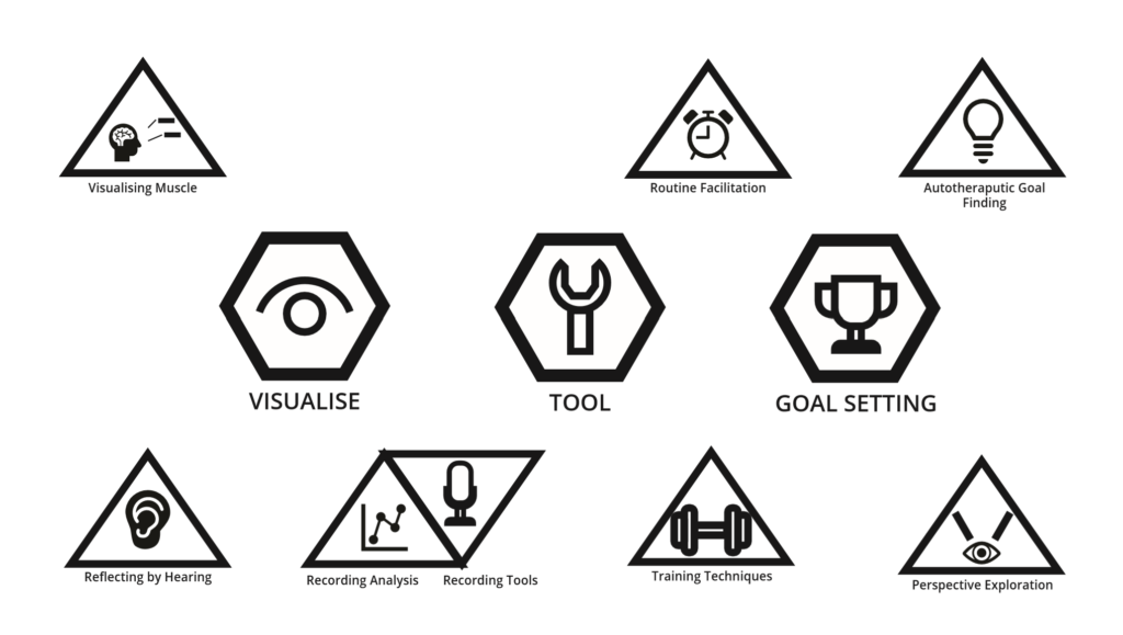
  • Visualisation: concerning the issue of self-reflection, issues around hearing yourself and your progress
  • Tool: A set of techniques and resources, not to supplant specialist support, but to aid in self-practice
  • Goals: Looking at the auto-therapeutic aspect of VTT, aiming to address the physiological distress and discomfort as well as help people define obtainable targets.

Electroglottographs and Self-‘Visualisation’
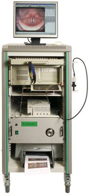
The ‘desktop’ version of the Larynograph which I have had experience with

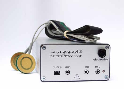
One of the most useful physical tools employed by voice therapists is an Electroglottograph, a device which provides in-depth data on the behaviour of the larynx and audio aspects which comprise the voice.

These devices are difficult to come by, large, clunky and expensive, hence few people who are not specialists are likely to own one.

Their function is effectively quite simple, an electrostatic field is created across the contact probes which are pressed into the client’s neck. The various vibrations and noises interupt the field across various channels, which are then picked up by the device, and processed into usable data by the software.

Rethinking the EGG

A Precedent

Initially, I assumed that designing a new EGG was impossible, so I pushed the idea away. In early December (just as everything was winding down for the winter break), I came across two articles concerning the creating of DIY EGG devices.

I am research and engineering driven in my approach; I was not willing to create a project based on the assumption that a new type of EGG could be made without first seeing something to indicate it’s validity, and then packaging this in some way into a proof-of-viability / proof-of-concept.

The first resource I came across was this project by Marek Materzok on Hackaday.io which documented their process of making and refining an EGG device from scratch. There was not enough information to replicate the process but it offered a beginning insight into some of the challenges such a device would face (namely noise filtering and the best way to create the oscillation).

This lead me to this tutorial on Instructables of all places, DIY EEG (and ECG) Circuit by user Cah6 which gave details and specifications for building an Electroglottograph from simple components. This was all I needed to tell me that it could be done.

I made inroads into building my own version but decided to allocate my time elsewhere given how late on in the project I was.

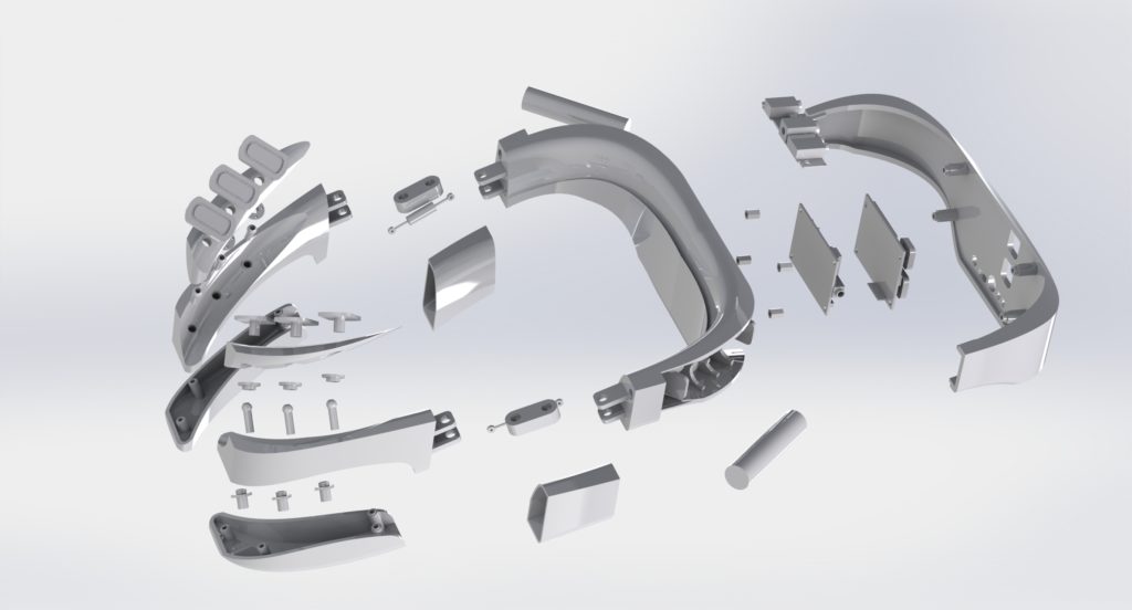
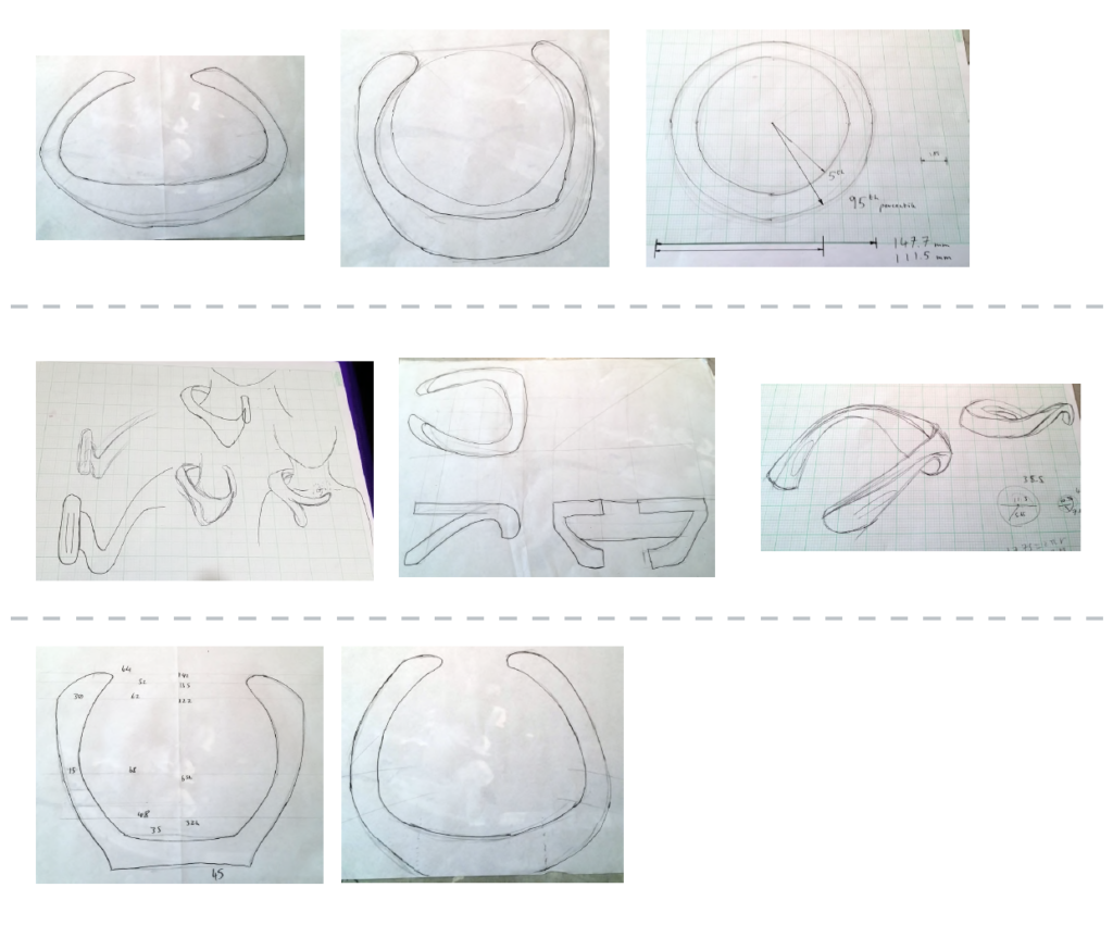
I decided on a wearable typology given the ergonomic difficulty encountered with the strap-on probes. The device would hook round the users neck, designed to cradle on the shoulders. The hinge components on each arm flex to adjust for neck sizes while retaining points of tension on the probes.

Most of the circuitry and interface buttons were placed on the back, with the batteries closer to the shoulder blades, this was to achieve weight balance on the arms but also ensure that any imbalance would only serve to pull the probes against the neck more, not slide off.

Development sketches for the wearable
a diagram of the wearable
The device stretching to fit a larger neck.

Chips on Both Sides

Using Cah6’s article as my template, I found an optimal size for the EEG control chip, which would be placed under another board which would handle interfacing with the ports and network. This second chip was designed around the Broadcom BCM 2835 controller used on the older Raspberry Pi’s given the low cost, versatility and proven record it provided.

Other smaller components such as the WiFi chip were also taken from the Pi series. Cost was a primary motivator with most of the deisgn descisions, given that this device had to be as low cost as possible.

render of the CAD model
Two images showing the interface PCB on top of the EGG

The chassis is comprised of simple injection moulded nylon and designed to be easy to disassemble, repair, hack, etc. Screws are standard size and not hidden, components are all accessible, the batteries are lithium-ion AAA’s so can be swapped out at any time.

Motivation and Repetition

For the software end, I layout out a feature map for a mobile app including:

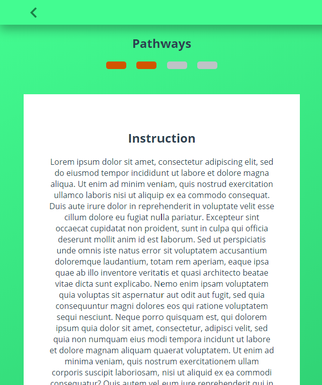
  • A modular daily training system: Inspired by the Enki app, this would show ‘Pathways’ which would utilise the following tools to guide users though speaking exercises.
  • A set of quick practice tools: These would show a simple animation or instruction and allow the user, in bursts of 30 seconds or so, to practice some aspect of breathing or warm-up.
  • A pitch sample recorder: An area to record and sample the voice over a piece of sample text to view pitch over time.
  • A resonance estimator (using neural networks): While the EGG is needed for accurate resonance sampling, this would provide a middle ground for people without financial access. Using a pre-trained convolutional network, an ‘estimation’ of resonance levels could be pooled. This would record the samples in the same area as the pitch sample recorder.
  • A continuous listening sampler: Somewhat experimental, this functionality would note samples throughout the day of the user’s voice as they perform their daily activities. This could be used by the user to see how they remember their training in various, uncontrolled environments.
  • A voice pattern matcher: Would depend on finding the right region-specific data set. Another convolutional network would match the user’s voice with one that sounded similar in most respects but could be adjusted for vocal features. This could then be used to practice against and set goals for the user to aim for.
  • A voice creator (neural networks): Would depend on finding the right region-specific data set, a recursive generator neural network would modify the input voice to be adjusted for vocal features such as softness, tone, pitch, resonance, etc. This would allow the user to, for example “gender swap” their voice to try it out.

I built the frame for a progressive web app to demo these features which I could implement now, and provide dummy data for items that would require live data.

Nuemorphism

At the time (late 2019), there was speculation rising about the concept of “Nuemorphism”, coined as a play on “skeuomorphism” by Devanta Ebison. I hadn’t made up my mind about the style but I saw potential for a textureful and soft, welcoming interface which would be great to try for the app.

The result was a pleasing warm aesthetic, I especially liked such items as the progress indicators which felt like little gems that you wanted to have, empty ‘slots’ for the unfilled sections.

I’d like to write extended thoughts about the topic at some time, but sufice to say, while I liked the unique aesthetic of this app, it only worked due to the colour contrasts and would have faltered slightly if I had followed the pattern where a ‘raised’ section is the same colour as the background.

This is one of the critical flaws with nuemorphism (and skeuomorphism to a lesser degree), it’s smooth transitions and drop-shadow facilitated layer / element separation are often incredibly low contrast. This is a problem on displays with lower contrast settings or fewer colour bands, items viewed at any sort of distance, and of course, accessibility.

The advantage of more Matrial-UI esque drop shadow element-separation is that you can still use other features such as subtle borders to add definition and get round this issue. Even skeuomorphism (which, for the record, I am not a fan of), relies on heavy gradients and colour mixing to get it’s textured effect.

Reflections

The project concluded successful, I got an A and the presentation was received well. Its one of my favourite pieces of work and I’m proud to have it as my final year project.

But I still have hang ups.

This was, for all intents The Big One™, the final year project, and more than that, it was something I so closely believed in. It wasn’t enough for it to be good or even great, it had to be a master-piece.

I was afraid my work couldn’t speak for itself

I kept diversifying the system while not building on what was there. It’s true that the solution should take the form of an integrated system but I remember over and over again not being sattisfied with what I had, constantly striving for something to truley step up to the next level.

In reality, I was having a crisis of design, I saw myself perched between two worlds, one of Product Design, and the other of Engineering / Code. I told myself over and over that there was no divide, that we all have ranges of skillsets but I couldn’t chake the feeling that I was a jack of all trades and a master of none.

So I kept adding ‘stuff’, imagining the basics of a complex system and then trying to work back from there (the egineering approach when you actually know what that system is). I spent a month on a little breathing excersiser device before stepping back to ask “what the * am I doing? What is this?”

When I shifted hard into the EGG route, I was doing so over the break, working tirelessly while others were relaxing, just to catch up.

I used my specialisation as justification for not re-evaluating

Perhaps what is worse is that the warning signs were there; clear indicators that I should clear my head, define one or two things that the product had to do, and just worked on those.

I let myself believe (not incorrectly) that I was uniquely positioned to pull off engineered solutions comepletly unlike anything my collegues could do, due to my specific code based skills. This is a mistake that would unfortunately not fully reveal itself until Tailored Nutrition.

In doing so, I chased these mutliple vauge threads instead of simply doubling down on the core that ended up being the final outcome. I ended up working twice as hard as some but still “only” producing what I could have under older circumstances.

I assumed that I could just grind to finish

Perhaps the most egregious mistake I made whilst all this was going on was the assumption alluded to, that I would miraculously pull off the feat at the last minuite. As I said, I did do that, but for an outcome which could have happened regardless.

I made a habbit of being in the studio from 10:00 until 23:00, calculating when would be the most ‘efficient’ time to drink caffinated drinks, pushing msyself beyond physical limits. I could have halved that time, used the remaining to rest, research, regain my humanity, but instead I saw time as a commodity to be collected and horded as much as possible.

We all have pressing deadlines from time-time. But if you begin to see time itself as an enemy, its overdue you stop and reevaluate.

Games of Life

A story of repeating patterns of behaviour.

The Game of Life by the mathematician John Horton Conway in 1970 is a zero-player game based on replicating cellular autonoma. this post details three different versions I made and the reason why for each.

The Game of Life presents an N sized grid where each cell has two possible states, alive or empty (dead). With each game tick, the cell can change state or remain as it is based on the number of cells around it. A cell with too many neighbours will die of overpopulation, a cell with too few will die without ‘civilisation’ to sustain it. Cells with the right amount of neighbours will come alive and so on.

V1 – React.js

V2 – React-Redux

V3 – Three.js

In this way, the Game of Life, a Turing Complete model in which each generation is a direct result of the previous state, is the perfect challenge for a state-building exercise.

My first version took a number of weeks, built in React, it helped me learn fundamental algorithm concepts and state-management techniques which would come in useful later.

I revisited this project again years later, reproducing it in a couple of hours, determined to make a cleaner, more robust rendition. At the time I was working with WebGL and three.js, so went back one more time to create a 3D game inspired by the 2D Game of Life.

I’m going to take a ‘poking fun’ approach to talking about these, I believe a little bit of mocking you’re old work is good for illustrating how much has changed since then, and appreciating the quirks of the learning process.

Remember kidos, in learning, there’s no such thing as “bad code”, just code that hasn’t seen growth yet.

Version One: October 2017

This original game, submitted as part of the freeCodeCamp challenge, came straight after the Recipe List and came with a steep learning curve for me.

I knew that I needed a table-like layout for rows and columns, I was familiar with using array’s and .map() but was yet to learn that you could make arrays of JSX and just… dump them in where you need them. I thought there was something magical about an inline array.map. 🤷‍♀️ This lead to some interesting patterns such as creating an N-sized row or column with and N-sized array in state.

a react state initialisation with an array full of 0's
I don’t miss old react state initialisation

<Table /> acted as the game renderer and controller, a pattern which would stick in future projects. It’s state held a ticker which would advance by one with each generation. It rendered a table by looking over the arr state item above twice (you were locked into square layouts) and rendered <Cell /> components.

the cell function to check other cells
Thankfully I was saved any ‘out of bounds’ errors (in which a cell on the edge tries to check a non exisiting cell) due to the function checking if the key exited in an alive state, and then checking a second time if the key existed in a dead state. In both cases the query for, say “col–1-row-21” would be undefined but no further value checking would take place.

Following the idea that “components should be self contained”, each <Cell /> had it’s own internal life state (nice)… and then on mount, writes this state to a ‘global’ object (i.e. outside the react tree) (not nice) with the following format string as a key: ‘”‘ + “col-” + this.props.colId + “-row-” + this.props.rowId + ‘”‘. 🤮 Don’t ask me why the quote marks are in double brackets because I cant remember.

Cells each had a method to look at adjacent cells in this global object and calculate their next state, which was hard coded because ofcourse.

The last anti pattern was that this function was called when the lifecycle method componentWillReceiveProps was called, i.e. when the ‘tick’ being passed down from the board went up.

Now this idea to tick a game forward in itself isn’t too bad, though it should have used componentShouldUpdate and checked that the new tick was changed. The issue here was that every cell, updating itself, was reading and writing from the same object. The cell does not know how much of the board is from the previous generation and how much form the last. Also, the fact that the globalObject existed outside the react app meant that it existed outside of the application lifecycle structure which could exacerbate this issue.

Remarkably though, it works most of the time.

Somehow, unless my machine is running slower than usuual, the cell updates sync in such a way that the game behaves as it should. the submission was accepted but this always bugged me, it haunted me, it’s remaking was inevitable.

Takeaways

A big thing I took away from this project that I hope could benifit others who may read this is that this potential cell de-sync issue was not enough to wreck the project. The code is duck-taped together in so many ways, its highly innefficient and jumbled but it works.

Often times I see people who achieve things and don’t allow themselves credit becuase they believe they somehow cheated or missed the point of the project. Its a part of imposter syndrome; they think that there is some sort of universally accepted correct structure that they were supposed to find but didn’t and are soon to be revealed as a fraud.

In my view this is how we get into innane discources such as “is HTML a programing language” or “this site design is invalid becuse you used a CSS framework”. In industry, clients generally don’t care whats gone on behind the scenes, they just care about the specification and the end result. To quote my favourite TV show, if you are asked to make somthing which behaves in a certain way then…

Coding isn’t the thing, its the thing that gets us to the thing.

The early prototype. https://codepen.io/Oddert/pen/OOLKzW?editors=0010
Final submitted version. https://codepen.io/Oddert/pen/POwgdP

Version Two: April 2019

It took longer than I thought for the urge to remake the game to finally take hold (other stuff took precedent).

This new game was built with create-react-app and included Redux. This time, the store had a two main keys board which contained data relating to the board display and control which controlled UI elements (in the end this was only used for the ‘paint’ mode, allowing users to write to the board).

The board was a two dimensional array with cell objects inside. Each cell object stored its x-y position and an ‘alive’ property. The reducer for this section only had two actions, one to manually change the state of a cell (for painting) and one which would loop over the whole board, calculate the new state for each cell, then write this new state to an entrely new board array, thus achieving feed-forward imutability.

The <Board /> class had two properties, one to generate rows by calling the next which would generate cells. <Cell /> classes still performed the check individually to see how they should render and would listen for mouse events to paint the board.

And that’s it, cells update when they need to, React takes care of that, the controller component dispatches to tick the game forward, and the files are simple and light apart from the enormous bundle size of create react app.

screenshot of version two
The quickly-finished version two with a clean edge less look.

There were still questions as to whether performing the board loop calculation within the reducer violated Redux’s pure function policy; that reducers should be pure functions and do little work. Despite this, the function would produce the same outcome every time and has no side affects so it is still pure in that sense.

Regardless, this was the remake that I had wanted to do since forever, and it only took a couple of hours, as opposed to approximately a week for the previous.

But I wasn’t finished.

Version Three: May 2019

Around this time I had been investigating WebGL and three.js for a potential project with Matter of Stuff, where I was an intern for my Diploma in Professional Studies (DPS).

See the Pen KYREdx by Robyn Veitch (@Oddert) on CodePen.

One of my little experiments involved creating a ‘voxel builder’, a simple grid space where you can place blocks in 3D.

I took the board state, extended it to a three dimensional array and wrote a function to map to the 3D grid space. I extracted the looping function and created a simple adaptation to run outside of React-Redux (which this project does not use). Lastly, I modified the rule set to return an alive cell if the number of neighbours was as follows: 5 <= num <= 9.

The result is this, a fully 3d rendition of the Game of Life. The rule set could use tweaking given that the cells tend to bubble outwards and oscillate around the edges. And of course you do not benefit from Redux’s immutable patterns.

Never the less I was pleased with the result which went on to influence a range of projects which took place thanks to Matter of Stuff.

Page Block System | Matter of Stuff

Following on from the MoodBoard system, as part of the Matter of Stuff site redesign, I implemented new pages using a fully customisation page editing system to give the team full control over their content.

When the Matter of Stuff core team set out to design their site, they wanted an outcome that reflected the bespoke, high-end, and established company which they had built over the past season.

They needed something which not only perfectly reflected the company they are now, and could be updated instantly to reflect changes dynamical, given the rate of expansion, events, new flagship pieces etc that they engage in.

In other words, they needed a site that would keep up with their pace, without having to wait for a developer to be available. Customisability and agency to control every aspect of the design was imperative, with one word at the centre of everything; control.

Working with the visual design created by Daniel Stout, a freelancer at Matter of Stuff at the time, I suggested using the Guttenberg Block system on their WordPress instance and fairly recently been adopted by WP as the default editor.

The result was a custom made series of 20 WordPress Blocks, created with the Block Lab library. These Blocks, which included a mixture of basic components (headings, paragraphs, page breaks etc) and custom layout sections.

The ‘About’ page showing how it was split into blocks. Some blocks like the ‘Icon Call To Action’ are self contained and use the built-in columns system to create layout.

This system would be reusable enough that creating new pages or radically re-arraigning a page layout could be done in minutes, without needing to worry if everything conformed to the Matter of Stuff design style.

Every Block had as many options as possible for customisation of not just all of the content, but also all aspects of layout and display.

Most Blocks had the same basic features to ensure consistency in editing with Block-specific features added on top.

For instance, most blocks featured a wrapping element which defined the element’s position in the document flow. Then, there would be a container to provide the layout for the actual content (unless the contend is full-sized), CSS flexbox was prioritised over grid using patterns of cascading pairs. That is to say that, if four elements are in a row, this would be two flex boxes nested inside another flex box. This meant that mobile layouts were usually intuitive but also allowed MoS to swap the left-right top-bottom alignment of each “level” of content as show bellow.

several itirations of a block component demonstrating different states
Shown here is the ‘What We Do’ block which principally exists to place text next to an image in equal weight.Here you can see how changes made to an individual block in the editor can alter it’s layout.
Mobile view compassion for the ‘About’ page
Paragraph and Quote blocks used on the ‘Manifesto’ page.
The ‘Procurement’ page showing a custom image gallery where, in addition to the ususal layout changes, the team had options to change the ratio of one image to another.

With the Dual Image Block, the team could enter a ratio using a set of standard formats (e.g ‘2 : 1’, ‘3/5’, ‘2 |4’) where my code would sanitise the inputs and use them with flexbox to change the ratio of each image accordingly.

This carousel showed various gif images of each of the MoodBoard features and was designed in the style of the MoodBoard itself.

While exploring options the team did discuss the option of building the site with a page-builder like Elementor.

I advised them to take this option given that I was able to replicate all the core aspects of customisation they would be looking for without having to pay the annual fee for the editor.

In addition, page-builders are a great and accessible options for people who don’t mind a bit of compromise; there will always be design ideas which the framework does not support and, the majority of the time, there is a perceptible feel that the result is “off the shelf”.

For a company like Matter of Stuff, we agreed that, short of fundamental technological limitations, no compromise should be accepted.

Nothing should feel pre-packaged.

Cloud Notes

A hyper-simple note taking app with auto-saving and cloud storage, inspired by OneNote.

With React-Redux on the front end for single page app efficiency, this app utilises local storage and MongoDB to allow the user to resume their progress on load but only save what they actually need. Security with Helmet.js, authentication with 3rd party Oauth2.

showing the tag filter
A simple tag system allows notes to be grouped and recalled quickly

I wanted to flex my new skills in a project that was clean, followed a structured project plan, and solidified my learned findings. I also wanted to mature some of my visual design work given my tenancy to flip back and forth on a design theme and make stuff up as I went along.

This app was built after projects such as Pinapathy and the Stock Price Viewer. I was proud of the things I had done and learned but still felt uneasy given how much I had to wrestle such things as getting Passport Oauth to work with React.

the notes menu being interacted with
An example of matured responsive UI feedback; in the past I would toggle between items going lighter / darker on hover, on click etc

The code structure such as the server routes and packages needed, as well as the front end components and application structure were planned in advance, I was able to successfully reconcile some of the things that bothered me with the previous projects, and I achieved my goal of a super “clean” app, even if it’s functionality was not much of a push on my skillets as I would seek out in later projects.

drop menu being demonstrated
UI features such as a drop menu which closes on out-of-bounds clicks and an unsaved-changes indicator.

Simon Says

A virtual Simon Says game replicating all the functionality of the physical toy. This project was useful early on for learning about time-based functionality, HTML sounds, and tasteful machines.

Simon says is the classic game where a sequence of lights and corresponding tones is played at you and you repeat the sequence back to progress to the next level. Starting at one beep, every level adds to the sequence building up until you eventually trip up and cannot remember what comes next.

large image of main view

This might seem like a simple device to implement, but the further you look, the more complexity you have to account for in terms of not letting people click while the sequence is being demonstrated to them, accounting for the “strict” setting and implementing a power on-off switch. What’s really being asked of you, is not just to deal with sequenced events, but to build a multi state machine to dictate what happens when.

It was also a fun chance to develop some aesthetic and layout skills, I wanted to inject some skeuomorphic styling on the buttons, took care to match the font on the front and spent some time trailing styles to make the score indicator look like a real digit display to really bring up memories of using little toys like this.

PinApathy

A Pinterest.com clone built with React on an Express back-end. Authentication by Passport.js using both local and 3rd party oath2, Mongoose and MondoDB as the database, hosted on Mlab.

pins in masonry style layout
The react-masonry package works to animate items efficiently into place in a way that is not possible with just css

The app replicates Pinterest’s masonry layout using react-masonry, allowing cards to create that cobblestone look, slotting into one another. Pins can be re-pined by new users, added to boards and have likes and comments posted.

The front-end was built using React-Router for pagination and to split the various aspects of functionality.

an individual pin in full-screen
An open pin with it’s source link credited and some comments underneath

The name was a joking placeholder on the observation that Pinterest’s once usable format was heavily modified and moved from it’s original format in the name of increased advertising and ‘engagement’. “Interest” meaning more click through’s instead of meaningful curation is replaced with “Apathy”.

user homepage
A user’s home page showing their boards and the three most recent pins

Straw Pole App

A relatively early project, a full MEEN stack (Mongo, Express, EJS, Node) app to allow users to post poles with simple, bold visualisations displayed to others.

list of open polls
The landing page listing active polls

The app used an Express server with Passport.js for authentication and followed strict CRUD principles in the route layouts. Pages were templated from EJS partials and bootstrapped using Semantic UI. Poll results were visualised using D3.js.

a sign in form with styling from semantic-ui
Login modal using Semantic UI for the first time

This was a good project for feeling out if a CSS framework was something I’d like to use more of going forward (nope as it turns out) and developing clean code practices.

a poll voting screen
Another, larger poll with custom option capability

For instance, at the time I didn’t use Mongoose promises and was not yet using ES6 syntax so there’s a lot of ‘pyramid code’ yet the app is still clearly readable, something to perhaps take on board given that some later projects, while far superior on a technical count, are difficult to reverse engineer.

a code snippet
An example of callback-based Mongoose leading to pyramiding; every nested callback adding to the indentation

Rouge Like React

The final project on the old freeCodeCamp curriculum, a seemingly gargantuan task to push the React framework to create a procedural generated rouge-like dungeon crawler.

This was my second really big React project and also served as my first introduction to Redux.

The game is grid-based, displaying the user in roughly the middle of the map, rooms branding off in various directions. The player’s view is obstructed by default, showing only their immediate surroundings. The player can move around, pick up items and health packs and fight enemies by ramming into them, every time calculating damage for the enemy and player.

game screen showing disrupted view
The Main game screen with darkness enabled.
screenshot of a generated level

The game progresses through levels which are generated completely randomly each time with a set, or slightly varying number of health packs, enemies etc. The player can progress their weapon to deal more damage on each hit of the enemy and prepare them for the final boss (a really tough enemy!)

The game was balanced to make it actually challenging to play; there is a genuine trade off between getting more XP, health and risk factors going into the next level. The collectables and diminished view port incentivise exploration of the auto-generated labyrinths.

Games like this and the Game of Life are brilliant for learning fundamental data structures and data-visualisation methods in an intuitive way. Years later I found myself learning about such data structures, not knee-deep in C or Java, but by relating what I was reading back to this project.

The core data structure is a matrix; a two-dimensional array representing the rows and columns, each entry holding cell data. A single Board.js component is tasked with itirating over this array and painting a cell a particular colour, off-white if the cell is a floor, blue if it is a wall etc.

React then handles updates to this board by re-rendering after mutations apply to the array. This was a great project to learn Redux with, given that it is an ideal use case for Redux’s feed-forward immutable patterns.

Given that nothing on the board moves independently, there was no need for a sequencer or ‘game tick’, the only actions come from the player moving, this is one of the realisations that helps to break down the problem early one; you only have to listen to four key press’es effectively.

On player move, the action-creator looks to the cell the user wishes to move to and decides an action based on what is found there, it then calculates the next state of the board and updates it all at once.

The biggest challenge with this project was dynamically creating each level, every level, and every game had to be unique. A function was created that followed this basic process:

The centre of the board was found, a starting square of 9 x 9 was turned into ‘floor’ (the default cell being ‘wall’). This was designed to ensure there were no proximity collisions on level load, hoping that the user would not notice the centre of each map was the same.

A function for generating a single ‘room’ took in a direction as an argument and decided on a size (width * height) within constraints. Then, in the direction dictated, using the previous centre as a starting point, it would move it’s pointer a random number of cells across (within constraint). Then in the perpendicular direction it would also move a random direction but only to a maximum of two cells.

For instance if I was ‘moving’ right, the pointer would move to the right a random around between 2 and 7 and then move up or down between 0 and 2.

a diagram of the room generator function
This diagram shows how the room generator function to find the new centre would check valid cells and shift in the x and y directions to find the new centre.

This would then give us a new section of floor space which overlaps with the previous (thus extending the room) or, if operated by a wall, a door would be made at a random point to connect the two.

The last thing this function would do is make note if any value was outside of the board boundaries, this allowed the implementation of the last major function; the recursive path generator.

The recursive generator would, for each cardinal direction, keep generating rooms using the previous function, picking a new direction each time, allowing it to loop back on itself. It continues until the data being returned would signal that an outer edge had been hit, and the function would stop. This enabled truly unique levels every time.

All that remains is to randomly place a set number of entities per level; enemies, weapon upgrades, health packs and the exit point leading to the next level. A recursive function is used to do this, randomly picking a cell and calling itself again if that cell is occupied.

I also put some small quirks in the game to give it some personality such as the “you died” screen and the choice of weapons in the progression such as “Rock on a stick” and “The power of React itself”.

This being a project in summer 2017, it was built using an older version of both react and redux which is amusing in hind sight. How remembers React.createComponent({}) ? or lifecycle method based Redux store subscriptions?

a lifecycle method from the old redux

Looking back, this project was a key moment in my development career. Sure, the code is highly inefficient and messy by my current standards given that three years have passed as of time of writing. There were also some pretty bad mistakes and antipatterns which I learned from later on such as the un-pure functions called from within the reducer and functions which dispatch also in the reducer.

But the biggest effect this project had was that it allowed me to realise the size of a challenge I could overcome. Before starting, I had taken a break from code because I had not idea where to even begin with this challenge. I believed I would quickly burn out or waste weeks worth of time only to eventually fail, thus validating my imposter syndrome.

I can’t remember what exactly what let me get over this self-imposed block but I do remember the thought process, bringing together all of my experience and knowledge of algorithms to that point, and experiencing inspiration about the issue of procedural generation which lead me to start.

Direction Planner

The Directions App was an attempt to reconcile challenges around balancing complex responsibilities and needs in day-to-day life, inspired by a personal need.

A new take on the classic “work life balance” dichotomy, the Directions App presented all actions and responsibility as equal, and aimed to offer ‘mindless’ task direction without simply creating to-do lists.

This was a significant project to me, it was my first proper Redux application and allowed me to hone in React knowledge that I had previously only uses in fits and spurts.

Much later on, the notion of non-coercive task organisation and my findings from this project influenced the “traffic light system”, a component of my project Boots & the Future of Wellness.

View the live demo and repository with the links or read on to learn the backstory.

Backstory

Ok so we’ve all built To-Do lists, you learn the basics of a new MVC framework and can easily test your work. Then maybe, while continuing your learning, you make a version with data-persistence, probably with localstore or maybe something like Redis. Then if you really want to, you can set up a database and save the data permanently which is a great way to practice React-Express integration.

If you desire more in-depth productivity and planning tools there is no end or free software available to help you ‘do more, faster and smarter’ or ‘take control of your work’ or ‘plan every last detail’.

I found myself in a personal quandary. I, as ever, had a lot going on in my life. I was slowly coming to the realisation that just powering through; working endlessly, pushing myself beyond limits, just wasn’t working. Day’s blurred into one endless stream of “stuff”, with five things demanding my attention at once, an endless wish-list of things I’d like my life to have (or not have) “once this is all over”.

I would burn out, I was kept physically fit by running about all day but my health took a beating with regard to diet, sleep, and of course, mental state.

You are a machine

Everyone has at least some experience of living like this and maybe gave or received advice that sounds something like “You’re not a machine, you’re a person, you need time to breath and do other things”. I agree with this sentiment broadly but I think it misses something: a ‘machine’ of most types does not run endlessly, without “rest”, or without “breathing”.

The definition of machine is broad but lets generalise of a second, imagine an abstract “Machine”. A machine can run for a duration of time then needs repair. A machine can run at sustainable levels for long periods. A machine can be pushed beyond it’s quoted physical limits but with the cost of quicker time-to-fail or malfunction.

I don’t know about you but that sounds like a pretty good description of a person to me.

A person is a biological system that has needs and conditions with affect their behaviour and abilities in their ‘functioning’, living day to day life. To take some easy exemplars, if you don’t sleep enough, you can put in all the extra hours that you like but won’t necessary be as productive. If you write something while caffeinated it may have a different read to something written in a more subdued state. If you do work while a little tipsy you may find you peak in creativity and inspiration but make sloppy mistakes and quickly drop bellow productive levels.

Here’s one I still struggle with, if you are stuck on a problem, taking time away, rather than trying to power through, can let your subconscious process it in ways you are unable to, leading to faster solutions. As intuitive as it may be to step away while the clock is ticking.

“This is not a task-list”

So how exactly do you balance things when you have five ticking clocks and now, the pressure to do this “self care” thing you just learned about?

You could try a simple planner and a to-do list but these both have the issue of making everything a “task” to finish. Is walking in a park a task? Reading a few pages before bed? What about things that repeat, like if you are job searching and need to do a little every day? Do you continue on weekends? How much do you do a day? How do you measure it?

The Directions App was an attempt at doing just this, it ordered all items with equal weight, utilising a tag system to differentiate them.

  • Priority: this denotes actual task items, things which need to be completed
  • Ongoing: this is used for tasks which repeat for a duration of time
  • Fun: used for recreational activities
  • Health: used for activities which benefit health and well being
  • Social: used to section social activities

In this way you could combine which would show items denoted by which filters were active. Looking to do something recreational but also healthy? Turn on ‘Fun’ and ‘Health’. Set some time aside for task work? Use ‘Priority’, and so on.

Looking back

I still have a fondness for this app even if I didn’t actually end up using it all that much after a while. It was a useful way to explore things which exist between boundaries such as something which is fun and enjoyable to do but is still ‘work’. I realised that by assigning everything a tag and grouping them together, I could see the interlink between various tasks but it didn’t work so well to actually designate time, to come up with that magic formula where everything is balanced and just falls into place.

On a stylistic note, it was useful for me to develop emerging styles and layout patterns which would be refined further later on, even if it looks somewhat garish now.