The Float Tracker system is an unofficial piece of software to track physical cash levels (also called “float levels”) and provide insights by graphing the data across time.
It achieves this by taking in data from various parts of the cash process systems, providing holistic ‘snapshots’ of till behaviours, contrasted with real world events.
The insights from the Float Tracker allowed us to reduce the overall levels of physical cash in each of the tills whilst actually increasing their ability to deal with unexpected surges in trade.
This post is part of a wider series discussing my various activities as Senior Cash Partner at my retail branch to overhaul operations, eliminating losses, and designing & implementing new processes.
This is a long and context heavy post. You may want to skip to the bit about the outcome.
Context
Disclaimer
This post concerns my experiences working in a retail branch and includes discussions of sensitive data and branch operations in order to contextualise the featured project. All information discussed has been carefully sanitised to remove identifying details as much as possible, to completely anonymise individuals and to change some details to appear authentic while being fake and representative. This post written in good faith and should not be taken as representative of real branches, people or organisations.
When I first took on the role of Senior Cash Partner at my branch, I inherited a cash office run by one person (who had just left), 13 cash-accepting tills (5 staffed tills and 8 self checkouts) with weekly cash losses in the hundreds, sometimes thousands of pounds per till.
We would loose hundreds of pounds worth of National Lottery scratch cards every week, numerous prize-draw tickets. Some of our old-style self checkouts (SCO’s) would “eat” notes, sheading them to pieces, cash would be swapped between tills casually by users without the system knowing.
Paperwork was disorganised, investigations were near impossible to conduct or even know where to start, and it turned out that till operator training was more a game of Telephone than a formal process.
The person I was replacing was highly skilled and intelligent, but they were a jack of all trades across the branch and so unable to dedicate focus to the issues listed. It needed someone to focus in and take ownership, making the section “theirs”. The problem was just assumed to be unsolvable.
Lets employ a bit of Socratic method to delve into the issue.
What is A Till?
To understand how a retail unit tracks and deals with cash losses / gains (called simply ‘discrepancies’) its useful to understand a few key bits of jargon and processes.
Once again, the information here is provided to give context and has been generalised to remove sensitive data and organisation specific details. Other retail units and shops will differ but most supermarket chains in the UK can be assumed to have generally similar processes.
Tills come in different forms, these are as follows:
- Mainline till staffed tills with a conveyor belt and dedicated packing area. Suitable to use with shopping trolleys and only found in the larger branches.
- Kiosk till which are smaller, more condensed staffed units, with space for a basket and bag, usually serving restricted items like cigarettes, Lottery services, and Spirits.
- Self Checkouts of which there are a few variants:
- Security Scale SCO’s At our organisation these were the standard and are now being phased out in favour of more modern designs, the “Skinny SCO’s”. These are old noisy boxes, unintuitive to use with insensitive scanning beds (the bit that goes “boop”). Bing early generation self checkouts they are large, clunky, prone to breakdown and their bagging area security scales slow customers down, cause frustration and don’t have any real benefits.
- Cash Accepting SCO’s The same as the Security Scale machines but with an extra unit added on the side to accept cash. These can still be found in some branches but are mostly being phased out due to unreliability.
- Skinny Checkouts Newer units which have no security scale and do not accept cash. These are more streamlined and take up much less space both in terms of breadth and depth. The screen and scanner are mounted on the front casing which can swing upwards to access the computer and a very small receipt printer. These are mounted in line on a continual platform that is simply cut to length.
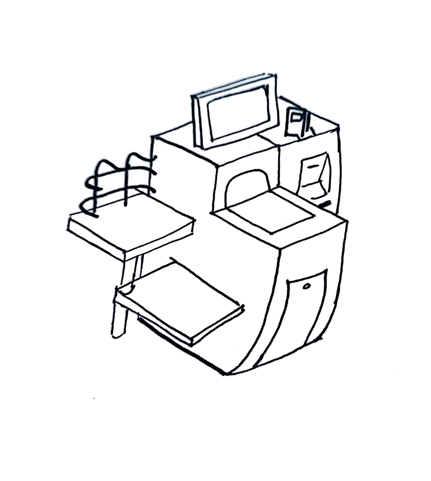

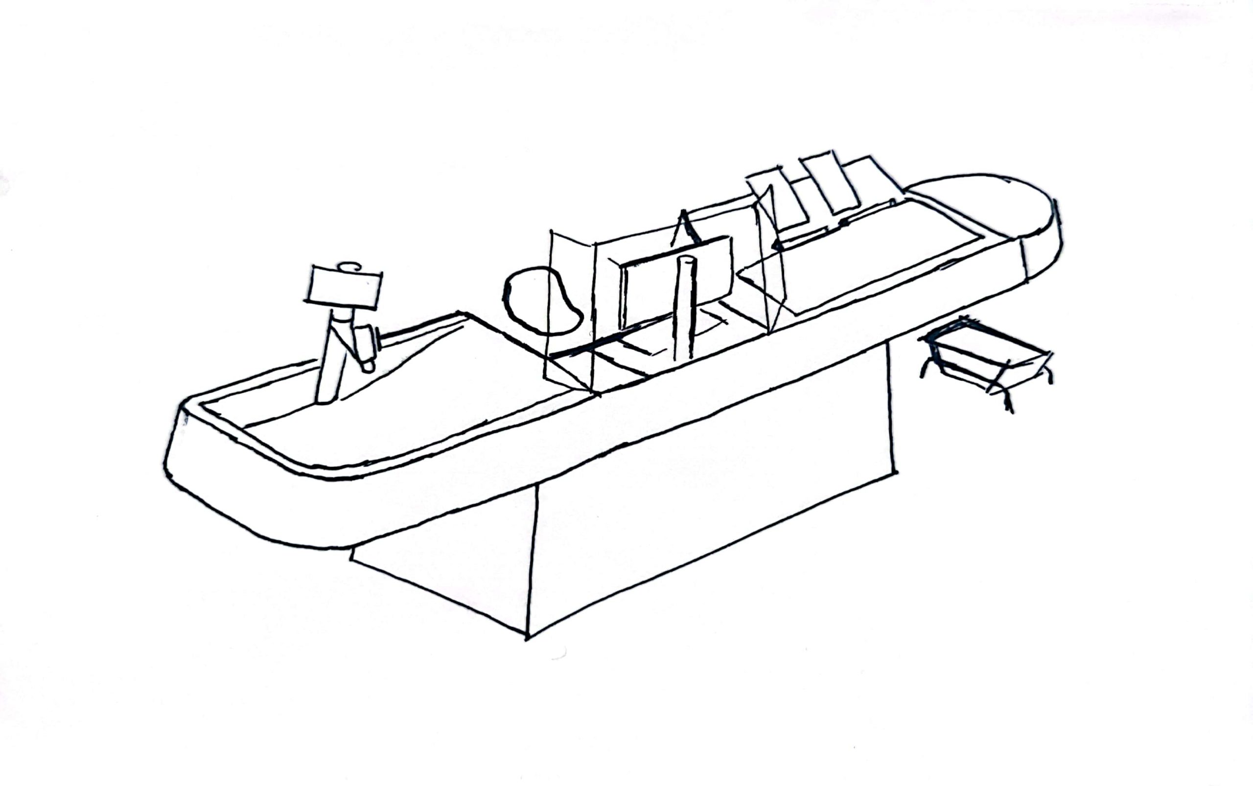
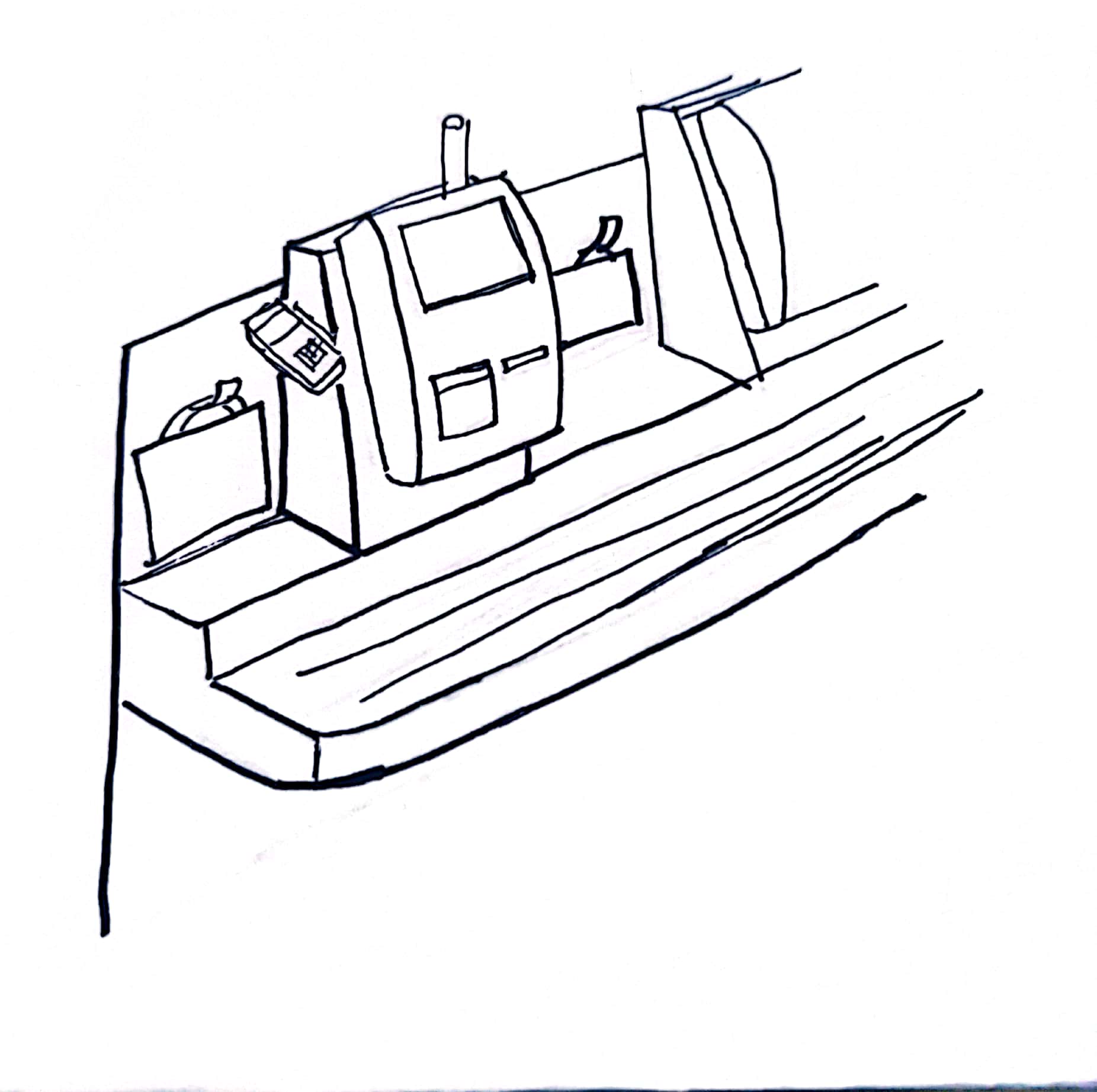
The COVID 19 pandemic accelerated the phase out of the old style SCO’s not just because of the unhygienic nature of physical cash, but also the sheer amount of time the attendants have to spend maintaining them; unsticking stuck notes and coins, resetting the security scale, all of which restricted customer flow and inhibited social distancing.
I could write a whole post on the psychology of SCO’s and insights based on observation from a couple of years of working with them. If you’re interested in the psychology of checkout design, have a look at this report by my former colleagues at the Design Against Crime Research Center.
We went from having 5 staffed Kiosk Tills and 8 large Cash Accepting Self Checkouts to an array of 12 cashless Skinny Self Checkouts (Skinny SCO’s) and three cash-accepting Kiosk Tills. Once COVID-19 hit, the middle kiosk was taken out of service and remained so until I left the partnership one and a half years later.
The new layout diminished the amount of cash payments slightly, but a compensating effect meant that the remaining cash activity was intensified and concentrated on the remaining kiosks.
How Do Tills Deal With Physical Cash?
Where cash accepting tills are concerned there three ‘types’ of cash held within the unit:
- Loose Coins: Held in the cash drawer (the bit that pops open for the operator to give change), separated by denomination.
- Notes: Usually adjacent to the loose coins in the cash drawer are the notes used. Typically these are separated by denomination but depending on the configuration of the drawer they may just be bunched together.
- Bagged Coin: A bulk reserve of bagged change kept in a secure location allocated to each till. Each bag holds a standardised amount of each denomination.
Should the till run out of a denomination in it’s loose coins drawer, it can be topped up from the bagged coin. Because the change is a reserve, the digital system draws no real distinction between Bagged and Loose Coins; it doesn’t know or particularly ‘care’ what the denomination levels are or how much is still bagged vs loose; its all part of the same lump sum. Remember this, it will become important later.
The digital system not only doesn’t discriminate between Bagged Coin and Loose Coin, but it doesn’t track individual denominations at all, it sees all cash movement as being an equivalent in 1 pence (the smallest GBP denomination).
Factors influencing cash flow in and out
This disregard of individual denominations seems counter-intuitive at first but makes sense when you think about it from a system design point of view. How could a digital system possibly know what combination of change each specific transaction is using? How could it know the breakdown of the cash handed over by the customer?
Perhaps I gave them a 50p piece, or perhaps I gave them two 20s and a 10, perhaps the customer found a 50p, gave it to me, and was given a £1 (an action you’re not really supposed to do but happens often).
There’s ways to calculate what the optimal change should be, but so many factors come into play, which frequently result in ‘sub optimal’ change being given, including but not limited to the following:
- Customers requesting specific change (e.g. £1 coins instead of an equivalent note)
- A particular denomination runs out
- Incorrect change being given accidentality or by malicious actions by staff
- Customers regularly not accepting small change which then gets placed back in the till
- Found change on the ground being placed inside the till
- People performing scams which results in them tricking the cashier into giving them more change.
When accepting cash, the operator inputs the value given to them by the customer, which in turn is used to calculate the value they’re told to give back to the customer, serving record keeping purposes. For an example, if the total is £17.32 and a customer gives me a £20 note, I’ll select £20 from the option list to tell the till what I’m placing into it. The till will pop open the drawer and request I give back £2.68. It doesn’t have any way of knowing how I made that value up.
It’s not uncommon for input errors to occur, meaning that these records are wrong, even though the till balances out in the end.
For instance, imagine I’m a customer purchasing something which totals £5 and I give you, the till operator, a £10 note. The input screen will let you type in the value or select from a list of “suggested” inputs, generated to save time typing “10.00”. You now accidentality hit £20 on the input screen suggested values. The terminal will tell you to give me £15 but you know this is incorrect and instead give me £5.
The record will show the wrong figures but the till is still balanced in the end and I’ve still received the change I expect.
Discrepancies
Discrepancies describe the difference between the expected value of a till and its actual contents.
The digital system tracks cash issued to each till, through it’s transaction records it knows how much cash it expects to find once totalled. By manually counting the contents of the till, we can produce a snapshot of this amount and compare them.
Actual Value - Expected Value = DiscrepancySome amount of discrepancies are inevitable and often self balance; a little bit of change falls behind the till, a customer leaves their change instead of accepting it. A partner makes a mistake and gives too little change, a scammer makes off with some petty cash, some change is found on the floor and so on.
Typical guidelines state that a discrepancy in the range of -£10 to +£10 is acceptable, and that the +-£5 range is very good.
There are a couple of factors which contribute to discrepancies and compound issues relevant to cash processing.
1. A certain amount of discrepancy is unavoidable. Even with perfect actions from the operator (no human error), customers leave a proportion of change behind choosing not to take it.
Sometimes (not often) coins come in that are either damaged or are actually a different currency that slipped through. We got a lot of international traffic from customers coming in from the airports and off of Eurostar so both customer and staff mistaking a euro for a pound was a common occurrence.
Then there is the fact we do not have any operators who don’t make human errors, given that they are humans. Change falls between cracks, sometimes incorrect change is accidentality given, even the old SCO’s would sometimes create errors, this is the imperfect nature of cash.
2. There is no reliable way for the tills to autonomously report on their actual contents. Even if you fitted the cash drawers with scales, cameras, and other features which could auto-measure the amount of cash at any given time, and even if you could guarantee the accuracy and calibration of such technologies, a bad actor could trick the system easily using random objects, fake coins, and slight-of hand.
Then there’s the fact that such a magical self-reporting till would probably last a total of five and a half minutes in active use; despite appearances, a shop-floor is a highly abrasive ware-and-tear environment. Equipment needs to be durable, it needs to withstand constant use, hits and heavy loads all day every day, sensitive reporting equipment would not last.
There’s a reason that consumer printers are still, after so many years, notoriously unreliable. Machines that deal with physical mediums and lots of moving parts in this way require a lot of maintenance and consistency of the medium.
Think of the uniformity and quality assurance systems of an industrial packing machine, churning out tens of thousands of units a day, that require full time technicians to always be present, monitoring vital signs and performing repairs. The little coin scale we used to perform manual spot-checks will frequently de-calibrate and is susceptible to errors if something is touching it or leaning on it.
Considering how customers crumple, un-crumple, fold, exchange, sit on, tear, write on, warp in to non-Euclidean geometry, lick, drop, and rub physical cash over lifetimes that can span decades, the fact that self checkouts are able to run autonomously at all is a wonder. And autonomous, accurate reporting of cash levels is completely infeasible.
Reconciling Discrepancies
Now that we understand how to find a discrepancy, what can we do with the information?
Sessions are digital records which denote a period of time to which transactions are assigned. Typically done per week, sessions allow us to cordon off a start and end date in which to look at transactions in order to defined periods to perform investigations in, explain discrepancies and then draw a line under them providing a “clean slate” for the next block of time.
While it’s possible to close and open new sessions at any point during the week, a branch like ours will typically keep one session open for the entire week, reconciling the result at the end of the week.
This performs the basis of investigations (if necessary) and plans for improvements to hone in on issues, but it also provides a time frame for issuing new change to the tills.
In our efforts to tackle losses, our branch employed an optional operational policy, to perform a ‘spot check’ every day before trade opens. This provides a consistent data stream through the week showing discrepancy change day-to-day. Random Daily Spot Checks (RDSC) can be employed on-top of this to target problem times / days / individuals.
Change demands can be done at any time but are best utilised when they are spaced apart; a till is unlikely to change much between 1430 and 1500 but may be quite different between the hours of 0930 and 1500. The time taken to perform the check and the disruption of closing the till are the determining factor that restrict how often spot checks can happen.
Spot Checks
Spot checks allow partners to gain a snapshot of a tills state at any given time.
Spot checks involve manually measuring the contents of a till and producing a readout from the digital system including, amongst other things, the total expected value of the till’s cash levels. If done correctly, you have a verified data point for a specific timestamp and a discrepancy.
Spot checks involve shutting down the till until the count is completed and the readout is printed. If the till is being used while the digital system is being consulted then the expected readout will not match the actual count. Likewise, if the count has any sort of error, the entire spot check has to be re-done.
Given that spot checks can be done during trade, shutting down a till while customers are potentially queueing is not ideal. Spot checks have to be done quickly and efficiently, and if the count is bad then that time is considered a waste.
Spot Check Record Keeping
Spot checks vary between contexts and branches in terms of how they are performed. However there are consistencies in terms of paperwork which factored into the design of the float tracker.
Values are sometimes recorded on specific float record forms (or just on a strip of receipt roll paper) then the total values and discrepancy are recorded in columns on a spot check form. This form is usually refreshed weekly, with enough columns for each day, however it can be used flexibly using multiple sheets as needed. Recording values sequentially in columns allows managers to compare results and their changes day to day.
These forms are held for a month or so, tucked away in a file, only looked at during investigations and with no long-term records kept.
If you think of an individual spot check being a snapshot in time like a plot on a graph, a group of spot checks together form a picture of changes over time, and the more checks you have in a given period the clearer an image you have of what is going on at any given point.
Of course this assumes you have time to actually look at the data, compare it to other relevant datasets, and make sense of it all.
Change Issuance
Branches will store the majority of their bulk change in their cash office, a highly secure (typically reinforced) part of the building with restricted access to even managers. Our organisation’s policy even states that the branch manager cannot be given independent access to the safe, such is the security of these rooms.
On the tills, bagged coin is held physically closer to the till to which it has been assigned, the digital system having been informed of which till got what. This is typically a very limited amount, enough to cover a single day.
Change Issuance is the process by which bagged coin is assigned to a till from the cash office.
So now we come a little closer to the problem on which this whole project is based, a single question that gets more complex as considerations pile up:
How much change should each till be issued?
And how frequently?
There are so many variables which influence the decision of how much to issue to each till at any given time. The complexity of the interplay between these is the original motivation for the Float Tracker.
First let consider the stakes; Why does it matter? Why do we care? Why not just hold all the cash reserves at the till and keep nothing in the cash office?
If there is too much cash in any given till, it increases the risk of being targeted for theft. This is less about the value of the bags which, relative to the weight, isn’t actually that high, but more about the psychological appeal of a potential thief seeing a large pile of cash and getting an idea in their head.
People can be motivated into stealing by a number of factors, most notably the desperation of the individual and the perceived ease of pulling off said theft. We like to think ourselves moral and “Theifs” and “Criminals” as being a morally compromised other, pre-disposed to evil deeds, but the fact of the matter is that crime is a complicated matter and that any of us, under the right circumstances, can do things we wouldn’t have thought possible.
Risk mitigation factors into the dynamic of how motivations are formed; it sees that once an individual has an idea in their head, the likelihood of pursuing extra-legal activities increases by bounds. It is therefore optimal where possible to stop ‘ideas’ forming to begin with.
While the bagged coin may not be worth much relatively speaking, consisting of a lot of low value denominations, to the right person in the right circumstances, its just a big pile of attractive coin, in a drawer. The weight and bulk of it makes theft ergonomically difficult but this actually doesn’t matter to someone with theft in their mind.
Additionally, having more cash will make the container heavier which will increase the time taken to fill up a till, which very often has to happen during trade when there’s a bustle of customers about. Even if a potential thief figures out that stealing bagged coin is widely impractical, they may still be desperate enough to try and steal it anyway, or they may turn their attention to other aspects of cash processing, wondering where other vulnerabilities lie.
So in short, having too much bagged coin is a very bad idea. The less bagged coin the better.
Having too little bagged coin poses a different obvious risk, that a till will run out of particular denomination during trade. The effect of this happening and the risk factor is, as with everything else, highly variable.
In a basic scenario, a till runs out of a single denomination, and other denominations can be used more heavily to compensate which usually isn’t that big of a deal. However things get more detrimental as more denominations run out. Two 50ps instead of a £1 will not negatively affect a customer to a great degree, but receiving five 20ps or even ten 10ps would be viewed unfavourably by most customers. As some denominations are used more heavily, others will run out faster.
As this situation gets worse, the till may be forced to close which can put real pressure on busier stores at peak times. Alternatively a mid-day cash issuance could be performed but this poses obvious security risks, trailing bags of cash across the shop floor.
So What is The Optimal Amount of Cash to Issue?
As you might expect, the individual denominations do not go down at the same rate. But more than that, the relative rate at which each denomination increases (or decreases) changes based on a range of factors that are difficult to pin down:
- How busy is the shop?
- Are there local events on such as a football match which might increase the proportion of cash-users (what proportion of pasangers coming through are on commute and how many are recreational)?
- How familiar are the local clientele with Self Check Outs?
- How willing is the local clientele to use card?
- What is the physical position of the checkout?
- What is the staff preference concerning this checkout?
Its a very difficult question to answer with no fixed way of deciding, relying largely on the intuition and experiences of a given cash partner to know what worked before and make a judgment.
An Example
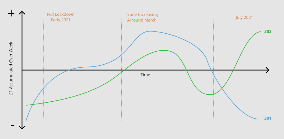
One of our tills, numbered 301 is favoured by partners versus 303 because 301 is closer to the door while 303 is tucked away in the corner meaning that in a pinch, 301 is more accessible than 303.
During the deepest Covid lockdowns when we were the only retail unit in the station open, basically only to serve Network Rail and the train crews, the £1 coins would deplete at a vanishing rate on 301, and slightly slower on 303.
As trade increased, this began to slow until the tills would both break even, hardly using their reserves of £1 at all, because the number of customers paying with £1 coins would equal the amount given in change.
Then, as trade continued to increase, 301 would end up depleting its supply of £1 again while 303 would toggle back and forth between staying level and increasing its supply.
The Outcome
Brief
Data Driven Actions
During my work as senior cash partner it became quickly apparent that improving cash processing and solving operational issues for staff on the tills was an issue of data visualisation. We knew what the symptoms of the problems were but could not effectively pin down when they were happening, what factors were influencing them, what timescales and processes to investigate, and what to make of the various sources of data we had to work with.
Once a few big easy-target issues had been dealt with and the dust settled a little, patterns emerged which pointed to processes which could be improved.
Its worth re-iterating at this point that malicious theft is only one portion of any problem and usually quite easy to track; practised thieves operate in a pattern, their actions align with a given shift pattern (scammers will target individuals), and they tend to get braver as more time goes on and they believe they’re going unnoticed. In terms of data-visualisation they tend to be quite a “noisy” data stream.
More difficult to track down are the common mistakes made innocently which are far more common, areas where partners do not realise that their actions are causing issues, tracking scam runners and conditions that cause people to rush and make mistakes. This can involve process changes but can also involve talking to people one-on-one, re-training them if needed, while being sensitive to not make the individual feel infantilised or like they’re in trouble. Having a good “case” built and plan thought through is a pre-requisite.
Manual Tracking
Never underestimate the power of a spreadsheet.
The first iterations of the project involved filling a Google Docs spreadsheet with data including the total float levels and discrepancies. The immediate effect was being able to see, for the first time, the long-term effects of new processes & changes and enabled me to convince management to invest the extra time and effort in more frequent checks.
However this required a lot of manual work from entering the data, transforming it, updating the charts, changing the titles, exporting the PDF’s and stitching the PDF’s together in a format that could be used in the end of week report to the managers.
It was also difficult to sample specific date ranges and to jump between time periods because of having to manually change the charts ranges. The whole process is very manual start to end.
Data Clumping & Scale
Spreadsheet data is quite flat; even if you have a large dataset it is difficult to get a sense of scale from a list of entries, compounded by the issue of charts showing one date range needing an awkward update to its settings to change.
With a linear list of data, it is often difficult to get a sense of scale; if you have 6 data points for Monday, one for each other day except for Thursday where you have a cluster of 3, it’s difficult to get a sense of till behaviour at a glance when they’re all just in a list.
Charts generated can, with configuration, display time-adjusted series but this adds time to setup and can sometimes complicate the issue of exploring specific ranges and mixing series’.
I squeezed as much as I could out of the spreadsheet but the more weeks passed, the more tedious the process of imputing the data, updating the relevant charts, exporting the PDF’s and compiling the reports became. The the data itself was stored in the sheet which got to be unwieldy and wasn’t a long term solution.
Overview
I decided that a small but versatile application could not only eliminate the hassle of this multi-step process but could enable users to quickly explore long term data and speed up the process of Random Daily Spot Checks.
The basic brief was to design something to be built quickly and achieve the following aims:
- To be a central repository to track a branch’s spot check and float level data.
- To give insights into till behaviour over time and with reference to recent events (like station closures, football matches etc).
- To allow cash office partners to reduce overall till float values to optimal levels by observing recent behaviour and comparable contexts.
- To follow a principle of data abundance and the adage “more good data overrides bad data”; users can quickly input counts with no authentication, the occasional mistake or bad count overwritten by more counts and an authorisation process by an authorised user later.
- To look and feel like any other digital system the staff might use, to share a common visual language and design patterns.
The system should be robust, designed for non-technical users and offering no impediments or blocks in the high-paced, pressurised environment of the tills. When you have to shut down a till and occupy another partner’s time to supervise, you can’t wait for redundant animations to finish, for a lag on every enter-key press, or for the app to hang because the connection dropped.
Count Classifications
The application centres around it’s main data type: Counts. A count represents the result of a single spot check, either a full check or a partial, and can be saved in any state of completion. The server uses a classification system to sort incoming counts and present them in different ways on the front end.
- Unverified: A count which is submitted with expired authentication or a low-access-privilege user which must be authorised by a higher-privileged user.
- Incomplete: This is a count which does not have enough data to be included in the data-visualisation areas and analytics sets.
- Partial: Some counts include sufficient data to render Bagged Coin can be used for some of the data visualisation but not for the full count. Counts with complete Bagged Coins but missing other details are classed as “partial”.
- Complete: Counts with all values present and submitted under sufficient authentication.
Authentication Levels
To facilitate this data input system, a privilege system was designed to control which actions a given user is able to utilise. For my branch’s use I defined three roles using these privileges, ‘general user’, ‘cash partner’, ‘managers’, but in theory any number of users could be defined, one per person if you liked.
- Standard User: This role has an empty string for a password that only has basic write abilities; counts submitted are saved as “unauthorised” (which really means ‘unverified’) requiring a cash partner or above to approve them. The lack of authentication is a strategic choice based on evaluation of how much damage a malicious user could do.
- Cash Partners: This role is for any trusted partner, someone who regularly performs spot checks. This role allows the submission of fully authorised counts but still cannot remove data, only mark it for review.
- Managers: Includes senior cash partners and management who oversee cash. This role has all write, update and delete capabilities for all data types. This role has a much longer password and quick session timeouts.
Design Prototyping with Figma
Learning from a couple of projects which preceded this one, I was adamant that this project would be designed upfront with prototyping software, fully thought out and with strict adherence to brand design given it’s context within the shop.
My previous projects immediately before this one involved building a clone of an old Microsoft Windows game in which I focused on building the engine and algorithmic structure first, thinking about its layout, interface options, look and feel, use context and other details as I went along. After all, the engine and mechanics were the thing.
This wasn’t necessarily a bad ideas but as time went on this lack of direction towards a single, clear end result (beyond replicating the main functionality of the game it was based on) created problems given that some of this functionality is tied to, or influenced by, the desired look & feel. Continually stopping a train of algorithmic work to come up with an interface idea which will potentially be rehashed later is an impediment that slows progress a lot.
Figma is a fantastic tool for design and prototyping, I had already used it for numerous pieces of work including Tailored Nutrition, Mosaic, lots of client work, and the redesign of this site. It allows you to pour thoughts out onto a page like a digital scrapbook but also to create mock-ups which look identical to the equivalent HTML and CSS. Its fast and versatile with a very low learning curve so check it out if you haven’t already.
Brand Analysis
I began by collecting material relating to the branding of Waitrose & Partners, first looking at the official brand guidelines, core colours, and examples of where these are used in existing digital sources such as their websites and internal applications (not pictured here for security reasons).
Beyond the core colours I wanted to look at the other pieces of tertiary branding such as the “Give a Little Love” campaign which was in full swing at the time, and other commonly used colours. I was particularly interested in how white-space was filled and how contrast is used.




It was important to me that the app feel a part of the eco-system, that it read to partners as a Waitrose app but I didn’t need to stick to the brand too exactingly; other sources take liberty with specific colours.
I had a rough idea of the layout that I wanted, it had to focus attention on the man content but also allow the user to jump between areas quickly so I decided on a side-bar based navigation layout with page titles and page-specific details on a bar running along the top.
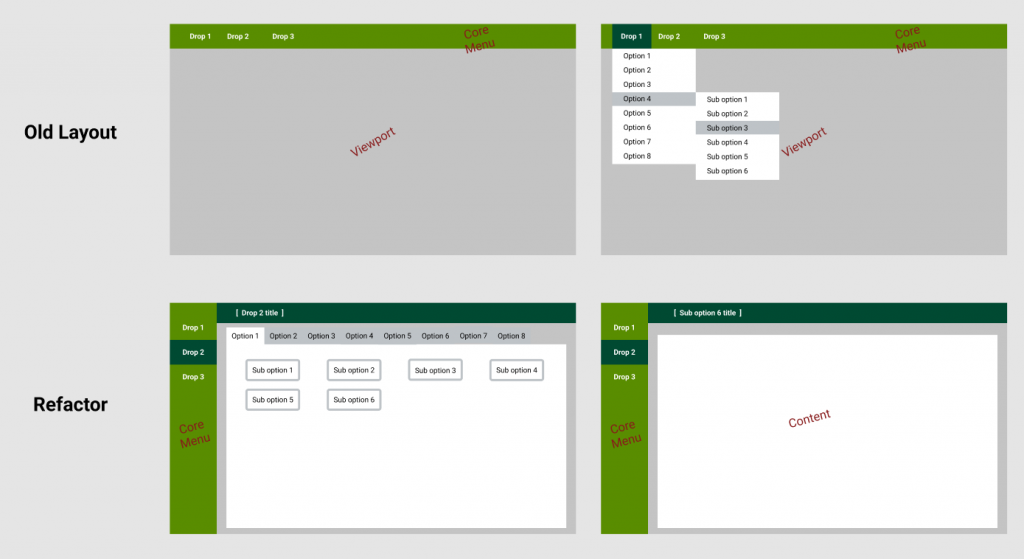
These decisions were decided in response to one of the main applications I dealt with in my cash-office duties. This application, which we will call Flint here, presented users with an empty page and left-aligned top-level menus. On click, these presented cascading drop-down menus to get to the individual section you needed. This section would then open up in a new window, meaning that the main page wasted 90% of its space while still requiring the user to navigate tricky cascading menus.
I knew that the app would involve a fair amount of lists and large vertical input forms so a side-bar layout eliminated the need to handle a top-level navigation.
It was imperative that the application stack and / or hide its complexity behind intelligent design as much as possible, it had to focus the user on one “thing”. As discussed in the context section, most of the users are non-technical and the use-case environment may be high paced so distraction, confusion & clutter is completely unacceptable.
The diagram bellow shows an approximation of how Flint’s main page looked, although in reality the menus are about half the size shown here making them difficult for even able-bodied users to interact with.
Bellow is a hypothetical refactor of Flint with the exact same content. A clear separation of concerns focuses the user on the main page content, tabs are used to keep everything on show at once but these could easily be cascading menus or even a drop down / sliding drawer, just so long as the content is larger.
Not only is space used more efficiently but large amounts of overflowing content can ba handled far more effectively than before. This basic layout shows what the original design for the Float Tracker based on.
I then iterated some layouts and colour combinations to settle on the look and feel of the application.
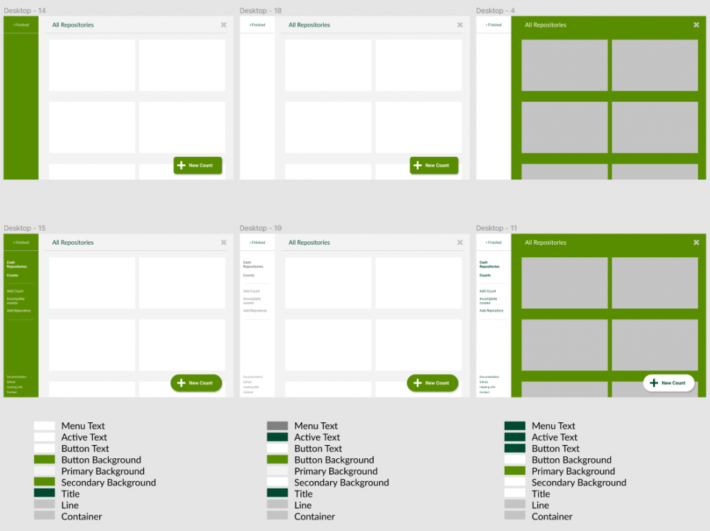
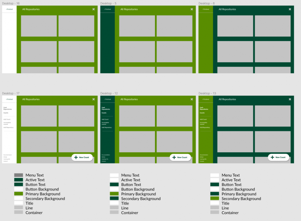
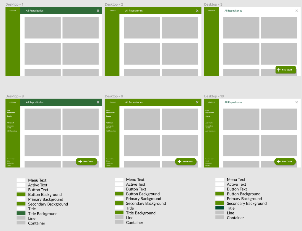
After deciding on the layout system, I designed the main pages and user-interactions. I wanted the user to land on a list of graphs to communicate recent levels across all repositories and then click into each graph to show the inspector view for that repository. We also needed a central list of counts which should be filterable, and a reusable component for entering a new count and editing an existing count.
On top of these there would also be pages for managing the data types; users, repositories and partners. A User is local to the application and controls authentication and authorisation while Partner represents the till login number and name of am actual person and is used to sign counts. These pages were low priority given that the application could run with manually updated seed data.
A persistent “Add New” button was added to most screens to allow users to quickly jump into a new count irregardless of the current state of the app, the button was placed and styled to create an association with a common design pattern found on platforms like Twitter and Tumblr which have similar features.
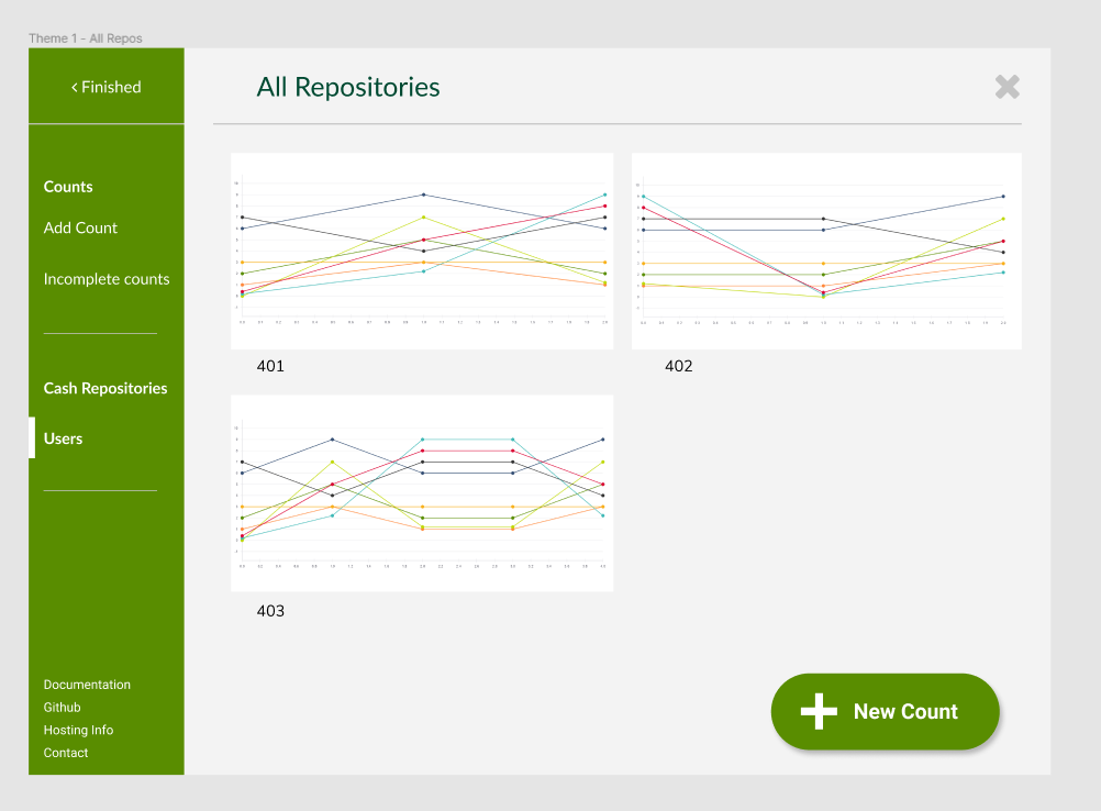
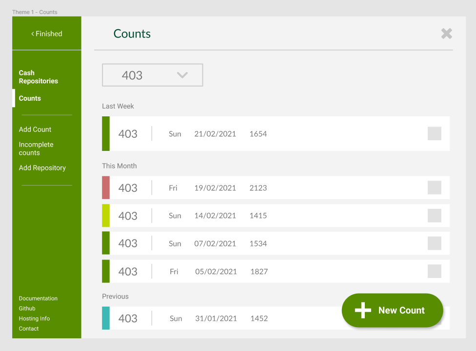
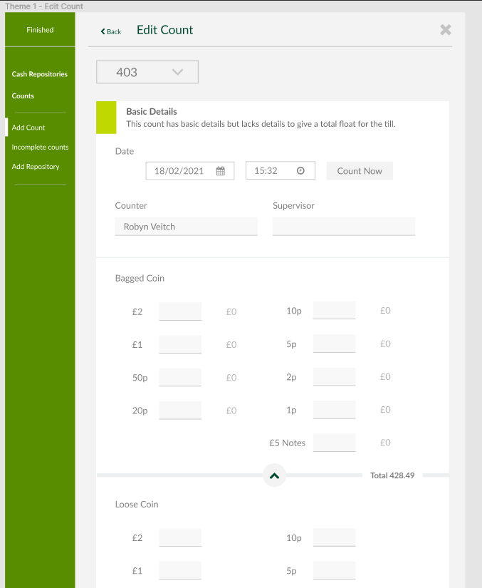
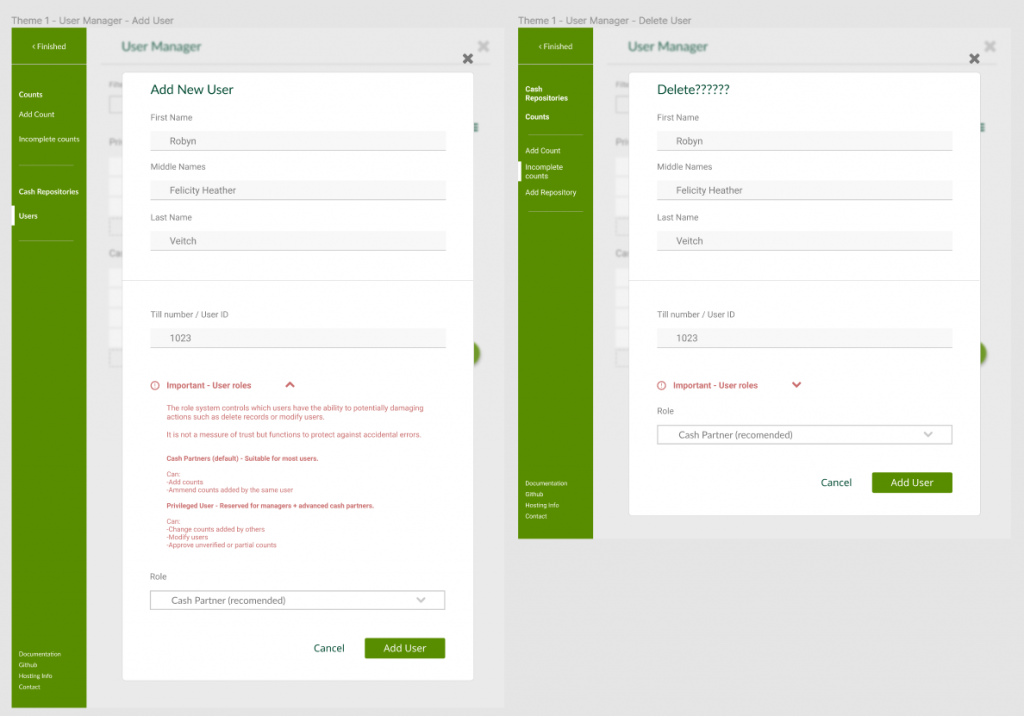
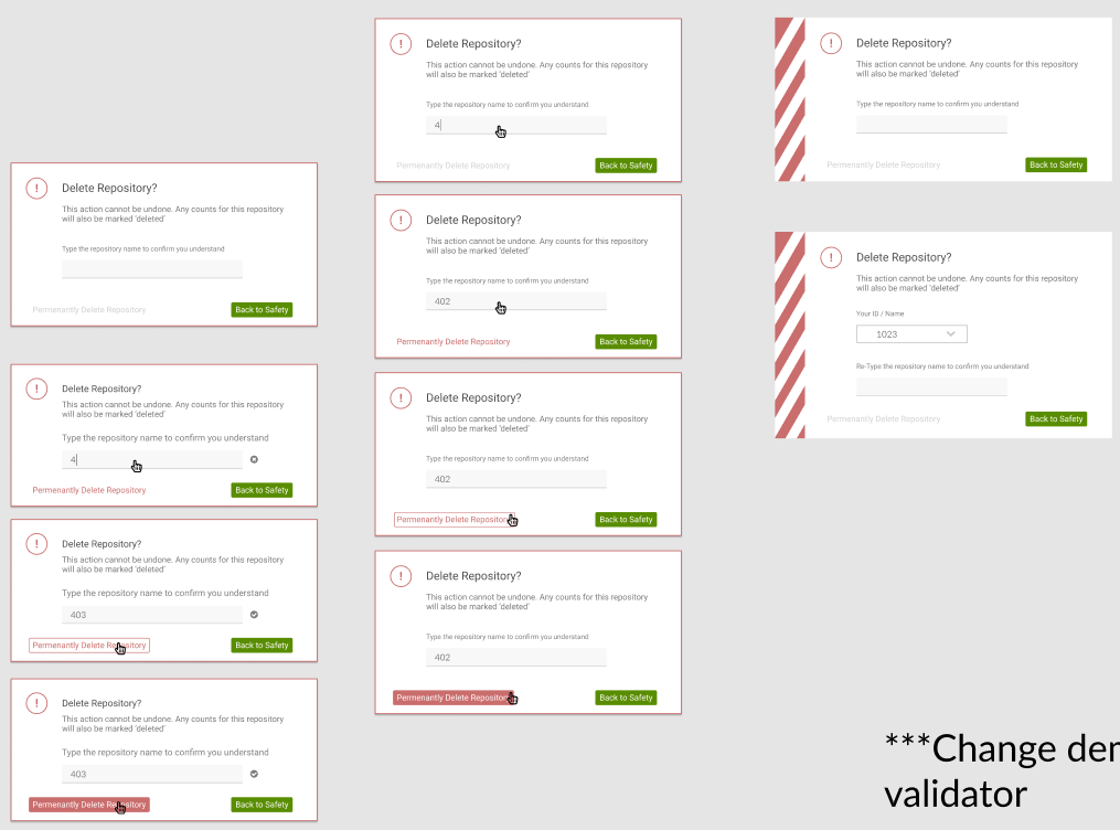
Modals were selectively used for many Create Update and Destroy (CRUD) operations in order to keep the user ‘in place’ and to help with component reuse. With actions like deleting a count, a reason must be recorded and the user must identify themselves by selecting their till number, creating a compounding complexity of forms on top of forms so modal pop-ups are used to simplify these interactions and to bring the user back to their starting point on exit.
Theme and Component Design
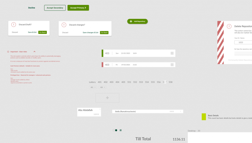
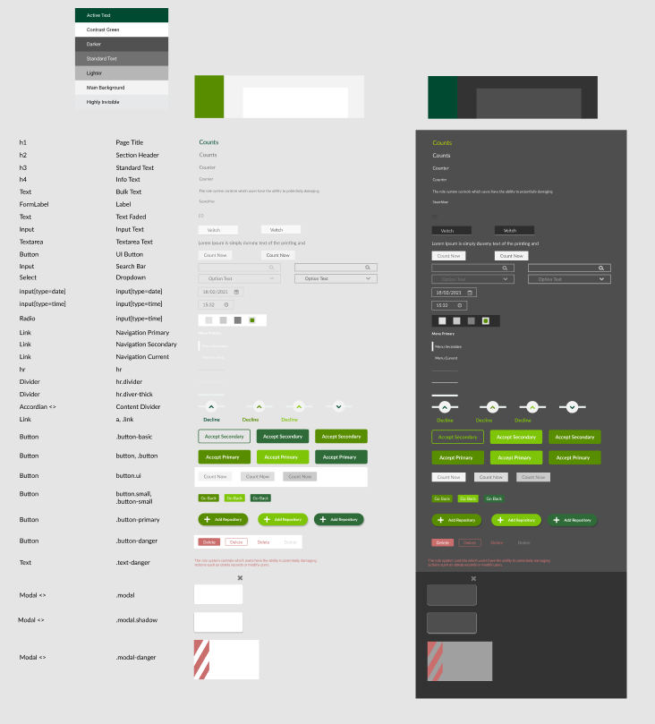
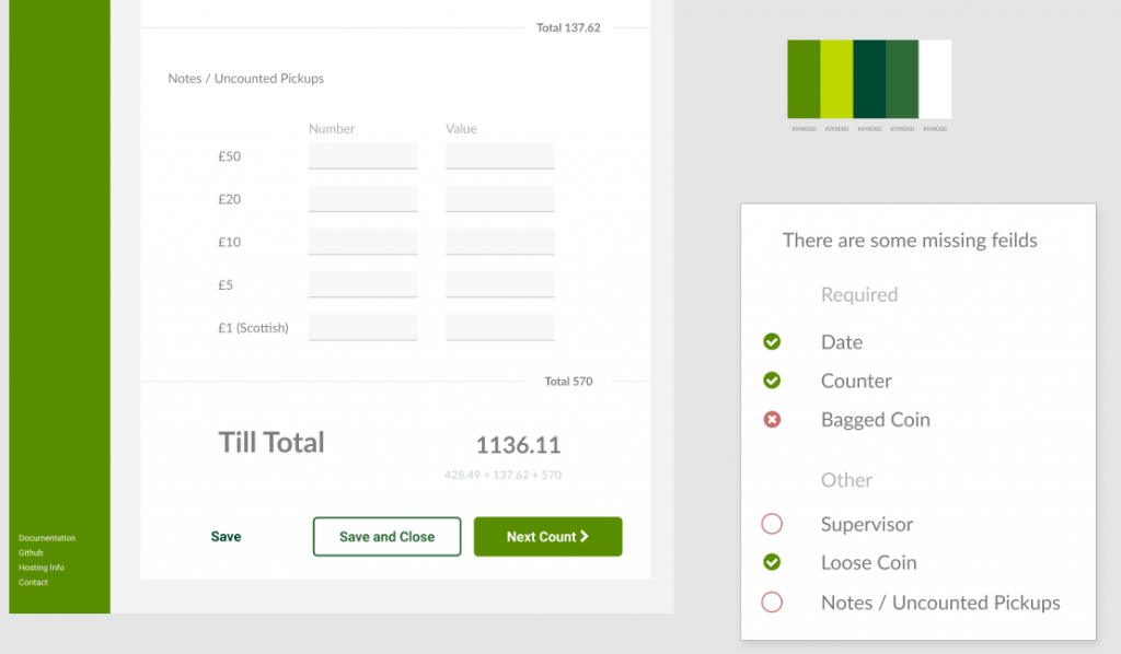
Once I had hashed out the layouts and user-flow, I gave a pass over each frame to ensure consistency between colours combinations, text sizes, margins, drop-shadows and so on. From this it was possible to define named colours and a set of “basics” colours which replace the native browser named colours like “red” and “green”.


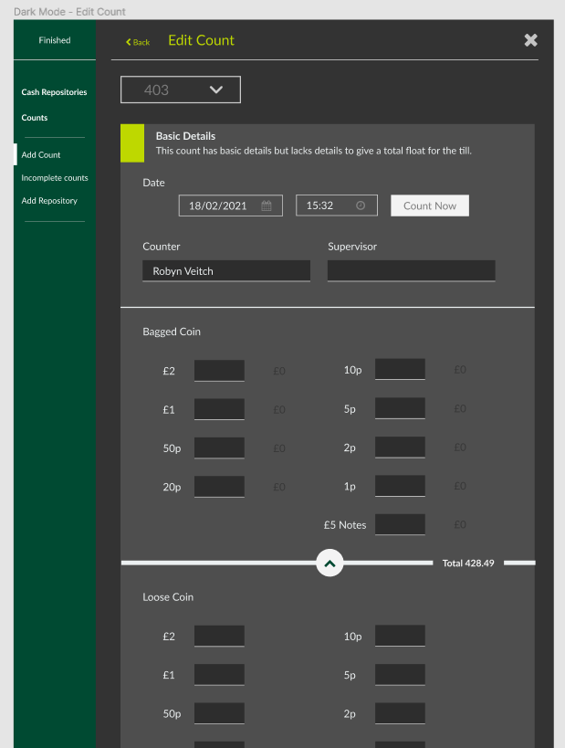
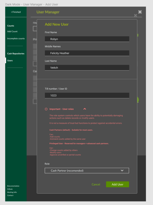
Another feature I wanted to try for the first time was the implementation of a “dark mode” and “light mode” theme, up until now all of my applications picked one style and pretty much stuck to it.
I took my primary inspiration from GitHub’s dark mode which appealed to me with it’s use of neon colours; at the time I was still not much of a fan of dark modes. One of my main issues with the way that many applications / sites implement dark mode is that often there are contrast issues, the contrast levels either being too low and difficult to see, or detailed elements like text being too bright and sharp, straining the eyes. Sites like GitHub that get it right largely do so because they solve this issue in particular.
I was keen to find areas where the same colours could be used for both light and dark modes such as the gray used to outlines and borders on inputs, the red warning text, some buttons etc.
I collected the common elements into one place and added other components which might be used later and collated them into a component library.

Tech Stack
The base of the font end was a React-Redux application for performance and data sharing between different elements of the state. React context was used heavily for local shared state for things like count editing and the inspector views. The application is a single page app using React-Router’s hash router given it’s ability to port to React Native if that option became desired later.
This project was also my first big typescript project, using the typescript create-react-app template for the front-end and a custom typescript setup for the back-end.
The back end is an express app secured with passport.js for authentication. There was no hard plan for the application to be used outside my branch however the idea that other branches could hypothetically spin up their own instance was important and so there was a plan to dockerise the app.
The app used a component and CSS-in-JS framework, unusual for me, with Emotion and Chakra. I was not amused by it. See the later sections for my thoughts.
For the back end I was keen that to use a SQL database, moving away from MongoDB; I was happy with my Mongo knowledge and realised I was lacking practice with SQL which is still more flexible and widely used in industry. I designed the data tables in Lucidchart’s diagramming tool with the entity relationship package, which you can view here.
To build the database, handle migrations, and build SQL queries Knex.js excels, allowing you to chain functions together representing the components of a SQL query in nice familiar JavaScript. Objection.js is an ORM (object relational modeller) is built on-top of Knex and allows you to build models and define database entities to interact with your database. It provides a comfortable middle ground / bridge for developers more used to things like MongoDB.
Chakra & Emotion
This could also be an entire post in itself, and may be some day.
This project was an opportunity for me to push myself to use new technologies and deviate from my typical tech stack. One such area I had previously been staunchly against was the idea of using a component library framework. I’ve used component libraries in the past but only for specific needs like date-pickers, the majority of the components would be custom made and the main layouts and styles implemented with CSS / SASS.
I was inspired to use Chakra.js, a component library built on-top of Emotion.js, one of the most popular CSS-in-JS libraries.
Chakra lets you pass props representing CSS attributes to your components and is touted to be a convenient way of quickly writing CSS. I found it to be a somehow even worse implementation of the already misguided utility-class method exemplified by Tailwind. This is definitely getting its own article at some point.
However this alone is not enough for me to not give Chakra a fair shake, what killed the experience for me was that a) Chakra is inconsistent on how controlled components (like text inputs) handle change events. Never before have I spent as much time fighting with an input to behave in the way I expect or trying to figure out if I should use <NumberInput /> or <NumberInputField /> .
The second thing was b) There was no date-picker. What’s a component library without a date-picker? Jokes aside, Chakra will frequently lack components that you would expect to be featured by default, and are the reason you use a component library in the first place.
You’ll be getting along fine, using <Box /> after <Box /> wondering what the functional difference is between just writing a regular <div /> and writing some CSS like a normal person, and then Boom! Stopped in your tracks and searching through another article listing component libraries which will need to be stylised and add bloat to your package size or through inscrutable documentation.
You become a designer for the framework, focusing on it rather than benefiting from it working for you.
React Vis
There are a number of chart options when it comes to a React application, I won’t go through a full breakdown as that could also be a post in itself.
D3 is still my preferred option for data visualisation but it is tricky to use alongside React given that it works by injecting data into the DOM and performing transformations progressively to said data. This poses a problem given that, strictly speaking, any manual DOM manipulation within the React app is an anti-pattern.
If you just search for “react d3” you’ll find many articles and an unmaintained ‘React-D3’ library which attempt to integrate D3 with react. Almost all of these will make the mistake of simply placing some amount of D3 calculation logic in useEffect’s and then simply placing the output in the render method, violating the basic benefit of using React and frequently causing unnecessary re-renders.
Some libraries such as chart.js calculate the output of graphs behind the scenes and then render the output to a canvas element. This eliminates the DOM manipulation issue as the library can track changes and is effectively providing the framework with an image to paint on each render.
The drawback is that you loose out on the flexibility of D3 and are locked into preset graph options and whichever configuration settings your chosen library supports.
Then there are libraries like React-Vis which lay somewhere in-between; they provide wrappers for pieces of D3 functionality that are designed to be used in a compossible manor.
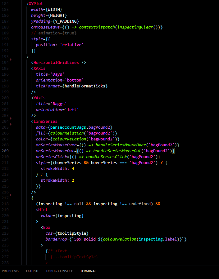
React Vis was made by Uber and was the library I chose to go with after research as I felt it was the best all-round compromise. Its compossible components are rendered intuitively in the JSX and can be configured by passing props, which I feel is much more in keeping with the style of writing React components than calculating and building a configuration object and passing it to a single <Chart /> component, but this is of course personal preference.
Good chart libraries usually already provide combination charts but what’s nice about the React Vis method is the ability to simply bring in a LineSeries or PointSeries and place it in the JSX. Want to get rid of the Y-axis? Just delete it! No need to scour the docs to find the right option to turn it off.
This is still a compromise, far from perfect, and I would still consider all available options per project but until someone can properly integrate React & D3, a good compromise is the best you can try for.
React Context and Reducer Hooks
This type of application has a number of areas where a large amount of shared state is used by several components but is still too localised to be put in the global Redux state, the app can be thought of as a collection of mini localised unit-applications that communicate with one another. The two most prominent examples of this are the count edit / add form and the inspection viewer.
With this type of situation the temptation would be to hold all the state logic in a top-level component and pass the necessary data and callbacks to each child, which can then pass them down as needed. This introduces a number of issues and inconveniences not least that these types of prop-drilling and callback trees are the problem that Redux is supposed to solve.
In addition, when child components need to perform data computation and complex algorithmic work, the top level component becomes bloated, loading and perform data parsing at inconvenient times and when the consuming component is unmounted.
By combining the React context and the hook useReducer we can create a Redux-like experience without exposing unnecessary data like mouse positions, series highlights and tooltips to the Redux store unnecessarily, and does so in such a way which compliments typescript.
useReducer allows us to dispatch actions to a reducer, just like with Redux, and have the reducers make immutable changes to a state object. Placed within context, each component can access the state object and access the sections it needs and dispatch modifications as needed.
By using enums for the action types, and action creator functions, enforcing type conformity is easy. By extracting the reducer, initial state, action creators and action types to their own Utils file you can create a separation of concerns and import what you need in each component.


Notification System
The application has a notification system built in, initially intended to provide the user visual feedback on a save action.
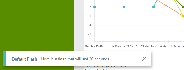
The implementation is fairly simple; an invisible layout is rendered over every page, it subscribes to a list of queued notifications in the Redux state. Each notification is represented by a standard object with options that specify how the item should render and a time property which, unless the notification is specified to be persistent, will define the amount of time before the notification self-dismisses.
Some notifications have links or actions which will dispatch events to change the state of the application (like redirecting the user to the inspector view with preset options). There was provision to have some notifications stash themselves in a drawer for the user to view again, similar to how many operating systems implement notifications.
The advantage of this system is that the notification can contain anything, it can render with a particular colour scheme such as a blue “information” for external events that the user may want to be aware of, a green “confirmation” for things like confirming a successful save, and a red “warning” for negative side effects like a network error.
This means that anywhere in the app I can write a simple dispatch function, pass in the required and optional props and have a notification appear. Notifications slide in from the side on top of any which are currently rendered, as others are dismissed the stack drops down. When the user mouses over a notification the expiry timer is paused.

Inspection view
While the main landing page graphs provide a brief comparative view at a glance, it is the Inspector view that provides users the ability to pull the majority of insights.
The inspector view allows users to quickly jump through date ranges to get a snapshot of the tills state and judge it’s behaviour but also to drill into specific counts and compare the change over time.
Date ranges
The date ranges allow users to filter the queried data and regenerate the graph seamlessly, with a minimal load time. It defaults to showing the last four weeks of counts but can theoretically show any time frame, given that the application has no gauge of how many counts exist in a given stretch.
Data Inspector and Series Selection
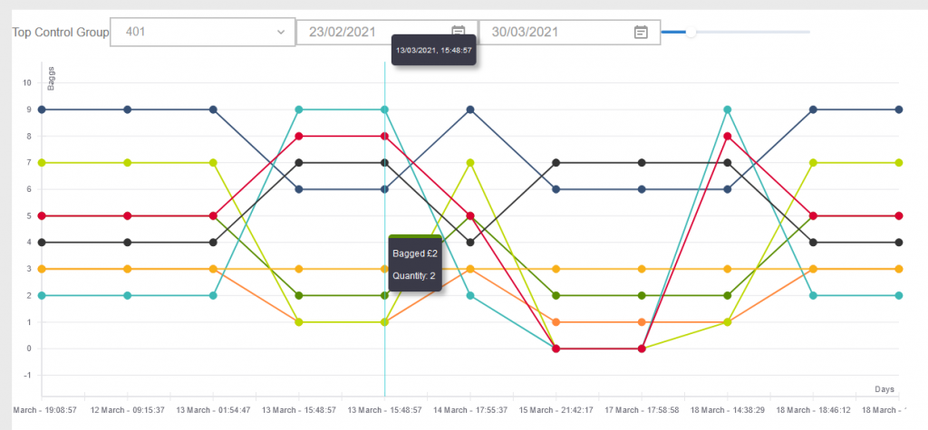
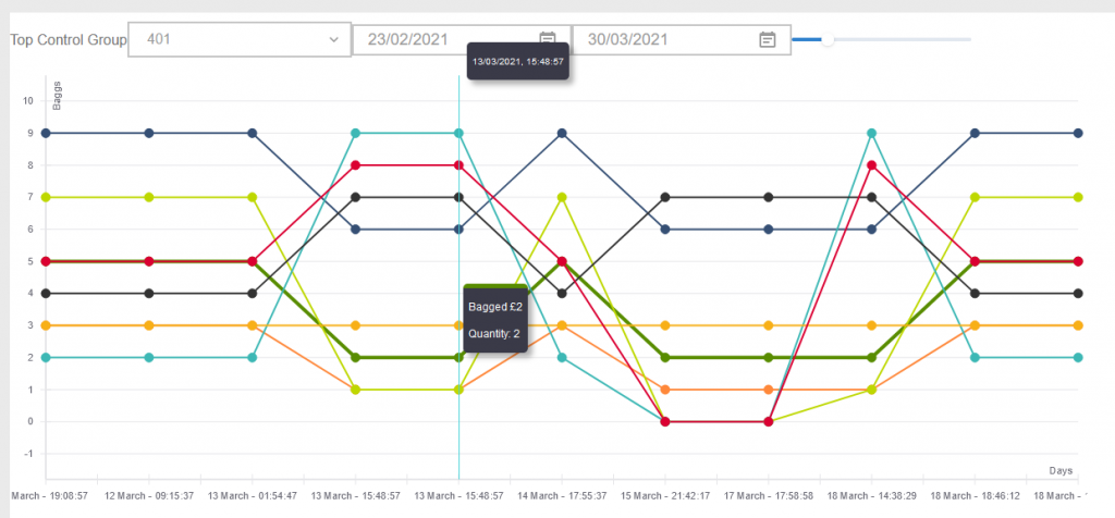
Two tooltips allow the user to interact with the graph, the first showing overall details for each count such as the date and float total (although the version in these screenshots here only show the timestamp).
The ‘local’ tooltip shows data for the specific data point and can be clicked to highlight the series to make it stand out.
The information is already distinguishable from other elements on the graph including the time series, the height of the point, the series colour guide etc. The the tooltips allow users to focus their attention and explore from point-to-point, without having to jump back to the series labels. This helps simplify what can be a complex array of data.
Series Adjustments
The inspector has two modes, one which shows just the Bagged Coin and another which merges Bagged Coin and Loose Coin by calculating the effective amounts.
Bagged coin has the disadvantage of being uniform in value; you’re never going to have more than say 10 bags, the bagged coin will usually be somewhere between 3 and 6 bags. This poses the problem of overlapping points and series, which are difficult to read.
The “adjustment” feature calculates the relative amount of each value and changes them to offset by a set amount. Each series will receive an “offset”, a value which it uses to change the vertical placement of each point, the series are then clearly visible as being in the same position but distinct.
Of course, the series could swap positions every step between counts creating a “leap frog” effect, but chances are such that a given series will remain above / bellow another for a period of time.
The following examples show situations in which an ‘adjustment’ is useful, and where it can conflate issues (see the left side in the third image, the series begin to look as though they are on the next line). These images show the same datasets, the first has no offset, the next has a small offset, the last has a large offset.
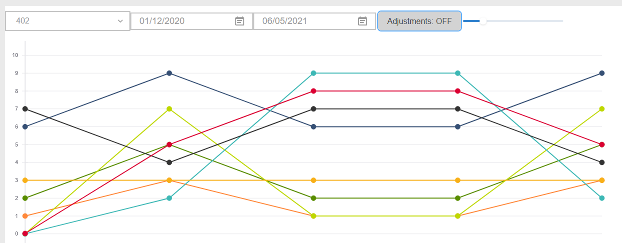
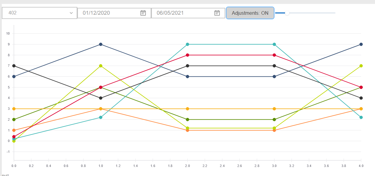
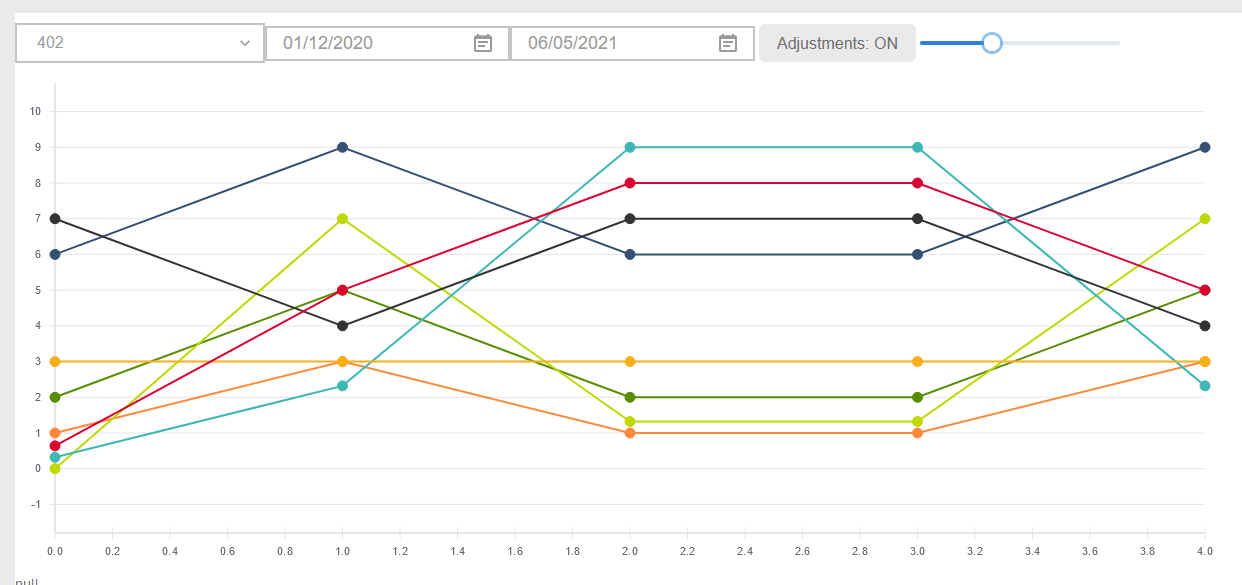
The series algorithm will alternate between offsetting positive values and negative values, for example, the first item will be offset by +5%, the next by -5%, the next by +10%, the next by -10%.
Shadow Points
Given that there will be between 8 and 20 values, it makes sense that the series lines and points would be small, this poses an issue given that small points are difficult to focus on with a cursor.
The app renders “shadow points” behind every actual point which provides a larger target area for pointer events, meaning that its easier for users to hover and see specific details on the tooltip.
Count Input
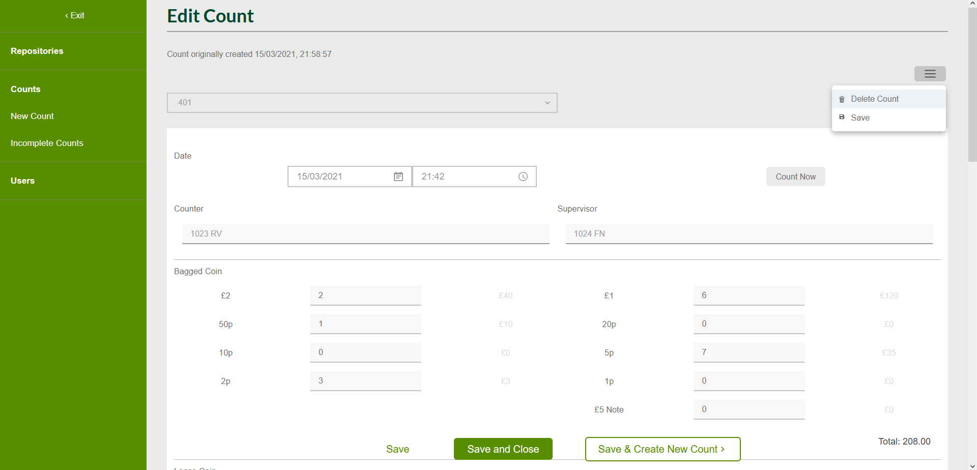
The component used to edit and add counts is the other heavily used section of the app. The same large component makes up the majority of the page and so the distinction between the ‘edit’ page and the ‘add new’ page is whether data is pre-loaded into the state.
In fact, when adding a count, the first save will redirect the user to the edit page with minimal perceptible effect to the user.
Count Validations
The validation functionality is used to perform two main functions, certifying that a count has enough data to be displayed alongside other counts, and to categorise the count into the completion states; “incomplete”, “partial”, “complete” and “unverified”.
Both the front end and the back end use a validation function, and unfortunately for me that meant keeping the two in sync manually, copying changes back and forth depending on what changes I needed to make. The front end uses the validator function to warn the user of the current state of the count and to attempt to reduce re-saving.
The back end is more strict and must use the validation to change how it saves each item (or perhaps not, should it fail certain checks).
Number Steps
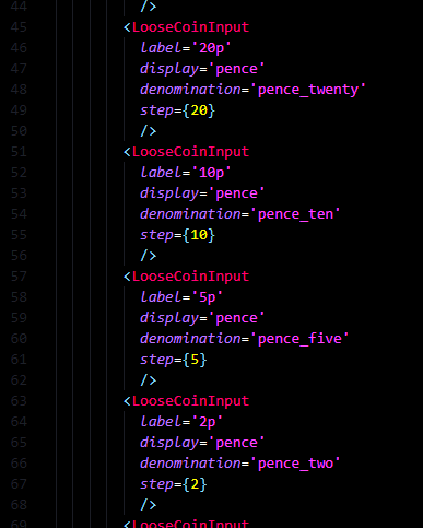
The input components for bagged coin, loose coin and notes are all reusable, they normalise values into their pence value given that 1p is the smallest possible denomination. All calculations are performed on the pence value and validated by calculating valid “steps”, e.g. a 20p input will go into an error state if it is given the value “£0.30”.
The first image shows how the reuse of the single input for a loose coin series, the second shows the logic used to add trailing zeros to the display value when the user tabs or clicks away.

User Selector
By the rules of the partnership, each count should be performed by at least two people, the ‘counter’ who performs the count, and the ‘supervisor’ who observes the count without interacting (they may write down the values or help out in another way).
The input allows users to select their name from a drop down list or type to filter the results. This matches not only the user’s first and second names but also their till number and initials meaning that however the user tries to identify themselves the system will try to approximate who they are. This is helped by the fact that there are a limited number of users per branch so the result matching can be quite loose.
The user can then click from the drop down or hit enter to select the top result.


Submission Panel
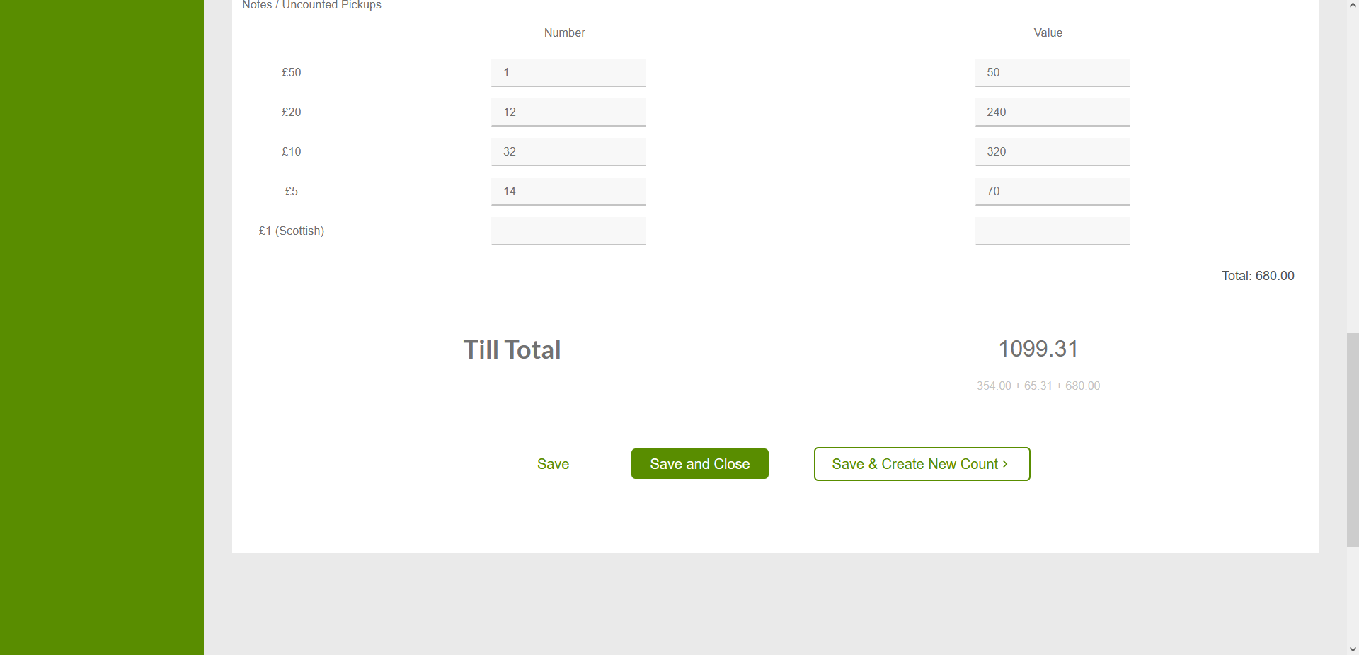
The form presents users with three buttons to submit the count, “Save”, “Save and Close” and “Save and Next Count”. This form is set to a sticky positioning at the bottom of the page meaning that it will display at the end of the form if the form’s end is on screen, otherwise it will pin itself to the bottom of the screen.
“Save” saves the count and displays a notification while allowing the user to continue entering data, “Save and Close” does the same and re-directs the user to the list of counts or back to the page they were on (only available for some locations), “Save and Next Count” saves and redirects to a new count.
In the Real World
You’ll notice if you view the app that its a bit rough around the edges and even missing some sections, not least because the branch on deployment is behind the main branch due to embedded sensitive data that I don’t want to put on GitHub.
Perfectionism was a real impediment working on this project, it was never finished and I was admittedly shy to show it to my colleagues before it was “done”. Ignoring that it will never be ‘done’. I started using it in March of 2021 and kept it mostly to myself at first.
I cant remember what prompted me to show my colleagues but I’m glad it happened so soon, the best antidote for perfectionism, and the assumptions and lies it plants in your head, is to expose it to other people. My colleagues were impressed and eager to get their hands on the app.
We never got to the stage of actually imputing numbers on location at the tills during a count, but we were able to input the data into the shonky, half-built graphs, and pull a number of key insights despite it’s half finished state.
The app made the end of week reporting so much faster for me and was used to track down a new scam which had just cropped up and was evading us at the time.
It allowed a massive reduction in float sizes and for us to find ways to build resilience into each till preceding events which were happening around that time. This included the run up to 17th July 2021, the day in which all Covid protections, including basic things like mask-wearing in indoor public places, were to be prematurely removed in England (but not the whole UK). This was a period of rising trade, beyond pre-covid levels, and further uncertainty about what the developing behaviour from the public would be as we moved into the next phase of the pandemic.
By the time I left the partnership in September 2021, the tills had held steady at a discrepancy of +-£10, the “very good” band of operations, something we had all assumed was a goal achievable by any branch except ours, an exceptional outcome for the project.
Still a little bummed I didn’t get my consistent +-£5 though.
Reflections
App professionalism comes at a time cost
As pleased as I am now by the way this project turned out, I cannot deny that it became a monster incarnation of something which in all rights should have been smaller and faster to produce.
I felt that this project took an inordinate amount of effort considering the relative simplicity of the outcome; “how come this app is not really more complex than my past projects but took longer?”.
Well, one explanation is that being an essential worker during a time of global crisis an having to interact with costumers every day who seem to flip-flop week-to-week between treating you as “the hero’s keeping the work running” and “just shelve stackers who are not bringing me service fast enough, Covid is over now don’t you know?” has a detrimental effect on one’s mental health and creates burnout.
Another explanation is that this application brought a level of production maturity that pervious works such as the chess app just did not have. A project like this had to be a showcase of skills built up until this point and deigned as though it were a production app to be maintained by the organisation after I left.
Many of my projects until now had had a focus on a particular core aspect like algorithms, a game engine, CMS functionality, etc. This one had to do everything from brand identity to a user and consumer focus, to new tech stack changes, to security concerns and so on.
In retrospect, a lighter, more stripped down version of the app could have been produced faster to begin generating insights long before it got to its current state.
Typescript should be top-down
My next project, following on from immediately from this one, was the Scratch Card Tracker app and re-used much of the tech stack from this project, with a number of improvements.
Given that this project was my first big typescript project, the most noticeable improvement in the Scratch Card Tracker was the quality of typescript used.
The Float Tracker suffered from inconsistent use of typescript standards with many instances where TS wasn’t used or where there was an abundance of any and unknown declarations to get the project moving again. This is somewhat to be expected from people new to typescript or new to strongly typed languages entirely. Unfortunately it creates a feedback loop as the more weakly typed a section of code is, the more brittle connected sections of code become, and the more you feel the need to just drop an any and move on.
Starting The Scratch Card Tracker I defined data-types from the beginning such as Actions, State types, ColourSets, Counts, Games (series), and stored them in a central file (although I must acknowledge that there are opinions about how to handle global typedefs but who cares frankly given how closely tied all the functionality of the app is, I saw no reason to not just import them from a types.d.ts file.
Having core data types right from the beginning meant that sub-components inferred stronger types (where TS “figures out” the type of a variable from its source) and so made more strongly-typed bindings, meaning the incentive to use ‘cheats’ like any were reduced. Strong typing cascaded from the top of the app downwards instead of having to be retroactively applied by adding them lower down and following the error stack slowly upwards.
This is not to say that having set data types is the answer to all the woes you might encounter with typescript, and there are certainly times when it is useful to just remove type definitions, but it’s worth thinking about areas where you can introduce strong type definitions from the beginning and cascade them downwards rather than getting caught out later on in the development process.
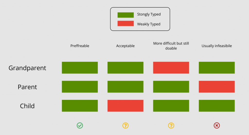
As a general rule, if your weak type bindings are lower in the component tree / call stack then you can probably get away with it. If there are weak type bindings at the top but constantly strong bindings later on then you’ll typically be alright but may run into some issues. If the type binding is chequered or has an area of weak bindings ‘half way’ all hell breaks loose. Lastly, if you want strong type bindings later on but none higher up you might as well walk away and go a bike ride or do some painting instead and never touch the project again.
This diagram communicates my general thoughts on type-bindings; consistency is key, and it is easier to put strong typing up front and become loose later than to try to introduce strong typings later.
Proper prototyping is essential but don’t get bogged down
Beginning this project I had a good idea of the necessity of prototyping, but I think I had slightly inflated ideas about how absolute a design could / should be before actual work can begin.
In an ideal world it would be possible to design every component, every component combination, every colour, every modal and every page / state and so on. In reality, not only is it not worth your time to mock every single modal, so long as every base piece can be found elsewhere and the general user flow is thought through.
In addition, there will inevitably be changes that come up through the built and UAT feedback process, its just what happens. You’ll find yourself going back and retroactively adding features to the design from the real deployment and diverging from the design.
Going forward I considered the prototyping phase to be essential but also sought to view it as a starting point for the project, to eventually be jettisoned and to grow beyond, not a strict rulebook to be bound to.
Stop trying to find a way around it and just write the CSS
Alright, I admit it, I am biased against component frameworks.
However I do still maintain that there is a right way to build a component library / framework and there are about 12 wrong ways. Perhaps a framework is inherently a compromise, that there will never be a “perfect” one because each will invariably have to choose from a set of trade-offs.
I’ve since worked on teams using Material UI, an implementation of Google’s Material Design system which has a range of it’s own problems but is rarely as blocking as Chakra was to work with.
MUI has a wide-ranging set of components out the box, very often we were surprised at how often a desired feature was present. It’s various methods of writing CSS-in-JS are still sometimes a pain in the backside, but I do appreciate that they’re trying to cater to a wide range of audiences and seem to do so well.
Ultimately though the source of much of my frustration comes from the fact that much of these technologies seem to be convoluted 5-dimensional-chess manoeuvrers to avoid just writing some CSS.
I understand the drive to encapsulate pieces of styling instead of having enumerate SASS files compiling into a global CSS sheet which then causes unexpected conflicts between components but, for fear of sounding like a stereotypical pensioner whining about “back in my day”, I can’t help but feel the solution is to just write better CSS?
We ended up having to define quite strict standards for setting up the ‘theme’ in our projects in order to try to standardise styles between components, and encountered situations where two unrelated components should look alike but diverge slightly, because at some point a chunk of CSS was copied and pasted and then unknowingly conflicted with something else in the page. Encapsulation moved from being the thing that enforces consistency to an impediment to consistency.
Every time I find myself tracking one of these issues down I cannot help but think to myself “what if this was just a SASS variable, wouldn’t that get rid of all this? Is this not a solved problem already?”
Anyway… get of my lawn you darn kids! And take yer no-good gadgets and googas wicha! I got my SASS runner and I like it! *harumph noise*
Trying to prove a point with code.
There is no project which exists outside of a context and a human story and this was no different, there’s also a reason I’ve struggled to get round to writing it until now.
I’ve joked at several points about the mental and physical stain and burnout of being an essential worker, in a retail unit, in a station, across the Covid pandemic (at least until I left in September 2021). Putting the jokes aside it has had long lasting effects and I’m not sure any of my colleagues or myself are quite the same people we were before it all started.
At least through much of 2020 we had the sense of urgency and emergency which stood to validate the stress of the work; it was tough but we had a duty to perform and were up to the task. By 2021 we were all severely burned out and it was showing, the camaraderie and “we’re all in this together” of the past was gone and the continual flip-flop between people taking Covid seriously and acting as though it was all over (and definitely not coming back, this definitely isn’t the 4th or 5th time we’ve said this) was compounding the issue.
We can’t disconnect ourselves form the broader context from our work and it is clear to me now that this project, and the ones to follow were a way of dealing with the trauma, frankly speaking. I could work on something which gave me a sense of achievement, something to focus on rather than the outside world, and something which I believed was a logical step up to the next phase of life, Covid or no Covid.
I believed in the partnerships mission and had the idea that I could use this and the Scratch Card tracker to get my foot in the door at the partnerships head office, driven in part by the belief that I was not qualified enough to just search for a development job outright (a strong case of imposter syndrome).
This would also helped create a bit of narrative consistency; I would use my position in the partnership to improve the branch, leave behind a lasting legacy, and then move into a developer job within the same organisation which could not have been obtained otherwise. This, it was felt, would justify the hard work, the sometimes back breaking effort, and the lack of any meaningful break in over a year, and ‘make it all make sense’.
In reality, while my skills were benefited by the project greatly, this project and the Scratch Card tracker were not even on my portfolio when I applied to my current position, and the partnerships head office rejected my application outright; they needed the team leading experience more than the specific skill-sets.
I was so deep in my own little world, head down, just trying to get through each week that there was no time to stop, take a breath, and think rationally.
The thing that eventually ‘snapped me out of it’ was my living situation falling apart; my then flatmates turned abusive and threatening before trying to kick me out and I had to pack up and move back to Glasgow to bunk with my parents. I was out of options, and probably on the verge of a nervous breakdown (yeah that was a fun couple of years, I love London really…).
It feels as though every one of my posts in recent years has ended with a section about burn out, but this had an air of finality about it. The reason I was so engrossed in this uni-linear career / escape plan / escapism, and the reason I was so attached to the partnership was because it created that narrative consistency; it meant I was working towards something when, in reality, I had all that I needed to get my current position from about mid-2020 onwards.
In retrospect it is easy to say that we all (myself and my team) did good work irregardless of context and irregardless of appreciation, that the time spent making these improvements and pushing each other was not wasted, and has had lasting effects but that thought doesn’t help when you’re in the midst of it.
Still, if there is anything in this which you think resonates with you or someone you know, take this as the ‘red flag’ sign you’ve been waiting for.


