Child’s AI Companion

A project looking to create an educational toy for nursery children aged 2.5 to 4 years, culminating in a robotic dog designed to provide companionship and empathy building skills.

The dog, designed to resemble the function of a pet to an age group unsuited to live animals, is tied into the IBM Watson API to respond intelligently to the child’s actions, mimicking a real pet. Within my high school, this project was the first and only SQA Higher Product design assignment to reach 100% in grading.

initial ideas sketches
The six initial ideas, some focusing on empathy building, some on cognitive development and some on physical development.

The target age group possess a challenge given they are so young, this outcome aimed to stimulate social and empathetic skills, getting them to play and connect with something that, to their eyes, is a real animal but without the risk or spontaneity of having live pets in the vicinity.
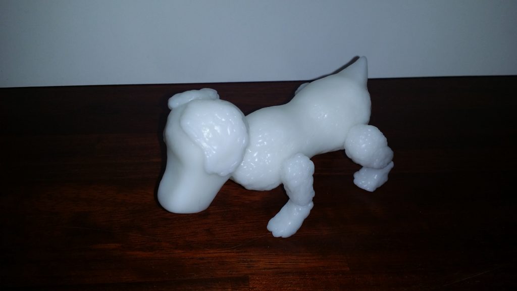
a model of the dog made from polymorph plastic
An early sketch model to judge the proportions of the dog. After this it was decided to make more elements geometric for fear of negatively blurring the distinction between the tech dog and real animals in the child’s mind.

The Dog would function full time in the context of a nursery school or play centre, randomising its behaviour (in a controlled scope) and reacting to environmental stimulus. Through the Watson API, it is sensitive to the behaviours of young children, reacting to their needs, for instance, backing off and acting docile if they express fear, coming to comfort if they look sad, excited during play.

technical details page
Some internal technical development to boost durability and implement safety features.

Control interfacing would be done through a custom computer software to customise behaviours, activate games, map the play area and ignore certain people should a particular child take exception to it.

The dog is short, geometric and robust, moving on protected wheels at the base of the legs, the dog can take a considerable amount of abuse whilst being possible to undergo repairs.

a sketch of the screen construction
In hind sight, more research and development could have been spent on the ‘analogue’ functions of the dog rather than tangents such as this screen for playing games.

This project definitely veered into territory that at the time I was unfamiliar with, that being an area of psychology / therapeutic design and speculative territories about our future relation with technology.

If I were to do this project today, I would like to not get as hung up as I was on the physical aspects of the design, for example, the touch screen game interface that was unnecessary and far beyond the comprehension of the target age group. More attention could have been payed to the beneficial (or otherwise) ways we interact with animals and what core empathy skills a child of that age could benefit from boosting.

Torch CAD Specification & Graphics Package

Higher Graphic Communication ‘Thematic folio’ produced to sharpen my technical competency and visual presentation capability in final year high school.

The Thematic Portfolio is essentially what other institutions would call a technical package, a fully detailed CAD package with supporting parts list and promotional material.

We were asked to choose a physical product to reverse-engineer, build in CAD, and then create a brand identity around. I was excited to use this as an opportunity to expand my Autodesk Inventor skills and build a strong brand image around the product.

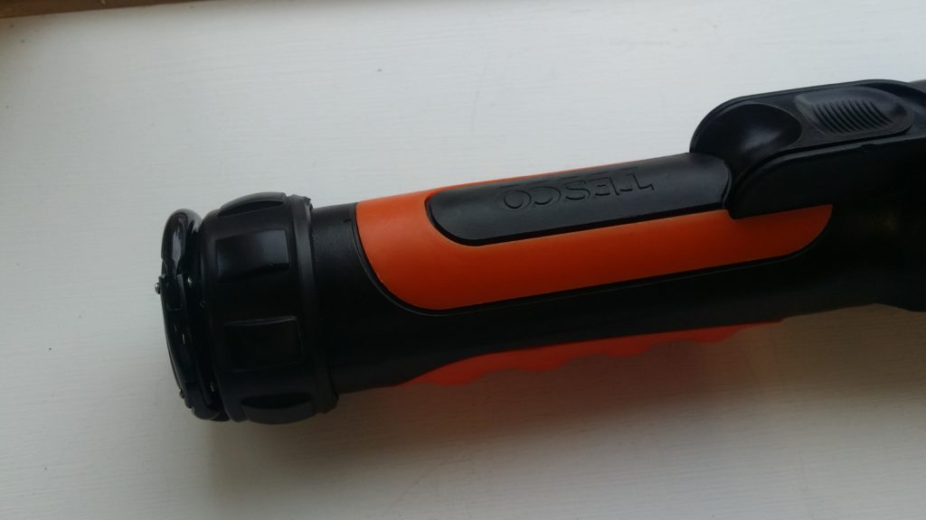
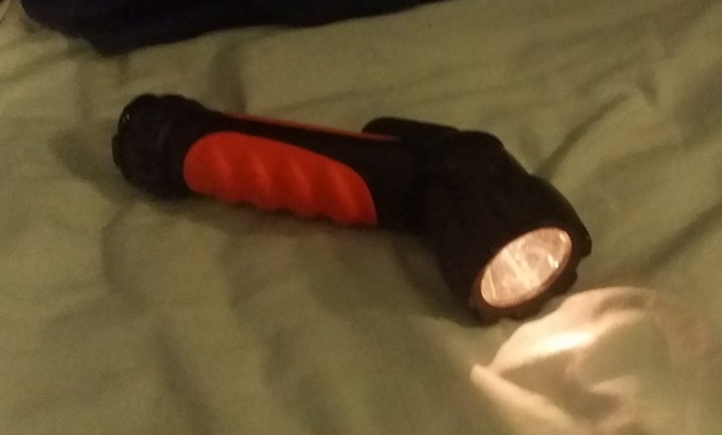
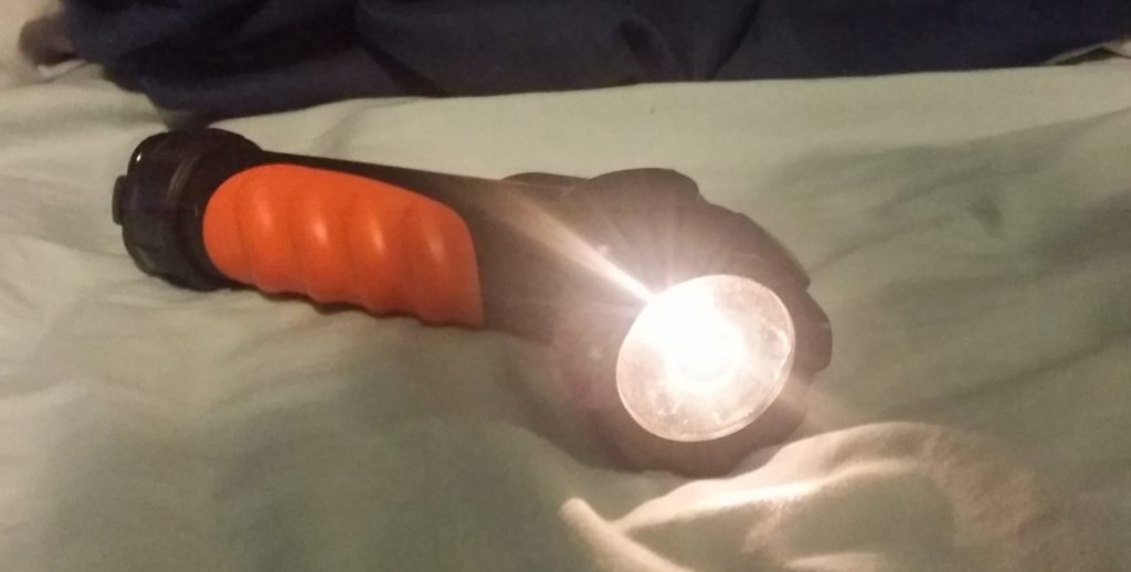
I choose this Tesco torch with a rotating head that can be tilted 90 degrees. Given it’s rotating mechanism, features following or arrayed around the cylindrical body, and detailed components, I felt it was a good challenge for my skill sets at the time. If I had wanted to I could have omitted detail such as the orange detailing, the clip, or the bulb assembly and still met the requirements of the brief but insisted on including these details for the sake of it.

The thematic is, in essence, a full visual display portfolio for our chosen product where we act as though the product is of our own design and we must now visualise and communicate it to a client, manufacturer and customer.

This folio is comprised of three components:

  1. A fully annotated technical package including parts sheets.
  2. Rendered CAD assemblies and exploded views.
  3. Promotional posters and leaflet.
torch CAD model
A render of the assembled torch.
torch CAD model exploded parts
An exploded view of the torch
specification sheet for model parts
Fully dimension-ed part sheet
promotional leaflet
The leaflet showing faux-company details
promotional posters
One of the posters produced.

The fictionalised ‘Nitor’ was presented as a utility device for both home use and the outdoors (in reality the torch was far too fragile to do either). The graphic presentation was based around plays on the idea of folding and direction changes.

This was a chance for me to play with some new graphic techniques including layered transparency and a form of flat design used for the icons. The text affect attempted to evoke the imagery of an eclipse.

NAT5 Course Material

In my fifth year of high school I contributed to a course redesign by supplying an exemplar project.

In my senior year, the ‘Intermediate’ courses were being replaced with the new National 4 / 5 courses (equivalent to GCSE’s). In this roll out, new materials and methodologies had to be designed. For Product design (now Design and Manufacture) this involved a research – oriented project for which I was asked to create an archetype to be used for demonstration purposes.

The brief was an introduction to research to inspire an interest in developing fields and technologies as well as an interest in research as a functional and recreational activity.

This is something I very much agree with and so was excited to participate in the creation of this new project.

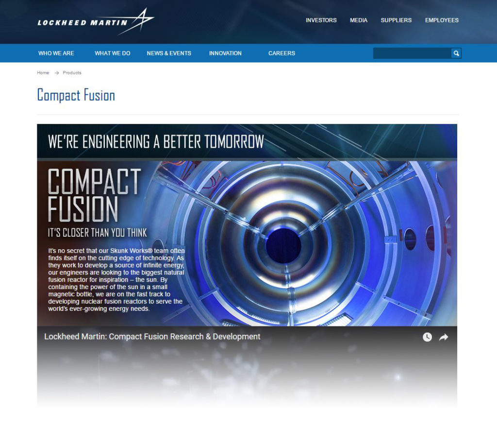
screenshot of Lockheed Martin's site in 2014
The landing page for Lockheed Martin’s fusion project.

At the time, Lockheed Martin was making headlines with their ambitious claim that they were five years away from achieving a sustainable fusion reactor. This was exactly the sort of thing the brief was indenting to look at.

icon development
At the time I was unfamiliar with vector-based programs, I created logos by designing shapes in Inventor and drawing over them with the colour select tool in Photoshop.

To visualise the research I utilised newly – learned ideas about graphic design, flat design and visual presentations.

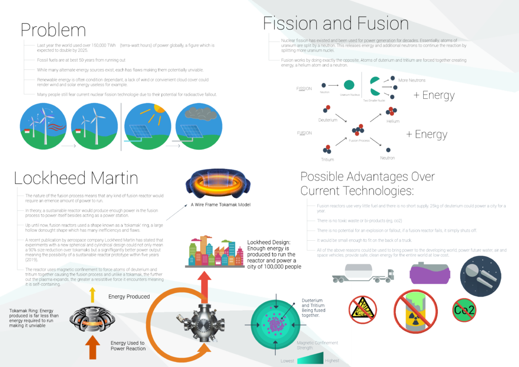
final poster
Final Poster Design

Utilising some previously devised archetypes and new techniques,this was the final design which was well accepted by the technical team for use in the project.

CCV Interface

A very early project to engineer a desk table with built in computer interface extension.

This project, developed over the summer of 2013, was one of the first ever long-form, self-directed projects I undertook. A small, movable work table with a reflected PC display extension and touch capability. It was built on the open source software Community Core Vision (CCV).

community core vision software
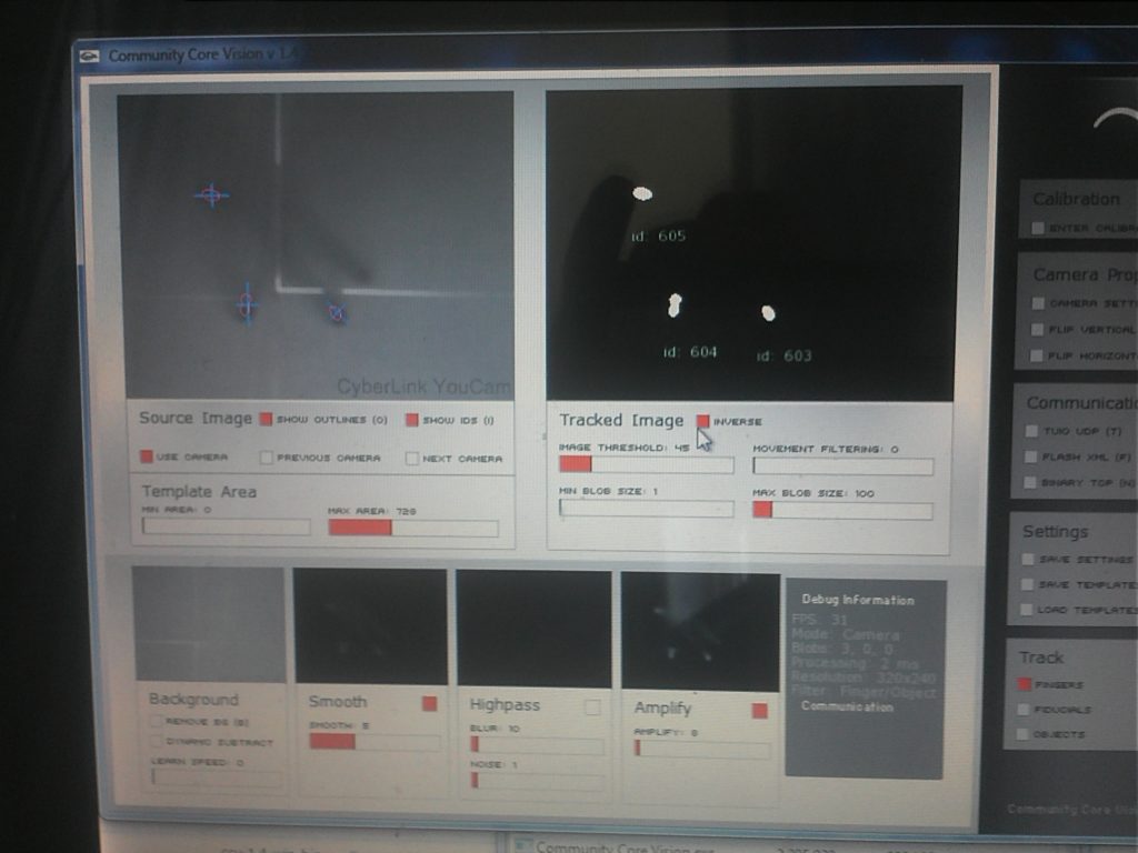
The main interface for CCV, on the left is the raw infrared image, the right shows the filtered image and registered touch points.

CCV is an open source software designed to interpolate data from an infra-red camera for use in this kind of project. The above image shows data from an experiment before the LED arrays were even introduced (i.e. working only with ambient IR light), already the software can detect ‘clicks’.

a disassembled and modified webcam
The final camera assembly after modification.

The device works by flooding the display sheet of polymethacrylate with strips of infra-red light via IR LED arrays. A small standard webcam is housed inside, modified to block visible light and pick up IR radiation. The IR light is even throughout the sheet until something comes into contact with the surface, at which point light deflects into the camera. The camera is in continuous use by the CCV software.

testing a prototype for the ccv table
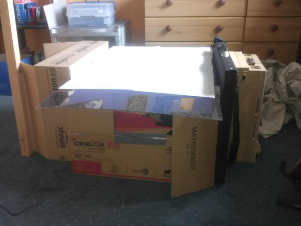
Throughout development and testing, several mock-ups were setup to simulate different conditions such as the amount of outside light pollution and camera / projector distance tolerances.

To design the casing, I created a minimalist but aesthetic form, inspired by the set design of one of the Star Trek movies. The display is created by linear setup of a projector reflecting off a mirror. The table has to encase the projector reflection assembly and camera with minimal light bleeding in so avoiding a ‘blocky’ aesthetic was a challenge.

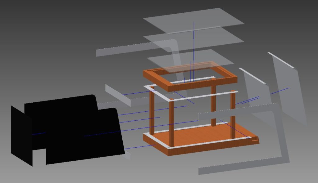
an exploded view of the components
The exploded CAD model, designed as a reference for the real-world build.

A full assembly was designed with a wooden frame clad in sections of polymethacrylate to give a smooth aesthetic in line with trends at the time. The table was designed with home / workshop manufacture in mind; I did intend to make it only opting not to due to cost and storage constraints.

In reflection I realised that I had, for the longest time, brushed away this project because of a restrictive mindset I was in at the time; this has no particularly beautiful renders or SQA-style presentation sheets. However, on closer analysis, I am very satisfied with how this project came out; the design was ready for manufacture, the projector camera assembly was working, acting as a proof of concept, and much was learned about electronics, interface software and engineering techniques which would serve useful later on.

Station Lighting

One of my oldest projects, done in early high school; A UX and Lighting project for use in redeveloping rail stations.

As part of the Higher Product Design Course, as with Intermediate Two, we must produce a Design Proposal as a prelude to the Design Assignment which comprised 50% of our final grade. The brief chosen was to create a platform lighting system for a fictional lucrative rail operator to use on all its station platforms with few restrictions placed on functionality and cost.

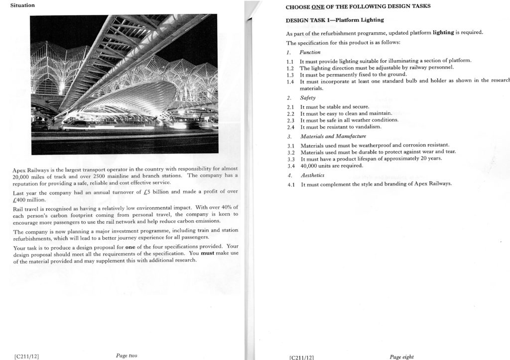
scan of project brief
The main brief with the chosen project.

This project was our first real chance to experiment an innovate as the product typology, its placement (multiple units on a platform) and restrictions placed by the brief were all very open.

Four of my original ideas were built on the premise that a lighting dimension could be built into an alternative function, that the functional part of a light is the light emitted and that the product to emit the light was merely a ‘casing’, a means to an end.

In this way, a lighting project can be thought of as a project to design a new way to achieve the generation and projection of light.

sketch of early idea for screen integration
The initial sketch for design idea two, floor directed lighting with a timetable display.

My first chosen idea was built around the idea that timetables could be placed on the ground level and used to project light along the ground. This was built on the idea that ground-level light projection was less intrusive and more ambient than excessive overhead lighting and that to build this into the platform would create a floor level intrusion. If the unit had a secondary purpose, the obstruction could be justified.

sketch of old concept
Design idea five, expanding sculptural light.

My second idea was built on the idea that a piece of lighting could be ornamental as well as functional, as most platform lighting is purely functional. The opens to emit light, transforming into a solid sphere during the day to evoke a sense of mystery and intrigue by being a piece of sculpture as much an emitter of light.

manual render sketch
The final manual render.

The final design chosen was the media display unit which incorporated elements from other ideas such as the rotating light cover from idea six.

The final design refined the notion of projecting light along the floor by emitting light directed down from the floor to about chest height allowing for some ambient spread.

Looking back on the project I am still pleased with the outcome but have some reservations about the means by which the outcome was created.

The brief’s looseness on function, cost and location allowed for some inventive ideas but none of those ideas really solved a problem. I tried to make ideas which enhanced the user experience but the lack of research to form the foundations was, in hindsight, a hindrance.

If I were to take on this brief now, I would want to do a great deal more research, finding a comparable rail operator and defining a set of problems, areas for improvement and constraints to follow.