Victorophone

Every year the innovation platform Jovoto hosts a challenge to design a limited edition swiss army knife casing design for Victorinox.

The competition is one of the most well-known repeating challenges on the site with little to no restrictions place on the aesthetic theme or outcome. In recent years a general theme has been defined but for the 2015 competition it was left open.
The Victorinox Logo.

I decided this was a good chance to branch into an area of product design which was new for me at the time. The challenge is purely graphical, you cannot change the function or materials of the knife and the logo must remain in the same location.

painting the second design manually
The original design for ‘A tool for all people’ before scanning and editing.

Two of the designs were created using manual techniques which were then scanned and adjusted for use in the final design, the third was created entirely digitally.

two ideas promotional posters
One of the promotional images for each of the three ideas.

The first of my designs played on the idea of smart devices (amongst other products) being compared to the Swiss army knife to describe them as versatile and useful, eg “This phone can do anything, it’s the Swiss army knife of modern phones” by representing each of the functions of the knife as an ‘app’ icon on a phone graphic.

The next (top left) looks at trying to capture motion and energy through use of blown inks and fast, un-coordinated brush strokes.

The last design is similar in that it uses a bright spectrum of colours to convey dynamism. The design uses they symbolism of a rainbow or spectrum to represent diversity of people. This is to push the idea of social acceptance and accessibility as the colours connect the design to the LGBTQ flag but do not make a direct connection.

In hindsight, it may have been prudent to make the LGBTQ connection stronger to cement the message but I wanted to keep interpretations for the design as open as possible.

Torch CAD Specification & Graphics Package

Higher Graphic Communication ‘Thematic folio’ produced to sharpen my technical competency and visual presentation capability in final year high school.

The Thematic Portfolio is essentially what other institutions would call a technical package, a fully detailed CAD package with supporting parts list and promotional material.

We were asked to choose a physical product to reverse-engineer, build in CAD, and then create a brand identity around. I was excited to use this as an opportunity to expand my Autodesk Inventor skills and build a strong brand image around the product.

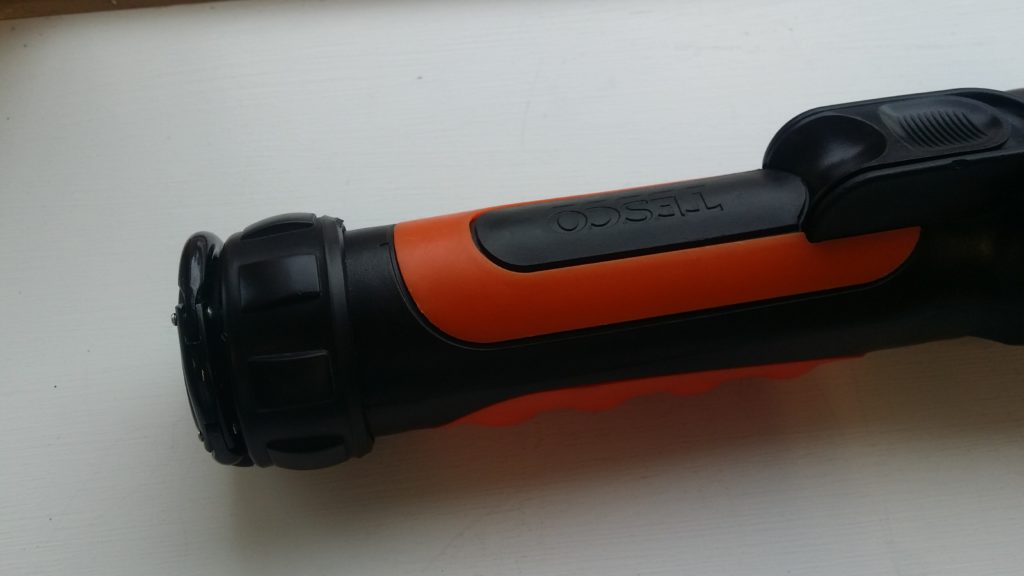
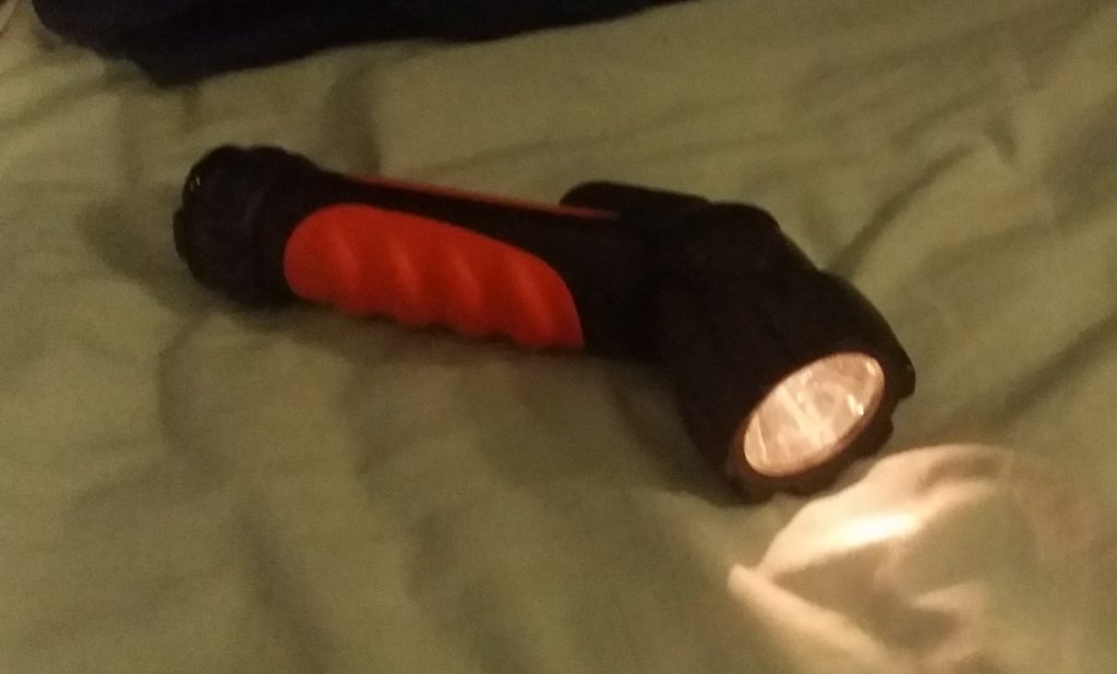
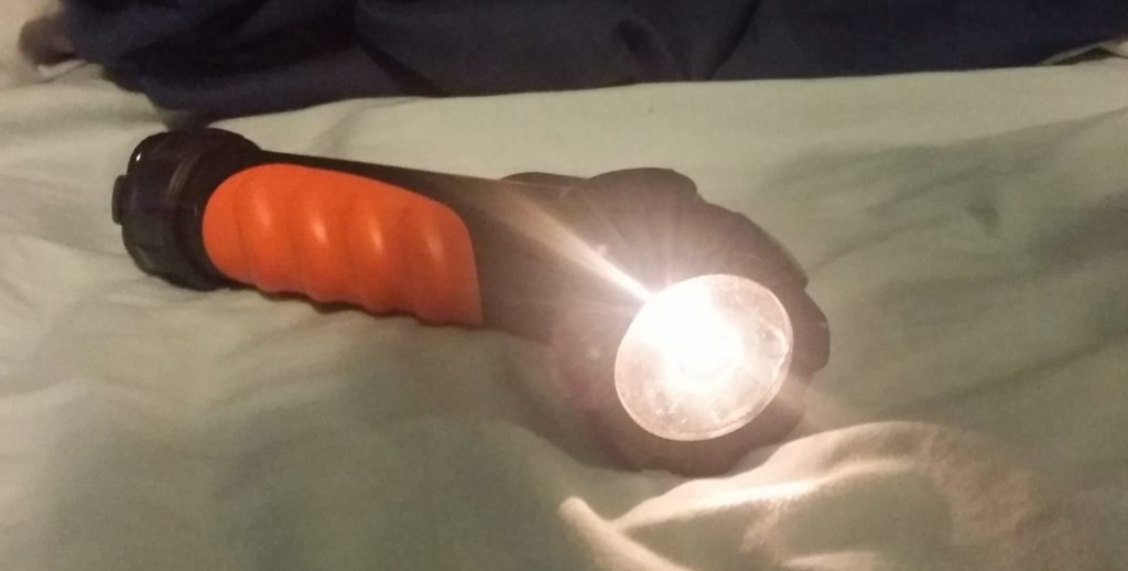
I choose this Tesco torch with a rotating head that can be tilted 90 degrees. Given it’s rotating mechanism, features following or arrayed around the cylindrical body, and detailed components, I felt it was a good challenge for my skill sets at the time. If I had wanted to I could have omitted detail such as the orange detailing, the clip, or the bulb assembly and still met the requirements of the brief but insisted on including these details for the sake of it.

The thematic is, in essence, a full visual display portfolio for our chosen product where we act as though the product is of our own design and we must now visualise and communicate it to a client, manufacturer and customer.

This folio is comprised of three components:

  1. A fully annotated technical package including parts sheets.
  2. Rendered CAD assemblies and exploded views.
  3. Promotional posters and leaflet.
torch CAD model
A render of the assembled torch.
torch CAD model exploded parts
An exploded view of the torch
specification sheet for model parts
Fully dimension-ed part sheet
promotional leaflet
The leaflet showing faux-company details
promotional posters
One of the posters produced.

The fictionalised ‘Nitor’ was presented as a utility device for both home use and the outdoors (in reality the torch was far too fragile to do either). The graphic presentation was based around plays on the idea of folding and direction changes.

This was a chance for me to play with some new graphic techniques including layered transparency and a form of flat design used for the icons. The text affect attempted to evoke the imagery of an eclipse.

Zeiss Zugriff

The Zugriff (German word for bridge) is a conceptual product imagining if the opto-electronics Goliath Carl Zeiss AG moved into the field of portable audio.

a collage of ziess products
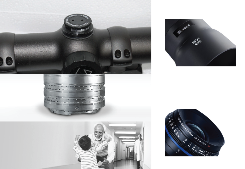
A moodboard of various Zeiss products / promotional imagery.

Carl Zeiss AG has been a sector leader for over 100 years, manufacturing lenses, optical products and specialising in the manufacture of micro-electronics (by way of their optics). A large and sterile brand, their ‘image’ is quite hard to place, certainly they wish to put forward an image of loyalty, stability and enabling but how much of that actually shines through their work?

early hinge development sketches
Zeiss leads absolutely in the sectors in which they operate, they set the standards and often have a unique presence despite attempts at copying. It was important that this speaker embody that distinction.

I decided that in the highly unlikely case that Zeiss broke form their optics-only model, such a speaker would want to embody the values of versatility, perhaps linking to their large sports-optics range. It should embody a ‘quirky’ high technology functionality and should embody the stability, balance and engineering associated with other Zeiss products.

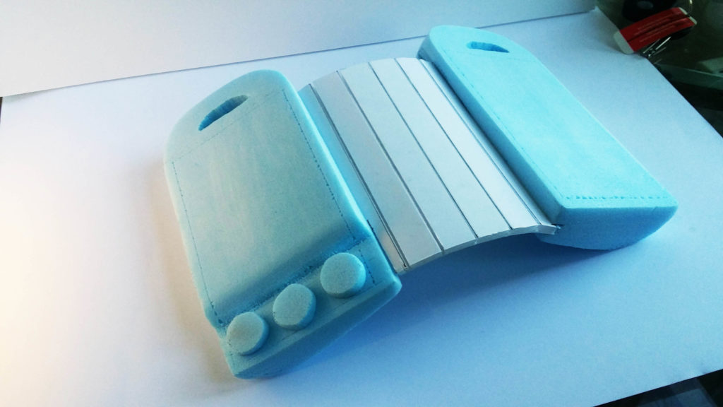
blue foam scale model
The final block model put across the physical feel of the device despite not having a ‘proper’ hinge.

The final designed carried through a mirrored 360 hinge mechanism to allow differing modes of sound output (direction vs ambient). The unit is highly durable, made of an experimental fibre mesh aluminium and designed to compliment Zeiss’s sports optics range.

features of the product annotated
An annotated render from my presentation showing key points of functionality.
conceptual renders of the model showing different use cases
A final render series showing the device in a range of intended locations.

In reflection I found this project very challenging, after all Zeiss isn’t what I’d call a flexible brand. I enjoyed the chance to broaden my scope on branding and to consider the semiotic meanings and associations embodied by brands beyond simple aesthetic surface-level messaging.