Tailored Nutrition | Boots, Bow & Arrow

Tailored Nutrition is a piece of service and systems design for Boots, made as a speculative project on behalf of the white space design agency Bow&Arrow.

Tailored Nutrition is designed to promote Boots brand products, namely their nutritional wellbeing items, and build brand integrity by giving customers insight into, and control over their base nutritional levels.

It does this through a new type of home blood testing kit which is integrated with a digital system and integrating with existing Boots consultancy and advice services.

Content Warning

This post discusses details of blood sampling and other medical details.

A note about COVID-19

This project started in early March 2020, there was public knowledge of the coronavirus but the extent was not yet known. The Project was extended twice and eventually concluded on the 9th of June, almost two months after the original deadline.

The project continued as much as was possible but obviously, it was started and finished in widely different contexts. This article is written from that perspective, talking about the future in the same terms as March, despite the fact that the entire premise would be changed were it to happen now.

Video Presentation

Watch the video bellow as presented to Bow&Arrow or continue on to read the text version.

Native Mobile App Codebase & Demo

Boots & Wellbeing Futures

A concluding page from the Health & Wellness Futures Report 2019 https://www.thefuturelaboratory.com/reports/health-and-wellness-futures-2019

As part of the final unit of my university course, the brief given by Bow&Arrow was an open one, asking us to consider the future of the wellness industry and to design a product which would give Boots an edge in five years time as they move further into this industry.

Extensive primary and secondary research was carried out across a target demographic which I was assigned, the “Course Correctors”; busy individuals between 25 and 35 who’s lives are consumed by either work or social obligations or both, and who’s schedules are sporadic.

This demographic, as it turns out, are particularly good at seeing though vacuous marketing schemes, and generally sited a lack of time and money to invest in new “stuff”, of which the wellness industry appears full of.

This is a difficult perception to work around because it is entirely correct.

Wellbeing

The wellness industry churns out repacked products with higher price tags at an alarming rate, it makes bold statements and often fails to deliver, it relies on the fact that “wellness” has no set definition to let the consumer fill in any perceived holes in the premise of products they encounter.

Even when a ‘wellness’ product is coming form a place of genuine desire to do good, it can fall into a category we dubbed “faster better stronger”. The offer of self-improvement offered becomes yet another standard to hold oneself to, another unobtainable image to aspire to and feel inferior to.

Products which seek to offer empowerment end up having the opposite effect, enforcing standards and exploiting vulnerabilities. We all remember the infamous “Are you Beech Body Ready” campaign.

Boots

My research also came up with some critiques of Boots, which seemed to be looking for a brand pivot for fear of shrinking market share, an believed wellbeing was the ticket.

Yet when we examine Boots competitors we find the opposite is true, said competitors are thriving for the exact reasons that are supposed to be Boots’s founding principles, for instance accessible healthcare and beauty.

The largest competitor is Superdrug which saw massive market share increase by pivoting more into healthcare, from a 60 / 40 split between healthcare and beauty to 70 / 30.

Public perception research showed that Boots does maintain its image as the quint-essential highstreet pharmacy, but that it is view as trying unsuccessful to be an ‘everything store’, one comment succinctly summarised this; “its like a supermarket, only I cant get coffee”. In store, this is obvious as you must battle your way through the beauty stands to get to the one thing you came in for, uninterested in browsing because why would you? In the flagship store you see the dedicated Wellbeing section, one third of which is taken up by a desk, another third by the same items you could find elsewhere in the pharmacy, and the last third by an Innocent Smoothies cart stall.

Futures

The wellness industry is expected to shift to a more 21st century mindset that, in short, refocuses product and service offerings away from simple pre-packaged solutions and embraces the complexity of real people, their experiences, their non-linear journeys and desires.

This poses a whole new set of challenges on an industry that is too often quite happy to slap gold embroidery on smelly soap and call it aromatherapy at 300% typical price.

Service providers must, if they are to survive, pivot to providing flexible, ongoing, bespoke yet accessible solutions to real problems, rather than arbitrarily plucked challenge vectors for someone else’s idea of aspiration.

Nutrition & Britons

During interviews with Wellness Ambassadors at Boots Covent Garden, it was discussed that over 50% or people in the UK do not get the recommended nutritional intake, largely due to our diets.

This involves not just what the diets consist of (i.e. which foods) but the conditions of the ingredients and food production methods. This nutritional deficit is in stark contrast to even our European neighbours and is a complex yet fascinating topic.

This Wellness Ambassador was specifically there that day to promote a new line of nutritional supplement products, stating that, those who already take supplements are doing so out of habit, and those who are not are unlikely to take up this habit. This campaign was aimed at normalising the casual use of supplements alongside healthy diets.

Further research corroborated these claims and added that one of the biggest barriers to uptake of supplements (where necessary) is that most people believe themselves to be healthy. Why pickup a habit taking supplements just because the average intake is sub-optimal?

Wellness Baselines

Another premise occurred; what is the point of enumerate products to improve our health, make us happier, give us more energy etc. if we are starting from a point of nutritional deficiency? How can people feel empowered to improve on their wellbeing if a baseline of wellness doe snot already exist?

It was from this starting point that Tailored Nutrition was born, the idea of finding ways to give people insight into their base nutritional levels, as well as ways to action changes they wish to affect. This would involve several service hooks giving customers option over their level of engagement and creating multiple monetisation vectors for Boots.

Councillors often talk about the concept of baselines with regards to mental health, the basic premise being that life’s ups and downs are best navigated with an emotional ‘status quo’ to return to. If we, as individuals, know that we can and will return to this baseline, we can deal with situations by effectively having confidence that “this will pass”.

Tailored Nutrition Overview

Tailored nutrition was designed to have several customer hooks but three core user journeys. The user journeys envision different levels of this engagement and seek to ‘capture’ casual yet loyal customers while generating new ones.

  • Customers motivated by a deficiency or suspected deficiency they wish to address.
  • Customers already engaging in supplement-taking or some dietary action related to health they wish to audit.
  • Customers interested in a casual audit or ongoing programme of food / intake tracking, who would benefit from insight into this diet.

Tailored Nutrition was a system with three main deliverable touch points, these were:

  • Home Blood Test Kit: A lancet device to for the core of a new testing kit, aimed at solving critical turn-off-issues and accessibility issues with standard kits.
  • A React Native App: A delivery system for test results and platform to perform non-invasive diet queries. This is the main implantation of the user actions; means to explore methods to action deficiencies.
  • The Boots Nutritional Model: A data model which would power the exploratory aspects of the app in addition to in-person guidance within consultation services.

Lancing Device

Standard home blood testing kits centre around small devices called Lancets, which are used to pierce the skin. The user then allows the target area to bleed openly into a small vial which is posted to the processing centre.

This is a clumsy procedure but also a psychologically taxing one. The vial is usually small and perched on a flimsy tray, often blood is wasted and a second, third, or even fourth puncture is needed. Lancets are often pressure activated, requiring the user to push in until they ‘click’ and the needle extends.

This is like deliberately stretching an elastic band to snap it, the pain is relatively minor, but the anticipation is agonising.

From personal experience, the last time I used on I threw up, another person I talked to said they fainted.
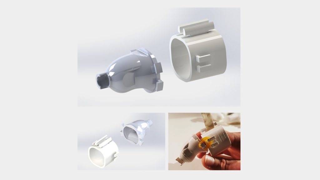
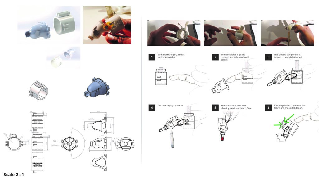
This new device, attaches itself to the users finger and holds the vial internally. The device applies pressure, removing the requirement for pressure-activated lancets only (for example a reusable one could be used). Using the lancet through the device adds a psychological separation of actions which eases the anticipation.

The forward component is a stiff medical-grade silicon meaning that it will retain its shape with minimal blood spillage. The user can then immediately drop their arm and allow the vial to fill.

In addition to this device, the kit would include moisturising wipes laced with a mild sedative to follow the alcohol based wipes. This would ensure the contact area is not dry and ease the pain of puncture even more.

Native App

The app serves the purpose of delivering data from the blood tests but also for auditing diets and symptoms of users who haven’t used the kits to estimate their levels.

The app then offers suggestions in the form of Boots products, recipes, and diet alterations as suggested actions for desired effects.

snack.expo.io/@oddert/tailored-nutrition/

Traffic light system

Instead of simply throwing data at the user, the app employs a jokingly named traffic light system, given that its intended effect is the opposite of the common UI pattern where users are presented with ‘good, medium, bad’ scales and coerced to take action.

The app splits data into “Insights”, “Changes”, and “Actionable” categories. Insights are auto generated suggestions or noteworthy information created based on data provided by the user. Changes are created when a trend alteration from the user is noted, for example a drastic change in a particular level that is neither good or bad. Lastly Actionable is the one area where users are given dietary interventions to tackle levels which are out of recommended bounds. It should be noted that any serious threat to the user’s health would trigger an alert outside of this system, with the potential to subscribe a customer’s healthcare provider.
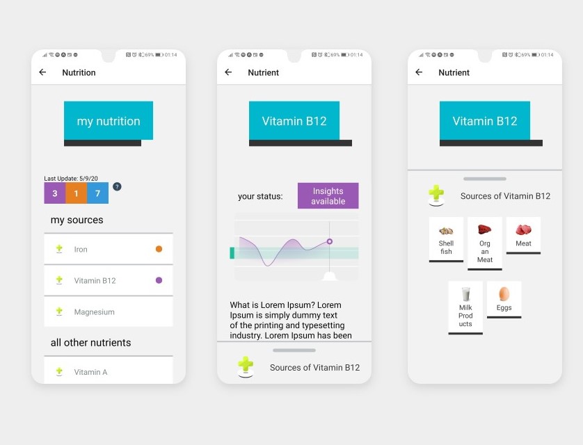
Visual Design

The aesthetic style was inspired by and extended from the Boot’s recent brand overhaul, some of their physical promotional material, and a set of aesthetic developments shown here on their temporary landing page during the beginning of the COVID 19 pandemic.

The site reverted these changes sometime in mid May but has been slowly introducing elements to the main site design.

This style is characterised by large block elements, overlapping block highlights, “shadow” elements adding variable emphasis, and a simpler colour scheme.

This was combines with the ‘standard’ Boots design characteristics such as lower case text, calming colours and soft blues at the forefront, high contrast, large touch areas.

Boots Nutritional Model

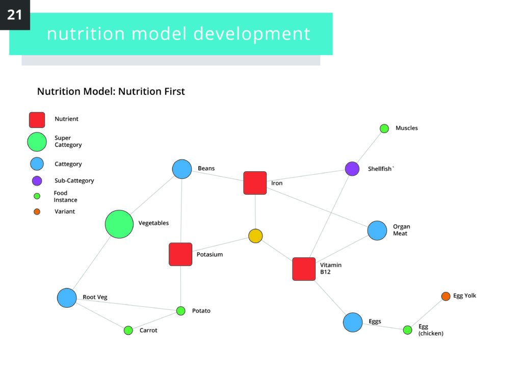
To inform the way data relating to nutrition sources is presented to the customer, I found it necessary to define a model to split items into hierarchical taxonomies.

  • Nutrient: A vitamin or mineral
  • Super Category: Encompassing groups such as “Vegetables” or “Fish”
  • Category: More specific typology of food such as “whole grains” or “root vegetables”
  • Sub-category: Used to give categories more flexibility, for instance distinguishing between “dark leafy veg” and “leafy veg”
  • Food Instance: A raw item or foodstuff
  • Variant: Used to give instances more flexibility, for example “chicken egg” vs “egg”
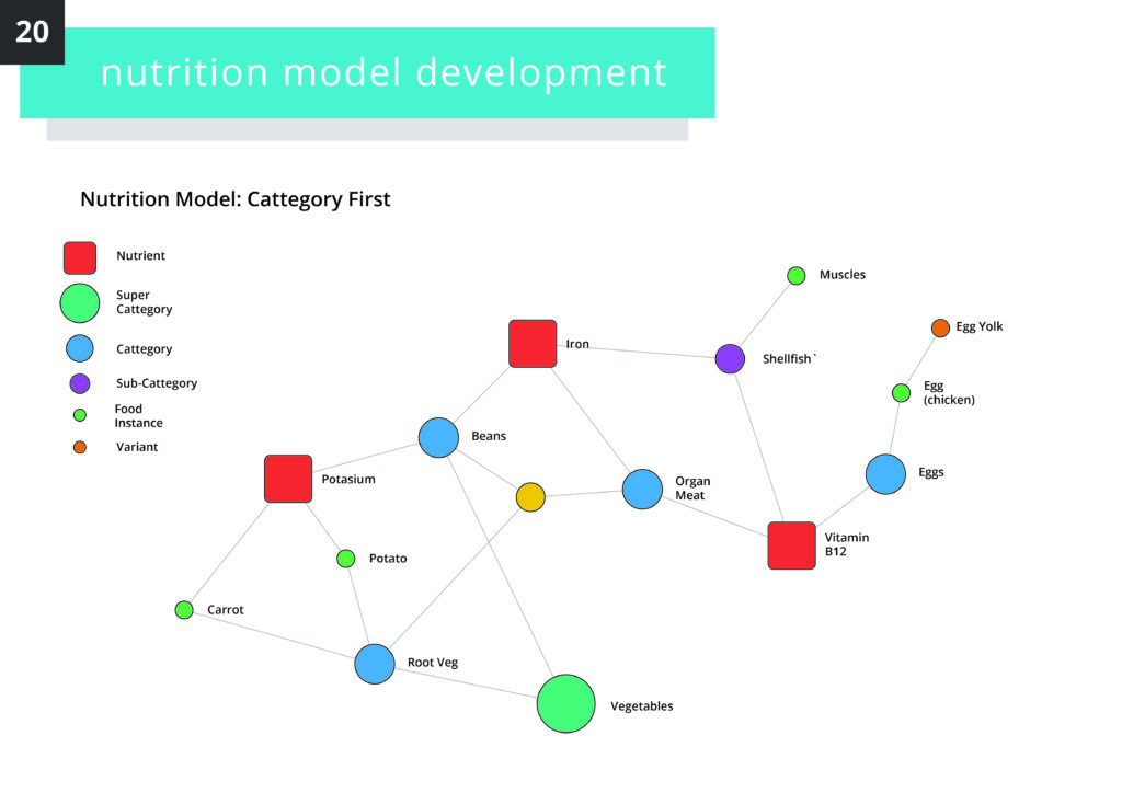
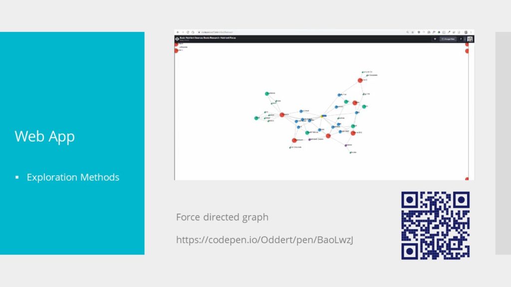
This model can be used to create data visualisations of how items relate to user-defined goals such as these.

Lastly, as time moves on, this database of recipes, collected trend data from users and nutrient sources would build, allowing Boots to identify areas of focus, trend data (if some deficiencies are seasonal) and so on.

In the immediate timescale, this could inform product promotional forecasting and increase response times for customer consultations in Boots other services.

Longer term this could be used to acquire new food sources to stock in appropriate branches. The reason for this is that often, with particular food items sought for nutritional benefit, the actual value depends on the source, for example the solid it was grown in, waters fished from, storage conditions.

Conclusions

This may seem like a departure for boots, to suggest that deli items and raw ingredients take a place next to other items in store. However I would submit that Boots ranges are already radically diversified beyond what a pharmacy is at its core.

More than the fact tat Boots already does sell food including raw (non processed) items, I submit that some people already treat this tailored sourcing of their diets in the same way that exotic lotions and other items are marketed for their unique capabilities. The disctinction is that for most of us, this level of insight and tailoring is too time consuming, the sourcing too expensive.

Tailored nutrition aims to democratise that work and offer options to establish baselines of wellbeing on which we can build.

Bloqs | The Design Against Crime Research Center

Bloqs is a Social Game designed to facilitate and rekindle relationships between incarcerated fathers and their children on the outside.

Bloqs was the outcome of a six month project by a small team of four, including myself, operating within the Design Against Crime Research Centre, at Central Saint Martins, University of the Arts London.

The team included Alexis Bardini, Alexandra Evans, Xiangie Li, and myself.

During this time, we conducted extensive research and iterated over a range of potential design directions. We attended a conference run by South Denmark University’s Social Games Against Crime team who were responsible for Captivated, the social game Bloqs is base on. We ran numerous workshops and interviews within Prisons, with social care groups and with individuals.

www.bloqs-game.com

designagainstcrime.com

Bloqs Game

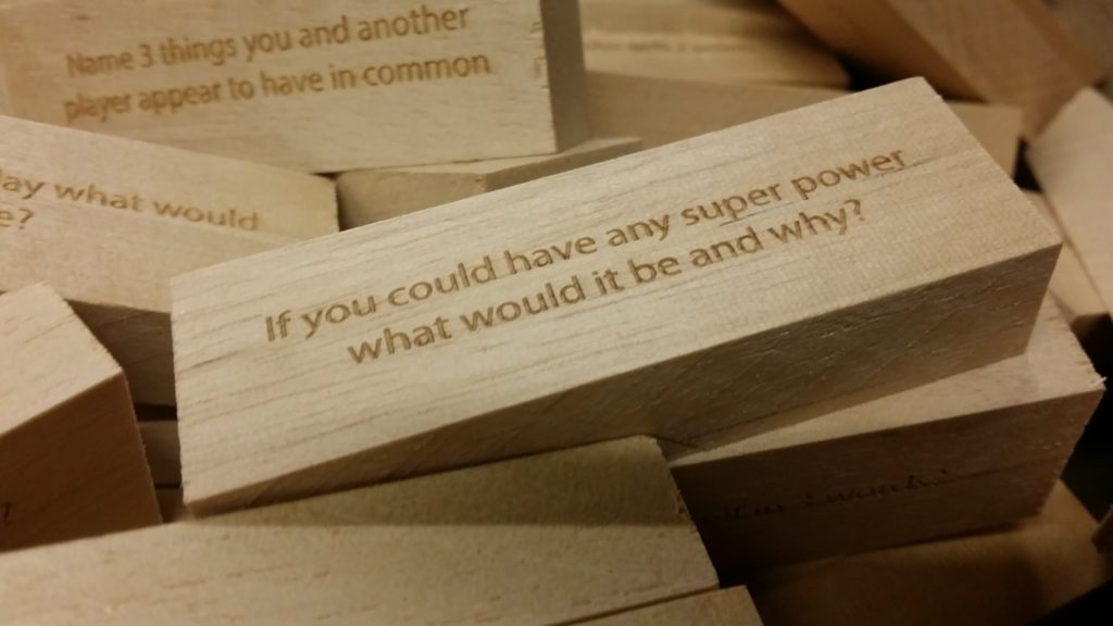
Bloqs is a Jenga-like tower stacking game where each piece, called a ‘Bloq’ has two questions or prompts written on each main face and a colour which indicates the ‘level’ the prompt corresponds to.

The players successively take a Bloq from the stack, choose a prompt which will ask them to perform an action or answer a question, sometimes involving other players. If the response is deemed acceptable by the others, the player must place the Bloq back on top and receive their corresponding money.

‘Levels’ refers to the Social Penetration theory, or onion theory, a theory of interpersonal communication and relationship that seeks to describe how relationships move from weak and relatively shallow, to deeper and more intimate connections. The colours correlate to where on the SPT the prompt aims to stimulate interaction:

  • (Red) Likes and Dislikes
  • (Orange) Goals and Aspirations
  • (Green) Religious and Spiritual Convictions
  • (Blue) Deep Fears and Fantasies
  • (Purple) The Concept of the Self

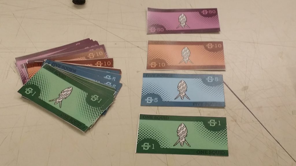
The game involves a currency called ‘Squids’, based off the British slang for pound sterling, or ‘Quids’. On successful response to a prompt the player is rewarded with Squids, higher levels rewarding more.

This works to play off the inherent tension between two people who are not close by balancing that tension off of game play.

The player is incentivised to move down the ‘layers of the onion’ (take progressively higher level Bloqs) by the financial incentive which plays off against the inherent resistance to answering more difficult / vulnerable questions / prompts.

This balancing which the players will engage in is completely neutral, that is to say, a genuine trade off is made between comfort and desire to win. No coercion or forced progression though the levels is employed.

In addition, the game play format revolving around a progressively more unstable tower creates a physical tension and focuses the players attention. Even if their attention wonders during the game, the moments of interacting with the tower magnetically draw players to a single focus point. After which, the tension is eased and the players balloon back out again.

This was one of the biggest yet subtle challenges our team faced when deciding on the format of the game, as we realised through previous iterations, the risk of forced progression and vulnerability.

The game ends when the tower falls, with the last person to interact loosing 50% of their currency. The winners or looser are then determined by how much money they have, although the game is not about who wins.

The game is built on the archetype most commonly recognised as Jenga in order to utilise preexisting associations with the game and avoid having to make players familiarise themselves with an entirely new game format.

Context

It is not a particularly radical notion that Prison as a system is ineffective as a means to rehabilitate.

This is especially true in systems such as the UK justice system which relies heavily on punitive action, both during and after sentence, and has a rapidly increasing population.

When opportunities are missing and rehabilitation is not an option, incarceration can feed into a vicious cycle of crime, anti-social behaviour and derivation.

A component of this is the role of relationships between incarcerated fathers and their children. Children and adolescents with stronger connections to their parents are far less likely to suffer health issues, do well in school and avoid crime cycles than those who’s relationship breaks down.

In their younger years, kids will be brought to visit with relatives, as adults they understand the importance of visiting themselves. Its in their teen years that people begin to drift apart and people stop visiting.

Bloqs was designed in response to this issue: How can we, assuming no radical change in incarceration trends, help incarcerated fathers reconnect and maintain connections with their children on the outside.

Captivated

The Bloqs project began with the notion of creating a cultural translation for the game Captivated, by the Social Games Against Crime team at South Denmark University.

Captivated is a board game layout out similar to Monopoly which represents a fictional Danish prison. Players progress through the prison, encountering characters who belong to groups or factions. The players learn about the characters and their experiences while also collecting Story, Action and Be Honest cards.

Story cards tell stories about the fictional prison, including interactions between the characters, intended to demystify prison for the child. Action cards ask the player to perform a physical challenge, intended to increase intimacy and bonding through touch. Be Honest cards foster interpersonal communication through the telling of personal stories.
The winner is the first to build up enough currency to buy the prison master.

Prison System Context Differences

Not only is Denmark’s population size far smaller than the UK’s, but their prison population is only 4,000, compared to the UK’s 96,000 at time of research.

Danish prisons are much more standardised than the UK, one prison more or less looks like the next. In addition, the level of amenities is far higher, with a strong bent towards rehabilitation.

When visiting, the visitor and inmate have a private room for periods of a time (typically 1 hour we were told) during which they have a table and other items in complete privacy.

Contrast this to UK meetings which are typically held in one large room on an array of small clusters of table and chairs. Guards line the area and patrol, with a control tower located somewhere. Inmates are only allowed brief moments of physical contact at the beginning and and of the meeting and could have the meeting cut short and be subjected to strip search if they violate this.

Inmates wear high vis vests and must remain seated in a specially designated chair. In one prison we visited tables were simply sawen-off logs with plastic chairs chained to them.

The one exception to this is open days, or family days in which dedicated space is cleared for games, bouncy castles, stalls and such. Families can spend up to eight hours along with inmates and many of the restrictions are removed.

The context of where the game was to be played was the most challenging aspect of the entire project, one which we were not able to resolve in the standard visits. We decided that Bloqs would be constrained to family days and could have applications in therapeutic settings outside of prison.

Blow’s questions were designed to probe areas our research found pertinent to the target users as opposed to Captivated which focused on using the prison itself as the common ground for bonding to occur.

During development, Bloqs was tested with different user groups including younger kids, university faculty, ex-convicts of women’s prison, retirees, and each of our families over the Christmas break.

Serious and Social Games

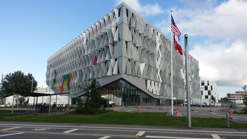
A picture taken of South Denmark University during our visit
a promotional shot of a board game similar in design to monopoly
Captivated, the social game by Social Games Against Crime

The term Social games comes from the definitions layout out by Thomas Markussen and Eva Knutz in Playful Participation in Social Games (2017) Download Playful Participation in Social Games here

In short, a serious game is one which is aimed at engaging the player in some form of intellectual engagement and uses the context of game play to facilitate this engagement, where enjoyment is not the motivation for play. An example of this could be a simulator for acting in a profession under a crisis situation like a medic making quick decisions in a war zone.

There also exist Health Games which aim to perform an auto-therapeutic function to a patient, helping them to process an event or ailment.

A social game goes further to extract the primary engagement away from the game and onto the relationship between players. Social games exist to use the game context to facilitate an interaction between players for the purpose of exploring or developing the relationship between them.

Presentation of Bloqs + Site

website landing page
www.bloqs-game.com
Bloqs on display at the 2019 degree show

Bloqs was presented during the Summer 2019 Central Saint Martins Degree Show under the Diploma in Professional Studies section.

In addition to the physical prototype, I designed and launched a promotional site for the project www.bloqs-game.com.

I included some new-at-the time features such as an interactive diagram built with D3.js to explore the SPT. Most of the graphics were taken from or inspired by the instruction set and packaging visual language.

Development

The project began with the intention that Captivated could be directly ported to a UK context so the first three months before Christmas were spent building games around it’s general layout and mechanics.

This involved workshops modelled around the type run by Markussen T and Knutz E, to see if we could build characters which roughly represented sections of the population without stereotyping.

A worksheet designed for a brainstorming workshop with inmates
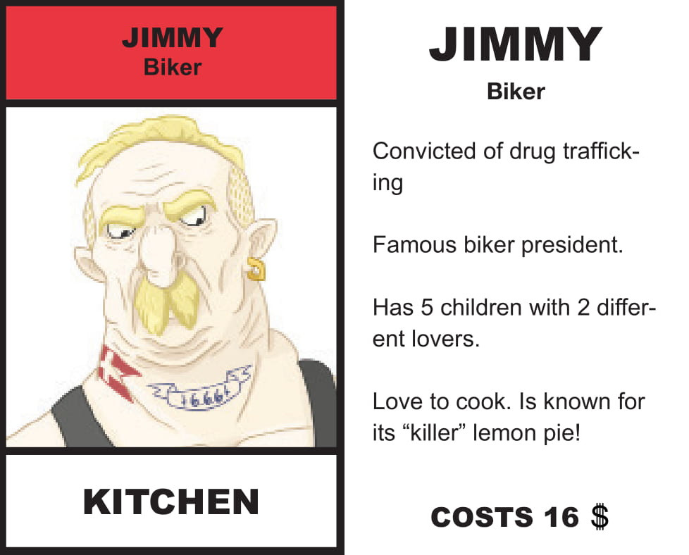
Both sides of an example card for one of the “Bikers”.

Doubt was present from the start as to whether this technique, which Captivated relied upon was useful from the start. The characters were deliberately cartoonish and exaggerated to add an element of humour. We trusted that the characters were appropriate to a Danish audience but could not distract ourselves from the more problematic elements of the game. For example the gang entitled “The Ghetto” which featured two Muslim men, one of which had 14 children and the other, named Kebab, who’s interests involved Marijuana and Kebabs.

These doubts were compounded when we struggled to get anything close to a taxonomy of inmate to model characters about.

It was already obvious that the UK differs vastly in local culture and idioms, that a joke common in one place may have different connotations in another, that there was a complex interplay of class and deprivation along strong location-based lines. As it turns out, this is reflected in the prison system where it was told to us that often gangs form around postcodes and social hierarchies are complex.

This meant that, even if we could create a set of inmate archetypes that were flexable and relatable as characters, we would struggle to make them relevant beyond one or two prisons. This was the primary reason that Bloqs moved away from the prison context entirely.

The first Bloqs iteration came from a need, while exploring alternate game modes, to rapidly test random prompts in batches, in an organic fashion. The game worked well enough that we showed it off as a side peace during a faculty end-of-year party and it ended up overshadowing the main game. A few more workshops later and it was clear that we had found the new format, the old game was discontinued after the Christmas break.

While running early workshops with both inmates and children, it became quickly clear that the Be Honest cards were the most interesting part of Captivated. The developed the adaptation based on this premise orienting the game play around encountering as many as possible.

Manufacture

During the period where we were still working with a direct adaptation, I came up with the new circular board, designed around advice from a prison commissioner we were in contact with who suggested that a dart-board radius would be most likely to work across multiple prisons. I designed little 3D-printed pieces, modelled off of objects associated with prison.

I also elected to come up with the aesthetic and design of the currency which we named ‘Squids’. The design started almost as a joke, using the image of a squid in place of a dollar or pound sign, however after minor alterations the theme was made subtle enough to add an amusing touch to the design. I endeavoured to make the aesthetic mature and have a realistic touch but still easily identifiable as mock game currency.

Choosing the colour scheme was a long and involved process for the team, we wanted something friendly and calming but not child-like or likely to be perceived as “soft”.

My colleagues took the task of manufacturing the Bloqs, first by laser-engraving the text in a single batch process, then by developing a technique to place multiple Bloqs together, so the outsides could be painted all at once. The last detail was to use a punching set to engrave numbers on the sides, corresponding to the level of the Bloq, so that new players would not need to keep consulting the instructions.

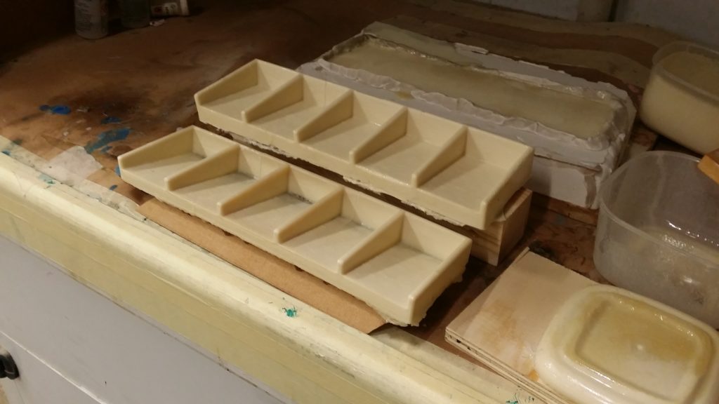
We worked to solve the issue introduced by the currency, that more loose items added opportunities for items to be lost, with little chance to replace them often. To do this, we settled on a currency tray and itirated over a basic design.

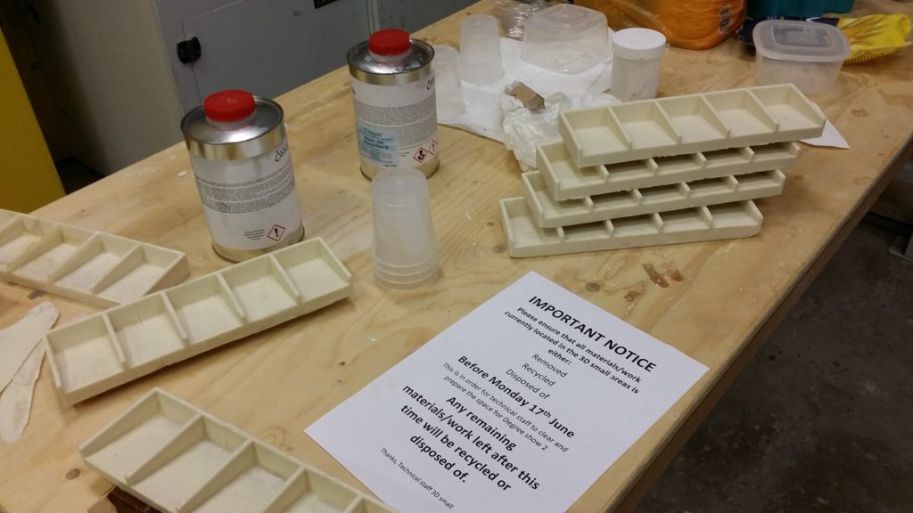
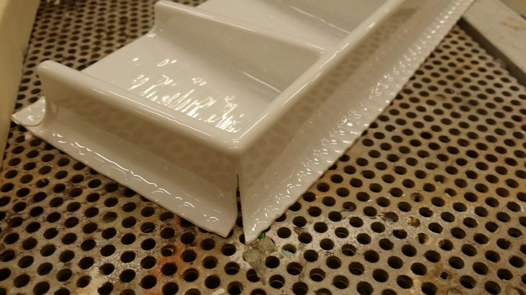
I took the design and refined it down to shave precious millimeters off the overall dimensions as space was at a premium. The final design was 3D printed in three parts and glued together. This was then used as the basis of a polyeurathane mould which we would sand down and spray paint.

I attempted to then use one of these to vacuum form an acrylic sheet but the result put too much stress on the edges and corners. The solution would have to involve inflating the shape to increase the radii of all corners which would be infeasible.

Reflections

In retrospect, the decision to drop the old format in favour of Bloqs was an obvious step, in fact, one could argue that it made sense to drop the old game much earlier, that it’s flaws were too obvious.

Yet, it took me a while to get used to it, I was stuck in a mindset of developing the old game and found the change to be abrubt and out-of-tune. Ofcourse in hindsight it was obvious that I was too close to the project, and that a widening of perspective was necessary.

This changed the way I looked at projects going forward, always mindful that metaphorically having my nose to the screen could damage my ability to guide the overall direction of the project. Breaks are good, guys!

Right now, more than ever before, fundamental flaws in our societies and institutions are becoming more obvious, more pronounced, more unavoidable.

You will have noticed that I make no bones about the fact that I was, and am, a staunch prison-abolitionist.

That’s another thing I took from DAC, their no-nonsense mincing of words and stances. We figure that other people, people in positions of influence, are plenty capable of making rationalisations and down playing things on their own. There is therefore no need for you and I to soften our statements. If anything, in making ourselves more bold, more direct, and more unavoidable, we simplify things for everyone.

This was one of the best projects I’ve had the privilege of working on. However, one thing that sticks with me to this day is a subtle yet nagging question which looms over any endeavour like this one.

“Are we just adding a plaster to a gash?”, “Are we providing a method to ignore the root cause of the problem, rather than solving it?”, “Are we facilitating each other in avoiding an uncomfortable reality?”.

Working in prison is surreal, the architecture looks almost like a school, only the fences are two high and the locks too thick. You see reminders constantly that you are surrounded by institutional violence. You forget, when working with the men, who are ostensibly the same as any random person you could encounter on the outside, that they will not get to go home, that most of them are probably still there as I write.

I was surprised one day to see a design from one of my year group come across my twitter feed, in the context of an article about the ‘Safer Cell Furniture’ project, which aimed to reduce the number of self inflicted injuries and suicides by creating safer furniture.

Thank about that for a second. Put aside the actual designs and the real need for more comfortable, more human furniture for a moment.

We have a problem; too many people are going into this system and not coming out, or are coming out traumatised. And our solution is to design furniture that makes it harder to kill yourself? Ok, so we do just this, the statistic “number of dead people” goes down, and… that’s that?

I was impressed by much of the work produced for that project while having the same reservations as described above. That being said I could not disagree with the derisive comments left bellow, much to the tune of the last paragraph.

One comment in particular, jumped out and has haunted me ever since, namely because it put into words something I had been trying to wrap my head round for a long time.

In my experience, the problem with design thinking is that is rewards thorough answers to exciting questions over useful answers to boring questions.

Twitter user @nthnashma 08:14 9/4/20

I soul-searched during this project and long after it ended because of this asking if we were simply creating a new, exiting way to not have to think about the real problem.

In the end, the conclusion I came to is that, our project existed in a very defined scope, we had a unique oportunity and insight to inject something into a pre-existing relation that otherwise would already exist. In other words, it was not possible for this project to ever “fix prison”.

This can become a deriliction of duty, a chance to turn face away from the bigger problem the mement we stop doing work at the boundaries edge. We must view projects like this as one small vector to attack the problem and then go further, ask what other ways we can affect change.

Our intervention is a clean up, and its good at being one, it should never be called a solution, or anything close.

For example, for many in DAC this meant confronting people in positions of authority, making them confront uncomfortable truths, never passing an opportunity to apply pressure.

The MoodBoard System | Matter of Stuff

Matter of Stuff are a bespoke design agency specialising in connecting client with their vast network of manufacturers and crafts people.

Matter of Stuff found themselves in a need to streamline the involved process of developing proposals for large-scale projects with clients. They needed something which offered flexibility in working methods and presentation structure that was collaborative and fast.

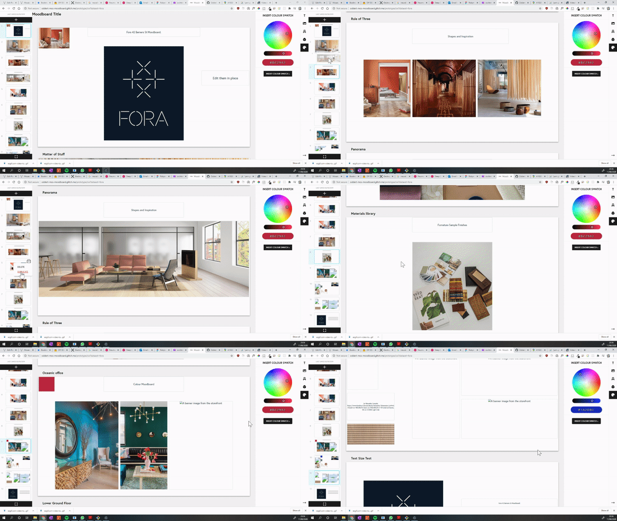
The result was the MoodBoard system, an integrated curation and display system which displays products, materials and media from the MoS website and catalogue and allows rapid prototyping and iteration of anything from a full project proposal to a simple colour scheme.

The app is built on principles of feed-forward data, with immutable patterns held to where possible and DOM changes staged into render cycles which, in turn, attempt to avoid re-rendering unchanged sections.

The only JS library used was jQuery given its presence on the site pages by default due to the CMS. A jQuery plugin library called Gridstack was used to create the grid snap functionality.

The final version, showing a dummy proposal for a hypothetical Fora branch

The Problem

When Matter of Stuff work on larger projects, they may find the core team tasked with designing the interior of an entire building, high end venues where every detail must be carefully sourced and made to fit with one another, manufactured bespoke.

One aspect of their working method involved creating documents which were, in essence, rolling design proposals. One page may have material swatches for a type of chair, the next a series of images describing a desired ambience, another will detail the layout of a room or floor, another lists technical specifications, another is colour combinations, etc.

These documents not only describe the overview vision of a project, but are ‘rolling’ in the sense that multiple stakeholders would make changes before sending the document to the next. The documents were pieces to have conversations over, more than just a display of specifications.

This was primarily done with Google slides which created a range of issues from content-secure policies, document permission control, images becoming out of date as the products changed on the main site to name a few.

The Solution

an image being adjusted in situation
A demonstration of the custom built crop tool

A number of potential interventions were discussed, eventually we agreed that I would build a Google-slides inspired system specifically tailored to their site’s eco system.

In addition to it’s functionality, the resulting site speaks to the bespoke, high-end image Matter of Stuff seeks to project. This is not just another colab tool, this is their colab tool.

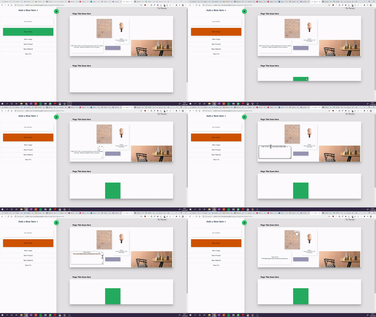
Each MoodBoard presents one or more pages, which appear like slides on a slideshow program, the style heavily influenced by Google Slides which the team relied on before. The content on the slides snaps to a grid, can be resized by clicking and dragging, and will ‘nudge’ smaller elements out of the way. This reduces the combustibility of a slide-show program to allow for rapid layouts without worrying about item size or alignments.

Gone are issues with resizing items to ensure they are the same as each other, spending time lining them up, getting frustrated when they inevitably still end up skewed. The curator is free’d from the tyranny of infinite choice, to focus on the actual content.

The MoodBoard can display just six types of content:

  • MoS Products
  • MoS Material Library Samples
  • Files on the CMS
  • Text Boxes
  • Images (internal or external)
  • Colour swatches

These were chosen based on what types of content were most often used in the old working process on Google Slides, with the addition of files which previously necessitated a hyperlink.

The text box input
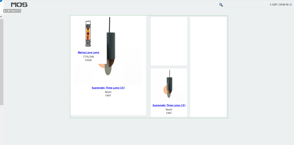
a successful product search showing wall lamps
Live updates allow the user to find content quickly without typing verbose queries

With content search (product, material) and image URL’s, live updating is used when the user is typing. To keep the strain on the server low, recent items to be shown first are cached on page load, only performing a database query once the user has stopped typing for a while.

For images, I built a custom crop tool which allowed the user to move and resize images relative to their container.

Double-clicking on an item would display its meta-data in place of the Add menu, allowing users to, for example, choose which image on a product is the cover, or interact quickly with a colour wheel.

A history system recorded the last 10 changes made by the user with standard shortcuts for ‘undo’, ‘redo’, ‘copy’, ‘cut’, and ‘paste’. For instance, if the user is on a mac, they can Cmd + Z to undo, with Ctrl + Z on windows.

The slide navigation icons each show an SVG representing the data on the page which updates on page-away, using a custom built function to dynamically create the thumbnails.

Previous Directions

Across the duration of this project, a number of different versions were created and iterated upon until we were satisfied with a modality that met all of MoS’s needs.

An early prototype designed as a proof-of-concept for Gridstack
The next iteration added pages as opposed to one continuous masonry layout.
Version four featured dymanically-sized board and was going to have a drag and drop interface. Drag and drop made it into the final version as an alternate way to add new items.
Version Five saw much of the same functionality that would reach the live version, but used a minimalist interface where clicking on an area would show this menu above the cursor. The sub-menus would appear in place and functioned the same as he side bar menu in the live version.

Mosaic

When I first started out in design, my only motivation was to contribute something, to ‘save the world’. For my final year project I forewent personal comfort to platform an issue that affects so many of my community on a deep personal level.

Mosaic Voice is a consumer-viable Electroglottograph (EGG) designed to help transgender people (specifically trans women) perform voice therapy training.

Comprising of two parts, a wearable EGG, and a supporting app, Mosaic was conceptualised as an extensible system, providing the basic software, while region and use-case specific needs could be met via a library of plug-ins.

This was based on first hand experience and extensive research which indicated that any solution would be region-specific and require outside experience for each subsequent location / context it was to be applied to.

Voice Therapy Training

Voice therapy training is a sensitive and highly personal process which poses significant practical difficulty and emotional strain for trans people with vocal dysphoria. Resources are scarce and sparse; embarrassment pervades around stigma about adults performing vocal training.

Democratised design can facilitate this process by creating assistive tools and means to alleviate the emotional difficulties incurred.

Voice therapy training (VTT) is a broad term for practices and training regimes designed to modify the voice to take on a different appearance. It can be utilised by singers and actors but also by people recovering from injury and trans people, in particular trans women such as myself, who’s voices are not affected by hormone replacement surgery.

Issues with Specialist Help

Specialist tutors & therapists exist to help with this process, offering guidance, techniques, coaching and so on, usually over a long period of time. I personally make use of the excellent service by Christella Antoni, who takes a holistic approach to sessions, integrating social aspects and involving the client in the process. It should be noted that I am not affiliated with Christella Voice, my opinions are my own and genuine.

This works well to tackle the individualised nature of voice and offer professional guidance, the issues arrise with the fact that so few people actually perform this service. People travel from across the country to attend sessions because there’s nowhere closer, the cost of travel tickets exceeding the sessions. And even then, one person can only see so many clients.

There’s also the issue that many trans people are, for lack of a better term, broke.

Trans people are massively discriminated against in work, promotions, housing and healthcare, among other things. This leads to a significant majority living bellow the poverty line. This works to make access to services like Christella’s difficult for some to manage, then additionally, you must consider the viscous cycle that one’s ability to “pass” is largely dependant on voice, which has a compounding effect on discrimination faced, which leads to more poverty, and so on.

This leads to many of us (if not most at some point), turning to the idea of doing it yourself…

Issues with DIY

Many people turn to resources on the internet such as YouTube videos, the few training apps which exist, and the occasional Reddit post which is cited by everyone you know and threatens to dispensary one day. Also you have to tolerate looking at Reddit.

The issue boils down to the fact that, with say a YouTube video, you are seeing a “patient’s” personal reflection on what they deem to be the most memorable aspects of a highly personal journey, as opposed to structured content.

Even when structured content is available, it is often nullified by the lack of tutoring context and practice structure. There is an issue of “hearing yourself”, that is, gauging correctly where you’re progress stands, what you should be working on still, and knowing when to celebrate achievement.

Three Target Issues

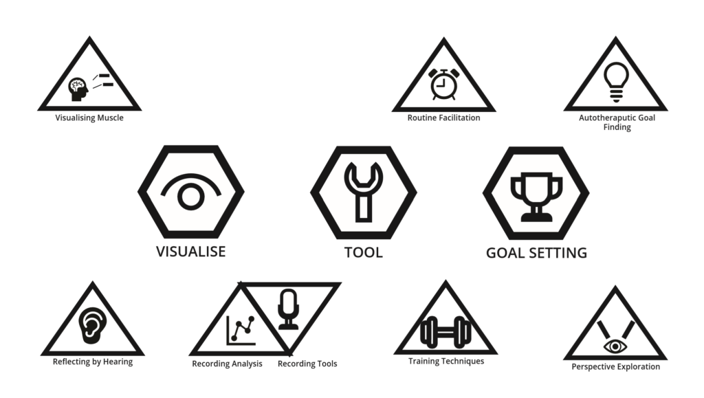
This lead me to define three topic areas to explore as the basis for my dissertation

  • Visualisation: concerning the issue of self-reflection, issues around hearing yourself and your progress
  • Tool: A set of techniques and resources, not to supplant specialist support, but to aid in self-practice
  • Goals: Looking at the auto-therapeutic aspect of VTT, aiming to address the physiological distress and discomfort as well as help people define obtainable targets.

Electroglottographs and Self-‘Visualisation’

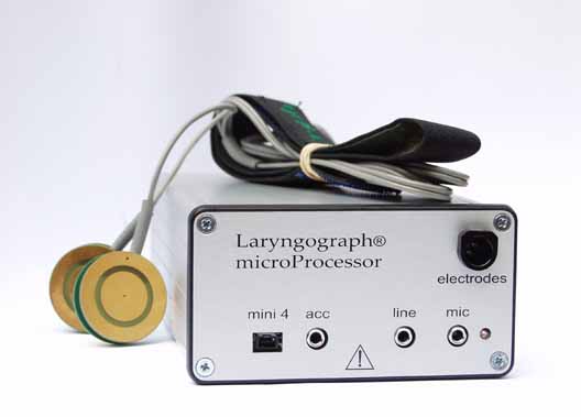
The ‘desktop’ version of the Larynograph which I have had experience with

One of the most useful physical tools employed by voice therapists is an Electroglottograph, a device which provides in-depth data on the behaviour of the larynx and audio aspects which comprise the voice.

These devices are difficult to come by, large, clunky and expensive, hence few people who are not specialists are likely to own one.

Their function is effectively quite simple, an electrostatic field is created across the contact probes which are pressed into the client’s neck. The various vibrations and noises interupt the field across various channels, which are then picked up by the device, and processed into usable data by the software.

Rethinking the EGG

A Precedent

Initially, I assumed that designing a new EGG was impossible, so I pushed the idea away. In early December (just as everything was winding down for the winter break), I came across two articles concerning the creating of DIY EGG devices.

I am research and engineering driven in my approach; I was not willing to create a project based on the assumption that a new type of EGG could be made without first seeing something to indicate it’s validity, and then packaging this in some way into a proof-of-viability / proof-of-concept.

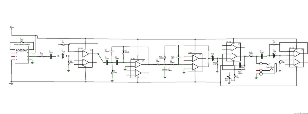
The first resource I came across was this project by Marek Materzok on Hackaday.io which documented their process of making and refining an EGG device from scratch. There was not enough information to replicate the process but it offered a beginning insight into some of the challenges such a device would face (namely noise filtering and the best way to create the oscillation).

This lead me to this tutorial on Instructables of all places, DIY EEG (and ECG) Circuit by user Cah6 which gave details and specifications for building an Electroglottograph from simple components. This was all I needed to tell me that it could be done.

I made inroads into building my own version but decided to allocate my time elsewhere given how late on in the project I was.

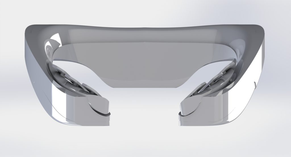
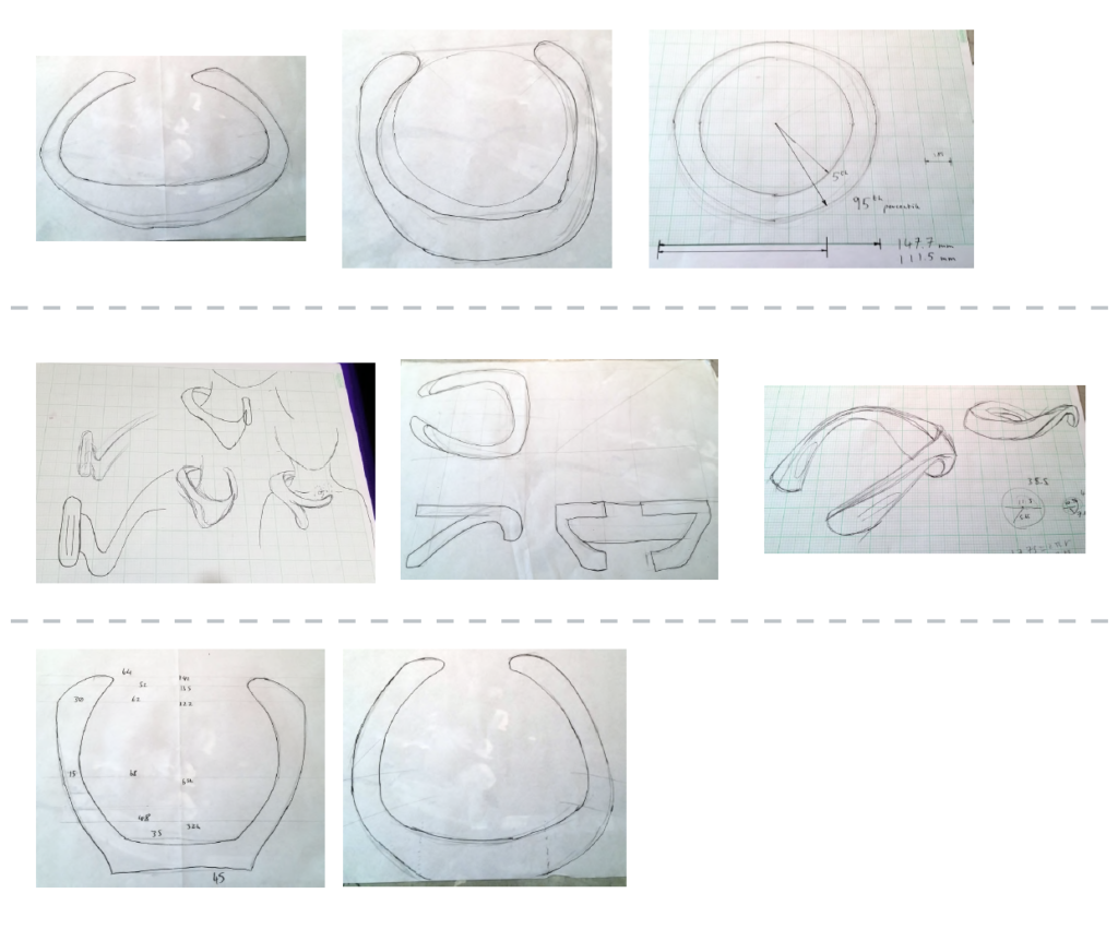
I decided on a wearable typology given the ergonomic difficulty encountered with the strap-on probes. The device would hook round the users neck, designed to cradle on the shoulders. The hinge components on each arm flex to adjust for neck sizes while retaining points of tension on the probes.

Most of the circuitry and interface buttons were placed on the back, with the batteries closer to the shoulder blades, this was to achieve weight balance on the arms but also ensure that any imbalance would only serve to pull the probes against the neck more, not slide off.

Development sketches for the wearable
a diagram of the wearable
The device stretching to fit a larger neck.

Chips on Both Sides

Using Cah6’s article as my template, I found an optimal size for the EEG control chip, which would be placed under another board which would handle interfacing with the ports and network. This second chip was designed around the Broadcom BCM 2835 controller used on the older Raspberry Pi’s given the low cost, versatility and proven record it provided.

Other smaller components such as the WiFi chip were also taken from the Pi series. Cost was a primary motivator with most of the deisgn descisions, given that this device had to be as low cost as possible.

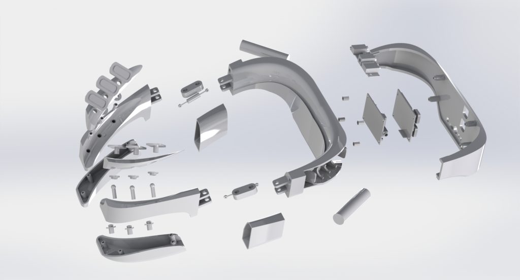
render of the CAD model
Two images showing the interface PCB on top of the EGG

The chassis is comprised of simple injection moulded nylon and designed to be easy to disassemble, repair, hack, etc. Screws are standard size and not hidden, components are all accessible, the batteries are lithium-ion AAA’s so can be swapped out at any time.

Motivation and Repetition

For the software end, I layout out a feature map for a mobile app including:

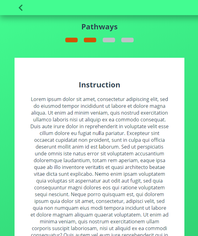
  • A modular daily training system: Inspired by the Enki app, this would show ‘Pathways’ which would utilise the following tools to guide users though speaking exercises.
  • A set of quick practice tools: These would show a simple animation or instruction and allow the user, in bursts of 30 seconds or so, to practice some aspect of breathing or warm-up.
  • A pitch sample recorder: An area to record and sample the voice over a piece of sample text to view pitch over time.
  • A resonance estimator (using neural networks): While the EGG is needed for accurate resonance sampling, this would provide a middle ground for people without financial access. Using a pre-trained convolutional network, an ‘estimation’ of resonance levels could be pooled. This would record the samples in the same area as the pitch sample recorder.
  • A continuous listening sampler: Somewhat experimental, this functionality would note samples throughout the day of the user’s voice as they perform their daily activities. This could be used by the user to see how they remember their training in various, uncontrolled environments.
  • A voice pattern matcher: Would depend on finding the right region-specific data set. Another convolutional network would match the user’s voice with one that sounded similar in most respects but could be adjusted for vocal features. This could then be used to practice against and set goals for the user to aim for.
  • A voice creator (neural networks): Would depend on finding the right region-specific data set, a recursive generator neural network would modify the input voice to be adjusted for vocal features such as softness, tone, pitch, resonance, etc. This would allow the user to, for example “gender swap” their voice to try it out.

I built the frame for a progressive web app to demo these features which I could implement now, and provide dummy data for items that would require live data.

Nuemorphism

At the time (late 2019), there was speculation rising about the concept of “Nuemorphism”, coined as a play on “skeuomorphism” by Devanta Ebison. I hadn’t made up my mind about the style but I saw potential for a textureful and soft, welcoming interface which would be great to try for the app.

The result was a pleasing warm aesthetic, I especially liked such items as the progress indicators which felt like little gems that you wanted to have, empty ‘slots’ for the unfilled sections.

I’d like to write extended thoughts about the topic at some time, but sufice to say, while I liked the unique aesthetic of this app, it only worked due to the colour contrasts and would have faltered slightly if I had followed the pattern where a ‘raised’ section is the same colour as the background.

This is one of the critical flaws with nuemorphism (and skeuomorphism to a lesser degree), it’s smooth transitions and drop-shadow facilitated layer / element separation are often incredibly low contrast. This is a problem on displays with lower contrast settings or fewer colour bands, items viewed at any sort of distance, and of course, accessibility.

The advantage of more Matrial-UI esque drop shadow element-separation is that you can still use other features such as subtle borders to add definition and get round this issue. Even skeuomorphism (which, for the record, I am not a fan of), relies on heavy gradients and colour mixing to get it’s textured effect.

Reflections

The project concluded successful, I got an A and the presentation was received well. Its one of my favourite pieces of work and I’m proud to have it as my final year project.

But I still have hang ups.

This was, for all intents The Big One™, the final year project, and more than that, it was something I so closely believed in. It wasn’t enough for it to be good or even great, it had to be a master-piece.

I was afraid my work couldn’t speak for itself

I kept diversifying the system while not building on what was there. It’s true that the solution should take the form of an integrated system but I remember over and over again not being sattisfied with what I had, constantly striving for something to truley step up to the next level.

In reality, I was having a crisis of design, I saw myself perched between two worlds, one of Product Design, and the other of Engineering / Code. I told myself over and over that there was no divide, that we all have ranges of skillsets but I couldn’t chake the feeling that I was a jack of all trades and a master of none.

So I kept adding ‘stuff’, imagining the basics of a complex system and then trying to work back from there (the egineering approach when you actually know what that system is). I spent a month on a little breathing excersiser device before stepping back to ask “what the * am I doing? What is this?”

When I shifted hard into the EGG route, I was doing so over the break, working tirelessly while others were relaxing, just to catch up.

I used my specialisation as justification for not re-evaluating

Perhaps what is worse is that the warning signs were there; clear indicators that I should clear my head, define one or two things that the product had to do, and just worked on those.

I let myself believe (not incorrectly) that I was uniquely positioned to pull off engineered solutions comepletly unlike anything my collegues could do, due to my specific code based skills. This is a mistake that would unfortunately not fully reveal itself until Tailored Nutrition.

In doing so, I chased these mutliple vauge threads instead of simply doubling down on the core that ended up being the final outcome. I ended up working twice as hard as some but still “only” producing what I could have under older circumstances.

I assumed that I could just grind to finish

Perhaps the most egregious mistake I made whilst all this was going on was the assumption alluded to, that I would miraculously pull off the feat at the last minuite. As I said, I did do that, but for an outcome which could have happened regardless.

I made a habbit of being in the studio from 10:00 until 23:00, calculating when would be the most ‘efficient’ time to drink caffinated drinks, pushing msyself beyond physical limits. I could have halved that time, used the remaining to rest, research, regain my humanity, but instead I saw time as a commodity to be collected and horded as much as possible.

We all have pressing deadlines from time-time. But if you begin to see time itself as an enemy, its overdue you stop and reevaluate.

Games of Life

A story of repeating patterns of behaviour.

The Game of Life by the mathematician John Horton Conway in 1970 is a zero-player game based on replicating cellular autonoma. this post details three different versions I made and the reason why for each.

The Game of Life presents an N sized grid where each cell has two possible states, alive or empty (dead). With each game tick, the cell can change state or remain as it is based on the number of cells around it. A cell with too many neighbours will die of overpopulation, a cell with too few will die without ‘civilisation’ to sustain it. Cells with the right amount of neighbours will come alive and so on.

V1 – React.js

V2 – React-Redux

V3 – Three.js

In this way, the Game of Life, a Turing Complete model in which each generation is a direct result of the previous state, is the perfect challenge for a state-building exercise.

My first version took a number of weeks, built in React, it helped me learn fundamental algorithm concepts and state-management techniques which would come in useful later.

I revisited this project again years later, reproducing it in a couple of hours, determined to make a cleaner, more robust rendition. At the time I was working with WebGL and three.js, so went back one more time to create a 3D game inspired by the 2D Game of Life.

I’m going to take a ‘poking fun’ approach to talking about these, I believe a little bit of mocking you’re old work is good for illustrating how much has changed since then, and appreciating the quirks of the learning process.

Remember kidos, in learning, there’s no such thing as “bad code”, just code that hasn’t seen growth yet.

Version One: October 2017

This original game, submitted as part of the freeCodeCamp challenge, came straight after the Recipe List and came with a steep learning curve for me.

I knew that I needed a table-like layout for rows and columns, I was familiar with using array’s and .map() but was yet to learn that you could make arrays of JSX and just… dump them in where you need them. I thought there was something magical about an inline array.map. 🤷‍♀️ This lead to some interesting patterns such as creating an N-sized row or column with and N-sized array in state.

a react state initialisation with an array full of 0's
I don’t miss old react state initialisation

<Table /> acted as the game renderer and controller, a pattern which would stick in future projects. It’s state held a ticker which would advance by one with each generation. It rendered a table by looking over the arr state item above twice (you were locked into square layouts) and rendered <Cell /> components.

the cell function to check other cells
Thankfully I was saved any ‘out of bounds’ errors (in which a cell on the edge tries to check a non exisiting cell) due to the function checking if the key exited in an alive state, and then checking a second time if the key existed in a dead state. In both cases the query for, say “col–1-row-21” would be undefined but no further value checking would take place.

Following the idea that “components should be self contained”, each <Cell /> had it’s own internal life state (nice)… and then on mount, writes this state to a ‘global’ object (i.e. outside the react tree) (not nice) with the following format string as a key: ‘”‘ + “col-” + this.props.colId + “-row-” + this.props.rowId + ‘”‘. 🤮 Don’t ask me why the quote marks are in double brackets because I cant remember.

Cells each had a method to look at adjacent cells in this global object and calculate their next state, which was hard coded because ofcourse.

The last anti pattern was that this function was called when the lifecycle method componentWillReceiveProps was called, i.e. when the ‘tick’ being passed down from the board went up.

Now this idea to tick a game forward in itself isn’t too bad, though it should have used componentShouldUpdate and checked that the new tick was changed. The issue here was that every cell, updating itself, was reading and writing from the same object. The cell does not know how much of the board is from the previous generation and how much form the last. Also, the fact that the globalObject existed outside the react app meant that it existed outside of the application lifecycle structure which could exacerbate this issue.

Remarkably though, it works most of the time.

Somehow, unless my machine is running slower than usuual, the cell updates sync in such a way that the game behaves as it should. the submission was accepted but this always bugged me, it haunted me, it’s remaking was inevitable.
Takeaways

A big thing I took away from this project that I hope could benifit others who may read this is that this potential cell de-sync issue was not enough to wreck the project. The code is duck-taped together in so many ways, its highly innefficient and jumbled but it works.

Often times I see people who achieve things and don’t allow themselves credit becuase they believe they somehow cheated or missed the point of the project. Its a part of imposter syndrome; they think that there is some sort of universally accepted correct structure that they were supposed to find but didn’t and are soon to be revealed as a fraud.

In my view this is how we get into innane discources such as “is HTML a programing language” or “this site design is invalid becuse you used a CSS framework”. In industry, clients generally don’t care whats gone on behind the scenes, they just care about the specification and the end result. To quote my favourite TV show, if you are asked to make somthing which behaves in a certain way then…

Coding isn’t the thing, its the thing that gets us to the thing.

The early prototype. https://codepen.io/Oddert/pen/OOLKzW?editors=0010
Final submitted version. https://codepen.io/Oddert/pen/POwgdP

Version Two: April 2019

It took longer than I thought for the urge to remake the game to finally take hold (other stuff took precedent).

This new game was built with create-react-app and included Redux. This time, the store had a two main keys board which contained data relating to the board display and control which controlled UI elements (in the end this was only used for the ‘paint’ mode, allowing users to write to the board).

The board was a two dimensional array with cell objects inside. Each cell object stored its x-y position and an ‘alive’ property. The reducer for this section only had two actions, one to manually change the state of a cell (for painting) and one which would loop over the whole board, calculate the new state for each cell, then write this new state to an entrely new board array, thus achieving feed-forward imutability.

The <Board /> class had two properties, one to generate rows by calling the next which would generate cells. <Cell /> classes still performed the check individually to see how they should render and would listen for mouse events to paint the board.

And that’s it, cells update when they need to, React takes care of that, the controller component dispatches to tick the game forward, and the files are simple and light apart from the enormous bundle size of create react app.

screenshot of version two
The quickly-finished version two with a clean edge less look.

There were still questions as to whether performing the board loop calculation within the reducer violated Redux’s pure function policy; that reducers should be pure functions and do little work. Despite this, the function would produce the same outcome every time and has no side affects so it is still pure in that sense.

Regardless, this was the remake that I had wanted to do since forever, and it only took a couple of hours, as opposed to approximately a week for the previous.

But I wasn’t finished.

Version Three: May 2019

Around this time I had been investigating WebGL and three.js for a potential project with Matter of Stuff, where I was an intern for my Diploma in Professional Studies (DPS).

See the Pen KYREdx by Robyn Veitch (@Oddert) on CodePen.

One of my little experiments involved creating a ‘voxel builder’, a simple grid space where you can place blocks in 3D.

I took the board state, extended it to a three dimensional array and wrote a function to map to the 3D grid space. I extracted the looping function and created a simple adaptation to run outside of React-Redux (which this project does not use). Lastly, I modified the rule set to return an alive cell if the number of neighbours was as follows: 5 <= num <= 9.

The result is this, a fully 3d rendition of the Game of Life. The rule set could use tweaking given that the cells tend to bubble outwards and oscillate around the edges. And of course you do not benefit from Redux’s immutable patterns.

Never the less I was pleased with the result which went on to influence a range of projects which took place thanks to Matter of Stuff.

Page Block System | Matter of Stuff

Following on from the MoodBoard system, as part of the Matter of Stuff site redesign, I implemented new pages using a fully customisation page editing system to give the team full control over their content.

When the Matter of Stuff core team set out to design their site, they wanted an outcome that reflected the bespoke, high-end, and established company which they had built over the past season.

They needed something which not only perfectly reflected the company they are now, and could be updated instantly to reflect changes dynamical, given the rate of expansion, events, new flagship pieces etc that they engage in.

In other words, they needed a site that would keep up with their pace, without having to wait for a developer to be available. Customisability and agency to control every aspect of the design was imperative, with one word at the centre of everything; control.

Working with the visual design created by Daniel Stout, a freelancer at Matter of Stuff at the time, I suggested using the Guttenberg Block system on their WordPress instance and fairly recently been adopted by WP as the default editor.

The result was a custom made series of 20 WordPress Blocks, created with the Block Lab library. These Blocks, which included a mixture of basic components (headings, paragraphs, page breaks etc) and custom layout sections.

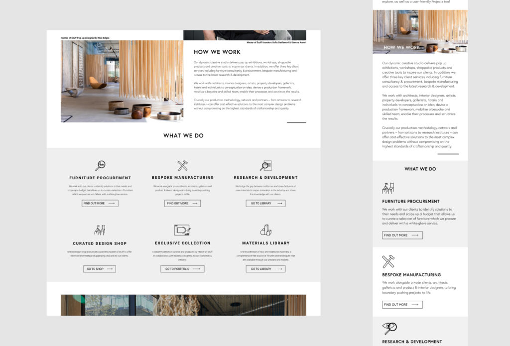
The ‘About’ page showing how it was split into blocks. Some blocks like the ‘Icon Call To Action’ are self contained and use the built-in columns system to create layout.

This system would be reusable enough that creating new pages or radically re-arraigning a page layout could be done in minutes, without needing to worry if everything conformed to the Matter of Stuff design style.

Every Block had as many options as possible for customisation of not just all of the content, but also all aspects of layout and display.

Most Blocks had the same basic features to ensure consistency in editing with Block-specific features added on top.

For instance, most blocks featured a wrapping element which defined the element’s position in the document flow. Then, there would be a container to provide the layout for the actual content (unless the contend is full-sized), CSS flexbox was prioritised over grid using patterns of cascading pairs. That is to say that, if four elements are in a row, this would be two flex boxes nested inside another flex box. This meant that mobile layouts were usually intuitive but also allowed MoS to swap the left-right top-bottom alignment of each “level” of content as show bellow.

several itirations of a block component demonstrating different states
Shown here is the ‘What We Do’ block which principally exists to place text next to an image in equal weight. Here you can see how changes made to an individual block in the editor can alter it’s layout.
Mobile view compassion for the ‘About’ page
Paragraph and Quote blocks used on the ‘Manifesto’ page.
The ‘Procurement’ page showing a custom image gallery where, in addition to the ususal layout changes, the team had options to change the ratio of one image to another.

With the Dual Image Block, the team could enter a ratio using a set of standard formats (e.g ‘2 : 1’, ‘3/5’, ‘2 |4’) where my code would sanitise the inputs and use them with flexbox to change the ratio of each image accordingly.

This carousel showed various gif images of each of the MoodBoard features and was designed in the style of the MoodBoard itself.

While exploring options the team did discuss the option of building the site with a page-builder like Elementor.

I advised them to take this option given that I was able to replicate all the core aspects of customisation they would be looking for without having to pay the annual fee for the editor.

In addition, page-builders are a great and accessible options for people who don’t mind a bit of compromise; there will always be design ideas which the framework does not support and, the majority of the time, there is a perceptible feel that the result is “off the shelf”.

For a company like Matter of Stuff, we agreed that, short of fundamental technological limitations, no compromise should be accepted.

Nothing should feel pre-packaged.