This Post is under construction, details coming soon!
Category: App Development
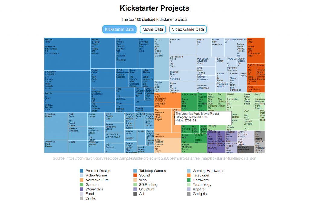
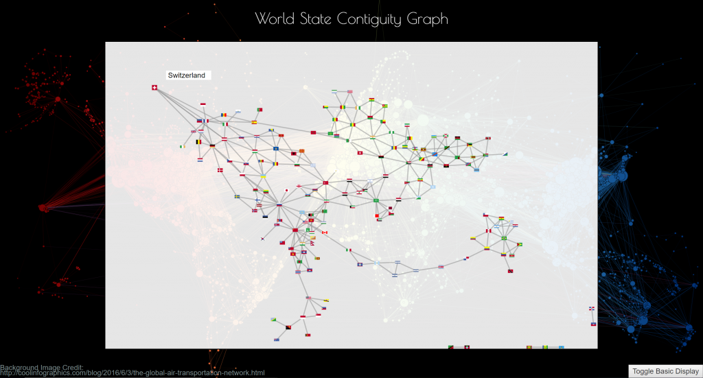
Data Visualisation with D3.js
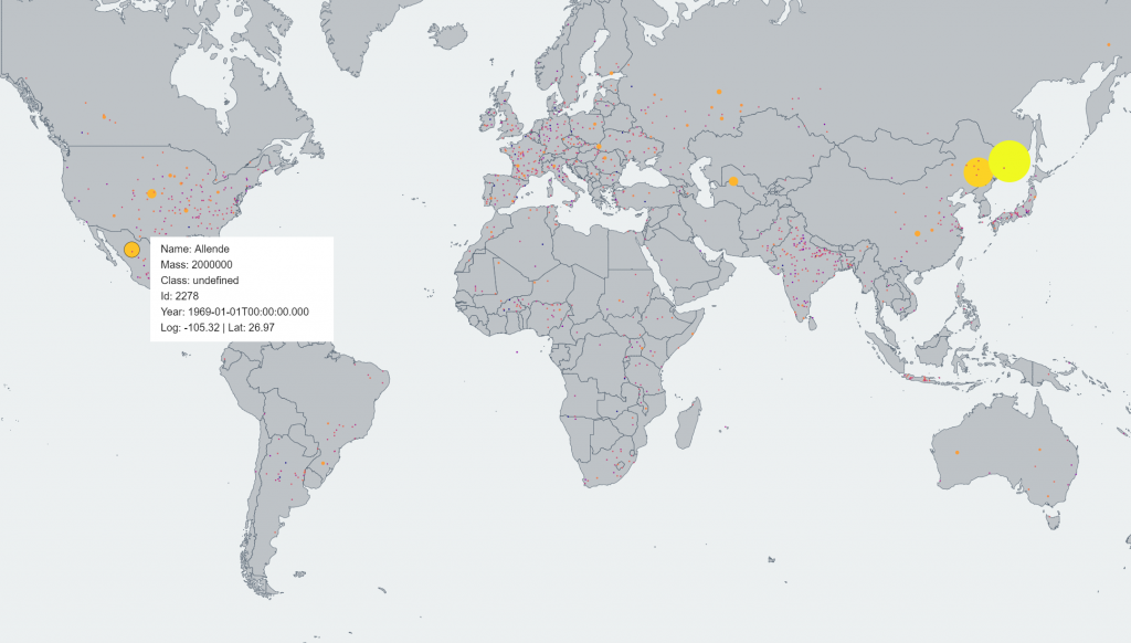
Meteor World Map
Represents meteor impact recordings across the globe, each hit represented as a point of varying size and colour, corresponding to its mass. Allows users to hover each point to view more information. Data is provided by a TOPOJSON API and is scalable in that the size variations are evened out by a logarithmic function.

USA Education Data Choropleth
A choropleth map of all counties in the US representing the portion of the population with a Bachelors degree or higher.
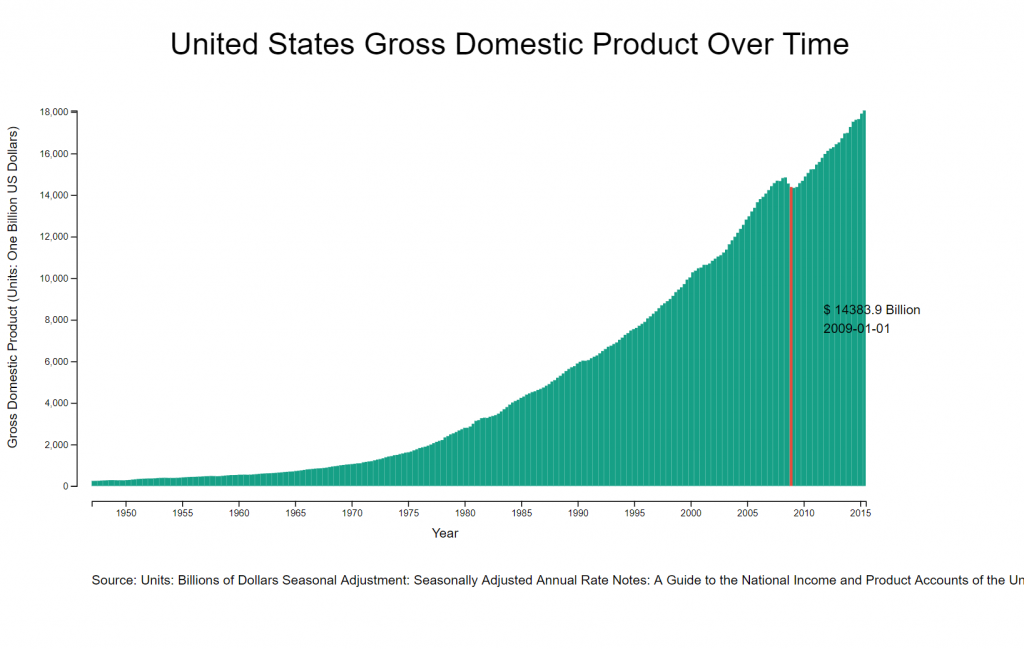
GDP Interactive Bar Chart
A simple bar chart with a hover tooltip created to map US gross domestic product from a JSON API.
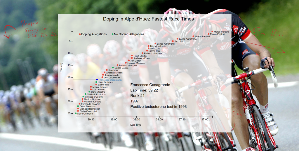
Scatter Plot Graph
An interactive, time-based scatter plot graph rendering static data for doping statistics for the Alpe d’Huez fastest race times, served from a static JSON file.
Microservice & API Projects
Microservices
Timestamp
Converts between UNIX timestamps and readable date formats (American standard).

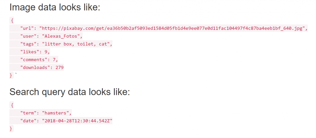
Image Search Abstractor
Queries an image database and returns the abstract data. Supports pagination and querying historical search data.
Request Header Parser
Returns basic data on the client’s user agent including IP, supported languages, and operating system.

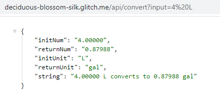
Imperial Metric Converter
Converts between imperial and metric units via the URL query parameters giving a JSON response.
API Based Applications
Exercise Logger
Lightweight service to log exercise sessions and query historical data. Supports interaction with a basic interface and a REST API.

Message Board
Allows for the creation of boards for specific topic, post threads on boards, and leave replies to posts.

Tailored Nutrition | Boots, Bow & Arrow
Tailored Nutrition is a piece of service and systems design for Boots, made as a speculative project on behalf of the white space design agency Bow&Arrow.
Tailored Nutrition is designed to promote Boots brand products, namely their nutritional wellbeing items, and build brand integrity by giving customers insight into, and control over their base nutritional levels.
It does this through a new type of home blood testing kit which is integrated with a digital system and integrating with existing Boots consultancy and advice services.

Content Warning
This post discusses details of blood sampling and other medical details.
A note about COVID-19
This project started in early March 2020, there was public knowledge of the coronavirus but the extent was not yet known. The Project was extended twice and eventually concluded on the 9th of June, almost two months after the original deadline.
The project continued as much as was possible but obviously, it was started and finished in widely different contexts. This article is written from that perspective, talking about the future in the same terms as March, despite the fact that the entire premise would be changed were it to happen now.
Video Presentation
Watch the video bellow as presented to Bow&Arrow or continue on to read the text version.
Native Mobile App Codebase & Demo
Boots & Wellbeing Futures

As part of the final unit of my university course, the brief given by Bow&Arrow was an open one, asking us to consider the future of the wellness industry and to design a product which would give Boots an edge in five years time as they move further into this industry.
Extensive primary and secondary research was carried out across a target demographic which I was assigned, the “Course Correctors”; busy individuals between 25 and 35 who’s lives are consumed by either work or social obligations or both, and who’s schedules are sporadic.
This demographic, as it turns out, are particularly good at seeing though vacuous marketing schemes, and generally sited a lack of time and money to invest in new “stuff”, of which the wellness industry appears full of.
This is a difficult perception to work around because it is entirely correct.

Wellbeing
The wellness industry churns out repacked products with higher price tags at an alarming rate, it makes bold statements and often fails to deliver, it relies on the fact that “wellness” has no set definition to let the consumer fill in any perceived holes in the premise of products they encounter.
Even when a ‘wellness’ product is coming form a place of genuine desire to do good, it can fall into a category we dubbed “faster better stronger”. The offer of self-improvement offered becomes yet another standard to hold oneself to, another unobtainable image to aspire to and feel inferior to.
Products which seek to offer empowerment end up having the opposite effect, enforcing standards and exploiting vulnerabilities. We all remember the infamous “Are you Beech Body Ready” campaign.
Boots
My research also came up with some critiques of Boots, which seemed to be looking for a brand pivot for fear of shrinking market share, an believed wellbeing was the ticket.
Yet when we examine Boots competitors we find the opposite is true, said competitors are thriving for the exact reasons that are supposed to be Boots’s founding principles, for instance accessible healthcare and beauty.
The largest competitor is Superdrug which saw massive market share increase by pivoting more into healthcare, from a 60 / 40 split between healthcare and beauty to 70 / 30.
Public perception research showed that Boots does maintain its image as the quint-essential highstreet pharmacy, but that it is view as trying unsuccessful to be an ‘everything store’, one comment succinctly summarised this; “its like a supermarket, only I cant get coffee”. In store, this is obvious as you must battle your way through the beauty stands to get to the one thing you came in for, uninterested in browsing because why would you? In the flagship store you see the dedicated Wellbeing section, one third of which is taken up by a desk, another third by the same items you could find elsewhere in the pharmacy, and the last third by an Innocent Smoothies cart stall.
Futures
The wellness industry is expected to shift to a more 21st century mindset that, in short, refocuses product and service offerings away from simple pre-packaged solutions and embraces the complexity of real people, their experiences, their non-linear journeys and desires.
This poses a whole new set of challenges on an industry that is too often quite happy to slap gold embroidery on smelly soap and call it aromatherapy at 300% typical price.
Service providers must, if they are to survive, pivot to providing flexible, ongoing, bespoke yet accessible solutions to real problems, rather than arbitrarily plucked challenge vectors for someone else’s idea of aspiration.
Nutrition & Britons
During interviews with Wellness Ambassadors at Boots Covent Garden, it was discussed that over 50% or people in the UK do not get the recommended nutritional intake, largely due to our diets.
This involves not just what the diets consist of (i.e. which foods) but the conditions of the ingredients and food production methods. This nutritional deficit is in stark contrast to even our European neighbours and is a complex yet fascinating topic.
This Wellness Ambassador was specifically there that day to promote a new line of nutritional supplement products, stating that, those who already take supplements are doing so out of habit, and those who are not are unlikely to take up this habit. This campaign was aimed at normalising the casual use of supplements alongside healthy diets.
Further research corroborated these claims and added that one of the biggest barriers to uptake of supplements (where necessary) is that most people believe themselves to be healthy. Why pickup a habit taking supplements just because the average intake is sub-optimal?
Wellness Baselines
Another premise occurred; what is the point of enumerate products to improve our health, make us happier, give us more energy etc. if we are starting from a point of nutritional deficiency? How can people feel empowered to improve on their wellbeing if a baseline of wellness doe snot already exist?
It was from this starting point that Tailored Nutrition was born, the idea of finding ways to give people insight into their base nutritional levels, as well as ways to action changes they wish to affect. This would involve several service hooks giving customers option over their level of engagement and creating multiple monetisation vectors for Boots.
Councillors often talk about the concept of baselines with regards to mental health, the basic premise being that life’s ups and downs are best navigated with an emotional ‘status quo’ to return to. If we, as individuals, know that we can and will return to this baseline, we can deal with situations by effectively having confidence that “this will pass”.
Tailored Nutrition Overview

Tailored nutrition was designed to have several customer hooks but three core user journeys. The user journeys envision different levels of this engagement and seek to ‘capture’ casual yet loyal customers while generating new ones.
- Customers motivated by a deficiency or suspected deficiency they wish to address.
- Customers already engaging in supplement-taking or some dietary action related to health they wish to audit.
- Customers interested in a casual audit or ongoing programme of food / intake tracking, who would benefit from insight into this diet.

Tailored Nutrition was a system with three main deliverable touch points, these were:
- Home Blood Test Kit: A lancet device to for the core of a new testing kit, aimed at solving critical turn-off-issues and accessibility issues with standard kits.
- A React Native App: A delivery system for test results and platform to perform non-invasive diet queries. This is the main implantation of the user actions; means to explore methods to action deficiencies.
- The Boots Nutritional Model: A data model which would power the exploratory aspects of the app in addition to in-person guidance within consultation services.

Lancing Device
Standard home blood testing kits centre around small devices called Lancets, which are used to pierce the skin. The user then allows the target area to bleed openly into a small vial which is posted to the processing centre.

This is a clumsy procedure but also a psychologically taxing one. The vial is usually small and perched on a flimsy tray, often blood is wasted and a second, third, or even fourth puncture is needed. Lancets are often pressure activated, requiring the user to push in until they ‘click’ and the needle extends.
This is like deliberately stretching an elastic band to snap it, the pain is relatively minor, but the anticipation is agonising.
From personal experience, the last time I used on I threw up, another person I talked to said they fainted.
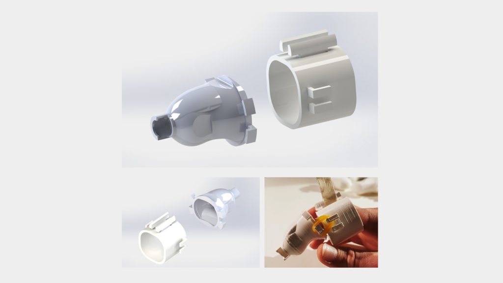
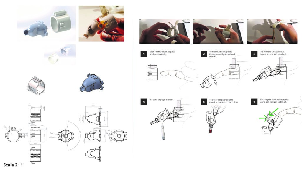
This new device, attaches itself to the users finger and holds the vial internally. The device applies pressure, removing the requirement for pressure-activated lancets only (for example a reusable one could be used). Using the lancet through the device adds a psychological separation of actions which eases the anticipation.
The forward component is a stiff medical-grade silicon meaning that it will retain its shape with minimal blood spillage. The user can then immediately drop their arm and allow the vial to fill.
In addition to this device, the kit would include moisturising wipes laced with a mild sedative to follow the alcohol based wipes. This would ensure the contact area is not dry and ease the pain of puncture even more.
Native App
The app serves the purpose of delivering data from the blood tests but also for auditing diets and symptoms of users who haven’t used the kits to estimate their levels.
The app then offers suggestions in the form of Boots products, recipes, and diet alterations as suggested actions for desired effects.


Traffic light system
Instead of simply throwing data at the user, the app employs a jokingly named traffic light system, given that its intended effect is the opposite of the common UI pattern where users are presented with ‘good, medium, bad’ scales and coerced to take action.
The app splits data into “Insights”, “Changes”, and “Actionable” categories. Insights are auto generated suggestions or noteworthy information created based on data provided by the user. Changes are created when a trend alteration from the user is noted, for example a drastic change in a particular level that is neither good or bad. Lastly Actionable is the one area where users are given dietary interventions to tackle levels which are out of recommended bounds. It should be noted that any serious threat to the user’s health would trigger an alert outside of this system, with the potential to subscribe a customer’s healthcare provider.
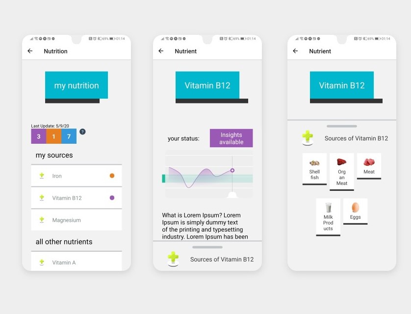
Visual Design
The aesthetic style was inspired by and extended from the Boot’s recent brand overhaul, some of their physical promotional material, and a set of aesthetic developments shown here on their temporary landing page during the beginning of the COVID 19 pandemic.
The site reverted these changes sometime in mid May but has been slowly introducing elements to the main site design.
This style is characterised by large block elements, overlapping block highlights, “shadow” elements adding variable emphasis, and a simpler colour scheme.
This was combines with the ‘standard’ Boots design characteristics such as lower case text, calming colours and soft blues at the forefront, high contrast, large touch areas.

Boots Nutritional Model
To inform the way data relating to nutrition sources is presented to the customer, I found it necessary to define a model to split items into hierarchical taxonomies.
- Nutrient: A vitamin or mineral
- Super Category: Encompassing groups such as “Vegetables” or “Fish”
- Category: More specific typology of food such as “whole grains” or “root vegetables”
- Sub-category: Used to give categories more flexibility, for instance distinguishing between “dark leafy veg” and “leafy veg”
- Food Instance: A raw item or foodstuff
- Variant: Used to give instances more flexibility, for example “chicken egg” vs “egg”
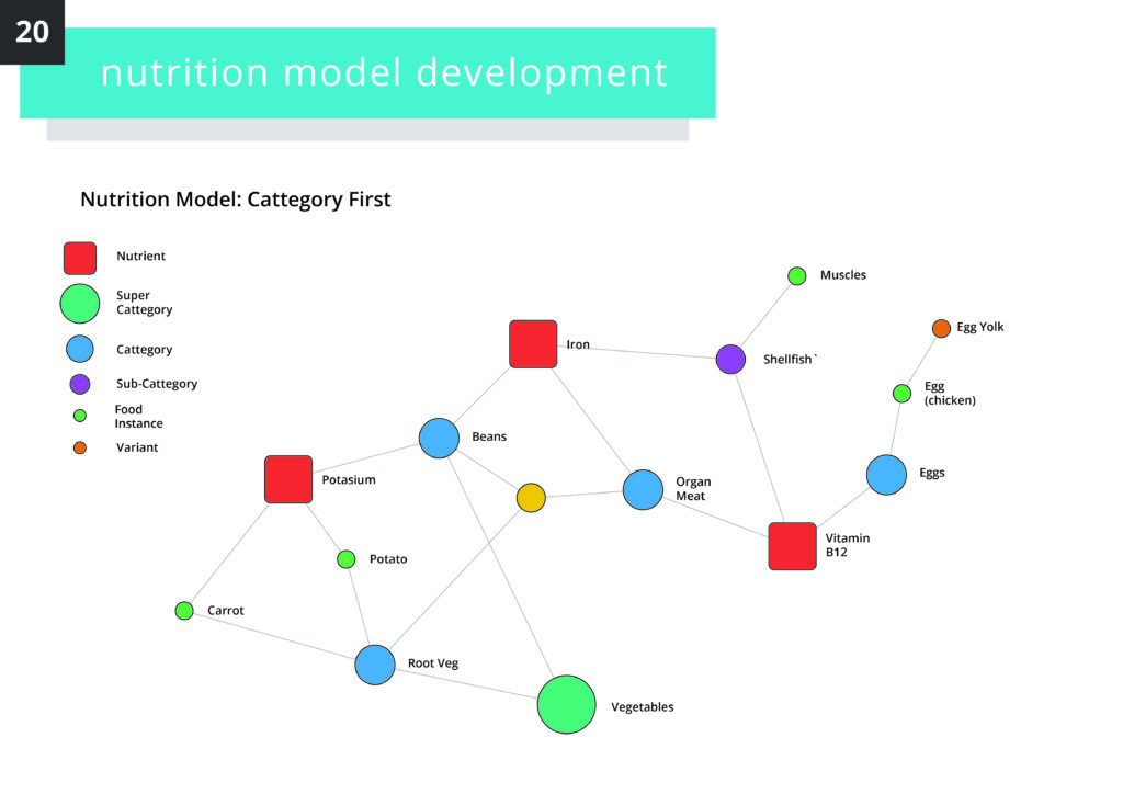
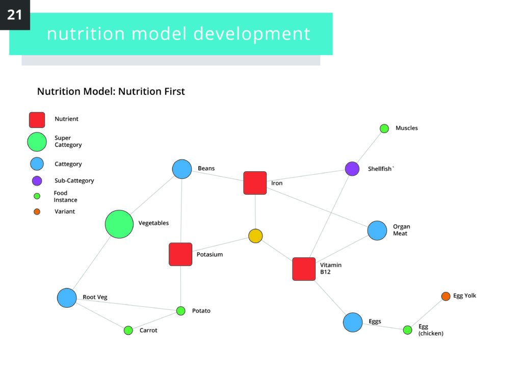
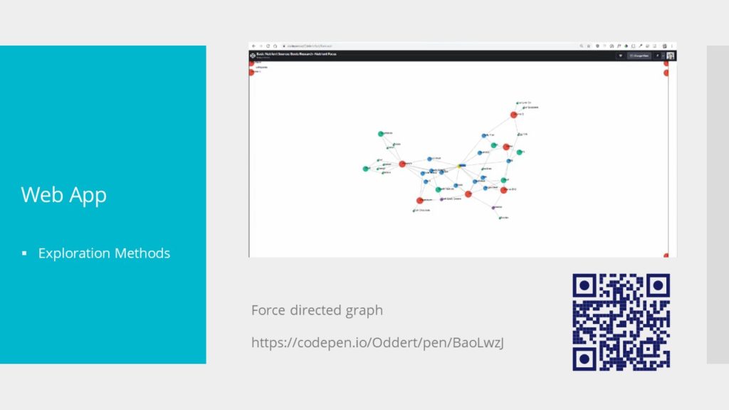
This model can be used to create data visualisations of how items relate to user-defined goals such as these.
Lastly, as time moves on, this database of recipes, collected trend data from users and nutrient sources would build, allowing Boots to identify areas of focus, trend data (if some deficiencies are seasonal) and so on.
In the immediate timescale, this could inform product promotional forecasting and increase response times for customer consultations in Boots other services.
Longer term this could be used to acquire new food sources to stock in appropriate branches. The reason for this is that often, with particular food items sought for nutritional benefit, the actual value depends on the source, for example the solid it was grown in, waters fished from, storage conditions.
Conclusions
This may seem like a departure for boots, to suggest that deli items and raw ingredients take a place next to other items in store. However I would submit that Boots ranges are already radically diversified beyond what a pharmacy is at its core.
More than the fact tat Boots already does sell food including raw (non processed) items, I submit that some people already treat this tailored sourcing of their diets in the same way that exotic lotions and other items are marketed for their unique capabilities. The disctinction is that for most of us, this level of insight and tailoring is too time consuming, the sourcing too expensive.
Tailored nutrition aims to democratise that work and offer options to establish baselines of wellbeing on which we can build.
Mosaic
When I first started out in design, my only motivation was to contribute something, to ‘save the world’. For my final year project I forewent personal comfort to platform an issue that affects so many of my community on a deep personal level.
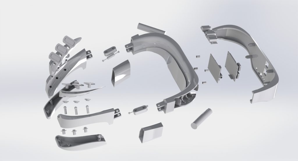
Mosaic Voice is a consumer-viable Electroglottograph (EGG) designed to help transgender people (specifically trans women) perform voice therapy training.
Comprising of two parts, a wearable EGG, and a supporting app, Mosaic was conceptualised as an extensible system, providing the basic software, while region and use-case specific needs could be met via a library of plug-ins.
This was based on first hand experience and extensive research which indicated that any solution would be region-specific and require outside experience for each subsequent location / context it was to be applied to.

Voice Therapy Training
Voice therapy training is a sensitive and highly personal process which poses significant practical difficulty and emotional strain for trans people with vocal dysphoria. Resources are scarce and sparse; embarrassment pervades around stigma about adults performing vocal training.
Democratised design can facilitate this process by creating assistive tools and means to alleviate the emotional difficulties incurred.
Voice therapy training (VTT) is a broad term for practices and training regimes designed to modify the voice to take on a different appearance. It can be utilised by singers and actors but also by people recovering from injury and trans people, in particular trans women such as myself, who’s voices are not affected by hormone replacement surgery.
Issues with Specialist Help
Specialist tutors & therapists exist to help with this process, offering guidance, techniques, coaching and so on, usually over a long period of time. I personally make use of the excellent service by Christella Antoni, who takes a holistic approach to sessions, integrating social aspects and involving the client in the process. It should be noted that I am not affiliated with Christella Voice, my opinions are my own and genuine.
This works well to tackle the individualised nature of voice and offer professional guidance, the issues arrise with the fact that so few people actually perform this service. People travel from across the country to attend sessions because there’s nowhere closer, the cost of travel tickets exceeding the sessions. And even then, one person can only see so many clients.
There’s also the issue that many trans people are, for lack of a better term, broke.
Trans people are massively discriminated against in work, promotions, housing and healthcare, among other things. This leads to a significant majority living bellow the poverty line. This works to make access to services like Christella’s difficult for some to manage, then additionally, you must consider the viscous cycle that one’s ability to “pass” is largely dependant on voice, which has a compounding effect on discrimination faced, which leads to more poverty, and so on.
This leads to many of us (if not most at some point), turning to the idea of doing it yourself…
Issues with DIY
Many people turn to resources on the internet such as YouTube videos, the few training apps which exist, and the occasional Reddit post which is cited by everyone you know and threatens to dispensary one day. Also you have to tolerate looking at Reddit.
The issue boils down to the fact that, with say a YouTube video, you are seeing a “patient’s” personal reflection on what they deem to be the most memorable aspects of a highly personal journey, as opposed to structured content.
Even when structured content is available, it is often nullified by the lack of tutoring context and practice structure. There is an issue of “hearing yourself”, that is, gauging correctly where you’re progress stands, what you should be working on still, and knowing when to celebrate achievement.
Three Target Issues
This lead me to define three topic areas to explore as the basis for my dissertation
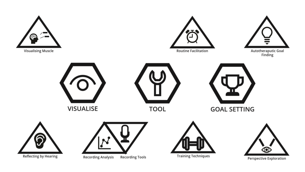
- Visualisation: concerning the issue of self-reflection, issues around hearing yourself and your progress
- Tool: A set of techniques and resources, not to supplant specialist support, but to aid in self-practice
- Goals: Looking at the auto-therapeutic aspect of VTT, aiming to address the physiological distress and discomfort as well as help people define obtainable targets.
Electroglottographs and Self-‘Visualisation’
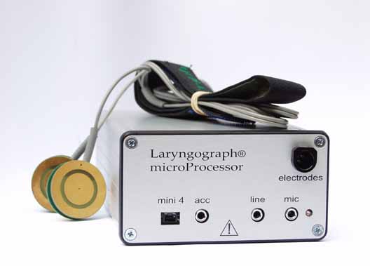
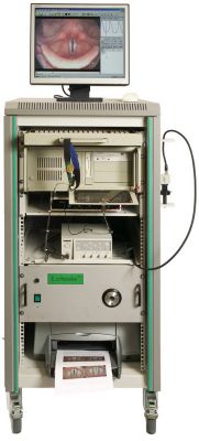
A more industrial system by Larynograph. I include this image to highlight the connection with the ‘desktop’ version; that these are medical devices first. 
The Larynograph site tells a story about how old / established this device is. 
The interface of the desktop version of the Layrnograph
One of the most useful physical tools employed by voice therapists is an Electroglottograph, a device which provides in-depth data on the behaviour of the larynx and audio aspects which comprise the voice.
These devices are difficult to come by, large, clunky and expensive, hence few people who are not specialists are likely to own one.
Their function is effectively quite simple, an electrostatic field is created across the contact probes which are pressed into the client’s neck. The various vibrations and noises interupt the field across various channels, which are then picked up by the device, and processed into usable data by the software.
Rethinking the EGG
A Precedent
Initially, I assumed that designing a new EGG was impossible, so I pushed the idea away. In early December (just as everything was winding down for the winter break), I came across two articles concerning the creating of DIY EGG devices.
I am research and engineering driven in my approach; I was not willing to create a project based on the assumption that a new type of EGG could be made without first seeing something to indicate it’s validity, and then packaging this in some way into a proof-of-viability / proof-of-concept.
The first resource I came across was this project by Marek Materzok on Hackaday.io which documented their process of making and refining an EGG device from scratch. There was not enough information to replicate the process but it offered a beginning insight into some of the challenges such a device would face (namely noise filtering and the best way to create the oscillation).
This lead me to this tutorial on Instructables of all places, DIY EEG (and ECG) Circuit by user Cah6 which gave details and specifications for building an Electroglottograph from simple components. This was all I needed to tell me that it could be done.
I made inroads into building my own version but decided to allocate my time elsewhere given how late on in the project I was.
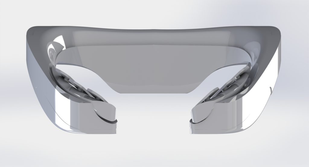
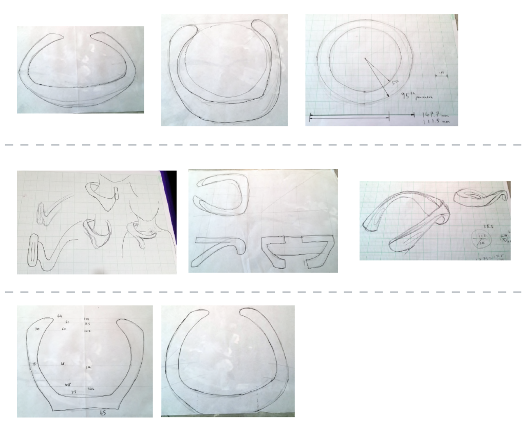
I decided on a wearable typology given the ergonomic difficulty encountered with the strap-on probes. The device would hook round the users neck, designed to cradle on the shoulders. The hinge components on each arm flex to adjust for neck sizes while retaining points of tension on the probes.
Most of the circuitry and interface buttons were placed on the back, with the batteries closer to the shoulder blades, this was to achieve weight balance on the arms but also ensure that any imbalance would only serve to pull the probes against the neck more, not slide off.

Chips on Both Sides
Using Cah6’s article as my template, I found an optimal size for the EEG control chip, which would be placed under another board which would handle interfacing with the ports and network. This second chip was designed around the Broadcom BCM 2835 controller used on the older Raspberry Pi’s given the low cost, versatility and proven record it provided.
Other smaller components such as the WiFi chip were also taken from the Pi series. Cost was a primary motivator with most of the deisgn descisions, given that this device had to be as low cost as possible.

The chassis is comprised of simple injection moulded nylon and designed to be easy to disassemble, repair, hack, etc. Screws are standard size and not hidden, components are all accessible, the batteries are lithium-ion AAA’s so can be swapped out at any time.
Motivation and Repetition
For the software end, I layout out a feature map for a mobile app including:
- A modular daily training system: Inspired by the Enki app, this would show ‘Pathways’ which would utilise the following tools to guide users though speaking exercises.
- A set of quick practice tools: These would show a simple animation or instruction and allow the user, in bursts of 30 seconds or so, to practice some aspect of breathing or warm-up.
- A pitch sample recorder: An area to record and sample the voice over a piece of sample text to view pitch over time.
- A resonance estimator (using neural networks): While the EGG is needed for accurate resonance sampling, this would provide a middle ground for people without financial access. Using a pre-trained convolutional network, an ‘estimation’ of resonance levels could be pooled. This would record the samples in the same area as the pitch sample recorder.
- A continuous listening sampler: Somewhat experimental, this functionality would note samples throughout the day of the user’s voice as they perform their daily activities. This could be used by the user to see how they remember their training in various, uncontrolled environments.
- A voice pattern matcher: Would depend on finding the right region-specific data set. Another convolutional network would match the user’s voice with one that sounded similar in most respects but could be adjusted for vocal features. This could then be used to practice against and set goals for the user to aim for.
- A voice creator (neural networks): Would depend on finding the right region-specific data set, a recursive generator neural network would modify the input voice to be adjusted for vocal features such as softness, tone, pitch, resonance, etc. This would allow the user to, for example “gender swap” their voice to try it out.
I built the frame for a progressive web app to demo these features which I could implement now, and provide dummy data for items that would require live data.
Nuemorphism
At the time (late 2019), there was speculation rising about the concept of “Nuemorphism”, coined as a play on “skeuomorphism” by Devanta Ebison. I hadn’t made up my mind about the style but I saw potential for a textureful and soft, welcoming interface which would be great to try for the app.
The result was a pleasing warm aesthetic, I especially liked such items as the progress indicators which felt like little gems that you wanted to have, empty ‘slots’ for the unfilled sections.

I’d like to write extended thoughts about the topic at some time, but sufice to say, while I liked the unique aesthetic of this app, it only worked due to the colour contrasts and would have faltered slightly if I had followed the pattern where a ‘raised’ section is the same colour as the background.
This is one of the critical flaws with nuemorphism (and skeuomorphism to a lesser degree), it’s smooth transitions and drop-shadow facilitated layer / element separation are often incredibly low contrast. This is a problem on displays with lower contrast settings or fewer colour bands, items viewed at any sort of distance, and of course, accessibility.
The advantage of more Matrial-UI esque drop shadow element-separation is that you can still use other features such as subtle borders to add definition and get round this issue. Even skeuomorphism (which, for the record, I am not a fan of), relies on heavy gradients and colour mixing to get it’s textured effect.
Reflections
The project concluded successful, I got an A and the presentation was received well. Its one of my favourite pieces of work and I’m proud to have it as my final year project.
But I still have hang ups.
This was, for all intents The Big One™, the final year project, and more than that, it was something I so closely believed in. It wasn’t enough for it to be good or even great, it had to be a master-piece.
I was afraid my work couldn’t speak for itself
I kept diversifying the system while not building on what was there. It’s true that the solution should take the form of an integrated system but I remember over and over again not being sattisfied with what I had, constantly striving for something to truley step up to the next level.
In reality, I was having a crisis of design, I saw myself perched between two worlds, one of Product Design, and the other of Engineering / Code. I told myself over and over that there was no divide, that we all have ranges of skillsets but I couldn’t chake the feeling that I was a jack of all trades and a master of none.
So I kept adding ‘stuff’, imagining the basics of a complex system and then trying to work back from there (the egineering approach when you actually know what that system is). I spent a month on a little breathing excersiser device before stepping back to ask “what the * am I doing? What is this?”
When I shifted hard into the EGG route, I was doing so over the break, working tirelessly while others were relaxing, just to catch up.
I used my specialisation as justification for not re-evaluating
Perhaps what is worse is that the warning signs were there; clear indicators that I should clear my head, define one or two things that the product had to do, and just worked on those.
I let myself believe (not incorrectly) that I was uniquely positioned to pull off engineered solutions comepletly unlike anything my collegues could do, due to my specific code based skills. This is a mistake that would unfortunately not fully reveal itself until Tailored Nutrition.
In doing so, I chased these mutliple vauge threads instead of simply doubling down on the core that ended up being the final outcome. I ended up working twice as hard as some but still “only” producing what I could have under older circumstances.
I assumed that I could just grind to finish
Perhaps the most egregious mistake I made whilst all this was going on was the assumption alluded to, that I would miraculously pull off the feat at the last minuite. As I said, I did do that, but for an outcome which could have happened regardless.
I made a habbit of being in the studio from 10:00 until 23:00, calculating when would be the most ‘efficient’ time to drink caffinated drinks, pushing msyself beyond physical limits. I could have halved that time, used the remaining to rest, research, regain my humanity, but instead I saw time as a commodity to be collected and horded as much as possible.
We all have pressing deadlines from time-time. But if you begin to see time itself as an enemy, its overdue you stop and reevaluate.

