Higher Graphic Communication ‘Thematic folio’ produced to sharpen my technical competency and visual presentation capability in final year high school.
The Thematic Portfolio is essentially what other institutions would call a technical package, a fully detailed CAD package with supporting parts list and promotional material.
We were asked to choose a physical product to reverse-engineer, build in CAD, and then create a brand identity around. I was excited to use this as an opportunity to expand my Autodesk Inventor skills and build a strong brand image around the product.
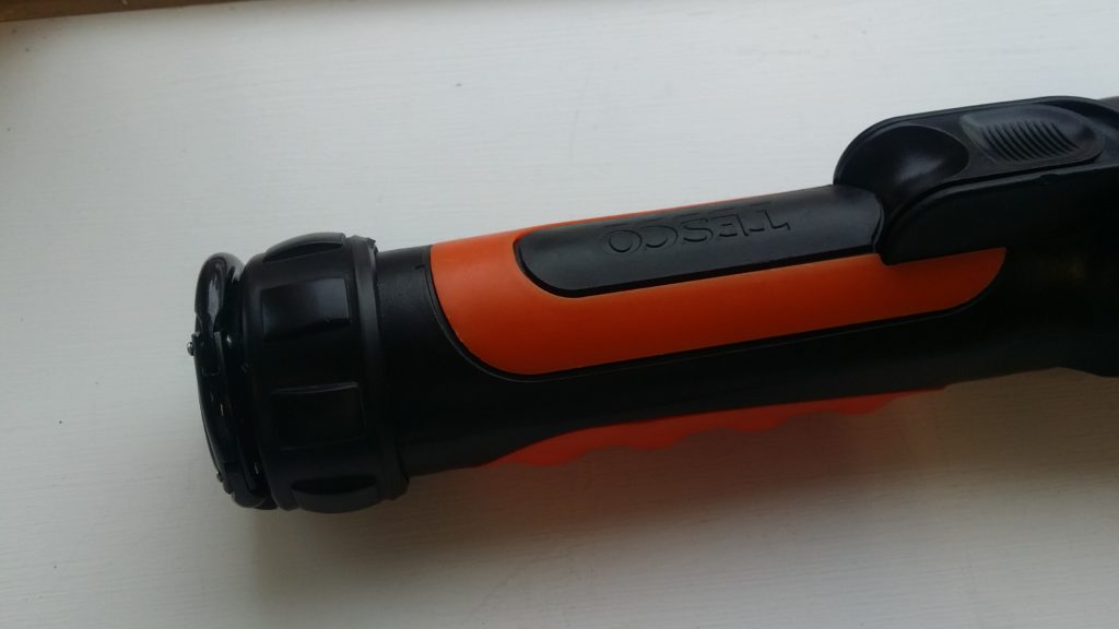
I choose this Tesco torch with a rotating head that can be tilted 90 degrees. Given it’s rotating mechanism, features following or arrayed around the cylindrical body, and detailed components, I felt it was a good challenge for my skill sets at the time. If I had wanted to I could have omitted detail such as the orange detailing, the clip, or the bulb assembly and still met the requirements of the brief but insisted on including these details for the sake of it.
The thematic is, in essence, a full visual display portfolio for our chosen product where we act as though the product is of our own design and we must now visualise and communicate it to a client, manufacturer and customer.
This folio is comprised of three components:
- A fully annotated technical package including parts sheets.
- Rendered CAD assemblies and exploded views.
- Promotional posters and leaflet.


The fictionalised ‘Nitor’ was presented as a utility device for both home use and the outdoors (in reality the torch was far too fragile to do either). The graphic presentation was based around plays on the idea of folding and direction changes.
This was a chance for me to play with some new graphic techniques including layered transparency and a form of flat design used for the icons. The text affect attempted to evoke the imagery of an eclipse.


