
Have a look at this image of a road near my parent’s house. Pretty ordinary, eh?
In many ways it is. This is the Ayr road, and is a microcosm of the transport and urban design situation in the UK. And I’d like to talk about what insights we can pull from this rather plane road.
This is an arterial road near where I grew up and where my family live in East Renfrewshire, a suburban area about 7 miles out from Glasgow, the largest city in Scotland and the third largest UK city outside of London.
There is currently a consultation to remove the protective bollards on the bike lane which were put in after the Covid-19 pandemic started.
I’d like to air my thoughts and make a case in favour of active travel but I also want to use this as a chance to talk more broadly about active travel.
Who is this post for?
This post is split in two; the first section is the core of the issue and the bit that’s most important while the second, longer section involves a deep dive into the subjects touched on.
There are three types of people I’d like to focus this post on:
- People who drive frequently. Specifically people who don’t really give much thought to bike lanes, active travel and all that stuff. Maybe you get annoyed by cyclists, maybe you have your own local change to parking or street layout that bugs you, maybe you have to commute in traffic every day or maybe none of that is true. For you, I hope to appeal to you without being condescending or patronising, to give you an insight into what people like me are pushing for and to offer a different perspective on roads and driving.
- Local People. Anyone local to the area who are eligible to take part in the consultation or similar consultations near you.
- Interested in Active Travel. People who are already interested in active travel and public transport advocacy, to give you more vocabulary to discuss instances like this and ways to discuss the topic with other.
The Road: A Dramatic and Riveting History
This is the Ayr Road, it was built as a dual carriageway arterial road for Newton Mearns. Later, a modecome of sensibility prevailed and it was reduced from a mini highway to a single lane each way at 40mph (65kph). At some point painted bicycle gutters were added on each side and a reservation island was built in the centre with painted margins on either side.
In 2020, using COVID-19 funding, the road installed some semi-protected bike lanes and reduced speed from 40mph (65kph) to 30mph (50kph). The protection for the bike lanes came in the form of “flexy bollards”; thin plastic bollards spaced apart which have a small hump at the base where they are screwed onto the road. On impact with a vehicle they fold over and sometimes deform or break away, causing at most aesthetic damage to the vehicle.
Flexy bollards are not ideal as they don’t really physically protect people from vehicles but in this case the justification was that they were faster and cheaper to install than permanent bollards or other barrier.
Flex-posts are not a long term solution as they do not offer sufficient protection and deteriorate over time so are often reasonably cited as a scourge of urban design, but they are a quick and cheap way to create a rudimentary physical separation of lanes in a short space of time and I think should not always bee seen as an inherently bad thing. As we’ll look at in later sections, flex-posts are still better than nothing and can literally be installed overnight so are an easier political sell.
The Consultation
East Renfrewshire council has recently proposed ripping out the bollards on the Ayr road and adjoining Fenwick road, and returning it to its previous state; an unprotected bike lane and 40mph (65kph) car traffic.
This is cited as being due to the fact that flex-posts, are not durable and not suitable as a long term solution, and that the COVID relief funds which were used to install them are no longer available for renewal. Rather than upgrade the road to full grade-separation (at reduced long-term maintenance cost it should be added), they would rather just remove it.
East Renfrewshire put out a public consultation asking for opinions on the current plans to remove the bollards and re-increase the speed, presenting a form with pre-made questions and calling for comments.
The posts have now been removed and the road put back to its old dangerous form, with the 5th May local elections coming up some conservative councillors are claiming it was a great victory and reason to be re-elected.
I initially wanted to make this post as a quick call-to-action but while planning it out I changed direction. I believe the decision is not only wrong and short-sighted, but its indicative of a wider problem in UK transport planning about how things like this (and active travel generally) are framed.
However, as I began to lay out my response and expand on some of the points, I found more and more to write about, more examples to use, and more comparisons to draw. The Ayr road is not only a typical example of how poorly Active Travel is implemented but also the barriers to changing the way we think about Active Travel, transport, and urban land use in the UK.
I want to lay out this dynamic as I see it and provide counter examples to demonstrate what change is needed and how that change might realistically come about.
Why is it important to speak up about little things like this?
With situations like this it is really easy to downplay the relative impact of a consultation or a single road project. What difference will it really make? Will the councillors really listen to me, or anyone? What can really come out of a single consultation of a single feature of some road? I don’t even use that road, what does it matter?
So here’s the thing, I’m not here to convince you that the best way to change the world is to engage with consultation forms on a local council websites. This is not a discussion on the merits of engaging with representative democracy.
What I will say is that, regardless of what representation you have; 1) People need to know what you think to know what matters, 2) People in power are still people, you should not make assumptions about what they know and what they don’t know, you cannot guarantee that a concept is something they’re already familiar with.
I think it is important to speak up on topics like this to make clear your ideas of how you want your local environment to be to which ever governmental structures exist, if for no other reason than to override the knee-jerk reactionary comments you expect.
It is important to let your representatives know what you want and expect, even if they’re already onboard they’ll likely base their actions on what they believe there is political consent for.
Lastly, I’ve recently had it demonstrated to me that sharing knowledge on topics like this, even if a lot of it seems obvious or redundant, is worth doing. A story from someone I know rammed this home for me; this person, as much a layperson as I am, had their material used in a course for real traffic engineers. While this might be taken as an indictment of the engineering institution in their country, I think it goes to highlight that as professionals we’re all too often taught to do the job that exists, and not think too much about criticising it. Its good to continually share what you know, even if you think its obvious or that you’re not an authority.
My Response
This consultation asks participants to choose between some multiple choice options and offers the chance to write a response. The following paragraphs are what I submitted, then the rest of the post serves as an explainer delving into the concepts mentioned in my response.
Admittedly my response was quite glib and could have been longer but I deliberately wanted to keep it short and readable for others looking at the comments.
Physical separation of cycle lanes is crucial to increasing safety for all road users and encouraging active travel.
Ideally a grade separated path or curb separation should be used but even a ‘soft’ barrier such as the ‘flexy’ posts currently installed create a visual barrier which encourage drivers to leave sufficient space and not to unconsciously meander into the cycle lane.
In addition, a clear demarcation of cycle and road lanes communicates that cycling (and other light vehicles) are prioritised and seen as a valid mode of travel, it prevents things like pavement parking and blocking of the cycle lane.
Active travel has great benefits including reducing congestion and pollution, reducing road wear, and personal benefits for the individual’s well-being. It also makes it easier for people who cannot drive to get around such as young people, people on mobility scooters, and equipment like velo-mobiles.
As countless examples from European countries show, the only way to induce demand for active travel and the benefits it brings are to provide safe and convenient ways. (add “to do so”, add “to meet Scottish government guild lines)
In an ideal word, the national government would follow the examples of nations like the Netherlands, who saw a relatively recent ‘revolution’ in active travel by redesigning their road building guides to include active travel provisions; every time a road needed resurfacing, active travel lanes would be simply built in at a much lower cost than adaptation (of already existing roads).
While this is outwith the scope of the two roads under consultation here, you already have a “Dutch design” (in the road design as stands); the cycle lanes are comfortably wide, there are relatively wide pavements and plenty of space for cars, and lastly there are single direction paths on both sides of the road (this is far preferable to a single two-way path).
I would implore East Renfrewshire not to undo this achievement and to go further to celebrate it and to push for more upgrades like it.
The more provision there is for active travel, the more appealing and accessible it (the option of active travel) becomes to the wider public, which is what is needed to support gradual modal shift.
To remove the barriers (or fail to eventually upgrade them to a curb) relegate cycling to the domain of people (brave enough to do it) doing it for sport; the relatively fit, usually male, road-bikers.
One thing I’d really like to pull out of this is that, this bike lane is pretty mediocre all things considered.
However, compared to what exists in much of the UK it is in-fact light-years ahead. I’m perhaps a little overeager in my praise of ER council but I do want to highlight that they actually have a pretty good thing going here.
They should not only not rip out the bollards, they should be holding the Ayr road up on a pedestal, saying to other local areas “Hey! look what we can do! Aren’t we forward thinking?”.
The lanes are a decent width, they cover a relatively large area, and connect areas of retail, businesses and residential areas alike, creating a large corridor of transport between urban centres. There are also individual lanes for each direction of travel instead of a bi-directional track.
Bi-directional paths are common in Glasgow where both traffic directions on the same lane. This can work in low traffic areas or in specific scenarios but generally speaking is bad; it reduces space for cyclists, makes overtaking more difficult, and generally goes against how we think of traffic movement. For instance if I want to catch a bus travelling east on an east-west road I expect to go to the north side of the road, having to cross the road to the wrong way just feels odd.
The Ayr / Fenwick road is a fairly big arterial road linking Malletsheugh, Newton Mearns and Mearnskirk with the Avenue shopping centre two high schools, north bound it becomes the Kilmarnock Road and then the Pollokshaws Road strait into the city centre. Prior to the opening of the M77 it was the main road route into the city for a wide area.
A key point
Something I want to point out regarding the consultation and the road is that no space has been taken from the car lanes, the bollards have in fact been placed on the inside of the bike lane.
In the description for the consultation there is a specific reference to parking provision, perhaps a tacit acknowledgement that before the bollards were put in place, parking in the cycle lane was so prevalent it was often unusable.
Parking in the lane still happens, given that drivers can simply enter in the gaps put in for driveways and junctions, but became far less prevalent when the bollards went in. Its now common to see the service and maintenance vehicles that have permission to park, do so on the pavement with deliberate care to leave both the pavement and bike lane clear.
Naturally there will be people responding to the consultation because they want to be able to park on the lane with impunity again, but for the sake of being as good faith as possible I’ll continue this post assuming that this position is a small minority.
Flexi Posts & Road Safety
Painted “bicycle gutters” have a range of problems, roads often deteriorate towards the edges; waste, drain covers and temporary signage are all pushed to edge increasing the risk of being pushed into the kerb and falling.
However, one of the biggest problems with relying on paint is that we as drivers have a tenancy to centre our vehicles in the roadway. Its instinctive; if you are in the middle of the ‘path’ you are treading the most secure and straight route, we do it even while walking on dirt trails. While piloting a 2-tonne metal box at speed, the centre of the lane is intrinsically the safest point, equal distance from obstacles on both sides and spreading the margin for minor errors evenly.
Painted road markings are used as part of that margin of error; they give directions and demarcate boundaries without actually enforcing consequences for minor errors in the same way that a physical barrier would. The typical example are merge markers; they instruct you how and at what angle to merge with another stream of traffic, but if you’re a little bit off you don’t (yet) hit a wall.
Take the example of the reservation islands used on the Ayr Road. The physical island provides a safer* way for pedestrians to get across, crossing one direction of traffic at a time, but also serves as minor physical protection should a car stray off towards the opposite lane should the driver pass out for example. The purpose of the painted margins is to enforce the actual safe distance for the road while providing a margin of error should the car understeer (turn at a larger radius than the road is at).
This might seem like a sensible design but in reality it is a requirement bourne of the fact the road’s design speed and legal speed are too high, the road is badly designed. “Designed speed” refers to the physical speed the road can hypothetically support physical, separate from the enforced legal speed limit.
*Pedestrian islands are another example of this same consequence; if the road layout were changed to be more safe and efficient, the islands would not be necessary.
Some painted lines will “enforce” their boundary more strongly than others; for instance the type which cause tyres to make a noise when run over at speed such as you’ll find on motorways, giving physical feedback to the driver. Others, such as dashed lines, specifically indicate areas where the barrier can be traversed.
In short, painted markings tell you where you are supposed to be but don’t actually keep you from going over.
As established, most people tend to centre themselves between the physical obstacles on either side of themselves while driving, typically the kerb on one side and the the other lane of traffic on the other side, both of which threaten consequences should we stray over. We align ourselves using the nearest physical barriers instinctively before looking at what the road paint has to say and maybe making a conscious correction.
The point of all this is to say that even good drivers who are more than happy to share the road and not to intimidate or assault cyclists will, on occasion, slip further over into the cycle lane than is safe. Providing any barrier, even one which doesn’t physically shield the cyclist, makes drivers take a more central position in their own lane and therefore makes both driving and cycling more safe.
More crucially however, they make the riders feel more safe, which is absolutely crucial to encouraging people to get out of their cars and jump on a bike.
In summary, flex-posts are not a long term solution, they don’t offer proper protection but they are cheep, fast, and economical. If you have a political structure that is reticent to spend money for fear of “waste”, flex-posts can be a way of getting partial protection in place which can be used to justify full protection later.
We should not ever have to choose between 900 meters of partial protection or 200 meters of full protection, we should fund good design as needed. However, too often this is the political choice we have to deal with, and a cheaper quicker option is very often an easier political sell, and an easier way to cover larger distances.
Creating Options for Travel to Accommodate Everyone
There’s a wee bit of a climate emergency on at the moment. Not sure if you’d noticed.
I’m not going to reiterate all of the detrimental effects of cars on the environment because this post would never end because I’m going to assume that its obvious to most that cars are detrimental to the environment.
I do however want to pick up on one thing; there is this idea amongst a large number of people that electric cars are the solution to the environmental effects of cars and solving local transport. According to this mindset, the problem with cars is the exhaust pipe only. Other emissions, infrastructure costs and manufacturing carbon costs are not fully accounted for, and street / urban design doesn’t factor in to most people’s thinking at all.
Electric cars solve only one of the myriad problems of cars; that being the exhaust fumes. Electric cars still produce brake-pad particulates, tire particulates (one of the largest sources of microplastics in the world comes from car tires), and particulate wear from the road surface which they damage as they ride. The amount of lithium mining and other manufacturing necessary to swap all ICE (internal combustion engine) cars for electric is plainly impossible. New electric cars don’t have any carbon benefits until they have completed years of use. And that’s assuming those miles are inevitable; they needed to be travelled in a car in the first place.
Now, despite all this, I am not anti-electric-car. If you have to take a car trip and there are two vehicles to choose from, one electric and one diesel, then the choice is obvious. Of course electric cars are better than ICE cars, if you need to make a car journey and have a choice between an ICE and electric then the choice is clear. However the idea that we can swap out all cars for electric and the world’s problems will be solved is just false. We still need to reduce the number of cars & car journeys.
There are also far more social and economic problems associated with car dependency that don’t go away once you’ve made a perfectly eco-friendly car. Many of us live in car dependant areas where many journeys are not accessible without a car, where the trips and amenities needed to live day to day are only paratactically accessed with a car because they have been spaced apart and there is no other convenient option. Our town centres and high streets are often clogged with traffic and parked cars making them unpleasant places to be. As I experienced going up, kids grow up in environments where they cannot travel far independently, needing to be ferried about in cars, and where even small residential streets are covered in cars.
We need to end car dependency and reduce the number of necessary car trips, not just to reduce emissions but to increase social mobility as well. The best way to do this is to give people choice about how to get around.
If you can go to the shops, the post office, the dry cleaners, the community centre, the school, the park etc. by walking or cycling safely and quickly, quality of life increases. When shopping you can make smaller trips with more frequency as opposed to the ‘big weekly shop’, and you don’t have to worry about getting half way home having forgotten something.
Of course, many people will still want to use a car even if other transport options are viable, this isn’t really about them. Every study on the subject of transport patterns shows that the vast majority of people don’t actually care what transport mode they use, they’ll use the fastest and / or most convenient (or if you like, least inconvenient) so long as it is safe.
As Jason Slaughter of the Not Just Bikes YouTube channel likes to say, there are very few “car people” or “train people”, most just want to get from A to B with as little hassle as possible. I write this as one of the few “train people”; given a choice of a 20 min bus journey and a 40 minute train I’ll choose the train because I like them more, but people like me (who would preference in the same way) are actually statistically quite rare.
The reason that people walk in walkable areas, take the tube in London, cycle in Amsterdam, and drive in Huston is because these are the most convenient modes respectively for each city. Often times “culture” is cited as the reason people choose particular modes, and while there is an element of getting people used to new ways of doing things, culture is still the result of behaviours, what people actually do, and is not set in stone changing with relatively little effort.
By giving people choice and by making the options safe and convenient, people will use it, even some don’t want to, and if that option is the most convenient then the numbers using it will only increase.
We owe it to ourselves and future generations to create provisions that enable active travel and make it a viable option, campaign after campaign “encouraging” people to “try active travel” will not succeed if these options are still not seen as safe or convenient.
The Rest of The Post
So that’s the end of “part 1”, the main post. What follows is a deep dive into specific design features and a comparison to other case studies.
The rest of the post is over 18,000 words long, if that does not appeal then you might want to stop here.
If you’re up for a deep dive and have a fresh hot drink prepared, then lets continue on…
What we can learn from the Netherlands
I was recently introduced to the YouTube channel Not Just Bikes. Run by Jason Slaughter, it documents his family’s experience moving to the Netherlands, his observations about life there vs his home town of London Canada, and discusses various aspects of active travel and car dependency.
It is difficult to really define exactly what his channel is, but I like to think about it as a 101 on Dutch design, how the Netherlands built their “active travel utopia” through a push for safer streets, and how their towns looked like any other European city until the 70’s when grass-roots activism laid the groundwork for what exists today.
In the 1990’s in the Netherlands, the great cycling capital of the world, the best you could hope for was a painted bike lane. There were efforts from some politicians fighting to remove bike lanes from congested areas as late as the 90’s.
Just like almost every other country in post-war Europe, the Netherlands had its own plans for an auto-driven recovery, for massive highway projects to plunge through their city centres, and the same earnest attitude that “if everyone can drive, why would anybody do anything else?”. Just like the UK in this era, cycling was widespread, and just like the UK, its prevalence was seen as a problem yet to be solved.
There was an explicit political motivation to get rid of the bikes, cyclists were descried in such terms as “locusts”, an “infestation”, a remnant of the old, and that they needed to “get out of the way, and make way for the motorcar!”. Bikes were the primitive past, and motorcars were the bold modern future that needed to be unstuck.
Just like the UK, there were extensive protests against the massive road-building projects and a move for safer streets to protect children. The only real difference is that their movement was more successful than the ones in the UK. The oil crisis of the 70’s is often cited as the reason why; that the UK’s response was to upscale drilling in the North Sea while the Dutch felt the pressure more which aided the safe streets movement. However, it is difficult to really know what caused the outcomes to be so different.
Today it is possible to go most places on a bike in the Netherlands, travelling on safe, grade separated cycleways and dedicated routes. Bikes are seen as a legitimate mode of transport and almost always outnumber cars.
Almost all roads and streets have protected bike paths, with the remnants of the 90s painted bike lanes being steadily upgraded. Many of their city streets are completely car free, their traffic lights dynamically react to bikes, trams and cars to turn green on approach and prioritise certain modes of travel.
Modal filters are used to create ‘desired routes’ for different modes of travel; cars take the long route round in many cases and avoid urban centres, while other modes can go straight through. Trams travel different routes to the Metros making sure to cross them frequently while buses are routed to avoid conflicting with trams. The Dutch have a word for this that roughly relates to “the untangling”; the principle is that if you try to maximise throughput for every transport mode in every area nothing will move, it will all conflict.
If your a frequent driver you’re probably thinking “that sounds hellish, imagine all the traffic”. Yet the opposite is true.
Because there are safe accessible routes and a range of travel options, the only people who drive are those who need to or want to. If you love your car and love driving everywhere, you still can! But most likely you wont want to. If you need to bring a car or van into an area that de-prioritises cars you still can, just don’t expect to go as fast as the main car routes. As Jason puts it in one of his videos:
“I think, I’ve started to appreciate, one of the really the really toxic things that comes out of car dependent places is that everyone is forced to drive, and they think that this is providing them with this comfort and convenience but driving sucks in car dependant places. There is so much traffic, there’s people cutting you off, there’s people that obviously don’t want to be there, they’re board, they’re looking at their phone…”
“…I mean when you take everybody and force them to do something whether they want to or not, it sucks. And you get all of the road rage and you get the terrible driving and this is where it comes from, but you have to do it, to even feed yourself, to go to a job, literally anything you have to go through this highly undesirable experience.”
Jason Slaughter (2021) Not Just Bikes with Jason Slaughter. 30 November. Available at: https://www.youtube.com/watch?v=cQSp7T5CaPo (Accessed: 21/04/2021).
On being a driver in the Netherlands he says:
“One of the things that surprised me about the Netherlands is its awesome to drive here like, I cannot explain how great it is to drive a car in the Netherlands. I actually drive a lot, there’s various time when I need to drive… there’s so little traffic, the traffic lights work so well, the big thing that makes it so great to drive here is that, the only people who are driving, are those people who want to drive or those people that need to drive and that’s it.”
Jason Slaughter (2021) Not Just Bikes with Jason Slaughter. 30 November. Available at: https://www.youtube.com/watch?v=cQSp7T5CaPo (Accessed: 21/04/2021).
Bikes as Transport
Very often, those of us invested in public transport and sustainable transport talk about cycling and active travel as a ‘side-effect’. We focus on the trains, the trams and the trolley buses. We talk about the hierarchy of inter-city travel to suburban routes, metro systems and buses, and then make offhand reference to “yeah and I guess there would be more active travel and bikes n’ stuff, something to do with the 15 minute city” without any specific idea of what this will look like.
This attitude focuses on the commute and fails to describe what local urban design should look like beyond “train good car bad”. It unwittingly downplays the local, day to day, and littler journeys that make up a great deal of our lives, and we forget about the benefits of existing in a space and enabling community growth.
We assume that reducing congestion, eliminating car journeys, and having spaces for people to live in just sort of happens once you have enough trains and trams.
The Netherlands presents a more defined vision of how localities can be transformed. In the late 20th century, there was an activist movement which was only really focused on the goal of making streets safer, the cycling was an unanticipated result that came along with pursuing this goal.
They had their own road building projects, their own plans to plough highways through their major cities in the name of “modernisation”, their own vision of a suburban, car driven future. The safe streets movement faced fierce resistance and won its victories later rather than earlier. Everything we now associate with the Netherlands, particularly the cycling culture, was an unexpected side effect of a movement focused around making streets safer.
The Dutch design codes used to guide construction and renovation of streets was redesigned largely based on the Crow Manual. Any given street needs to be repaved and rebuilt every 15-30 years depending on the road due to wear and tear, by incorporating active travel designs into the guidelines for doing so means the infrastructure comes at little cost.
Retrofitting a road to have a dedicated bike path has a cost associated which can often put authorities off the idea of proposed single projects to do so. By changing the design codes to have bike paths, accessible pavements (side walks), and traffic calming measures built in, you get them almost for free. The features are simply a part of the road’s specification, if you’re going to have to replace the kerb anyway, it costs next to nothing to simply move it over a bit.
Of course cost is not an excuse for not retrofitting an existing road even if you must do it on a project by project basis. However by simply incorporating the feature into the design guidelines, you build consistency and widespread connectivity faster than a case-by-case basis. You build up the expertise in the organisations and labour forces that are going to do it anyway, rather than brining in costly consultants to do one ‘project’ and then leave.
Its worth pointing out that this does not just apply to dense, inner city and urban areas, these designs permeate out to suburban and rural areas as well. Your typical single-family, detached, suburban housing still exists in the Netherlands if you want it. The difference is that in the Netherlands your kids can travel to the park themselves safely, they can cycle themselves to school without fear they’ll get mowed down by an SUV, they can (parental permission willing) visit shops, takeaway restaurants, go to the cinema, and take part in extra-curricular activities, all without being tied to their parent’s car and schedule. They need not wait until they are old enough to get a driver’s licence to have lives of their own.
Up until the late 20th century, much of the Netherlands looked remarkably similar to the UK. A quick internet search will bring up numerous ‘before and after’ pictures of car-clogged streets with architectural styles similar to many high-streets in the UK, transformed into spaces which not only accommodate everyone but are cleaner, nicer places to be.
The image bellow is from an article on sustainableamsterdam.com and shows the street of Maasstraat as it looked in 1977 and 2014. This is actually a outdated design given that there are only painted bike lanes and not protected bike paths.
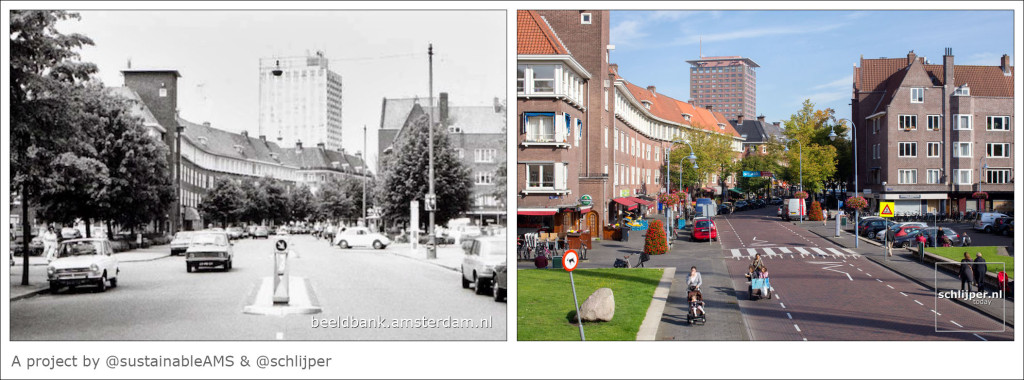
Doesn’t this look rather… ordinary? Mundane? Easy?
Sometimes we, as sustainable transport advocates, fall into the trap of defeatism while discussing the ongoing urban design trends of the past 50 years or so. It is admittedly difficult to look at the endless new developments of environmentally damaging, car dependant sprawl built with giant car parks, next to enormous motorways, and not feel a bit daunted. Compounding this is the fact this type of development seems to be the only major house-building happening in most of the country.
When you begin to see through the inefficiencies in existing street design, and when you become familiar with better designed spaces, you begin to see how even the worst of car dependent suburban sprawl can be drastically improved without even initially taking space way from cars (although you should totally do that too). After all, Amsterdam wasn’t built in a day.
One of the things that stands out about Not Just Bikes is the mundaneness of the things Jason talks about. Part of this is deliberate, Jason talks several times about the fact he makes his videos specifically un-cinematic to avoid a sense of drama and to point out how ordinary these “revolutionary” features can be. He also talks about how a proportion of his audience is Dutch and watches his content because they are interested to find things they take for granted are not normal elsewhere. They get to see their lives and their ‘normal’ from an external perspective, and learn that it hasn’t always been this way.
Visions of the Future from the Past
The concept of almost everyone owning a car and driving everywhere is an experiment.
It is an idea from a post-war world searching for a path to recovery, borne of a need for fresh thinking and new ideas, and cemented in the 60’s and 70’s.
It is difficult at time to imagine that the attitudes and political zeitgeists of a time so close as the 1970’s was so different to ours, after all most of us would consider those decades to be roughly the beginning of the modern eara, post WW2.
Another commentator whom I have great respect for, railway Permanent Way (track design) engineer and writer Gareth Dennis points out, when we consider things like the Ringway projects of London or Dr Beaching of the infamous report The Reshaping of British Railways we must remember that attitudes and understandings about the car were fundamentally different.

Michael Dnes. London’s lost ringways (2022) Available at: http://transpressnz.blogspot.com/2010/11/days-of-future-passed.html (Accessed 11/06/2022)
Dr Beaching, for example, is blamed for the majority of massive railway cuts that took place in the 1960’s, and is often portrayed as a car-obsessed, railway-hating fanatic, slashing at the network with gleeful abandon. In reality he was just a man, commissioned to produce a report on the current state of the railways, which was then acted upon by superiors that did not have sufficient foresight to see that what they were doing was wrong. They were not innocent, but they were also not ideologically driven, moustache twirling villains (those would come later).
People in that area found themselves looking at graphs showing rail in terminal decline (to rebound unexpectedly in the 70’s), massively rising car ownership and improving bus ridership, and made decisions based on the attitudes of the time. For instance, there was a strong belief that people would switch between modes with frequency, driving to stations and parkways to ride trains into metro areas, that buses would replace small infrequent trains as they were more versatile.
We now have information to know better, it seems obvious that such lines of thinking were flawed, and yet in this time they had no precedent to draw on, they had to come up with a new image of the future. This is not to make excuses for the mistakes of the past but to recontextualise the thinking that gave us our current status quo.
There was a time when developing suburbs where everyone could have their own detached home with a little garden and drive everywhere was not only a practical response to housing shortages, but was also sold as the height of aspiration. When you look at much of the imagery from that eara, their vision of the future was Jetsons-esq, with everyone flying along in their own individual little pods between large towers. The motorway wasn’t a necessary evil, it was new and exciting! The future was little pods, liberating everyone with their convenience.
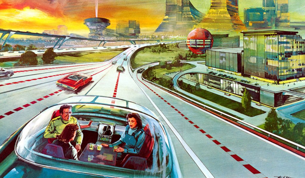
Old image from an advert above by America’s Electric Light and Power Companies from the mid-1950s. Available at: http://transpressnz.blogspot.com/2010/11/days-of-future-passed.html
The issue was that the world they built served little pods, and only little pods. Public transport waned, the suburbs sprawled out, previously favoured urban centres entered decline in favour of spread-out box stores and shopping centres. Every street was converted to modern standards to try desperately to speed up the motorcar which just kept getting stuck in traffic, while more and more public space was given over to them to try and alleviate congestion; for much of the population car dependency was born.
Car dependency (not cars in general) is just another idea of a future, one that we tried, and one that hasn’t panned out.
We can keep our cars, you can personally keep driving everywhere if you like! But its time our streets were designed a bit more sensibly to accommodate all users, and to not force people to drive who can’t or just don’t want to.
It is time that we re-thought the function of streets and roads, realising that the “street” is a destination first and a thoroughfare second, while “roads” are high speed corridors between spaces. It is time that we stopped perusing the smooth flow of just one type of vehicle at the expense of all others. It is time we evaluated whether we all really do just love our cars that much, or if in fact what we actually love is the freedom they afford us. It is time we ponder if and how that freedom could be achieved in other ways.
And most of all it is time we stopped pandering to prevailing myths about car dependency, traffic, and congestion.
Making a commitment to accommodating active travel involves a need to look beyond short-termism, old conceptions of congestion relief, and the convenience of being able to park in an unprotected bike lane whenever you like. It will take time to develop a critical mass of adequate infrastructure and encourage modal shift, it is not a quick fix but an ongoing and active effort to value personal mobility beyond the car.
Even well designed streets are the result of a process of continual review and redesign which is ongoing. By the time the UK looks anything like the Netherlands does today, the Netherlands will surely look vastly different. This is not about swapping out one fixation with another, it is about adopting an attitude of enlightened design.
Urban fabrics have never been static and are always engaged in a cycle of re-use and repurposing depending on the demands of the day. The urban fabric we’re used to in the UK is not the way it has always been and is certainly not immutable, it is time to re-examine how we allocate space and ask what values we would like to embed with this era.
Some Important Points to Keep in Mind
Intended Speed vs The Design Speed
There’s an old concept in road design that wider lane width and lack of obstacles is directly tied to increased safety; that it gives drivers a greater margin of error for minor mistakes and reduces the chance of a head on collision.
This idea is based in sound logic; you need some margin of error to be able to make small mistakes without crashing, the punishment for a slight twitch on the wheel should not be injury or death. However, after a certain point increasing this margin of error the effect on safety begins to move in the opposite direction.
Separating oncoming lanes does reduce the chance of collisions if the vehicles are already travelling at high speeds, you’d certainly never build a motorway without physical barriers between traffic directions. However at lower speeds it encourages drivers to drive faster because they feel safer going faster.
The same goes for other obstacles; if the road is grade separated and designed for high speeds then yes, having a line of trees at the side could be disastrous, but for anything at lower speeds you are likely to simply make drivers feel safer and driver faster. The more clearance and error margin you give drivers the more comfortable they will be driving at higher and higher speeds, at a certain point this begins to eat any safety gains you got by clearing the route in the first place.
The speed at which an average of motorists would potentially feel safe driving at is referred to as the design speed of the road. There’s no specific formula to determine the design speed but there are various ways designers estimate it.
One way you can think about design speed is to imagine a world in which speed limits didn’t exist, in which we were all urged to use personal responsibility to judge the risks for ourselves much like the UK government’s current Covid-19 policy. In such a world, what speed would people drive at on a particular stretch of road? What feels safe? What could you get away with if it was quiet? How do you estimate others would act? This is the design speed.
Modern traffic engineering should in principle consider the design speed of the road as well as the intended speed, and should add or remove obstacles based on this. One of the most prevalent mistakes in UK road design was, and still is, to take actions which increase the design speed of the road in the name of safety and assume the posted speed limit will be enough to enforce safe speeds.
“Many of my engineering colleagues will reply that they do not control the speed at which people drive – that travel speed is ultimately an enforcement issue. Such an assertion should be professional malpractice. It selectively denies both what engineers know and how they act on that knowledge.
For example professional engineers understand how to design for high speeds. When building a high speed roadway, the engineer will design wider lanes, more sweeping curves, wider recovery areas, and broader clear zones than they will on lower speed roadways. There is a clear design objective – high speed – and a professional understanding of how to achieve it safely.
There is rarely the acknowledgment of the opposite capability however; that slow traffic speeds can be obtained by narrowing lanes, creating tighter curves, and reducing or eliminating clear zones. High speeds are a design issue, but low speeds are an enforcement issue. That is incoherent, but it is consistent with an underlying set of values that prefer higher speeds.”
Charles L. Marohn Jr (2021) Confessions of a Recovering Engineer: Transportation for a Strong Town. Hoboken, New Jersey: John Wiley & Sons, Inc. pg 6
An example of the detriments of a high design speed is the Barrhead Road, a typical main road with a posted speed of 30mph (48kph). It features a range of features which increase its deign speed above this, all of which have been or will be discussed in this post, namely the use of pedestrian barriers to compensate for pavements that are too small, large turn outs for turning lanes, wide clear zones, and lack of obstacles. All of which come together to increase the design speed to something way above 30mph.
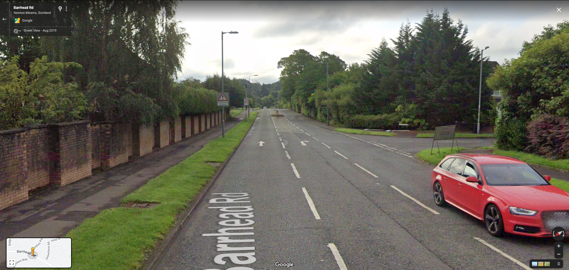

In early 2021 a car travelling in excess of 100mph (160kph) sped westbound down the hill and almost made it around the corner before mounting the clear zone near Balgray Road, and launching itself into a house on the corner (number 1 Balgray Road). The car smashed through the bottom of the house destroying most of the ground floor. Luckily no one except the driver was injured, everyone inside was apparently upstairs sleeping at the time. The house was almost condemned but was able to be repaired and is now up for sale.
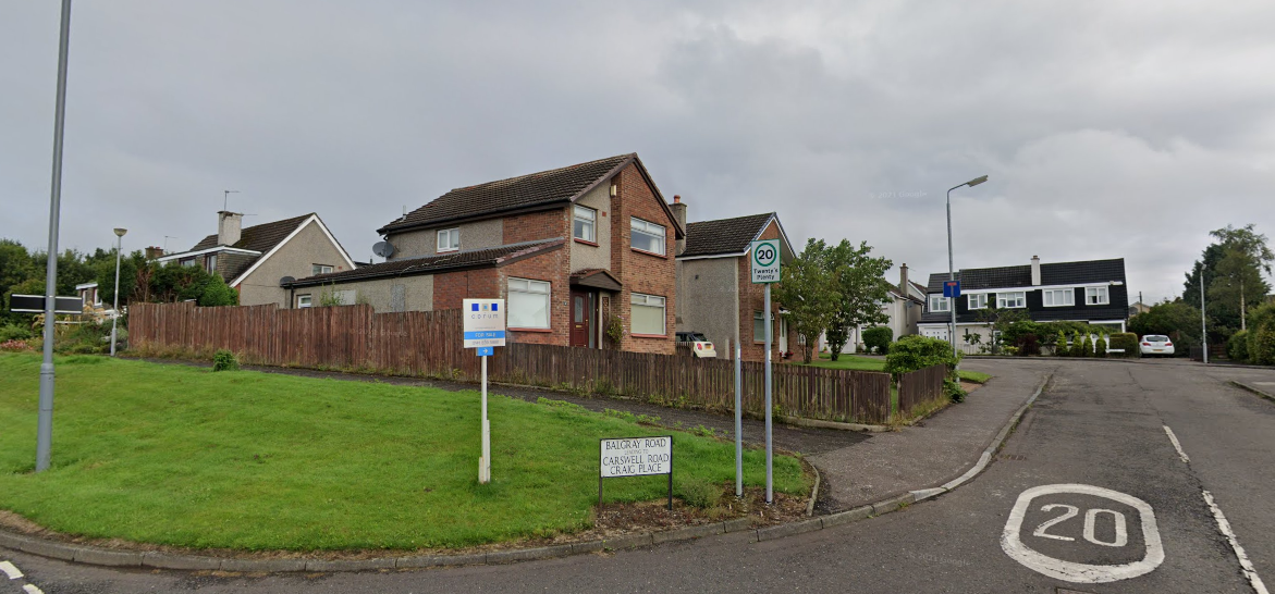
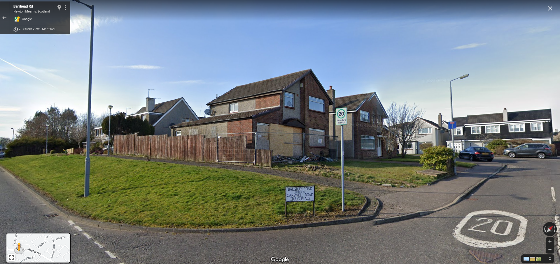
A road like this should be designed in accordance to this speed. It should never have been physically possible for someone to reach 100mph and turn their car into a torpedo. And yet, after such a dramatic incident, absolutely no action was taken to prevent something like this happening again.
In countries like the Netherlands, after every major crash or fatality occurs, a comprehensive design review is performed to ascertain why and how the crash happened. It is acknowledged that safety is influenced by the physical design of the road, and often redesigns are performed to prevent the specific incident happening again. This rarely happens in the UK, traffic crashes are attributed to the personal behaviour, and personal responsibility alone.
Its actually a pretty mediocre bike lane.
OK look, I know I’ve been signing the praises of this bike lane on the Ayr Road, and there are things ER council genuinely got right.
However, in may respects it only warrants such praise because the bar is so incredibly low to begin with. Rolling it back would be bad but that does not mean it is in any way perfect.
If I’ve got you to read this far, I assume the argument in favour of providing proper infrastructure for multiple modes of travel and good street design benefiting everyone has been illustrated, even if you find you still disagree on the points. By talking about problems this case study still has and by looking at more examples I can hopefully get you to build on this idea and begin to re-imagine how streets could be redesigned, how space could be optimised differently, with relatively little effort.
So lets talk a bit about what they got wrong.
Bike Lane width
If you use something like Google Map’s time travel tool you’ll see that the bike lane used to be smaller than it is now but even at its current width it’s not really big enough. In addition, the posts have been bolted on the inside of the painted line reducing its with further, perhaps because they can’t be secured on the paint itself.
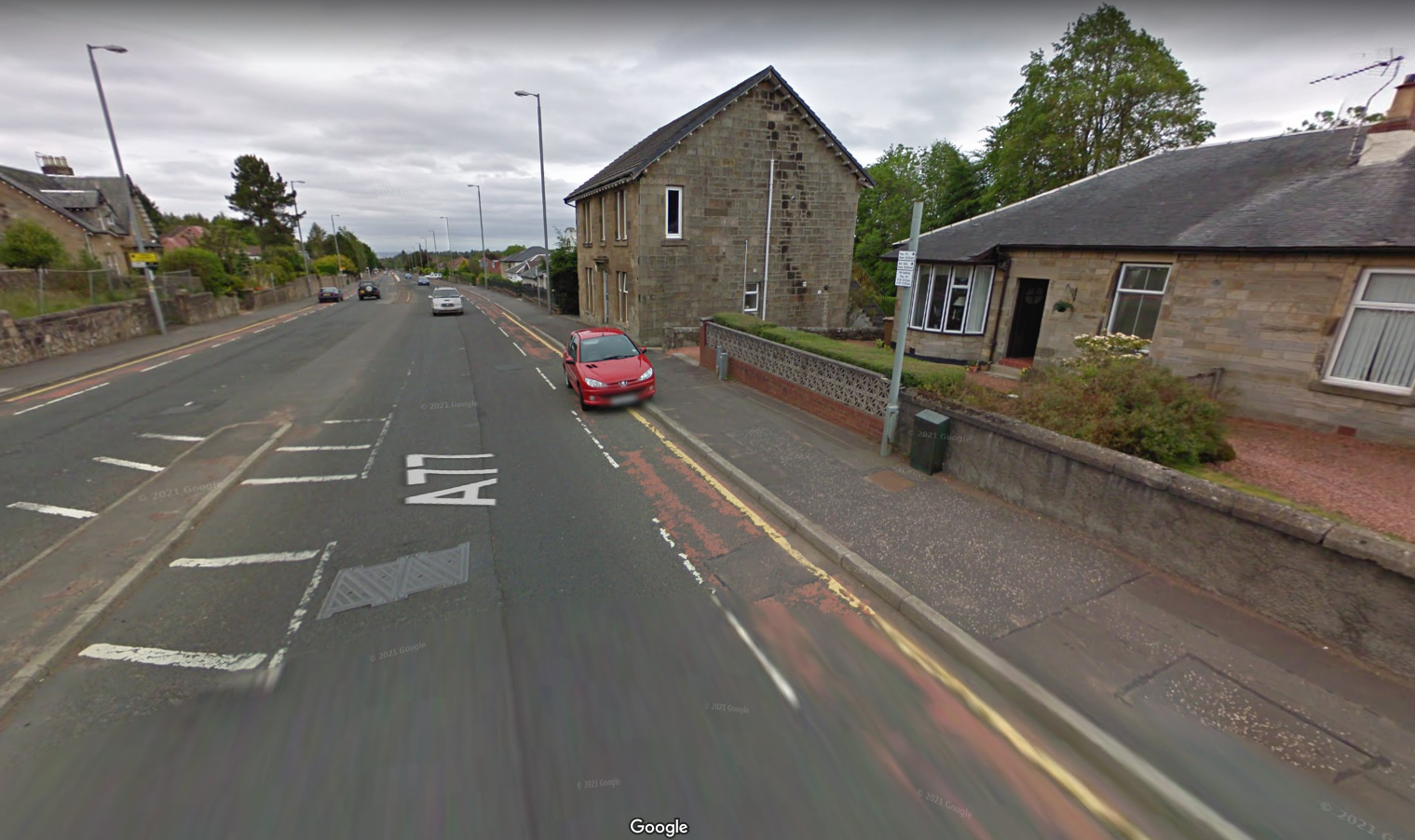

The base of the bollards isn’t that big, maybe about 40cm across, but this can make a difference when the total lane width is only about 1 meter to begin with. In addition, the height of the bollards mean that you can’t swerve as close to them as you could with smaller ones given that the profile of a bike and rider is top-heavy.
Having wide bike lanes isn’t just about the ability to overtake, if the lanes are wider there is a dramatic improvement for safety for cyclists and boosts confidence because there is more space between you and the cars, all for the sake of about 50cm or so.
Central reservation and gutter
Almost the entire length of the Ayr road includes a central reservation created with a kerb area for physical separation, and a painted hatched area to enforce a recommended safe distance.
The presumed reasoning for this is that the physical kerb protects the minimum safe distance between lanes and will protect the driver should they accidentality veer over, while the hatched area represents the optimal safe distance plus a margin of error. In addition, the central refuge provides pedestrians with a “safer” way to get across, although I personally do not feel particularly at ease standing on a plinth between two lanes of 40mph / 65kph (or faster) traffic because the road is too wide to traverse all at once.
This design was implemented when the road was reduced from four lanes to two and presumably seemed the safest option given the speed limit remained at 40mph (65kph). However the result is a road with a design speed far in excess of 40mph. This can be evidenced by the fact that many people could be found travel along it quite happily at 50mph (80kph) and even now, few people stay at or bellow 30mph.
If this were to be redesigned properly, the two lanes should be pushed closer together, eliminating the hatched area entirely and perhaps removing the central reservation entirely. This is not about making the road ‘less safe’ for the intended limit, but about making it less safe to exceed said limit, there is no reason to be travelling at motorway speeds on a supposedly residential street.
Of course by eliminating or at least reducing unused space in the middle of the road you then have ample space to put in a proper bike path, better bus stops, and maybe even some parking.
In fact, Fenwick Road, which the Ayr Road turns into, demonstrates this. Despite having many of the same problems as Ayr, Fenwick road has a minimal central reservation and wider bike lanes.
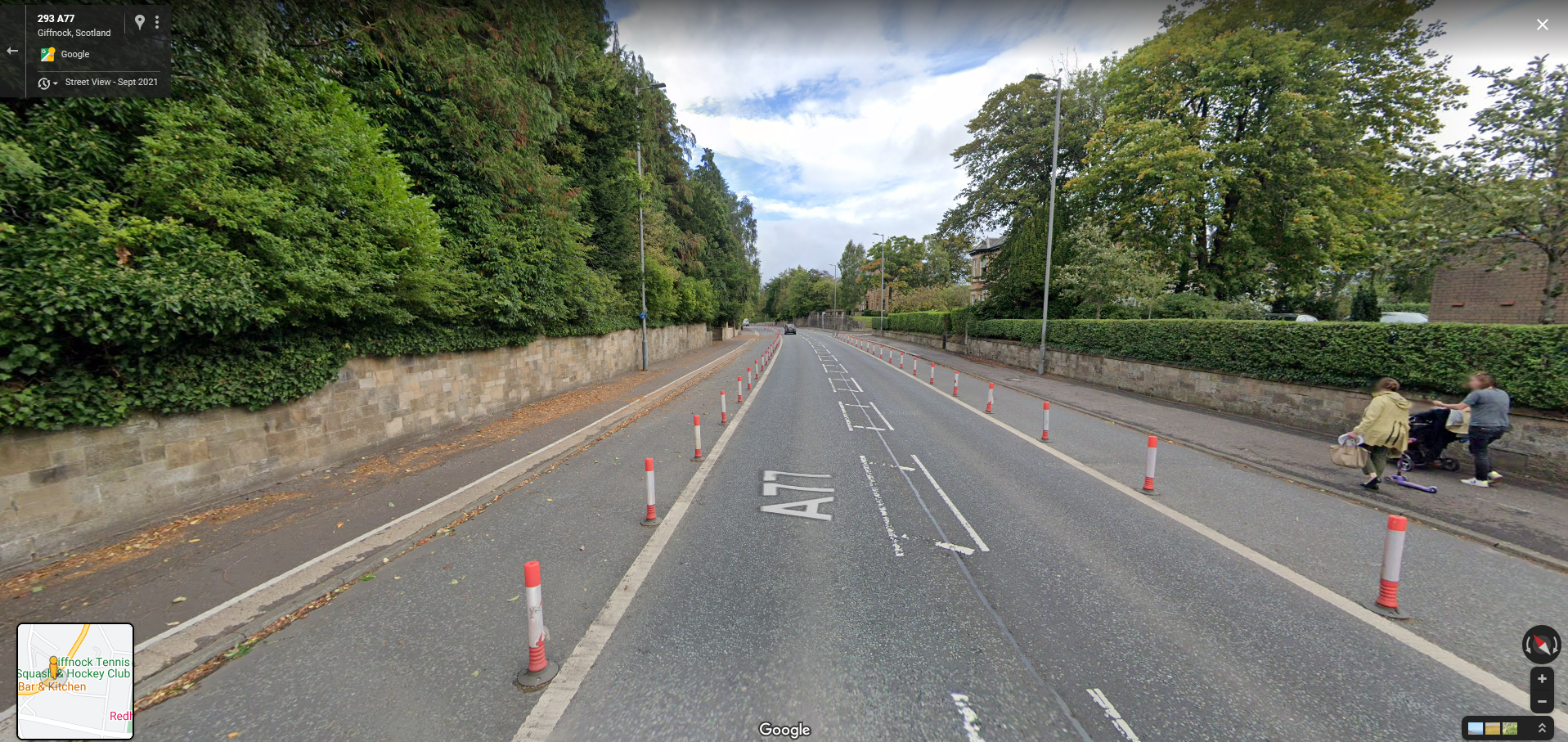
I would argue that this is still very far from being safe but serves as a great demonstration of how much space the Ayr road is wasting and how much could be reclaimed without affecting throughput at all.
Bike lane crosses turning lanes
At intersections the bollards have been placed in such a way as to preserve as wide a turn out as possible. That means that the rider is exposed to potential turning vehicles for longer and have to contend with cars turning as faster speeds.
At the junction next to Whitecraigs station a left turn lane forms out of the parking lane, separated by a side road turn out. The bike lane continues straight ahead into the cycle box. This means that traffic turning left has to merge across the cycle lane.
Presumably the designers of this layout believed it was better to keep the bike lane moving straight, allowing cyclists to maintain their speed and not have to turn. Perhaps they patted themselves on the back for their ingenuity getting a turning lane ‘for free’.

Incredibly dangerous, turning lanes that cross bike lanes create a concentrated conflict point between cyclists and cars meaning both parties have to anticipate the other’s movements to prevent side-swiping. In addition, it makes cyclists pull up between two lines of cars which is uncomfortable and risky.
These types of merges are prevalent in the US and are the bane of bike infrastructure advocates, it would have been better to merge the bike lane left into the space left by the parking lane, and putting the turning lane on the right.
There’s a gap on Fenwick Road
This is less a criticism of the project itself, which as I understand was never going beyond the finish point on Fenwick road, but a criticism of a lack of joined up thinking more generally speaking between Glasgow authorities.
When the large bike lane on Fenwick Road reaches a junction with Church Road it stops and turns into a ‘sometimes bus lane sometimes parking lane’.

It stops completely later on and isn’t present through much of Giffnock, despite the area being a more residential and commercial area and containing a school.
This whole area is a bit of a mess. Even driving through it is uncomfortable and confusing. The road fluctuates between being a four lane road, to sometimes three, swapping sides frequently, sometimes it has parking and sometimes not, at some points there are as many as five turning lanes and parking.
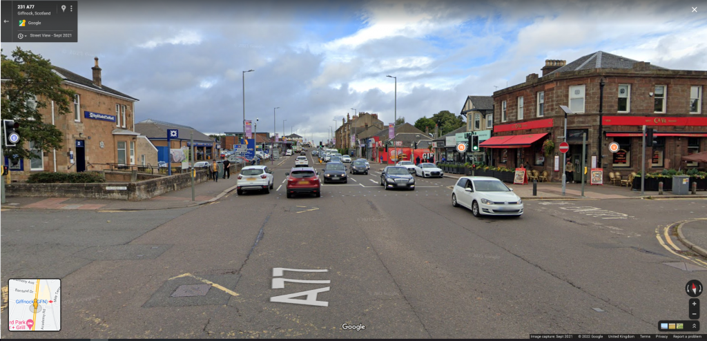
Finally, at the Giffnock Police station, the bike lane reappears. In total this gap is only about 500 meters but the area is congested and messy enough that it doesn’t matter.
Having to navigate a number of large difficult junctions and areas lined with pedestrian fences is enough to definitely put you off before you reach the measly bike lane at the other side. This bike lane, despite offering little, carries on until it reaches the edge of Shawlands.
If this area, which involves a density of housing, shops, restaurants and a school, would be made safer and more pleasant, then it could create a path directly from the Shawlands area all the way to Newton Mearns. It feels like an oversight that for the sake of 500 meters this utility has been missed out on.

The junctions and roundabouts are still really bad.
The Eastwood Toll is a large two-lane roundabout connecting the Ary Road and the Fenwick Road. Measuring about 65 meters across, its four adjoining roads have curved entrances and exists and all connect with two lanes in either direction. If there was a specification for a “high speed roundabout” this would qualify.
Naturally, there is no cycling provision but to add insult to injury, the bike lane does not even formally end as it approaches the roundabout, the paint just kind of.. stops.
On one section of pavement approaching northbound there is a blue “shared path” sign, implying there is some idea that bikes should mount the pavement when the lane ends and use that to navigate round. However, aside from this sign there is nothing else to indicate this is what you are supposed to do, its possible the blue sign is just there for bikes exiting Eastwood Park.
Here is where the bike lane ends as it approaches from the south. Note the care homes on the left and the fact the lane shrinks to be too small to fit even the cycle stencil inside of the lines.
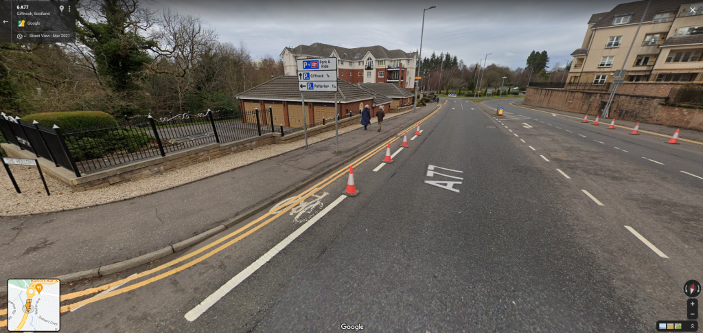
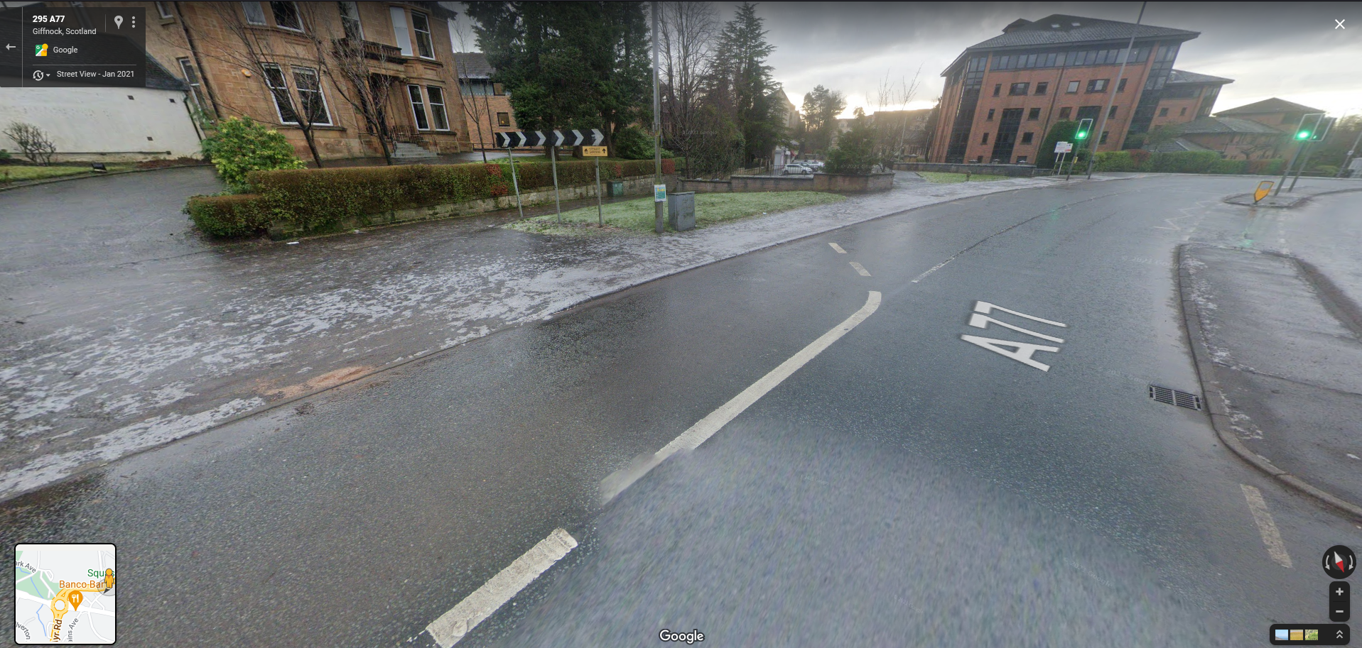
And here is how the bike lane ends on the southbound, about 200 meters travel distance from the roundabout. Is the intention that cyclists should turn into the pavement here?
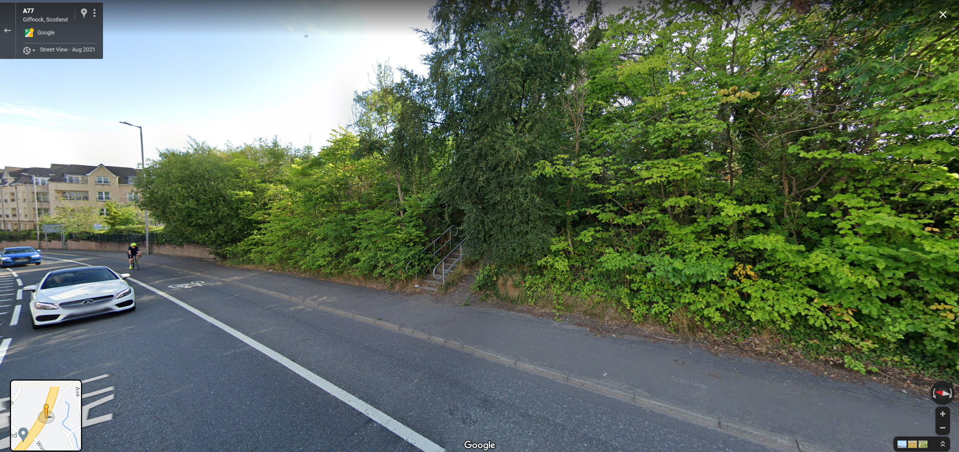
If you do, you’ll head down a pavement and straight into people exiting a barber shop, you can then cross the four lanes of the Eastwoodmains Road, navigate through some winding streets, until you reach the top of this overgrown staircase in the second image, about 180 meters from where that bike lane actually starts.
If this is indeed the intention of the route planner then I would suggest it is a bad one.
Pedestrian Barriers are Not For Pedestrian Safety
Sometimes called ‘guard rails’ or just ‘fences’, pedestrian barriers are ubiquitous in the UK. Most people assume their purpose is to protect pedestrians from collisions in areas where they cannot easily be avoided.
What most people don’t realise is that these barriers crumple like wet paper on impact, they provide minimal impact resistance. An observably large number of stretches of these fences have dents or other minor damage which some might assume is from signifiant crashes, however most of these dents come from low velocity impacts or large vehicles simply backing up too far and not noticing they had even made contact.


Compare this design to the crash barriers used on motorways and other vulnerable areas; those barriers are much lower to the ground because a crashing vehicle is best stopped by controlling the centre of momentum closer to the wheelbase. They are continuos corrugated strips attached to the ground by poles on the opposite side of the impact area, this means that on impact kinetic energy from the vehicle is redirected horizontally and spread along the direction of travel, decreasing the chance of the vehicle overpowering the barrier.
This is a clever and cost effective design, and very different from the spinally, hollow tubes found on pedestrian fences, loosely connected to each other and the ground with often just a single bolt.
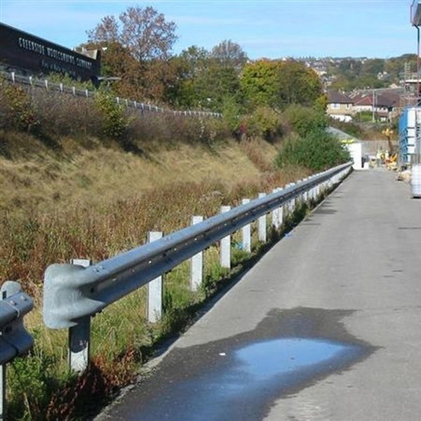
The design and ergonomics minded among us will also note another subtle aspect of these fences; they’re not tall enough to fully protect pedestrians if, for instance, shrapnel from a crash comes over or a wide vehicle gets too close to the edge. However, they are tall enough that even a tall adult will struggle to climb over in a hurry. This is compounded by the vertical struts which stop you being able to get a purchase and are placed close enough together that you cant fit a foot between them.
The reason for these features is simple; the main function of pedestrian barriers are to prevent pedestrians from crossing at certain points where they would impede cars, straying too close to the edge in areas where the speed is too high, or leaving the pavement where it is too small.
This is useful in allot of places, for example when you have a path connect to a road on an incline, it stops any loose prams or people running from accidentality running straight onto the road. However in the majority of use-cases they are used on corners and high-streets where the pavements are too small and there is a ‘risk’ pedestrians will try to use the space allotted for cars. When you have squeezed as much road space as possible to try and make cars go faster and have none left for people, those people get penned into ‘their’ space.
These barriers are traffic control for people and compensate for bad design, there are very few instances where they are actually necessary because of some geographical feature or other.
Pedestrian barriers are not to protect you from cars. They are for protecting cars from you.
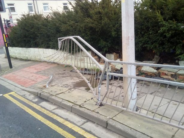
Haggerty, G. (2018) Damaged Pedestrian Barrier after Van Crash. Available at: https://www.grimsbytelegraph.co.uk/news/van-crashes-through-pedestrian-crossing-1213818 (Accessed: 24/03/2022)
Pedestrian Cages Reduce Travel Convenience for All
An extension of the idea that pedestrian barriers are for the benefit of drivers and not for pedestrians; very wide / fast roads, badly designed junctions, and other features designed to try and squeeze as much capacity and speed from cars as possible, bring with them a feature that I like to call Pedestrian Cages.
Sometimes called ‘staging areas’ or ‘refuges’, these are areas in the middle of the road that split a crossing in two with two stages. Often the two sets of lights and crossing points are separated to avoid people trying to go straight over. These are typically surrounded on all sides with pedestrian barriers and almost always require you to wait for quite some time while traffic whizzes by.
I like to call them ‘cages’ as you feel penned in, the second priority, sitting tight in your special box to give the important traffic maximum time to pass.
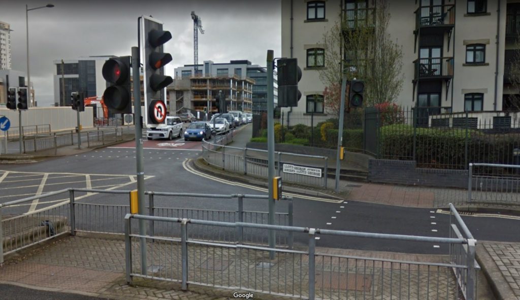
Pedestrian cages often require users to move in strange ways because the entrances are not in the same position or becuase they are built on some other strange set of road geometry to, and they are frequently chained together meaning you have to cross multiple times. While these crossings make attempts at being physically accessible, the need to stop and turn frequently and to stand and wait in small areas decreases their accessibility overall.
People do not behave like vehicles; the more difficult it is to cross the street, the more likely people simply wont, decreasing the amount of people choosing to simply exist in an area. From a commercial standpoint, street spaces with amenities on both sides decrease the number of spontaneous consumer interactions lowers due to the effort to cross over.
Cars need a lot of infrastructure to work and staged crossings / cages are part of that, they are features that increase the amount of equipment needed for an area with minimal to no proportionate benefit, all for the sake of a bit more speed or a bit higher capacity. This can result in large areas covered in asphalt, fences, poles and lights which is not only not aesthetically pleasing but are environmentally damaging as well.
There are also cases where pedestrian cages are used to justify a more hostile street design, people walking are forced to use them with the effect of actually slowing down traffic due to the lights being used to cross so often; if people could cross more easily traffic would not have to be stopped so frequently.
While writing this post I came across the bellow tweet purely by chance, but I think it’s really illustrative of what a lot of our urban areas in the UK look like. John asks “Where am I?”, a difficult question to answer, as they really could be anywhere.
In pursuit of speed, every other requirement this junction might have is compromised, including capacity. In Confessions of a Recovering Engineer, Charles Marohn explains that engineers’ obsession with speed is a holdover from the early days of traffic engineering, a field which is young enough some of it’s early practitioners are still alive.
He explains how at the turn of the 20th century there was already a strong road network, mostly made of gravel or dirt tracks, sometimes paved to no particular standard. One of the fist things traffic engineers did following the brief to increase automotive mobility, was to pave the roads, make them uniform, and remove obstacles creating speed gains which were directly correlated to mobility gains. In other words, they figured out that speed = mobility = efficiency and that value has been embedded into the practice since.
If you ask most people which they would choose in a trade off between speed and capacity for a given road, almost all will say capacity. After all, what’s the point of taking 30 seconds off of the travel time only to get stuck in traffic? Yet the embedded value placed on speed results in messy, inefficient layouts like this which only deliver benefit at non-peak times and make everything else worse for everyone.
Roads, Streets and Str-odes
Marohn and the Strong Towns foundation define a Road as being a high speed connection between two places, its primary purpose to be the movement of people with few entrances and exists. A motorway is the ultimate expression of a road. A Street is defined as being a space for communities to build wealth, unlike roads, streets are destinations first and de-prioritise throughput, having slower speeds, lower car capacities. Streets are spaces for people to be and exist, cars and other motor vehicles are guests.
A Strode is a street-road hybrid which purports to give the speed and capacity benefits of a road, with ll the community wealth benefits and amenities of a street, but in trying to do so fails at achieving either.
Strodes are mini highways that plunge through communities, they are dangerous; being often built like motorways they allow individuals to reach alarming speeds when clear, but most of the time they are also completely congested creating wall-to-wall gridlock. Strodes are hostile to people outside of cars but they are also pretty unpleasant for people inside cars too. Strodes are a failure of separating concerns, to the detriment of all of their users.
Here is example of a particularly nasty strode in Darnley, an area that is residential but has pushed aside most other things to make way for big box stores and car infrastructure. It is covered in asphalt, pedestrian fences, and lights yet still does not deliver signifiant speed or capacity.
I recently found myself on it while attempting to cycle to the Silverburn shopping centre. Having to walk my bike along the pavement, the yellow line indicates the route I had to take, the red blobs are where I had to wait, each wait being out of sync meaning 2 minutes at each.
At one section I had to cross to a mini island and wait for another set of lights to change as the turning lane had been given priority separately from the forward lane, another capacity increase effort.

I appreciate the image quality is not great but you can view this link instead and imagine trying to, for example, visit the local shops from the housing estate.
This whole effort could have been avoided with the use of simpler crossings further away from the junction, however the design ethos of the road was to minimise the amount of time each lane had to be stopped, meaning pedestrians are forced to move in keeping with the cycle of the cars. More individual crossings for pedestrians means fewer lanes for cars blocked at any one time, the pedestrian’s journey can be cut up to give more priority to cars.
This type of infrastructure pretends to cater for pedestrians but in actuality treats the existence of them like a pest, by only allowing you to cross when it can be absolutely assured no cars can be given priority instead.
The Other Case Study
If all this has you thinking “even when we do get it right in this country, we still get it wrong” then let me offer a look at what things could be, with proper planning and proper design.
Shawlands is another sort-of-suburban area closer to the city, it has a mixture of low and medium density housing and connects to the Ayr / Fenwick road as the Kilmarnock road.
Shawlands is a different area than Newton Mearns but is quite similar in terms of street design, setbacks, and layout, featuring a similar mix of housing types and density.
As a demonstrator of this mix, the first image bellow is Glasserton Road, a low density street, lined with detached and semi-detached houses with big gardens. The second is Clarkston Road near to Cathcart station, a mixed use development with amenities and flats and, according to Google, is a 7 minute walk away from the first image. If you are unfamiliar with UK cities this type of mixed zoning pattern is pretty common.


For extra context, here are two streets, each about a 10 minute walk from the Ayr Road in Newton Mearns. The first two images are of the same position on Kings Drive looking both north and south, the second is Broomburn Drive, which is the next street over.
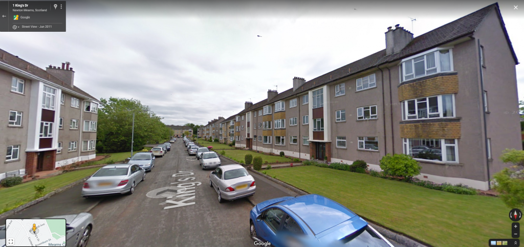
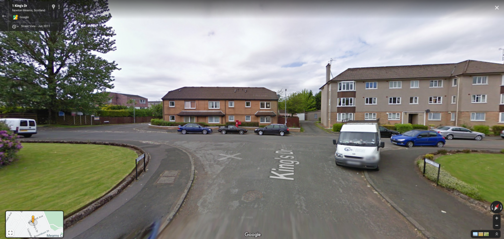

This is obviously different to Shawlands, but the point is to illustrate that Newton Mearns has even more space and wider, more flexible roads, so therefore has even less of an excuse for making bikes and cars alike struggle for space.
Our case study is the Victoria Road, a dense single-file road which leads from Victoria Park into the city via the Victoria Bridge (but also connects to the Crown Street Bridge).
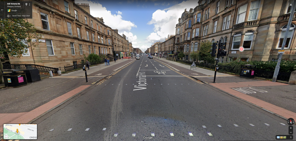
While this is a very different type of road given the surrounding environment and traffic expectations, it has the same theoretical capacity as the Ayr / Kilmarnock Road; one lane in each direction and turning lanes. It has bus stops which inline with the lane and it has high quality bike lanes on either side for each direction of travel.
As the Ayr Road turns into Fenwick Road which turns into the Kilmarnock Road, it then turns into the Pollokshaws Road. The Pollokshaws road is a 6 minute walk from the beginning of Victoria road at the point of the image above, the two converge at Eglinton Toll and diverge again into the city.
It is home to the South City Way project, a fully grade separated bike path that follows some design decisions so good its almost Dutch. It’s certainly better than a lot of the “Cycle Super Highways”; the mediocre bike lanes which London calls acceptable.
How it Used to Look
This is a view of Victoria Road in 2015 looking south towards the park, about 100 meters down the road from the position in the above image, where Albert Avenue joins it on the left.
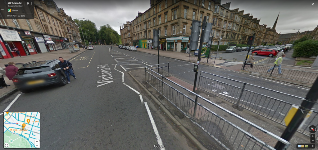
Note the range of bad design features:
- Pedestrian barricades to restrict crossing points.
- Pedestrian cages with two sets of lights making crossing the road an effort.
- Road is too wide and fast to safely cross without using the lights increasing pedestrian journey times and increasing the number of times drivers will be stopped at the lights.
- Wasted gutter space in the middle is necessary to maintain the design speed but serves no one.
- Zig-zag lines are necessary to slow and re-centre vehicles as the approach the crossing which takes up space that could be used for parking and other uses.
Throughout this article I have put a driver-centric point of view in many of my arguments, this is a deliberate attempt to really drive home how good street design benefits everyone, including drivers, and to try and pre-empt some expected objections.
Notice how this road layout impedes almost everyone, including motorists with the lack of parking provision, all to make way for through speeds that are as possible.
This is a street, like so many others, that has been pushed aside to make way for people in cars to pass through with as little inconvenience as possible. When streets are designed around throughput they are effectively saying “this destination is not as important as peoples’ ability to pass it by”. This is not a place to go, it is a place to get around.
Here is the same street location looking both north and south from 2020.


A marked improvement in so many ways for all users, including drivers.
I said before that what’s really interesting about this project is how simple the adaptations were, and yet how transformative the effect is.
Victoria Road in 2015 looks just like so many other roads in the UK and especially around Glasgow, its not particularly special apart from the connection to Victoria park at one end. It provides a concrete example of what this kind of adaptation could look like while (at least for the time being) maintaining the current level of car through-put and parking, if not increasing it.
Lets look at what these features are and how they work.
What the Victoria Road Gets Right
Continuos Protected Bike Path
The first and most obvious thing is the continuos protected bike path running on both sides of the road. Unlike the Ayr road, these are physically separated by a kerb meaning that unless a car drives directly at them or is going at speed, it will not be able to mount and veer into the bike lane.
The bike lane is not as wide as the modern standard but is still more than enough to be comfortable riding in, and more importantly, it is consistent and changes with gradually at points where it needs to.
The surface is smooth asphalt instead of slabs and there is clear delamination between the bike path and the pavement.

Grade Separated at Pavement Level
Bike paths at pavement level are far superior to those at road level, they are easier to get on and off and they wear better because the entire path is raised instead of a free standing kerb.
This is another thing that the Cycle Super Highways get wrong; some, particularly the older ones, still fundamentally think of a bike as a small, slightly vulnerable cars instead of something between a car and a pedestrian.
As a result they opt to put the bike lane at road level with a kerb between the road and the bike lane which introduces a number of issues but primarily they minimise the ability for users to get in and out and means that any break in the kerb exposes the lane to the road.
They almost get the idea right; that bikes need protecting from cars, but they still have the bikes at road level and frequently expose them to car infrastructure features.
Large Pavements Preserved
Its uncommon but not unheard of for cycle projects to take space from the pavements to supply extra infrastructure like bike paths (because re-designing the car space is clearly unthinkable).
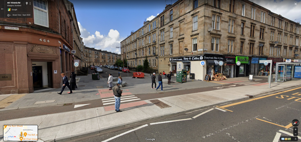
For the most part the pavements are wide enough to get two wheelchairs past side by side and never too narrow to get at least one through. There’s even enough space for some alfresco dining although I’m not sure what the permit situation for that is at the moment.
Good Use of protective ‘Islands’ and Push-Outs
A continuation of the topic of grade separation is that the Victoria Road employs excellent use of “Islands” or “kerb Push Outs” (I’m sure they have a proper name but I don’t know what it is).
These are the bits where the pavement sticks out for bus stops and pedestrian crossings, allowing the bike lane to pass through. This is another thing that London’s Cycle Super Highways get wrong a lot.

The islands give pedestrians a way to safely cross the bike lane with ease, to focus on the car lanes, and get them as close as possible to their destination (the bus stop of the other side of the road) before crossing meaning they can take more time or even cross without having to use the cross button, thus actually speeding up traffic.
The Islands are wide and well maintained, at bus stops they raise up to meet the bus to decrease the step (I don’t know if they are fully step free), and they’re long enough that people can move organically and spread out. The design isn’t just big enough for whatever feature it supports, it acknowledges that people will naturally try and take a direct path to where they need to be and will not necessarily follow the determined route.
As an example of push-outs being used incorrectly, take this junction near Aldgate East station on CS2 in London. This is somewhere I used to cross a lot as a pedestrian to get to bus stop H on Commercial Road.
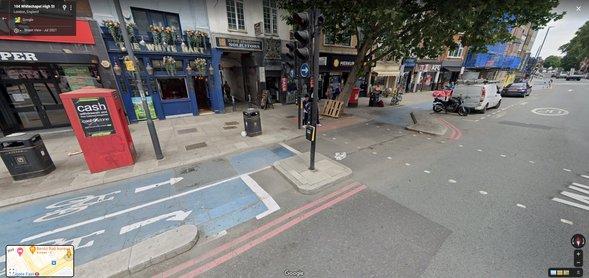

Its not entirely clear to some people where they are supposed to stand while waiting. Pedestrians are supposed to stand back where the bin and tree in this image are, yet many will want to stand between the bike path and road given the roads massive size and limited viability.
This results in some awkward movements and milling about as some try to stand in the unprotected middle section, some try to squeeze onto the square island with the button, many stand in the bike lane itself.
All of this awkwardness is the result of the fact the kerb edge is too small and the bike lane is not at the same grade as the pavement. The kerb starts and stops and often isn’t big enough to stand on yet sometimes you’ll find yourself on it none the less. From my many commutes late at night crossing here, trying to be mindful of where I should and should not stand, while also trying to get as close to the road as possible so as not to be caught out by the short crossing times, the most generous I can describe this areas is “confused and confusing”.
Then there is this bike turning lane for cyclists turning left. You can see what they were going for with the turning lane and “beg button”, but these are poor compensation attempts for the fact that this road and junction are just too big, to messy and haven’t actually been redesigned at all.
Where are you supposed to go once you turn right on your special bike turning lane? There certainly isn’t another bike path to catch you at the other side. The road designers don’t really know either.
Desire Paths & The Expectation that Pedestrians Act Like Cars
You’ll have seen ‘desire paths’ before, these are where an intended route has been built but requires people to move in a way that is not intuitive, takes longer, or assumes the wrong destination, and so the people using it tread out a new route that is more natural.
Very often this involves the assumption that pedestrians will act like cars and follow a dedicated path, even if it involves an indirect detour, for the sake of avoiding conflicting traffic flows. An example of this is suburban feeder streets which often deliberately wind around and have awkward entrances to side streets; a more direct route is possible but it’s not detriment to cars to go 500m or so further. This is done to make through running (or “rat running”) inconvenient.
Where pedestrians and bikes are concerned this is an inconvenience because a loner distance to walk is just more energy expended. Bike and pedestrian traffic can flow in and out, merging and weaving in very complex patterns, they do not need to be flow controlled nearly as much as cars.
Here is an example of bad pedestrian deign and desire paths from near my parents at Patterton station. Note the desire path on the side of the entrance where pedestrians have walked over the grassy verge. Most of the foot traffic approaches the station travelling north-east and yet there is no pavement on that side entering the station.
The majority of foot traffic is expected to pass the station crossing the entrance, turn round, skim the long way round the drop off zone, and then walk back along to the platform entrance. The route is indicated by the first image bellow by the yellow line. This is extra insulting if you would then have to walk along the platform length again to get to the overpass to reach the other platform.
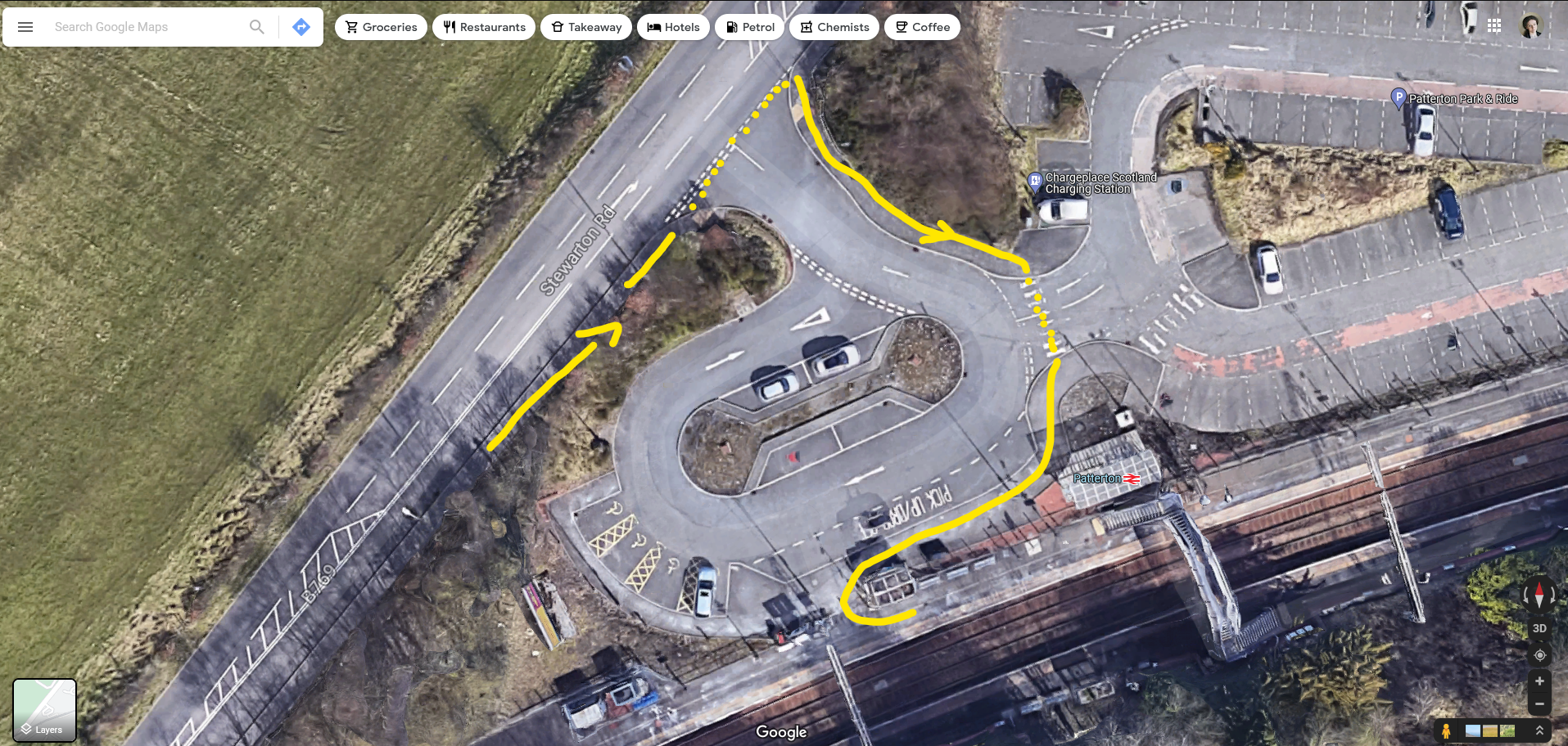

The second image in that set shows the actual route the vast majority of the traffic takes, walking on a small dirt ledge, through the cars, over this middle reservation thing, and into the station.
Its so accepted that the design is bad that almost all the drivers anticipate pedestrians and will stop and watch out for you. I would love to talk to the designers who implemented this in about 2009, did they really expect this not to happen? Did they really expect pedestrian traffic to happily act like vehicles and take the long route round?
Perhaps they thought there would be so much traffic moving round the drop-off zone that pedestrians had to be kept away from that area, in which case why make them cross over the entrance?
On Victoria Road it is incredibly pleasing to see the push outs offering buffer space, multiple zebra crossings with the accessible texturing, often joined with other features. This enables foot traffic to move dynamically, entering and exiting from a range of directions and rarely having to travel unnecessary distances. This reflects the varied ways in which people actually move and reduces potential conflict points.
For example, the second and third images here show a bus stop which turns into a street crossing and an entrance to a traffic-calmed side street. There are bike racks, bike-share racks and alfresco-dining coffee shops on the corner .
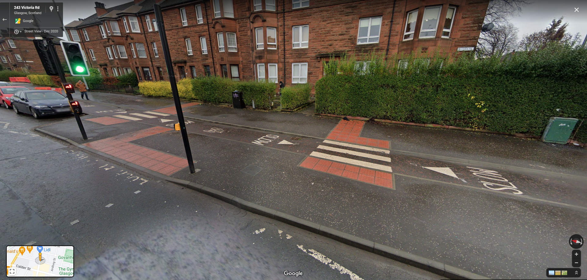
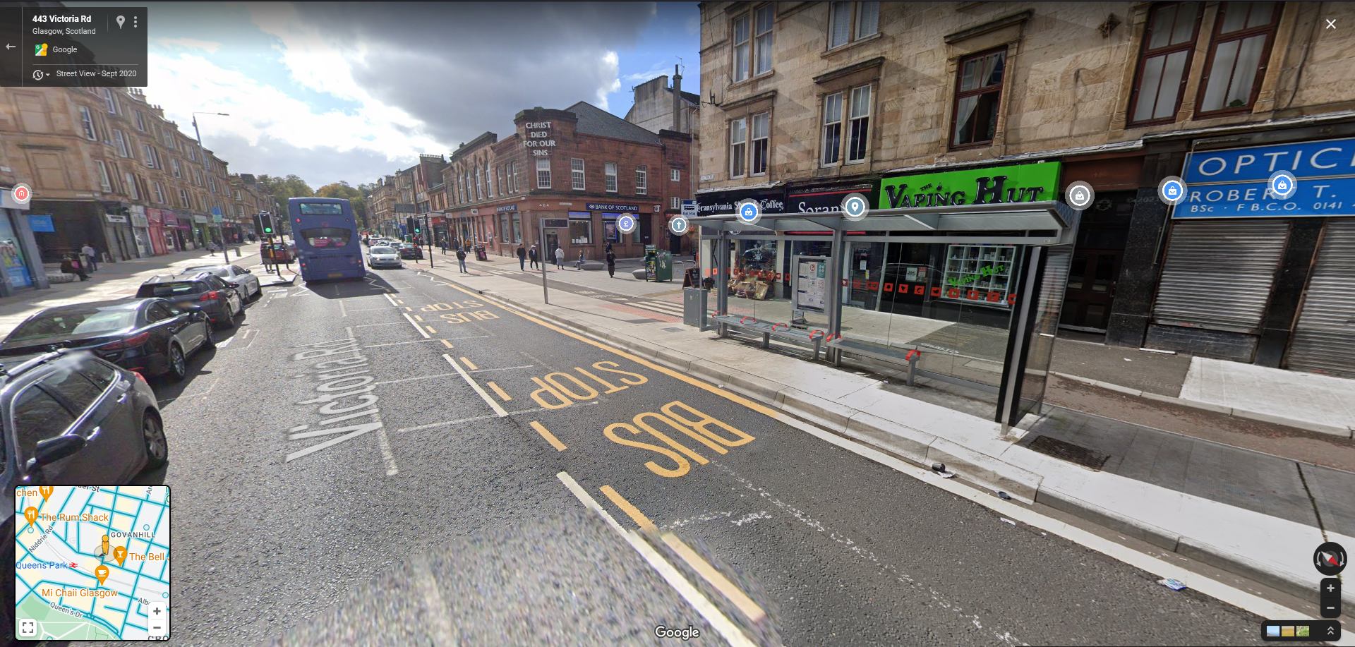

The Eglinton Toll
Further up the Victoria Road it meets the Pollokshaws road before they both diverge into the city centre. This area is a great example of how push outs with multiple entrance / exits aids people crossing the street. Its worth remembering that the Pollokshaws is still a single lane in either direction, despite being an ‘A’ road (larger class road compared to Victoria). At this point it also has two lanes which are ‘sort of bus, sometimes turning, sometimes parking’-lanes.
Both of these screenshots were taken at almost the same place approaching the point they meet, you can just about see the entrance to the petrol station on both. The Pollokshaws does have crossing lights just behind the camera (the images from that position were too dark) and an abundance of pedestrian fences, pedestrian cages and ultra-wide turn outs. Both of the roads are approximately the same “wall-to-wall” width relative to the pavement size.
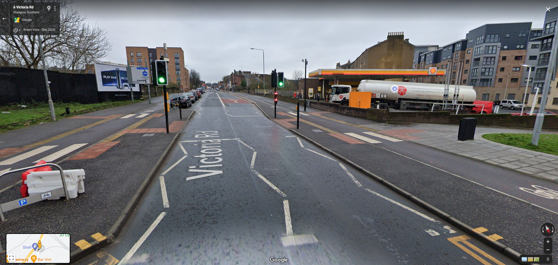
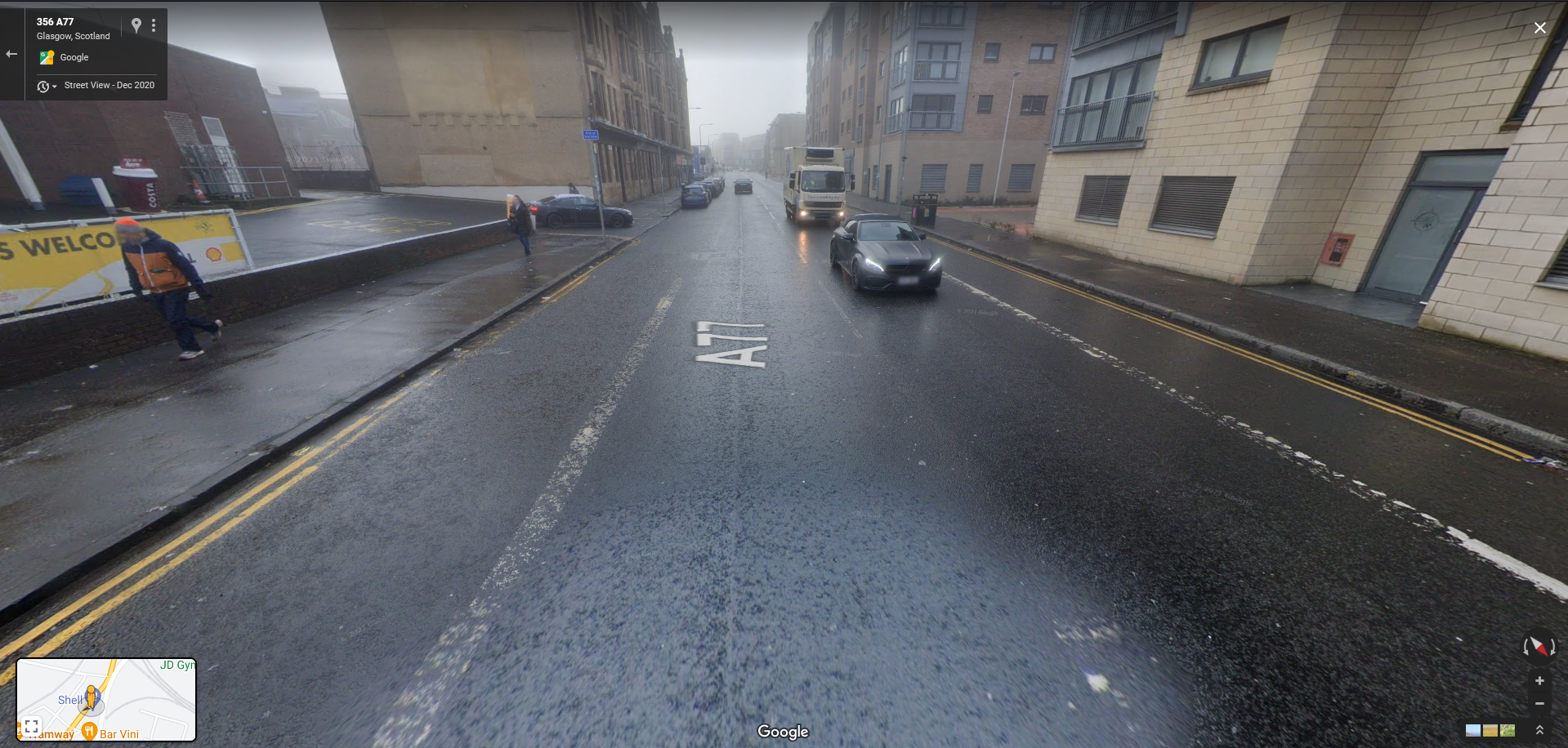
Now, considering these roads have almost the same through-put, which of these looks easier to cross for someone walking / wheeling a bit slower? Which looks easier to speed a car on? Which road better uses the space available? Which one even looks nicer (accounting for the dull day in the second image)?
Viewing this area in 3D really illustrates this divide further, these are not all that different road types, but the way they’ve been built they are two different worlds.

No Central Reservation
This one is obvious but there are no hatched lines wasting valuable space in the middle of the road, no pedestrian cages, no wide turn outs into turning lanes.
If you use the Google Street View’s time travel feature (by clicking on the date in the top left) to go back even as far as 2017 you can see just how much space in the middle of the road just isn’t being used for much at all.
Bus Stops Moved to the Lane
This one may seem to go against my theme so far of trying to appeal to motorists but in reality this isn’t the case.
By moving the bus stops into the road lane more space is freed up at the sides for the bike infrastructure, the pedestrian “push outs”, and also for more parking.
Sure, as a motorist I’m sure the notion of being stuck behind a bus for all of 30 seconds while it stops is the worst thing in the world ever. But if it means there is now more parking available, is it not a valid trade off?
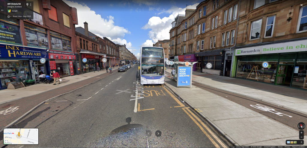
Motorists who want to get from one end to the other quickly can use a range of other options including the Pollokshaws Road which, as an A road, is supposed to be more oriented to through-traffic. Vehicle through-put on Victoria is now being hindered in order to increase the amount of vehicles that can stop and actually use the space, spend money in the shops, and enjoy the pedestrian-oriented infrastructure.
For cars, this place is now a destination first, and a transport corridor second.
Parking and Other Obstacles Placed Between Road and Bike Lane
An extension of the previous point, all roadside obstacles like bins, temporary signage, lamp posts, etc. are either placed on the pavement side in such a way they don’t interrupt the bikes or pedestrians, or placed on the island push-outs. This is not only an efficient use of space but is much safer and more accessible than if they were placed more randomly on the pavement as an after thought; some thought has been put into their positioning.

Moreover, by placing the parking between the moving cars and the bike lane, cyclists are more protected from accidents from moving cars and are not at risk of being cut off by a car entering or leaving the parking space. Bikes are completely isolated from the car section of the road and their interactions.
This again is another way that good cycle infrastructure acknowledges that bikes sit between cars and pedestrians; they are neither ‘big pedestrians’ nor are they ‘little cars’.
You have organised the road-space by separating and containing risk factors; large, fast moving vehicles are kept to the centre, smaller slower vehicles on the outside of them, and squishy, slow pedestrians on the outside of those, where the buildings and other amenities are.
Bike Path Behind the Bus Shelters
Related to the use of push-outs / islands, the fact that the bike lanes weave behind the bus stops and bus shelters is really good as well. With some dedicated cycle routes, and very frequently with painted bicycle gutters, the bike path will go through the area the bus is to stop in or, in some cases, actively direct the rider to overtake which is very dangerous.
By putting the path behind the shelters, at grade with the pavement, it can gently curve out around the bus stop, safe from the buses and any road vehicles which may try to overtake.
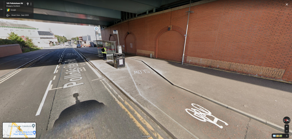
Lets have a look again at my dear favourite junction at Aldgate. Because of the insistence that the cycle way be at grade with the road not the pavement, the bus stop island is literally an island; cut off from the pavement save for a little pedestrian “bridge”. If you have limited mobility, a wheelchair or are pulling heavy luggage, you have no choice but to go up along the pavement then cross over at the single crossing. If you’re riding in the lane on a bike you effectively have a jarring speed bump.

Also note the position of the actual stop (the pole, marking where the front doors open), its behind the shelter which sits between the stop and the “bridge” meaning you have to squeeze past to reach it, and impossible if you have large luggage.
One of the reasons I direct so much criticism at the Cycle Super Highways is not because they are terrible (although CS2 is pretty bad); even the bad ones are better than nothing, but because of how they are branded. PROOF
Particularly the earlier CSH’s which weave in and out at sharp angles, have almost no overtaking space and get dangerously narrow at points, often just turning into a painted gutter.
They offer no meaningful redesign of the spaces they’re placed in, shyly dipping in and out to avoid the ‘important’ automotive infrastructure. This bus stop isn’t just a badly designed bus stop, its a bus stop which is badly designed because its designers did not want to take any more space away from the 5 lane highway that should be a vibrant high street.
These flaws would be somewhat excusable if bike lanes like this represented some new standard for all bike lanes across London; not great, but better than a line of paint. Instead, they are touted as the pinnacle of bike lane design, even their name, Cycle Super Highway’s, is evocative of some smooth, fast, state of the art, experience.
The ‘Quiteway’ projects are another example is this misguided thinking. These are quiet routes for people to take which take longer than the direct route but avoid the majority of traffic, another admission that cutting traffic across the board is not a serious enough objective.
This is not the best they could do, it is not a bold re-imagining of how space could be better used, it is a placation to the type of drivers who see all space not currently given to cars as being bad. It is the designers saying to drivers “don’t worry, it won’t get any worse than this”.
Raised Entry to Side Streets
In modern Dutch street design, the road rises to meet the grade of the pavement and cycleways and cut outs ensure the width is appropriate while proving space for bike racks, bins etc. This causes drivers to instinctively slow down, take more care, keep more of the cycleway and pavement clear and yield to traffic on the road they are joining.

Often described as “making drivers feel like guests to an area, rather than giving them priority”, as these streets are connecting to side streets, safety is greatly improved when drivers enter or exit them carefully.
Raised entrances these are better for accessibility because wheelchairs, prams, people with luggage, upright walkers etc. can walk across the junction in a straight line, they don’t have to manoeuvre to a specific crossing where the kerb bends down.
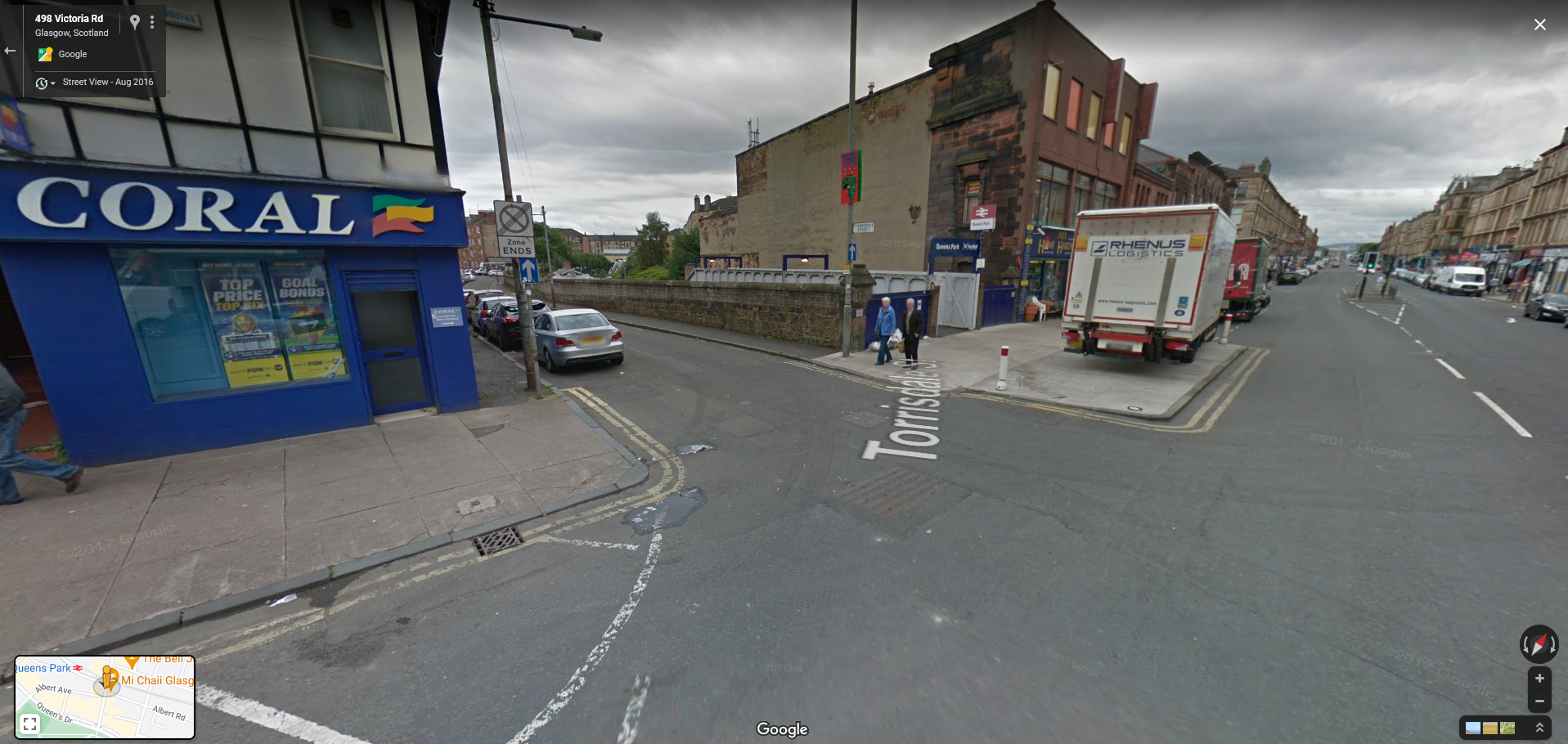
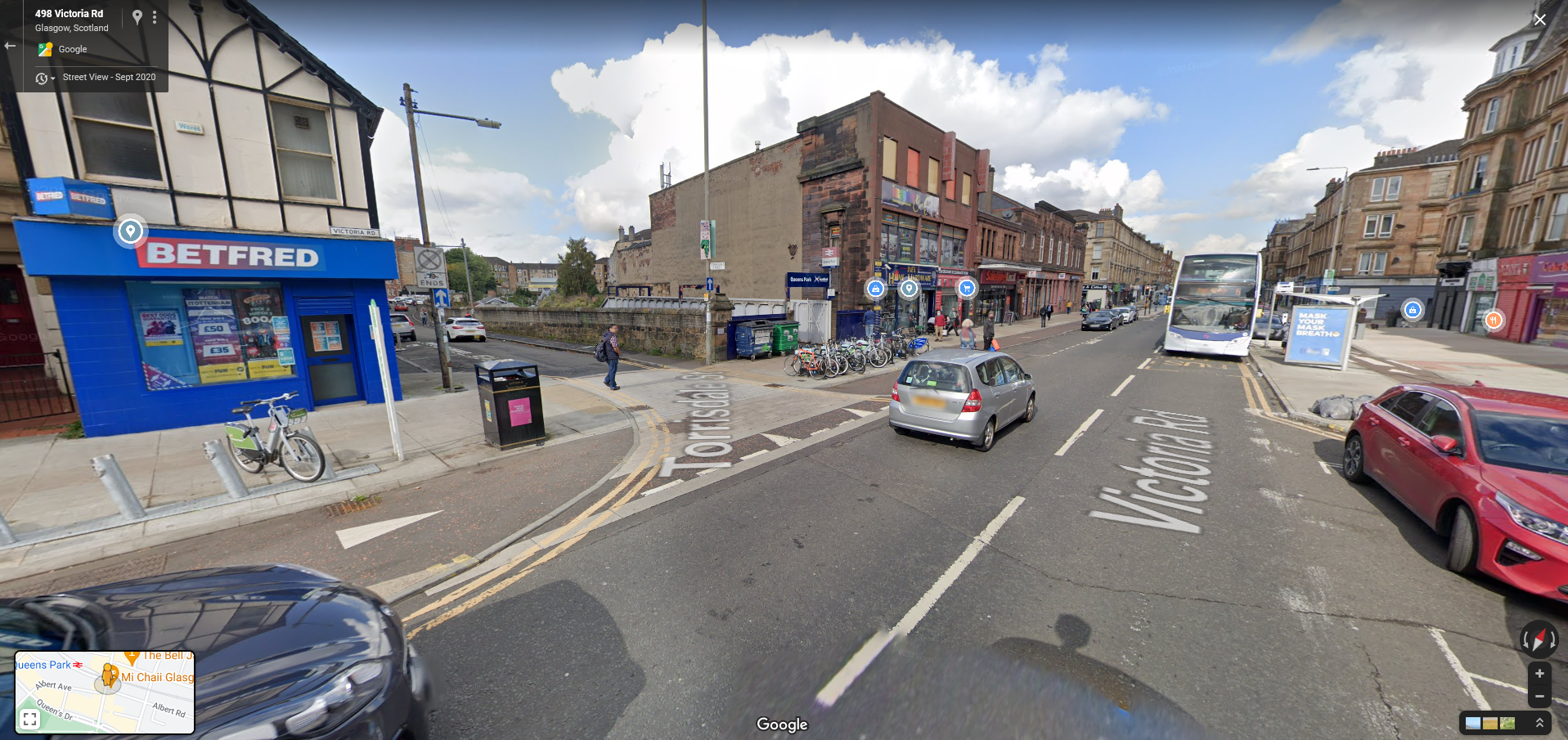
This is another example taken from Queens Park station, 2016 vs 2020. once again it is worth reiterating that no space has been taken away from cars, just remodelled. The van on the pavement in the 2016 image is a nice mood setter I feel.
Its (almost) Red Asphalt
One common mistake made by some bike paths is to utilise some sort of non-conventional material to pave them, or even to have no material distinction between the path and the adjacent pavement or road. In the Netherlands they have a problem with legacy paths paved in bricks which was once thought an appropriate way to build them but will rattle your bones to pieces when you ride on it.
The Victoria Road paths not only succeed in using proper asphalt (not tiles) but they also include another key concept from the Crow manual; the concept of way-finding.
The Crow manual defines way-finding as an integral consideration to the design of bicycle ways, suggesting that distinctive landmarks and memorable areas should give users a sense of where they are, using signage as a last resort. Paths should feel direct, take into account how people actually move, and require little effort to decipher; you should always know where to go next.
Part of this specification involves the consistent use of a distinctive red hue for the asphalt, meaning that all bike paths, be they large intercity paths or little lanes next to a road are instantly recognisable as bike paths, giving the user confidence.
The Victoria Road path uses a spotted red and black asphalt to distinguish it from the pavement and road in the same fashion, meaning that even when flush with one of these areas it remains visually distinct. It would be nice if the colour was more distinctive like the red asphalt of the Netherlands but its still better than nothing.
Mixed Messages
This issue of a lack of distinction between bike paths and literally anything else is prevalent in in many UK bike paths, and is part of a larger problem of a lack of any meaningful standards in bike infrastructure design.
Here is an example of mixed message way finding which appears a few times across Glasgow. This is Kings Inch Drive in the West of the city, south of the river near the Clyde tunnel. It connects a series of car parks and also some big box stores.
There is a cycle path painted on the pavement, another variation of the “shared path” pavement concept however, unlike examples we’ll look at in a bit, it makes the effort to somewhat differentiate the ‘pedestrian side’ and the ‘bike side’.
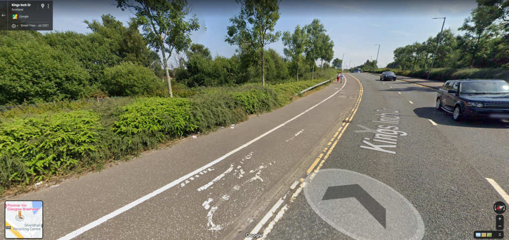
What’s interesting is that the bike lane is actually technically not bad (in some respects). Its a decent width, its smooth and consistent, its grade-separated from the road, and there are decent islands on the roundabouts to get across.
What lets it down is the fact there is nothing to visually or physically differentiate it from the pavement area save for a white line; its the same surface just with a bit of paint suggesting where to stand. This sends mixed signals to pedestrians, are they supposed to keep out? is it advisory only? Are the designers serious about this being a bike corridor? Can you, as a pedestrian, expect to have to encounter bikes frequently?
When a council throws up a blue “share the path” sign on a regular pavement it is clear they don’t really take the idea of cycling as a mode of transport or the path being a shared space seriously. Its the equivalent of a bad substitute teacher in a riotous class nonchalantly saying “ey, knock it off” while not looking up from their phone.
Its not serious about its intent, it isn’t setting out a plan for where different users should be. Pedestrians are not really expecting any bike traffic because the space looks like a pavement. Bikes may not be confident using the space because it doesn’t feel designed for them. Cases like the above are somewhat odd middle grounds, its not quite clear how serious the intent actually is. They are better than an advisory sign but at the same time not entirely cohesive; they don’t go the full way.
When you have a proper grade-separated bike path like the Victoria Road it is clear that that is a serious piece of infrastructure. It is very clear where each mode of transport is prioritised, what the intended paths are (and connections), and how the space is intended to be used. It feels as though it was designed by someone who not only knows the theory, but has been to the location to understand it, someone who cares about the users.
Here is a graphic from the government’s Gear Change Report which recommends good guidelines on modern standards of bike path design. It is interesting because it not only identifies common mistakes with previous projects, but also specifically highlights aspects of way finding.
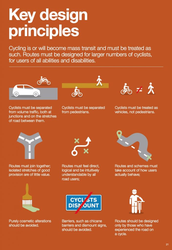
A distinctive lack of distinction on UK paths
If you go to something like Google Maps and turn on the bike path layer you’ll see an effect I dub the “Green Confetti”; most urban areas look like someone has sprinkled confetti of various green shades indicating different degrees of bike infrastructure (the different lines denoting different grades of separation).
Our urban areas are littered with discontinuous bike paths of varying widths, lots of start-stopping bike lanes, routes that cut hrough estates, paths in parks shared with pedestrians and leisure riders, decent sections of bike lanes in the middle of nowhere with no way to access them, and so on.
Often you’ll be perusing a mapping software of your choice and you’ll see a nice stretch of path indicated as a “protected / dedicated path” or “path with bike lane” only to discover it looks just like a pavement. Looking further you may see one of these blue signs indicating that the area is a ‘shared route’; a multimodal bike and pedestrian route.
Here are some random examples from Google Maps looking at Glasgow. Note the confetti effect created by short bits of bike path and interspersed parks. Also note how the South City Way, South West City Way, and West City Way stand out as does the Clyde river path. There are the very early beginnings of a network but too many circular paths and paths leading nowhere useful.


The more time you spend with browsing areas in the UK, the more you begin to notice how even the really easy wins are missed out on. The centre of Glasgow is busy but it is not crowded, there’s no reason they can’t have at least a bike lane on every street within the CBD.
Areas like the first image bellow show small segments of bike paths of varying quality but they don’t join up! This area around Central Station, the largest station in Glasgow, is such a wide open goal yet no one has thought to just join these segments.
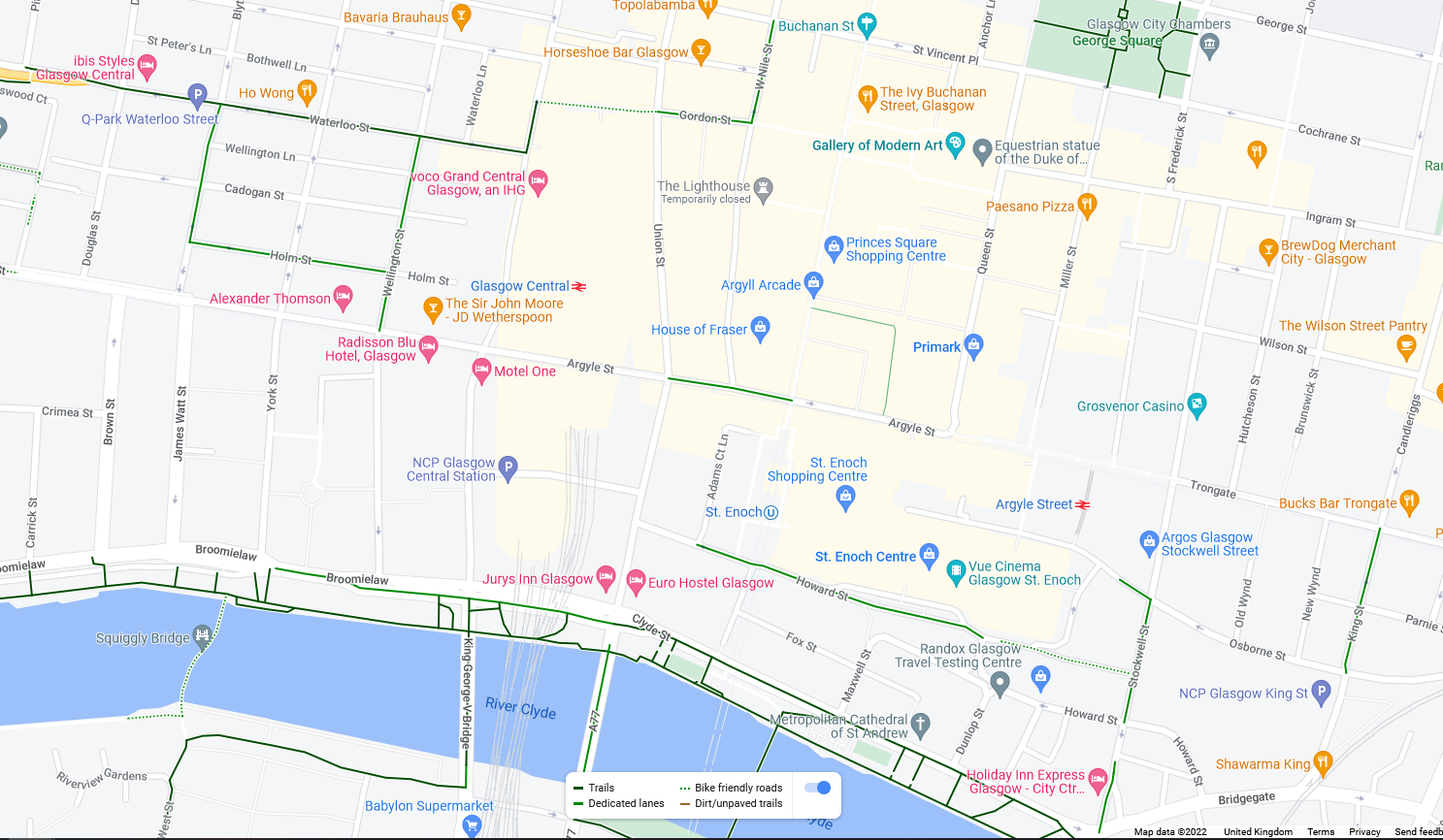

The second image above shows the example from Kings Inch Drive amongst other paths, most notably the former railway line north of the river which leads all the way to Loch Lomond. Even if Kings Inch is deemed to be good enough, it just doesn’t really go anywhere or connect to anything. You can ride on the road to get to the Clyde tunnel but the road is busy and dangerous and there is nothing for if you wan to stay on the south of the river.
Blue Signs
Here is an example of a supposed connection between a national rail station, a large chunk of suburbia, and the Ayr Road. Cool right? Unfortunately this ‘protected bike path’ is just a pavement with a blue “share the path” sign on it. It is a supposed ‘shared path’, which in this instance means a regular pavement that bikes are directed to use.
I’ve travelled this route many times in my life while visiting family nearby, the road is often too fast and dangerous for me to feel safe riding a bike on, but the pavement (shared path) is just only just big enough for pedestrians. While its not small, its not massive; I have had difficulty as a pedestrian overtaking people walking side by side, there’s no way I’m going to ring my bell at them on a bike and try to squeeze past.


I have no issue with pavement riding when other people do it; I believe it is a symptom of a lack of infrastructure and if you don’t like it then you should provide traffic calming and / or a dedicated bike way. However I personally hate doing it, I feel like a child, riding slowly to school on the pavements because I’ve been told to be careful of the roads.
It is slow, inefficient, and not fair on pedestrians who may only have just enough space for themselves and may not see me coming round blind corners like this. They probably wont even know that this particular pavement, although identical to other bits of pavement, has been “blue signed”.
Even if there are no pedestrians, the cyclist must often take sharp corners, crossing at pinch points, and can’t see far enough ahead to react to coming traffic.
Shared path designations are often applied in inappropriate places as a cop out by the road designers who think it a valid substitute to actual infrastructure.
The case for shared paths
There are places where it makes sense to have a shared path; areas of low traffic, paths through a park, or by the side of a road between urban centres where there are not going to be too many people. Good shared paths should be direct and clear, allowing you to see others from far away. They should have ample space for mixed traffic in both directions and be put in places where both bikes and pedestrians are probably going in the same direction from one point to another, not mingling or moving erratically.
In the Netherlands shared paths are most commonly designed as bike paths first, then pedestrian traffic considerations are laid on-top, as opposed to designing a pedestrian path and then trying to squeeze bikes in as an afterthought.
One such example is in fact the Ayr road which, at the south end, bends off to parallel the M77 down to Kilmarnock and acts as a collector road for the motorway. The flexy-post protected bike lanes give way as the road approaches the primary school (because what do little kids need with car safe infrastructure right?) to older, smaller red painted lanes which have all but faded away, similar to what the rest of the road had if you look back to about 2008.
As you continue past the school the red lane gives up entirely and the user is “blue signed” onto a pavement area. This makes sense, the foot traffic is low and the pavement eventually widens out to a comfortable width.

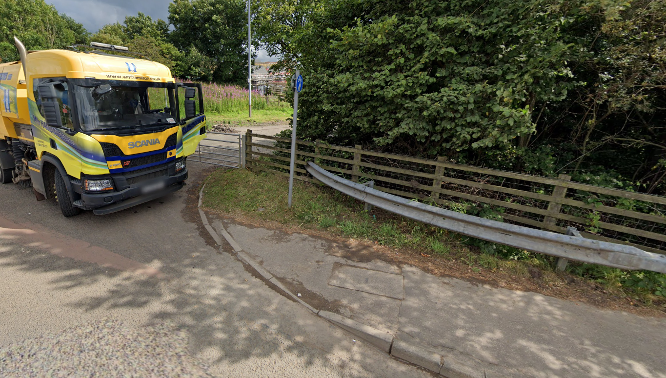

Then something odd starts to happen. As you approach the corner of East Renfrewshire Golf Club, the type of paving surface changes, the kerb edge becomes more reinforced, and intermittent gaps appear with bollards protecting them.
Further on, the look and feel of the “pavement” has changed, there are red markings with bike symbols on them, and more blue signs as if to say “Yes, this is still a shared path. Pedestrians may use it, but the main audience is bikes”.
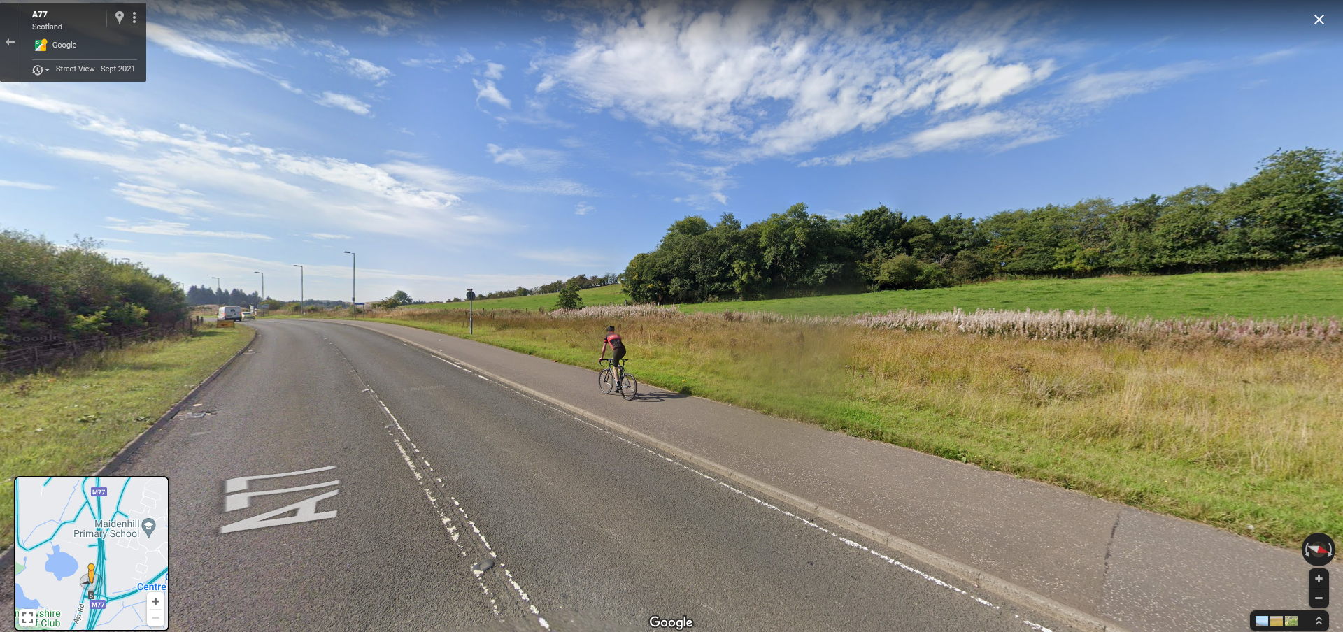
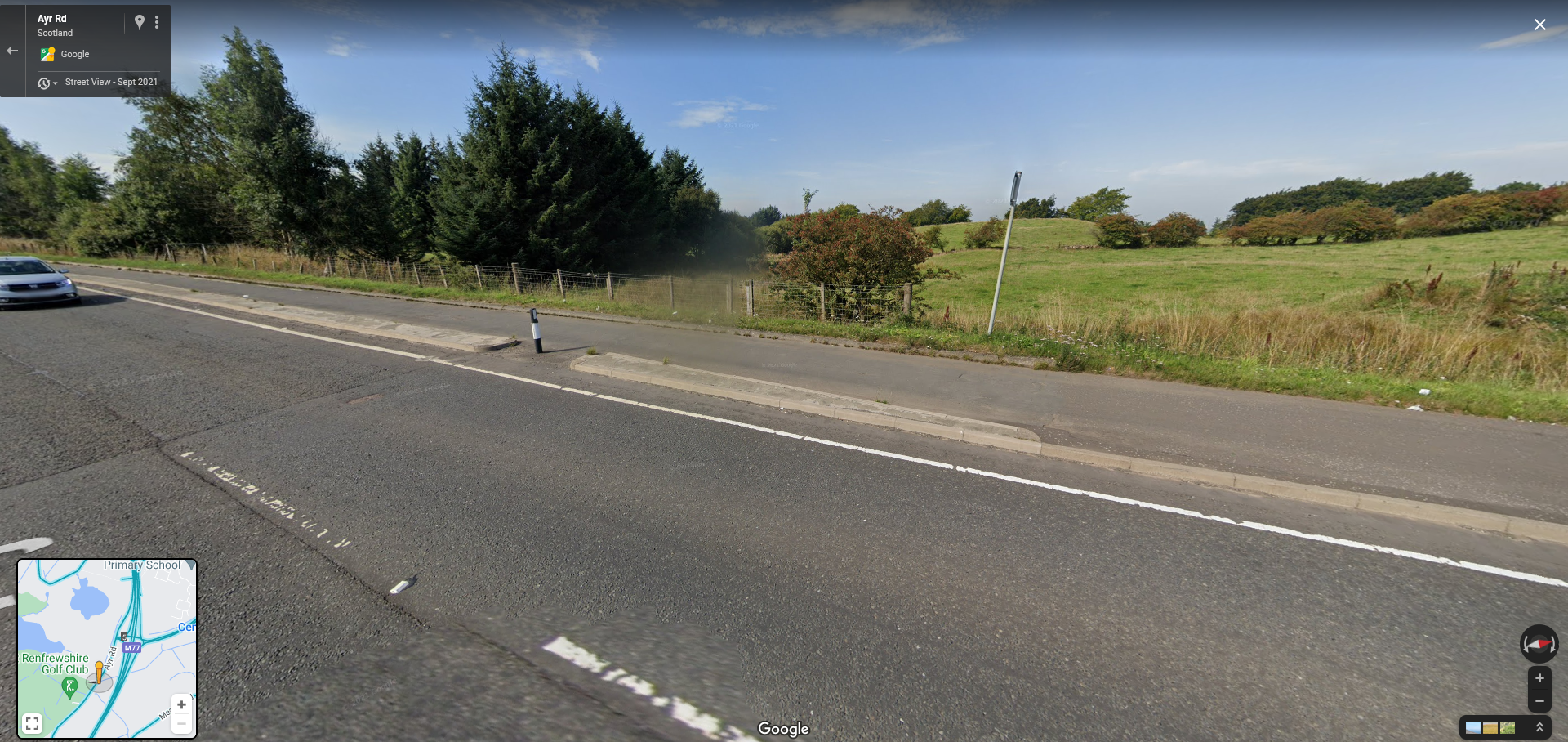

The path has become an inter-city bike way, much like you would find all over the Netherlands, connecting Newton Mearns and Glasgow with Kilmarnock and, (if you don’t mind a stretch of road cycling), Irvine, Ayr, and the coast.
This is yet another reason why keeping, reinforcing, and extending the protection on the Ayr road and closing the gap at Giffnock is so crucial. With it, the road not only serves active travel capability to locals but forms a link from Shawlands all the way to the coast line.
This is the kind of infrastructure that is often billed as being a financial fantasy, and yet it can be found if you look for it. Its total utility will only ever be realised if it is connected to a wider network. PROOF


Kerb Protected Junctions
This is another of those “can’t believe it happened outside of Amsterdam this side of 2050” features and very welcome.
What should a bike lane do at a roundabout? At a four way junction? Approaching a car park? How do we go about designing the solutions to these problems in a way that is safe?
Thankfully the Dutch have done that for us so don’t worry about it.
There’s only a couple of these on the Victoria Road because after this the roadside changes and other crossings can be used but it’s still remarkable to see this feature appear on a UK road. At the interaction of Allison St the route uses a Dutch junction to continue across.
These junctions use kerb protections to prevent cars from cutting into the bike line waiting space while crossing and use separate traffic lights for bikes to coordinate movement with cars.

Here is another screenshot from inside the junction box. You can see from the entry and exit points for side streets which could connect to mode paths if they were to built later.
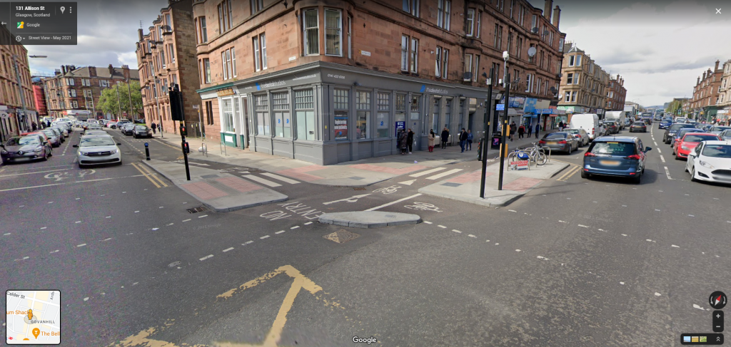
Kerb protections on the corners prevent motor vehicles cutting off bikes and force them to slow to a safe speed whilst also providing safe refuge points for bikes to wait to turn across traffic. In this sense the junction is for bikes like a mini signalised roundabout; if you want to turn right you cross over, turn into the refuge and wait for the light direction to change.
This is actually relatively simple and cheep to implement yet is so much safer than the alternatives you’ll find in the UK, in which bikes are simply dumped into traffic and expected to move like cars in the junction. Yet features like this are missing even in places like Copenhagen, much more renowned for their cycling infrastructure.
Infrastructure that Just Gives Up
Often in the UK you’ll find yourself looking at a particular piece of bike infrastructure that just ends suddenly, then restarts later on. This is very often the case where a bike path meets a road feature that the designers don’t know how to handle, so they dump you out onto the road, say “I don’t know, figure it out”, and then welcome you back at the other side.
Junctions are a key example where bikes are often forgotten about or assumed to be able to fly; the kerb drops off, or worse still, the path is indicated to sharply merge with the car lane to get across. This is a small part of a broader topic of designers treating bikes as either “little cars”; expected to act like much larger vehicles, or “big pedestrians”; expected to move like pedestrians and use pedestrian infrastructure, weaving in and out of tight spaces.
Here is an example of this from Cycle Super Highway 2 in London. The grade separated path just stops and requests you push the beg button not once, but four times, to cross over four pedestrian cages sometimes barely big enough for a bike. This happens a lot on the CSH’s.

Here is another example from a particularly egregious junction on the north side of the Rutherglen Bridge on the A728. The junction is a mess so the protected bike lane just melds into the road and cyclists left to fend for themselves.
At the other side (on some exits, not all) you are welcomed back with this nice ramp up to another protected bike lane. “Welcome back! You survived! Here is your reward”.
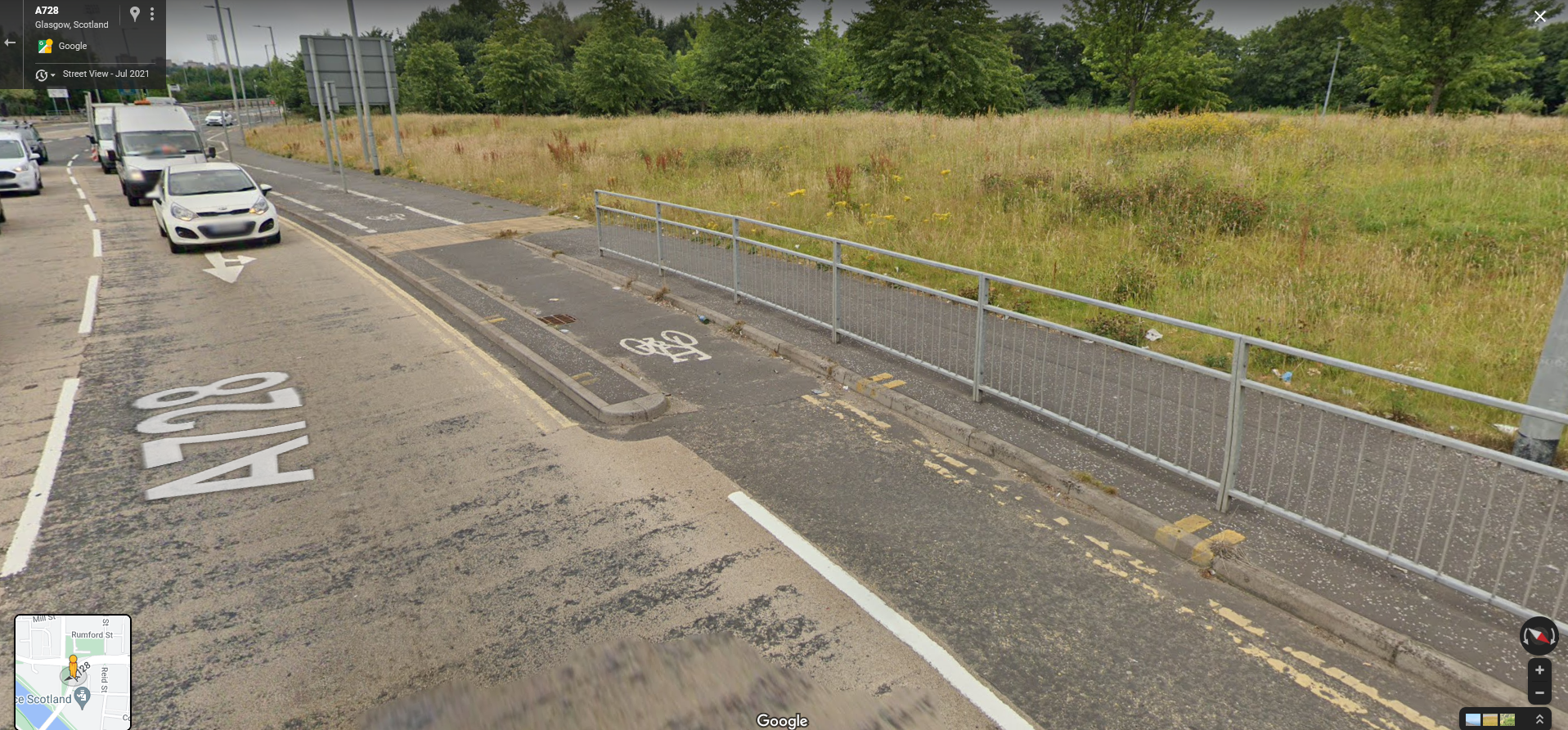
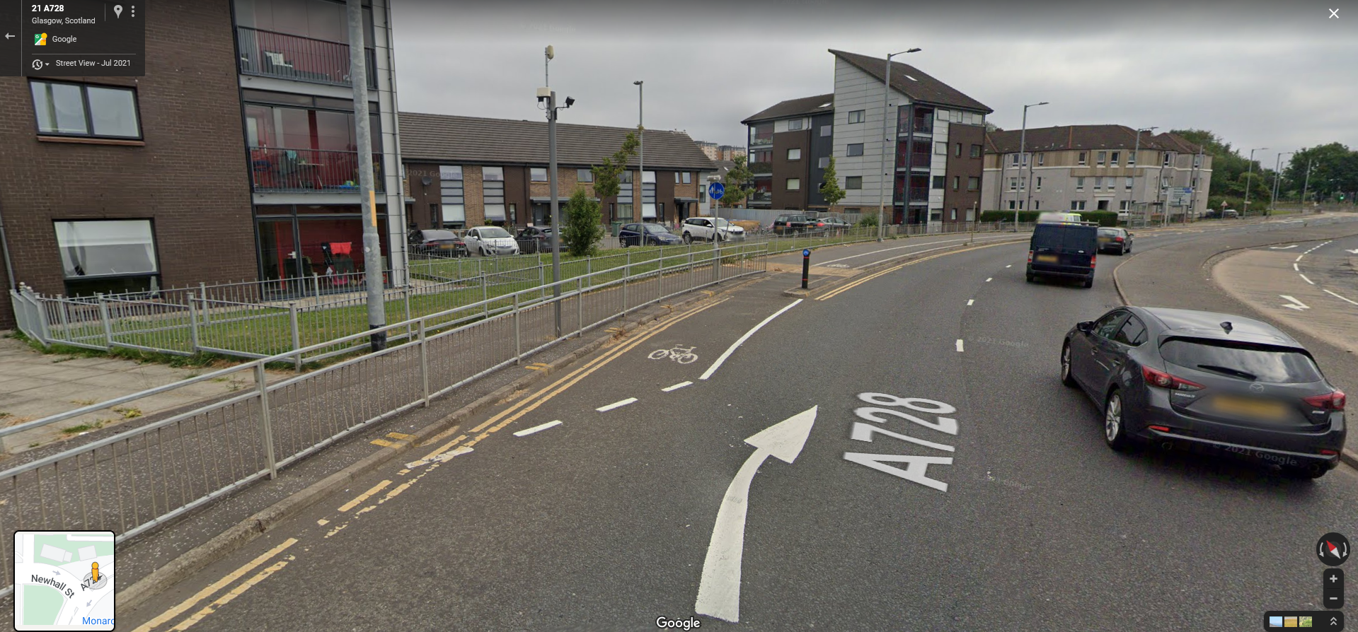
Standard Junctions
In the UK, the problem of how to deal with junctions is usually dealt with using these ‘bike boxes’ or ‘advanced approaches’. The idea is that motor vehicles stop a meter or so back from the lights, cyclists can then sit in front of them and, if turning right, move over to the right side. Here is a typical example of a bike box from Auldhouse road.

These are bad for a number of reasons, lets start with the intimidation; sitting at the head of a column of traffic which can’t move until you do is just plain scary. As soon as the lights begin to turn you have to put all your energy into accelerating as fast as you can, lest you incur the anger of the drivers.
This is made easier with an e-bike but still isn’t great. There is still the possibility a car will come up behind you and not slow fast enough ramming into you, and you still need to be ready to accelerate fast which a fully loaded ebike with a 250w compliant motor may struggle to do.
Then there is the fact that many people will naturally drive as close to the light as they can get, the light marks the point to stop after all. This means that even good drivers will have a tendency to stop in the bike box before they even realise where the stop line is.
There’s the fact that the paint ware and tear means that very often these boxes disappear from view entirely or end up with indecipherable edges.
Lastly there is the large number of people who will disregard them entirely because they don’t care. Sitting in the bike box puts them 1 meter closer to their destination. Similar to when my dog, being dried after a bath, gets as close as he can to the door thinking it’ll get him out faster. This behaviour comes from the same place as when people overtake, sometimes dangerously, just to be caught up on at the next set of lights. There is no benefit to being 1 meter further forward and yet some people will still insist.
Dutch Junctions
Dutch Junctions are effectively roundabouts for bikes; traffic going straight through can simply continue, to turn left (for left-hand driving), the bikes can simply continue around the curve and skip the lights entirely.
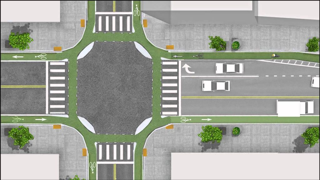
Protective kerbs like these prevent motor vehicles from turning too sharply and cutting off cyclists going strait. If the bike is turning on the inside of the junction, they barely interact with it at all, only having to watch out for oncoming bikes to yield to.
If the cyclist is going straight or turning across the junction (in the image above this means turning left as they drive on the right), they wait before travelling to the next kerb and effectively joining the traffic perpendicularly.

The kerb protection provides a safe lane to wait behind for cars to clear the junction or for the lights to change. In the case where cars have to yield to bikes it helps the cars judge their margin of error. To turn right, the cyclist continues straight and then turns to wait until the lights change to authorise the other direction of traffic.
Dutch Roundabouts
Here is an example of a typical roundabout in the Netherlands, remember you ride on the right-hand side of the road there so imagine entering from the right side of the road and moving anti-clockwise. The car lanes are the dark asphalt, the pavements are light gray asphalt and the bike lanes are red.
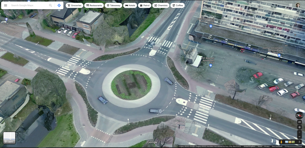
In Dutch style roundabouts, the bike paths carry on around the circumference with a protected section between the road and the bike path. Like car roundabouts the bikes enter via a path which curves out, yielding to those already on the roundabout, and exist via a similarly curved path.
Because the ‘car roundabout’ is in the middle, cars cross the bike paths to enter and exit, meaning they pay attention to both cars and bikes from one direction at a time. Depending on the area, the density of car and bike traffic, either the cars or the bikes will have priority and yield to the other.
If it helps to think about it, consider how pavements join roundabouts; they curve round the outside and have gaps with crossing points where the cars enter and exit. These are basically the same but the paths are more continuos, instead of a crossing you have a yield section. Once you spend a bit of time with these, and especially if you watch videos of them in action, they seem really obvious.
The South City Way doesn’t feature any roundabouts Dutch style or otherwise, but I would be remise without mentioning them as they demonstrate that even complex driver interactions can be designed for.
Dutch Roundabouts & Junctions in Depth
I acknowledge that the concept of these junctions and roundabouts may be hard to imagine if you haven’t experienced one so to illustrate their function I’m going to use a case study of a typical UK roundabout.
This is an unnamed roundabout on Muirend road just west of Muirend station. It connects three residential roads each with one lane in either direction which widen as they approach the roundabout to include a turning lane and a forward lane, joining in a rough ‘T’ shape.
This is typical even for small roundabouts, the idea being that two cars can enter at the same time, the car going straight on doesn’t need to curve much and the turning car can hug the tight corner to get round. Its another example of over engineering where more space than necessary is used to try and not make cars have to slow down despite little to no actual speed or safety gains.

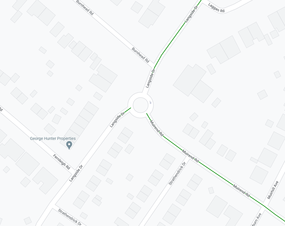
Like many road features in the UK, it has a few quirks and imperfections in its geometry that give it a distinction and are useful to demonstrate how good street design is not an exact science, it is a set of guidelines to work differently in each situation.
This roundabout connects with some painted bike lanes which in typical UK fashion disappear at the roundabout and reappear on the other side. It also has an interesting protected bike lane to allow people continuing onwards at the ‘T’ to bypass the roundabout which is a nice touch.
Here is the road with annotations showing the car lanes, red for traffic entering the roundabout, and blue for exiting. The next image shows the bike lanes, light green for paint, dark green for protected sections.


Clearly this is the optimal road design and nothing can be done to make it better for all users. The sides cannot be narrowed and the centre area cannot be made any smaller so there is no way to accommodate anything other than cars.
Except that’s not quite true is it? The current road designs do provision for another type of user; pedestrians. Here is the same map with paths for pedestrians indicated in purple, as you can see, no one would have difficulty understanding this interaction.
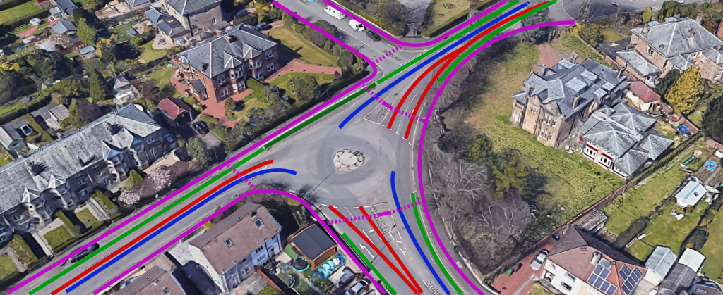
The pedestrian paths line the edge of the roundabout with the car interactions happening on the inside. Pedestrians are mostly required to yield to road vehicles but you can imagine if the crossing points here were pedestrian crossings how that priority could hypothetically change.
Now what if we were to double these paths? What if there were an additional layer of paths on the inside or outside? This is effectively what protected bike paths (or even just continuos bike lanes) would have to do. Note how similar this is to the pedestrian paths diagram; the points of intersection with the car lanes are almost exactly the same.
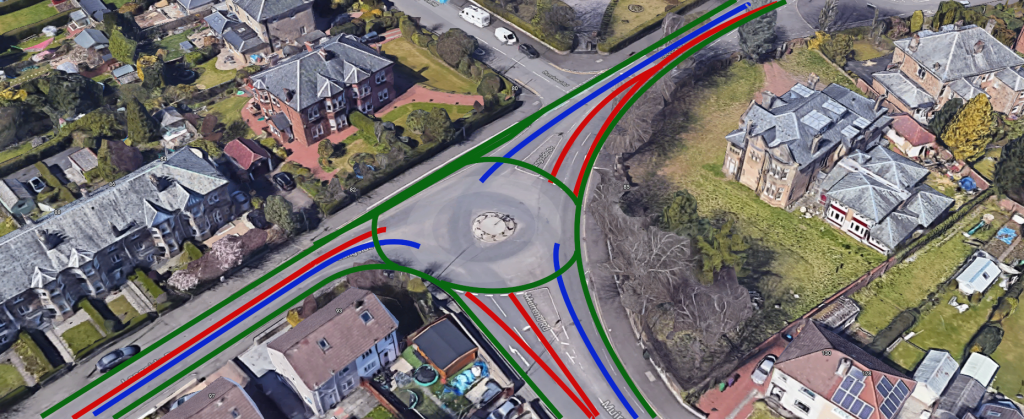
If we turn the pedestrian layer back on you can see this interaction take place. Again, the yield priority and use of lights should be determined by the designer based on nearby traffic, perhaps it is better for both pedestrians and bikes to have a refuge on the islands seen on Muirend Road and Langside Drive.
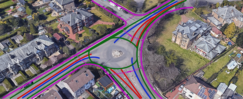
Lastly we can introduce kerb protections to let traffic mix where necessary and prevent conflicts and cut-offs where needed.

Obviously these are just rough lines drawn loosely on a screenshot of Google Earth and far from an actual design, but hopefully it can illustrate that these junctions and the interactions they involve are actually not that complicated or difficult to implement.
What the Victoria Road Could Improve
“What? But this is supposed to be the good example. What are we criticising this one?!”
Throughout we’ve been looking to the Netherlands as our gold standard for urban design and safe streets which accommodate multiple modes of travel. However good design is an ongoing process, it is not about swapping one unchangeable status quo for another, but about a continuos process of reevaluation and redesign.
Amsterdam wasn’t built in a day. The changes which have taken place in the Netherlands, from streets which looked like ours in the 70’s to what they have now, took place overtime.
There are still areas in the Netherlands where the best you can hope for is a painted bike lane (built in the 90’s). There are other areas which have dedicated bike paths but made of brick, bumpy and difficult to ride on (made 2000 – 10’s). The modern fully protected paths (with the red asphalt) are an invention of the last 20 years or so. New ideas being trailed all the time.
The South Side way and Victoria road is orders of magnitude better than the Ayr road, in the same way that the Ayr road with bollards was orders of magnitude better than it is now, in the same way that the current Ayr road is better than the small “door zone” bike lanes of the Kilmarnock Road, in the same way that any of this is better than the six-lane suburban strodes with no side walk you’ll find in north America.
By looking at what could be improved with better examples, we can re-evaluate the current state of design and realise its flaws and hopefully create improves in the next iteration. The decision to rip out the bollards on the Ayr road is movement in the opposite direction and represents a failure to think systemically.
In a generous reading, the decision to remove and not replace the light segregation is not a malicious attempt to make the road less safe, but simply a move driven by a belief that they have a ‘compromise’ which is ‘good enough’. It is the act of representatives which either do not value active travel, or simply don’t understand how infrastructure creates it.
So lets finish up by having a look at what can be improved on the Victoria Road, and what it can tell us about potential future design projects.
Turn-Outs Around Obstacles can be Quite Sharp
I complimented how most of the the turn outs, where the path curves behind a bus shelter or other obstacles, are smooth and well considered but there are places where sharper curves are used. PROOF
However some of the turn outs are less considered, creating sharp corners which can be dangerous, creating conflicts between the two directions of travel and potentially leave the lane.
One such instance is found at this bus stop near an estate in Laurieston approaching the river, seen here covered in some nice slippery leaves. Why does it have to be this sharp? It appears that it was built this way to ensure the angle of the pedestrian crossing lines up with an allay way between the houses to the left.
However given the space behind is unused (the road ends behind the line of bollards), its difficult to imagine this was the best they could do. Even if the crossing couldn’t be moved, the bus stop could have been pulled a little closer to the crossing to allow a smoother turn out further south, making it safer for both pedestrians an bikes.

Few Opportunities to Overtake
While the paths are built to a high standard, are consistent in width and wide enough for even novice users, it is rarely wide enough to overtake other cyclists. This isn’t the biggest concern particularly as the traffic is still relatively low, but going forward larger pathways like this should really be wider or at least have some sections of wider path for slower or less confident users to be safely overtaken by people trying to quickly get from a to b.
The latest Dutch design standards allow for two people to cycle side by side in one direction and another to pass them in the other direction with a minimum path width of at least 4 meters with the previous standard of 2 meters recently replaced. With
Of course, we’re a long way from having to manage that level of bike traffic, but will be felt as active travel capacity increases; the London cycle network has a tendency to cause cycling tailbacks at rush hour, in part due to the small width of the tracks. The designers of later London Cycle Ways are apparently finally making the lanes wider to facilitate this.
Bizarre Two-Way Sections
Speaking of inadequate widths, the route has one section where the lane narrows with little warning and turns into a bi-directional path. Take a look at this screenshot near Cuthberton St, you’ll see that the southbound side has a bike lane travelling south while the northbound has a dual direction lane allowing both north and south travel, which then merges back into a northbound only lane at Copelaw St.

This is apparently to connect with a bi-directional bike lane going along Cuthberton St besides a school. While I can see the argument for having the lane outside the school be bi-directional I think this is a compromise for the fact the street is not traffic calmed sufficiently, at the planners maintained the parking / drop-off space on the other side of the road.
Ultimately this is an attempt made to connect to a tributary street that may have been too difficult to redesign / rethink. I don’t think its the end of the world but it would not have taken much to make the lane 50cm or so wider to reduce potential conflict.
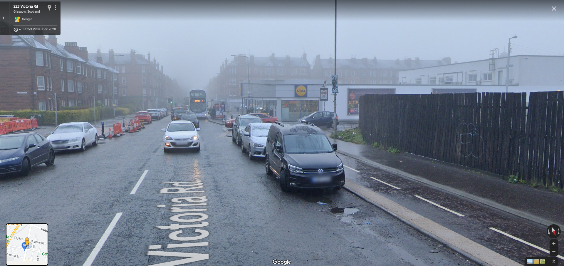
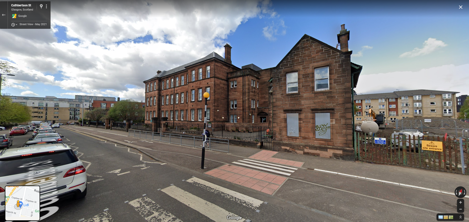
Street Parking Limits the Road
Throughout this article I’ve tried to frame the point of view of the driver as much as possible. I want to draw attention to the fact that good street design and planning benefits all road users, and that a lot of basic active travel infrastructure does not negatively affect cars at all.
I have done this because discussions concerning street design and road building in this country are inevitably centred around the experience of drivers. Ideas such as capacity being the determining factor in congestion are highly ingrained in our way of thinking.
Any change, even changes that benefit motorists, are often opposed by citing the idea that the only way to improve congestion is road widening and removing obstacles.
It is a knee-jerk reaction for many of us, even those of us that don’t normally think about the topic, to resist changes that look as though they affect road capacity. Every urban project is framed in terms of the convenience to cars. For instance, discussions around Low Traffic Neighbourhoods are entirely centred around hypothetical increases to journey times or congestion affecting people out of area, as if journey times and road safety belong in the same form and are comparable as trade-offs against each other.
This is the reason I wanted to talk about the Victoria Road. It is far from perfect, but is a great example of how adaption could and must look in the short-to-medium term. It shows us that you can not only build active travel infrastructure (and nicer urban environments in general) by rethinking the use of space, but you can actually increase parking and utility for motorists.
This is similar to the Dutch idea of “untangling”; the idea that separate modes are prioritised in separate spaces and along separate routes so as not to conflict. One type of motorist; the type that wants to pass through as quickly as possible, is being de-prioritised in favour of another; the type that is local and wants to reach the area as a destination. A conflict of values exists and space is remodelled to account for this.
After the easy bit is done; removing wasted space, we cannot avoid the fact that the Victoria Road is limited by its provision for cars. To continue to give the street room to grow it would be necessary to restrict car access more or remove it entirely.
Who Exactly Are We Designing Our Streets For?
Fundamentally this article is about choice.
Choice of how to get around, choice of which types of people are prioritised, choice for environmentally friendly travel modes, choice about what values we want embodied in the design of urban environments.
The design of our urban environments has always been in a state of flux; they have always been successively rethought, and re-organised depending on the needs and the values of the current inhabitants. There is no “correct” design that is the way things have always been or the way things must stay. And just because areas look as though they’re not changing or that change has been resisted for the past 30 years is not an excuse to avoid rethinking them now.
When people have a choice of how to get around, and when these choices are easy, accessible, and pleasant, you can reach a situation where the only people driving are those who need to drive or who want to drive.
Ending car dependency is first about eliminating unnecessary car use and giving people options, but beyond that its about re-framing the way we allocate space and move around, removing the car from the centre of transport consideration.
In the UK, any mode of transport other than the car is, as the result of embedded design or sometimes explicit policy, seen as a secondary concern and often not catered for at all. There is an attitude commonly expressed that public transport is a cheap substitute for those with no other choice than to use it. Even then, the train is still at least seen as being for blue collar office workers while the bus is for the poorer yet. In times of high fuel prices news stories inevitably arise about ordinary people “forced” into using the bus of cycling by circumstance, framing the injustice that such a terrible fate be forced on them.
Cycling is infantilised, seen as something that children do, riding their mini mountain bikes on pavements perhaps with a parent. Its something that road bikers do, dressed in Lycra, with tinted glasses on country roads. And something that perhaps you do, on trails in the highlands while on holiday, on a rented mountain bike mounted on the back of an SUV.
When the topic of cycling as a form of commuting is raised, the general opinion seems to be that doing so is an extension of the hobby of road cycling, and that only smartly dressed office workers do, by choice and mostly for fun. They are not even seen as people just getting to work, they are seen to be doing it because they are “cyclists“.
This is exemplified in the way that many people view cycling advocacy. When the topic of cycle advocates is raised they imagine performance and racing bikers, hunched over their road bikes, demanding unreasonably for more space to do their hobby to the detriment of the “serious” road users.
Choice of Travel
We have discussed many ways in which the designers of the past didn’t know what the standard of active travel should be, or what made safe cycling. “We gave you a 0.8m painted bike lane, what more could you want?” is asked, not in malice, but in genuine confusion.
While the cause might be innocent, the result means that people on bikes are often left to their own devices, left to navigate bizarre and contradictory road instructions that can’t seem to decide if a bike is a little car or just a big pedestrian. There are times you look at a section of road design and come to the conclusion that some designers believed that bikes can fly (or teleport).
I confess that until relatively recently even I did not take cycling seriously as a method of travel. I had some half baked idea that bike lanes are good, Copenhagen is cool, and meandering around a town centre would be nice on a bike.
However I did not understand the crucial role active travel could play in sustainable transport. I believed that the main focus of sustainable travel should be on building a copy of the London Underground under every city, bikes and walking was mostly an aesthetic concern.
I strongly understood concepts like induced demand and the issues with car dependency and car dominated spaces, but I believed that simply providing mass transport links would reduce car numbers on its own, that local transport issues would sort themselves out. I was inadvertently making excuses for car dependency. London itself proves this isn’t how it works; yes public transport is key, but if you don’t redesign streets you’ll still have the car-dominated landscape as you do today.
While the cycling situation in and around London is improving leaps and bounds, it still has a long way to go. The tube and other transport modes are an incredibly effective system -one of the best transport systems in the world- but the reason the capital depends on it so much is because there is often no other choice than to use it. The street level is still congested, smoggy, noisy, dangerous, and often an unpleasant place to be.
Sure you have a fast frequent tube train to take, but if you want to instead take the tram, bike, national rail or even walk, your ability to effectively do so will be limited by what your location supports, which is often just one of the above (excluding cars, which can go anywhere they like, at an average speed of 6mph).
The reason the tube is at capacity and tube strikes are so effective at causing disruption, is not just because the capital relies on it, but because it is dependant on it. The lack of other modes means the transport system cannot affectively absorb shocks, delays ripple out, and you get to spend 10’s of minutes in a stranger’s armpit whether you want to or not.
Outside of the few UK cities that have transport systems or are small enough to be easily walkable, you’re often left with a shoddy, infrequent, unreliable bus service or you’re completely dependant on the car.
Almost all car journeys are within 10 miles and about 60% are under 5, more people can cycle or use a mobility scooter (or some other similar device) than can drive. There will always be people that need to drive and there will always be people who will never drive. There will always be times when you need to use or rent a vehicle to move some absurd load a distance or go to some remove place which can be easily satisfied by vehicle share schemes and courier services.
So why then are we content with environments that force everyone to drive? Why do we insist that people lug around a small living room with them everywhere they go? Why do we continue to build urban environments this way?
Perhaps some people prefer to drive, perhaps a majority of people want to drive everywhere, perhaps you do, but why should everyone be forced to do the same?
Accessibility
Disability and Active Travel
There is a common assumption that disabled people largely rely on cars, which is cited as a reason to oppose perceived impediments to car travel. It is often stated outright that cars are the ultimate accessible transport mode, and that to restrict cars is to restrict accessible access to much of society. Very often this line of argumentation is brought out by people who are not disabled, speaking with genuine concern on behalf of those who are.
With that being said, many of the concerns raised that restricting car access and creating active travel provisions are inherently discriminatory against disabled people are simply unfounded. In addition to people who actually care, many people who make this argument are simply using disabled people as a political football to maintain the status quo, playing on the legitimate concerns of the others.
Some people, disabled or otherwise, will always be dependant on a motor vehicle to get around. Others will never drive because of their physical condition. The assumption that cars are always the solution to mobility access issues ignores the fact that driving is itself an activity dependant on a level of physical ability. I think many people would be surprised how many seemingly physically able people have some kind of visual or information processing impalement that disqualifies them from driving but not from bikes or smaller vehicles.
For more information you can read this article from Novara Media ‘Stop Using Disabled People As an Excuse Not to Ban Cars in Cities‘.
Even for those dependant on cars to get around, car dependency is a detriment. In an alternative universe where the car has just been invented, about the worst idea you could come up with to help those reliant on them would be to force everyone else into cars and create congestion. As stated in previous sections, when only those who want to drive or need to drive are in cars, driving is far easier and more pleasant.
Pedestrianised areas can also be of great benefit to disabled people; no longer having to squeeze through cluttered pavements and navigate fast heavy traffic, there is plenty of space to design accessible landscapes. Then there is the fact that mobility scooters, wheel chairs, and other non standard ‘vehicles’ like microcars can use active travel paths while full sized cars use the road.
Micro Cars
In the Netherlands there is the concept of the “Micro Car”. These are exactly what they sound like; little cars with usually one or two seats, that are speed limited and so allowed on bike paths.
They do not require a license but there is usually a control in place to stop non-disabled people from using them. Micro Cars are not bound traditional car rules due to their size and so can be parked on the pavement so long as they do not obstructing anything.
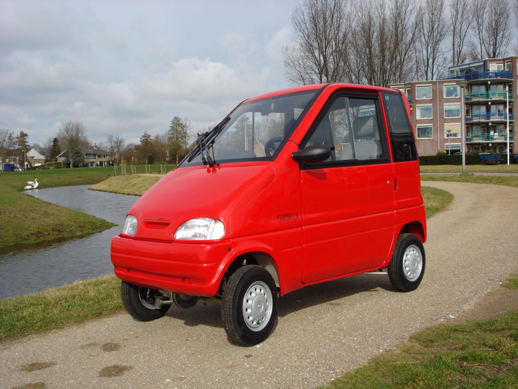
Intended solely for accessible access, many micro cars do not feature a seat but instead the backs open up to let a wheelchair user glide in and control the car with hand controls only.
These are a great idea for filling the gap between pedestrianised areas for those with severely limited mobility that do not want to be tied to an adapted car / carer. However, more than this I like them because they demonstrate how the automobile typology can be rethought once you break out of the system for cars that currently exists.
When cars do not need to house a conventional engine, when they do not need to always have ample luggage space, carry round three to five redundant seats (given a typical car occupancy of about 1.2 people), when they do not need to be reinforced to increase survivability at high speeds, and most of all, when we are freed from the constant market and social pressure to guy bigger and bigger cars, when all these things are true, the car itself can be built again from the ground up.
I like micro cars because they are the “essence of car”; they are the bare basic components of the advantages cars bring, stripped down to suit an actual specific function, and not to be a generic all-rounder. They are designed at a scale to work within a new system of transport, one in which the car itself is not the focus.
This is not to say that micro cars are a solved problem; right now there is a big issue in Amsterdam where another type of micro car, the Biro, can be purchased by anyone regardless of ability, and so becomes the unrestricted runabout of some rich people who would rather not bother cycling.
However this is a problem of regulation, a problem that is being actively addressed as we speak and demonstrates how cars, even micro cars, will come to dominate a space if given unrestricted free reign.
On a more positive note it demonstrates how car use might look in the future as modal shift continues, that the car (or something like it) still has a place in our urban areas, it just needs to be considered in context and designed for in accordance to the values of a shared space.
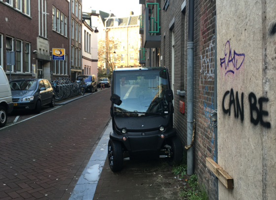
Forgiving Systems
In design we have this concept of a systems “forgiveness”. A forgiving system is one which can withstand user error or accident, minimising the negative impact on the end user. It allows users to recover easily from errors or to avoid errors entirely. An unforgiving system is one which impacts the user more severely on error. PROOF
A motorway is an example of an unforgiving system; a small error can quickly compound into a much larger one. If something goes wrong with your car, and even if you make is safely to the lay-by, there is always the risk that another vehicle hits your stopped car to catastrophic effect.
An example of a forgiving system would be a text editor with Undo, Auto-Save and Spell Checker functionality, helping users find the correct spelling and grammar, accounting for the user forgetting to save, or for unexpected computer faults, and reverse the state of the document.
Walking is another forgiving ‘system’; there’s only so much harm you can do to someone walking into them (most of the time), you can turn on a dime, start and stop as you please, and mingle in busy traffic with little collision risk.
One of the advantages of cycling as a transport method is that it is much more similar to walking in terms of forgiveness than driving a car. It takes little effort to injure someone with a car while comparatively it is quite difficult to seriously injure someone with a bike. It is still possible to have a bad fall, but most crashes have a much smaller risk profile, especially compared with the certainty of injury being hit by a large metal box at just about any speed it might be travelling at.
Because of the ease of overtaking someone on a bike and the fact that most people ride at similar speeds, there is no real punishment for riding at slower speeds; you can ride the speed that’s comfortable, and others can usually overtake with ease if need be. Try driving at anything more than 5mph under the speed limit (or often at the speed limit) in the UK and describe how patient the other cars get. Even on very dense cycle routes at rush hour, people will easily adapt round an obstruction like someone expectantly stopped, even if it may appear intimidating at first.
And if you go the wrong way? Just find a gap in traffic and spin round on the spot. You can stop as often as you like at the side of the path and easily lift your ‘vehicle’ out of the way.
All of this is to day that even while riding a larger cargo bike or trike, the stakes are low and therefore the risks are low, the tension of riders is lowered, the attention needed is lowered. You need not take on the incumbent risk of lugging about 2.5 tones of steel and metal just to retrieve a pint of milk.
Freight & Emergency Vehicle Access
There’s another bizarre idea pervading that says the only way to move freight about is in the back of a large Transit van or a full sized HGV, and that the only way to have provision for this is to give over the majority of public space to cars. Both of these assumptions are nonsense.
The first thing that needs to be said addressing this claim is that a great many vehicles we use for freight today are just too big. There is no need to have massive HGV’s ploughing down our city streets because its easier and cheaper to send one of those as opposed to smaller, more nimble vehicles. Companies like Amazon and DPD will send one oversized van each to run all day long along convoluted routes about suburbia, often to deliver small packages to each destination, rather than sending multiple smaller vehicles like cargo-bikes.
When I worked at Waitrose & Partners I got an amount of insight into the logistics processes of supermarkets and other retail companies. Large HGV’s will depart from central distribution centres and stop at two or three stores, in cities potentially hundreds of miles away before returning back, because this was the most cost effective way of distributing goods. Each driver and truck is a set cost so the fewer drivers / trucks per day the better.
Unfortunately this has the effect of adding risk to the supply chain, forcing branches to wait if the truck was delayed at another store, and affecting two or more stores if something happened to a single truck (which happens far more often than you’d think). The only reason this risk is incurred is because larger vehicles are cheaper, requiring only one driver.
This is before we consider the problem of multiple deliveries where different companies run separate vans to the same locations multiple ties a day. Even if the van starts out full, it is still not an efficient system especially when some companies require the van to move within a minimum distance of each stop, even if the driver could just park and walk.
In some cities in the UK you may begin to see cargo bikes crop up. Cargo bikes are bikes with large buckets built in and are typically electric assist (e-bikes). Cargo bikes can hold vast amounts of goods and can often easily constitute a van replacement. As they are bikes the relative emissions and congestion costs of sending more riders out or the same riders more frequently is non existent, and parking is much less of an issue. For a signifiant subsection of small business deliveries cargo bikes can be a logistical revolution.


Naturally there are times when a full sized van might be required, while you can move a sofa with a cargo bike, the effort is not for the novice rider to say the least. However by opening the possibility of new types of freight a range of hybrid vehicles can take the floor. Companies like Amazon, DHL and UPS in the US have been experimenting with cargo bike hybrids for urban deliveries. Even if the bike itself is as large as an equivalent van, it is still far safer and far more environmentally friendly than a van and better suited to an urban environment.
Loading and unloading large vehicles is also possible in areas that are largely pedestrianised. Much of the conflict created by loading on ‘regular’ streets is due to the pressure to keep as much of the road lane clear for cars, incentiviseing parking on the already small pavement and bike lanes. When you have wide pavements and bike lanes, you can more easily allocate space for loading; bike and foot traffic can merge round obstacles easily when they’re not already competing for space.
Here is an example of a recent case in Amsterdam where a large concrete mixer was required on a quiet, pedestrianised street. On a typical car-dominated street this would cause quite the disruption, yet here the intense traffic can simply merge around it.
Even on streets in the UK, bike lanes of sufficient width provide an easily clearable path for emergency vehicles; it is far easier for bikes to be dragged out of the way of an oncoming ambulance than a column of car traffic.
Lycra Clad Men
The reason that most people, when they think of a “cyclist”, imagine a man in their 20’s, decked out in specialist road biking gear including Lycra clothing (this seems to be the feature that stands out for people) is because road cyclists are often the only ones brave enough to be consistently out and about.
They are not the dominant demographic of all people who might want to cycle, they are just the only ones willing to brave the current road conditions because they don’t fear death love the sport that much.
Even for those who brave dangerous roads to commute or make trips to the shops (so-called utility cyclists) are pushed to take on attributes of the “Lycra cyclists”. You are pressured to wear as much reflective clothing as possible, to wear ‘fast’ tight clothing, to keep pace with the motor traffic to limit overtakes, and you’ll probably be hunched over an upright A-frame instead of a more casual step-through. Being asked to mix with motor vehicles you will trend towards acting like one for safety.
If you search for an image of London’s Cycle Super Highways at peak times, you’ll find countless images like this one bellow of packed cycleways, a reflection of what its like to actually be there. This is great! Don’t get me wrong; having congestion on your bike paths is a good problem to have.
However take note the amount of specific cycling clothing vs work or casual clothes, the necessity of helmets, and the upright frames, the concentration on the faces of most. It’s not universal, but many people still often look more equipped for a race than the office or the park.
How people dress and the equipment they bring is an indicator of what they feel they need to be prepared. They tell you about the environment, how safe it is, how safe people feel, and how much skill is needed to cycle there.

Now lets look at a random image of Utrecht in the Netherlands (although you could do the same for any city or town in the Netherlands). This image shows a typical rush hour scene in the Netherlands, the only unusual bit being the bike lane is actually quite small by modern Dutch standards.
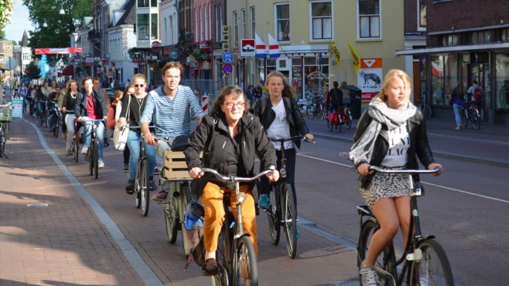
In the Netherlands you’ll rarely see people wearing “cycling clothing”, most just ware whatever they happened to have on, be that a suit, a dress, or work gear. They don’t need helmets because its completely safe, and they prefer step-through “Omafiets” bicycles which they barely maintain and will actually brag to you about how beat up their bikes are.
Hardley bike-crazed enthusiasts, these are just regular people who have simply chosen the most convenient way to get around.
The most important thing to note is the diversity of people cycling. From little kids to pensioners, athletic and not athletic, office workers and construction workers, confident and less confident, able-bodied and physically-disabled, mental disabilities or none. People with disabilities will often ride recumbent bikes, trikes, scooters, micro-cars and other non-typical mobility aids which they can use on bike lanes.
As one last anecdotal example, here are three screenshots of people cycling caught on Google Maps of our case study roads, the Ayr Road, Fenwick Road and Victoria Road. While this isn’t in any way qualitative evidence of anything, I feel it helps to create an image of the above effect.
The first image is of the Ayr Road prior to any protection being put in. The second is of the only bit of protection caught on Google Maps on Fenwick Road, where we find this second person in red. The last image is from Victoria Road.
Which one of these is the odd one out?
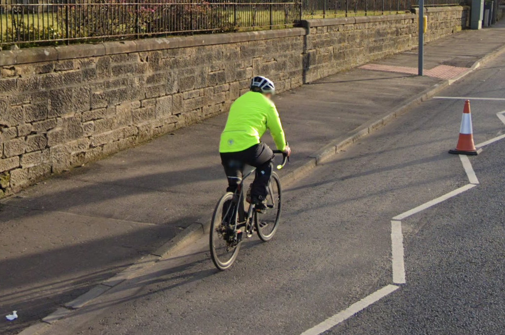
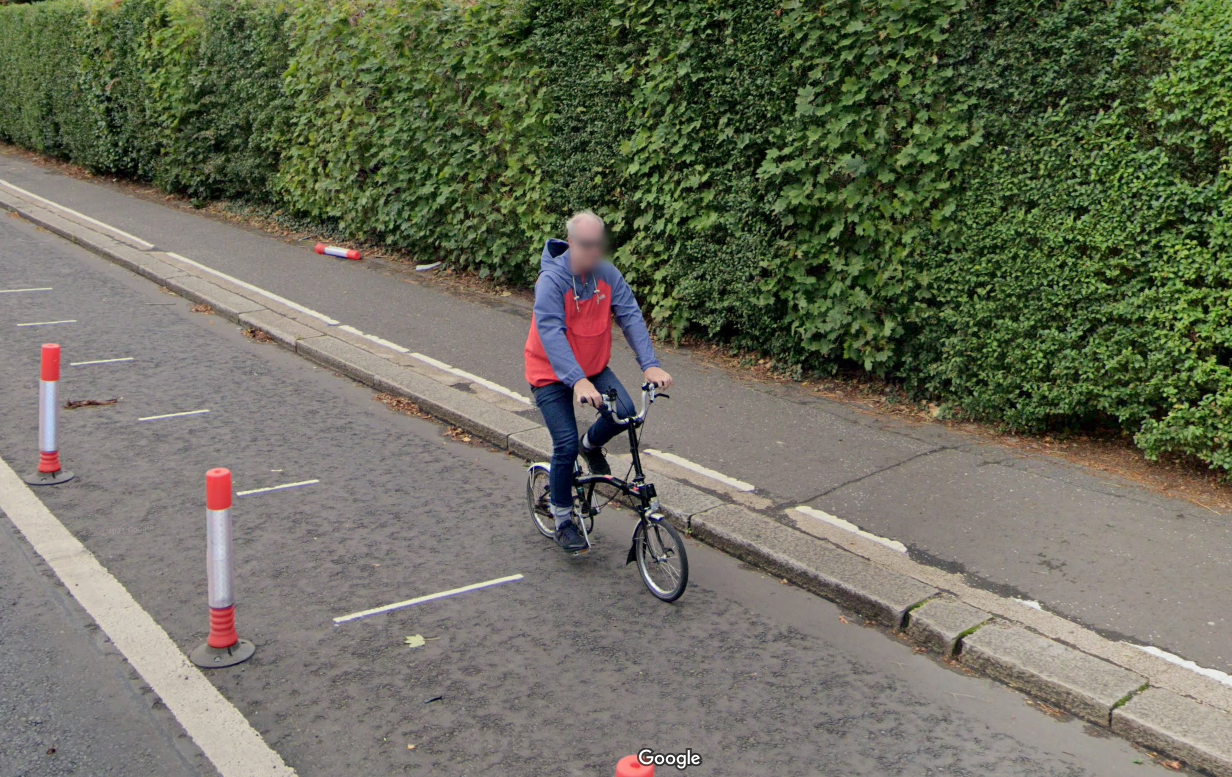

Conclusion
The Ayr road is a microcosm of the transport and urban design situation in the UK.
The result of a combination of half-baked ideas of what cyclists want and need, bollards were added under an understanding that protecting cyclists would encourage the use of bikes, and removed again because the safety of cyclists is not a seen as important to those in charge. It’s brief moment as a genuinely good (not great) piece of infrastructure was more a fluke than a plan, and its value was lost on those who made and unmade it.
Many individuals, governments and organisations talk about wanting to reduce congestion and increase active travel. Some mean it, some just want to look as though they mean it.
When I was in school in the early 2000’s we were surrounded by messaging about climate change and the need to use “personal responsibility”, to solve it. While the insistence on personal consumption is now seen as a cynical marketing technique from the fossil fuel industry, there was at least the acknowledgement that the private car was a contributor to climate change. We were urged to drive less and ask if there was an alternative way we could make a journey such as walking or cycling.
While the message was clear, it was backed with very little real incentive. Much like many active travel campaigns today, the desired result (more cycling, less driving) was shouted over and over again at us, but very little happened to encourage uptake. There is an attitude that a lack of active travel is the result of not making the point well enough or not shaming people into doing it enough.

Anecdotally, it seems as though car dependency has become more ingrained since then. We seem less able now to acknowledge the simple fact that the car has an environmental impact, and that we must try to reduce car usage overall. I’m a little baffled, looking at the election material for 5th May 2022 that almost no counsellors are stating the objective to reduce car numbers, perhaps because they know that stating such will garner a negative reaction.


Car numbers have doubled in the past ten years, never mind the last 20, the cars themselves are often less efficient today and are certainly far larger.
Study after study shows that there is a latent desire for cycling and active travel infrastructure in the UK. A recent UK study found that approximately 71% of Brits support more cycling infrastructure, and about 44% could consider cycling more if it was safer.
I’ve always found it interesting how many fellow Brits will cycle on holiday, or strap a bike on the back of a car for a weekend trip. A great many of us have experience cycling at some point or another, there seems to be at least a couple of bikes in every garage in the country. Whenever there is something like a critical mass ride, we come out in droves, with our kids, or on our own. There is a latent desire for more cycling infrastructure and a baseline level of interest amongst a proportion of the population.
What stops people is not (as the consensus when I was at school assumed) laziness or a lack of information of the benefits, it is the lack of safe provisions and stress involved in doing it. It does not matter if cycling is technically safe, if it is stressful, and if riders are not confident in the route then they simply won’t do it.
In Britain, like in many parts of the world, we are contending with a rapidly ageing population. This has a number of implications, but for transport specifically we have a problem where too many people will be unable to age-in-place due to being car dependant. The number of people relying on mobility aids and scooters will continue to increase for the forceable future while we have trains that lack level boarding, infrequent and inaccessible buses, and pavements which are too small and falling apart.
Many of our town centres were retrofit in the 60’s to accommodate the car, ploughed through to squeeze every last bit of performance as possible, and locked in place due to a lack of political will to change them. Increasingly the only political action taken in this country is in an attempt to remodel it based on a vague image of how things were, as remembered by the people in charge.
Transport was, and can be again, a solved problem. The solutions exist, the barriers are entirely political.
We once had tram networks in every city sprawling out into the suburbs and countryside. It was possible to go almost anywhere by a combination of train, bus, tram or coach. Cycling and walking were easy because everything was at human scale and there were few cars to contend with. And all this was before the technological capabilities we have today.
With today’s technology we have sped up trains but now have a saturated network. We have much more comfortable buses but refuse to lay on enough of them. We have e-bikes, scooters and wheelchairs but few places to put them. And of course we have efficient automobiles within the reach of a majority of people.
Rather than mixing modes carefully together so they can work together, we have saturated the land with cars such that even the cars cant move. In the 60’s and 70’s they believed it was possible to design around this problem with overpasses, large car-parks and road widening / clearing, and we now live in the result. If you could talk to the most enthusiastic proponent of the private car and suggest the notion of ‘car dependency’ to them I suspect they’d be horrified. “What do you mean ‘no other option’? Cars are supposed to be liberating, not confining!”
It is time to stop trying to solve the impossible geometry question of one large metal box per person in a space and to let the car do what it is most suited for. It is time to stop beating the dead horse and nievely questioning “Why doesn’t it move? Its supposed to move when its hit?!”, to stop trying to solve congestion with more and more capacity.
By the time the UK looks anything like the Netherlands today the Netherlands will look completely different. A commitment to active travel (or, if you like, intelligent land use) is a commitment to continual adaption and land use reassignment based on the needs of the time.


