The MoodBoard System | Matter of Stuff

Matter of Stuff are a bespoke design agency specialising in connecting client with their vast network of manufacturers and crafts people.

Matter of Stuff found themselves in a need to streamline the involved process of developing proposals for large-scale projects with clients. They needed something which offered flexibility in working methods and presentation structure that was collaborative and fast.

The result was the MoodBoard system, an integrated curation and display system which displays products, materials and media from the MoS website and catalogue and allows rapid prototyping and iteration of anything from a full project proposal to a simple colour scheme.

The app is built on principles of feed-forward data, with immutable patterns held to where possible and DOM changes staged into render cycles which, in turn, attempt to avoid re-rendering unchanged sections.

The only JS library used was jQuery given its presence on the site pages by default due to the CMS. A jQuery plugin library called Gridstack was used to create the grid snap functionality.
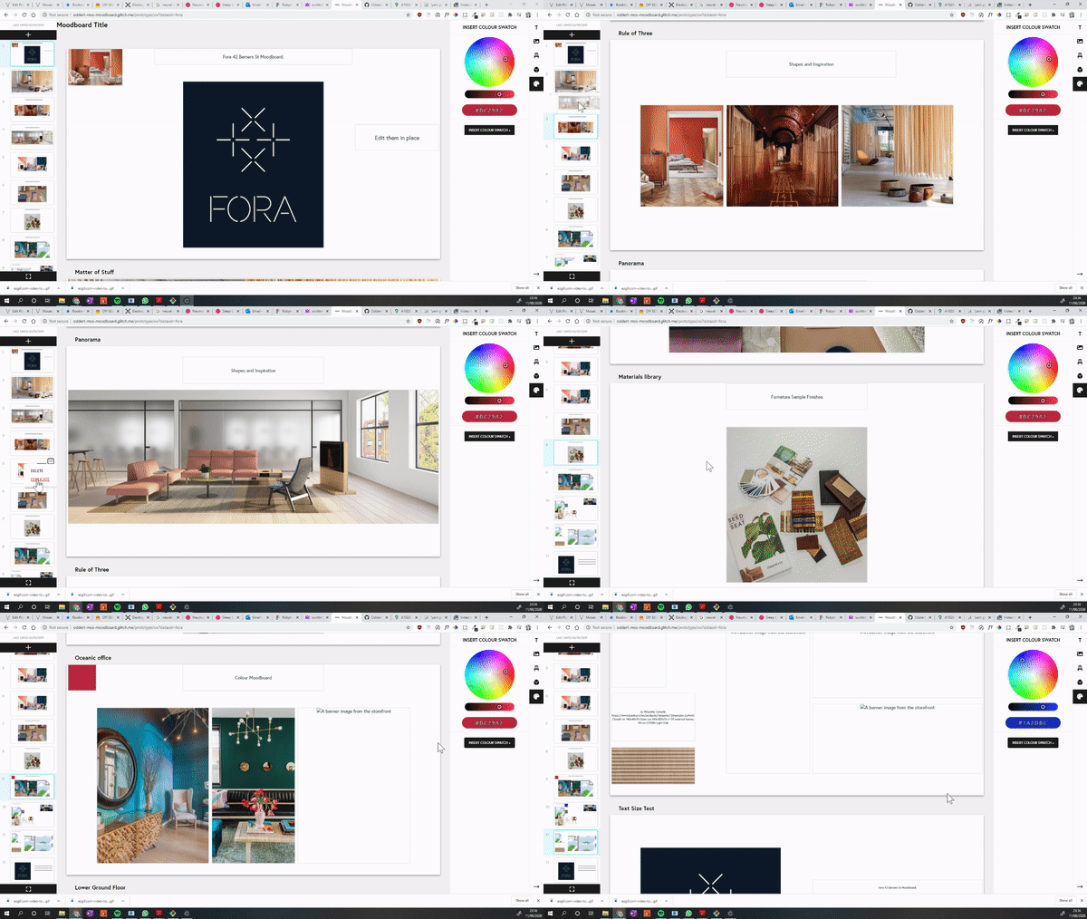
The final version, showing a dummy proposal for a hypothetical Fora branch

The Problem

When Matter of Stuff work on larger projects, they may find the core team tasked with designing the interior of an entire building, high end venues where every detail must be carefully sourced and made to fit with one another, manufactured bespoke.

One aspect of their working method involved creating documents which were, in essence, rolling design proposals. One page may have material swatches for a type of chair, the next a series of images describing a desired ambience, another will detail the layout of a room or floor, another lists technical specifications, another is colour combinations, etc.

These documents not only describe the overview vision of a project, but are ‘rolling’ in the sense that multiple stakeholders would make changes before sending the document to the next. The documents were pieces to have conversations over, more than just a display of specifications.

This was primarily done with Google slides which created a range of issues from content-secure policies, document permission control, images becoming out of date as the products changed on the main site to name a few.

The Solution

an image being adjusted in situation
A demonstration of the custom built crop tool

A number of potential interventions were discussed, eventually we agreed that I would build a Google-slides inspired system specifically tailored to their site’s eco system.

In addition to it’s functionality, the resulting site speaks to the bespoke, high-end image Matter of Stuff seeks to project. This is not just another colab tool, this is their colab tool.

Each MoodBoard presents one or more pages, which appear like slides on a slideshow program, the style heavily influenced by Google Slides which the team relied on before. The content on the slides snaps to a grid, can be resized by clicking and dragging, and will ‘nudge’ smaller elements out of the way. This reduces the combustibility of a slide-show program to allow for rapid layouts without worrying about item size or alignments.

Gone are issues with resizing items to ensure they are the same as each other, spending time lining them up, getting frustrated when they inevitably still end up skewed. The curator is free’d from the tyranny of infinite choice, to focus on the actual content.

The MoodBoard can display just six types of content:

  • MoS Products
  • MoS Material Library Samples
  • Files on the CMS
  • Text Boxes
  • Images (internal or external)
  • Colour swatches

These were chosen based on what types of content were most often used in the old working process on Google Slides, with the addition of files which previously necessitated a hyperlink.

The text box input
a successful product search showing wall lamps
Live updates allow the user to find content quickly without typing verbose queries

With content search (product, material) and image URL’s, live updating is used when the user is typing. To keep the strain on the server low, recent items to be shown first are cached on page load, only performing a database query once the user has stopped typing for a while.

For images, I built a custom crop tool which allowed the user to move and resize images relative to their container.

Double-clicking on an item would display its meta-data in place of the Add menu, allowing users to, for example, choose which image on a product is the cover, or interact quickly with a colour wheel.

A history system recorded the last 10 changes made by the user with standard shortcuts for ‘undo’, ‘redo’, ‘copy’, ‘cut’, and ‘paste’. For instance, if the user is on a mac, they can Cmd + Z to undo, with Ctrl + Z on windows.

The slide navigation icons each show an SVG representing the data on the page which updates on page-away, using a custom built function to dynamically create the thumbnails.

Previous Directions

Across the duration of this project, a number of different versions were created and iterated upon until we were satisfied with a modality that met all of MoS’s needs.
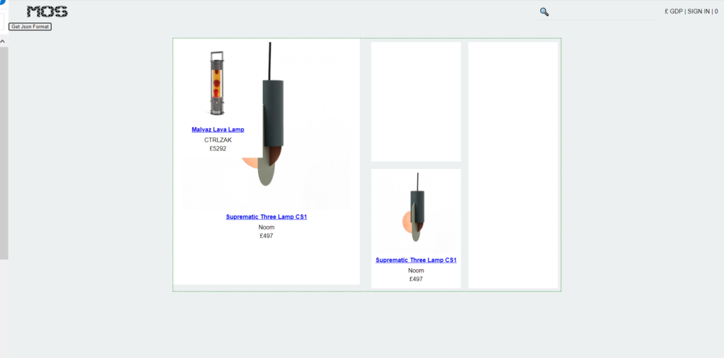
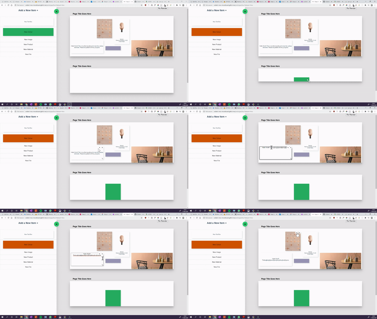
An early prototype designed as a proof-of-concept for Gridstack
The next iteration added pages as opposed to one continuous masonry layout.
Version four featured dymanically-sized board and was going to have a drag and drop interface. Drag and drop made it into the final version as an alternate way to add new items.
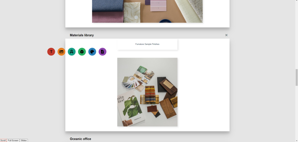
Version Five saw much of the same functionality that would reach the live version, but used a minimalist interface where clicking on an area would show this menu above the cursor. The sub-menus would appear in place and functioned the same as he side bar menu in the live version.

Cloud Notes

A hyper-simple note taking app with auto-saving and cloud storage, inspired by OneNote.

With React-Redux on the front end for single page app efficiency, this app utilises local storage and MongoDB to allow the user to resume their progress on load but only save what they actually need. Security with Helmet.js, authentication with 3rd party Oauth2.

showing the tag filter
A simple tag system allows notes to be grouped and recalled quickly

I wanted to flex my new skills in a project that was clean, followed a structured project plan, and solidified my learned findings. I also wanted to mature some of my visual design work given my tenancy to flip back and forth on a design theme and make stuff up as I went along.

This app was built after projects such as Pinapathy and the Stock Price Viewer. I was proud of the things I had done and learned but still felt uneasy given how much I had to wrestle such things as getting Passport Oauth to work with React.

the notes menu being interacted with
An example of matured responsive UI feedback; in the past I would toggle between items going lighter / darker on hover, on click etc

The code structure such as the server routes and packages needed, as well as the front end components and application structure were planned in advance, I was able to successfully reconcile some of the things that bothered me with the previous projects, and I achieved my goal of a super “clean” app, even if it’s functionality was not much of a push on my skillets as I would seek out in later projects.

drop menu being demonstrated
UI features such as a drop menu which closes on out-of-bounds clicks and an unsaved-changes indicator.

Direction Planner

The Directions App was an attempt to reconcile challenges around balancing complex responsibilities and needs in day-to-day life, inspired by a personal need.

A new take on the classic “work life balance” dichotomy, the Directions App presented all actions and responsibility as equal, and aimed to offer ‘mindless’ task direction without simply creating to-do lists.

This was a significant project to me, it was my first proper Redux application and allowed me to hone in React knowledge that I had previously only uses in fits and spurts.

Much later on, the notion of non-coercive task organisation and my findings from this project influenced the “traffic light system”, a component of my project Boots & the Future of Wellness.

View the live demo and repository with the links or read on to learn the backstory.

Backstory

Ok so we’ve all built To-Do lists, you learn the basics of a new MVC framework and can easily test your work. Then maybe, while continuing your learning, you make a version with data-persistence, probably with localstore or maybe something like Redis. Then if you really want to, you can set up a database and save the data permanently which is a great way to practice React-Express integration.

If you desire more in-depth productivity and planning tools there is no end or free software available to help you ‘do more, faster and smarter’ or ‘take control of your work’ or ‘plan every last detail’.

I found myself in a personal quandary. I, as ever, had a lot going on in my life. I was slowly coming to the realisation that just powering through; working endlessly, pushing myself beyond limits, just wasn’t working. Day’s blurred into one endless stream of “stuff”, with five things demanding my attention at once, an endless wish-list of things I’d like my life to have (or not have) “once this is all over”.

I would burn out, I was kept physically fit by running about all day but my health took a beating with regard to diet, sleep, and of course, mental state.

You are a machine

Everyone has at least some experience of living like this and maybe gave or received advice that sounds something like “You’re not a machine, you’re a person, you need time to breath and do other things”. I agree with this sentiment broadly but I think it misses something: a ‘machine’ of most types does not run endlessly, without “rest”, or without “breathing”.

The definition of machine is broad but lets generalise of a second, imagine an abstract “Machine”. A machine can run for a duration of time then needs repair. A machine can run at sustainable levels for long periods. A machine can be pushed beyond it’s quoted physical limits but with the cost of quicker time-to-fail or malfunction.

I don’t know about you but that sounds like a pretty good description of a person to me.

A person is a biological system that has needs and conditions with affect their behaviour and abilities in their ‘functioning’, living day to day life. To take some easy exemplars, if you don’t sleep enough, you can put in all the extra hours that you like but won’t necessary be as productive. If you write something while caffeinated it may have a different read to something written in a more subdued state. If you do work while a little tipsy you may find you peak in creativity and inspiration but make sloppy mistakes and quickly drop bellow productive levels.

Here’s one I still struggle with, if you are stuck on a problem, taking time away, rather than trying to power through, can let your subconscious process it in ways you are unable to, leading to faster solutions. As intuitive as it may be to step away while the clock is ticking.

“This is not a task-list”

So how exactly do you balance things when you have five ticking clocks and now, the pressure to do this “self care” thing you just learned about?

You could try a simple planner and a to-do list but these both have the issue of making everything a “task” to finish. Is walking in a park a task? Reading a few pages before bed? What about things that repeat, like if you are job searching and need to do a little every day? Do you continue on weekends? How much do you do a day? How do you measure it?

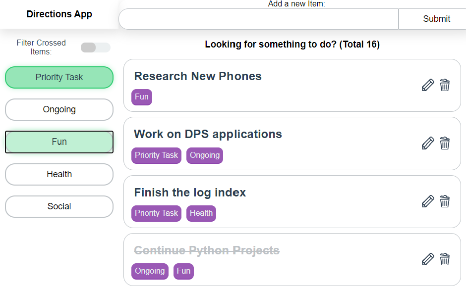
The Directions App was an attempt at doing just this, it ordered all items with equal weight, utilising a tag system to differentiate them.

  • Priority: this denotes actual task items, things which need to be completed
  • Ongoing: this is used for tasks which repeat for a duration of time
  • Fun: used for recreational activities
  • Health: used for activities which benefit health and well being
  • Social: used to section social activities

In this way you could combine which would show items denoted by which filters were active. Looking to do something recreational but also healthy? Turn on ‘Fun’ and ‘Health’. Set some time aside for task work? Use ‘Priority’, and so on.

Looking back

I still have a fondness for this app even if I didn’t actually end up using it all that much after a while. It was a useful way to explore things which exist between boundaries such as something which is fun and enjoyable to do but is still ‘work’. I realised that by assigning everything a tag and grouping them together, I could see the interlink between various tasks but it didn’t work so well to actually designate time, to come up with that magic formula where everything is balanced and just falls into place.

On a stylistic note, it was useful for me to develop emerging styles and layout patterns which would be refined further later on, even if it looks somewhat garish now.