Introduction
Personal Finance is an application designed to provide insights into a user’s spending as an individual, and allow the user to create realistic, practical budgets and future scenario projections.
Personal Finance was essentially created to fill a very personal, specific requirement, but as time went on I realised it also had the capacity to be a showcase project for what I consider to be a standard, internal enterprise grade, microservice application.
In the beginning I was performing finance planning by hand, I had a series of Excel sheets with graphs and calculations to pull insights out of data which I manually downloaded from my online banking and pasted in for each month. It was an enormous pain. The first version of PF was designed with the specific goal of simply replacing this.
A Showcase App
The brief for the app is nothing new or extraordinary – and definitely nothing that hasn’t been done before – however, after building some momentum on the project, I realised it had the potential to encapsulate improvements to my practice over the past few years, and to become a showcase application for what I consider to be the minimum standard for enterprise grade microservice applications.
In this portfolio piece I’ll walk though the features of PF but also use it as a jumping off point to talk about building applications, big and small, for large corporations.
You can read my more extensive thoughts on what I define as “enterprise quality” on this post. Originally these were the same post but I have a habit of writing far too much (don’t check the word count on this one, don’t worry it about it), so this post will focus just on the application itself, with some scattered references to the other post.
How to Read this Post
This post is split into two sections, a Phase 1 and Phase 2. This is because there was an initial build-out of the application centred around an initial goal that eventually ended, back in 2023. While I did the odd bit of work after that the project was mostly shelved, until the end of 2024 when I came back to revive it and take it in a new direction towards the place it’s in today.
The post is a bit of a long one because I’m not capable of brevity, so I’d recommend skimming the main headers to read about the interesting bits or just look at the images, rather than read it start-to-finish. Some of the best bits are towards the end.
Or maybe you’re the kind of person who reads technical manuals on holiday like me, in which case, enjoy!
Phase 1 (2023)
Data as a backbone
The core of the original starting point was to create a system focused around ingesting data as easily as possible.
The thinking was pretty simple; the most labour intensive, non-automated part of using The Old Excel Sheet was manually getting the data, plugging it in, categorising the transactions, and changing the graph ranges. The process was the same every time, the charts never needed to change, the slowness was in just getting the data in.
If the problem of data ingestion was solved – that is, made as smooth and automated as possible by a new application – most of the friction to automating insights would be removed.
If this could be achieved to an acceptable standard then the application would become a sort of CMS for serving standardised, sanitised transactions on which any number of features could be built. The features themselves were not really in focus at this time (more on this misstep later), because if the data ingestion isn’t there, then the app fails it’s primary purpose to replace the manual spreadsheet.
With this in mind, the guiding design principles setting out were as follows:
- Avoid being influenced the design of other similar applications, to avoid going down rabbit holes building non-priority features because someone else did it and it seemed cool.
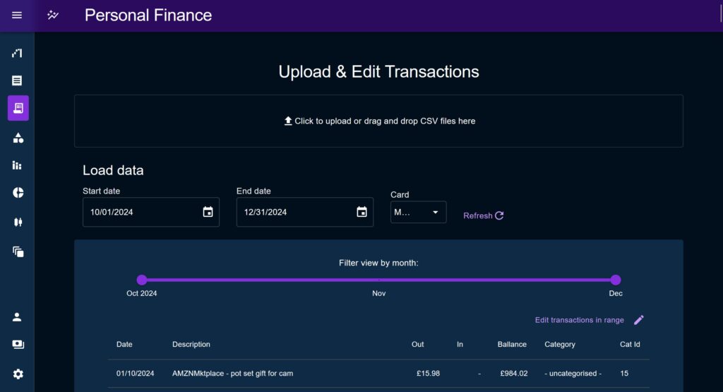
- To focus the user journey on data import, making adding data as easy as absolutely possible.
- To make the application a showcase of my idea of a modern React application (for 2023/4/5).
Designing the data ingestion
Broadly speaking there were two big challenges to tackle when considering how to ingest data into the system:
- How to deal with various CSV formats, common in the export of online banking systems.
- How to solve the problem of categorising transactions into the user’s defined categories, making them useful for analysis.
Interestingly, transaction categorisation is a continually important line of research and development within banks, I’ve personally had some very interesting conversations with teams within NatWest on the topic.
Importing is done through an upload modal which allowed me as a developer to introduce data sanitisation and post-processing in between the two steps of the user uploading and writing the new data out to the database.
CSV relation mapping
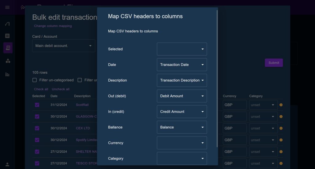
The import modal presents a ‘relation mapping’ modal which defines associations between the columns on an uploaded CSV, and the column names used by the application. The user can change these mappings and see the data reviewed in the table in real time, allowing them to take any CSV format and auto-fit it to the application.
This feature is based on the idea that most people will typically perform batch-uploading, and will typically be taking data from the same online banking system, therefore the CSV mapper saves it settings to the browser’s locals to rage to prevent having to enter it fresh each time.
The staged transactions are presented to the user in a table under the headings used throughout the application. The user can immediately see where a piece of data is missing, update the column mapping, and see the result populate the table.
An addition made in Phase 2 was to allow each field to be user-edited, as well as allowing them to enter and delete rows manually. Checkboxes were added to each row to allow users to selectively ignore part of an uploaded CSV. Other Phase 2 additions included shrinking the row padding considerably to fit more on screen at once.


Context Reducer Pattern
A design pattern I can’t get enough of in React is the Context Reducer pattern.
React’s Context API allows you to define a local state which descendant components can access, and is intended to avoid excessive prop-drilling and callbacks. The useReducer hook provides a Flux State implementation within a React component wherein you have a piece of state, you update the state via a reducer, and you interact with the reducer via dispatching actions.
By leveraging these two together, you can effectively make a ‘mini Redux’ localised within one part of your application. Within a sub-tree of the application components can all subscribe to parts of a shared state, regardless of where they sit, and update that state via actions which can be moved out of the component for cleaner code.
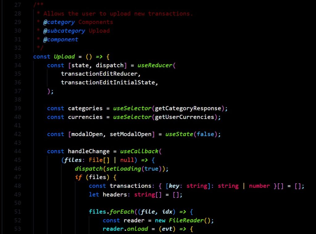
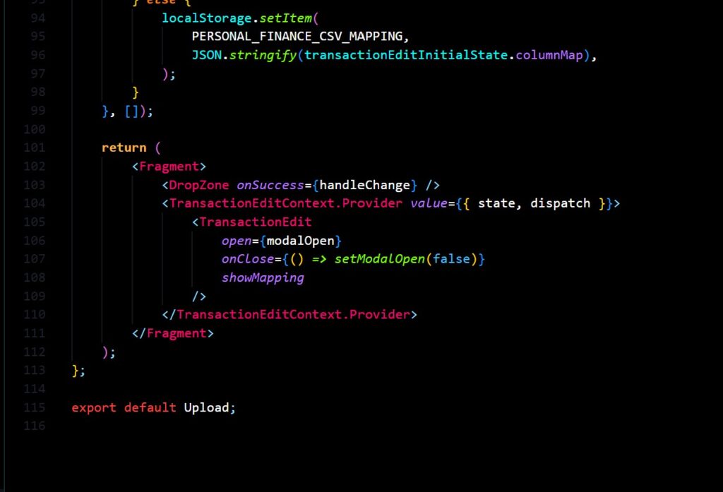
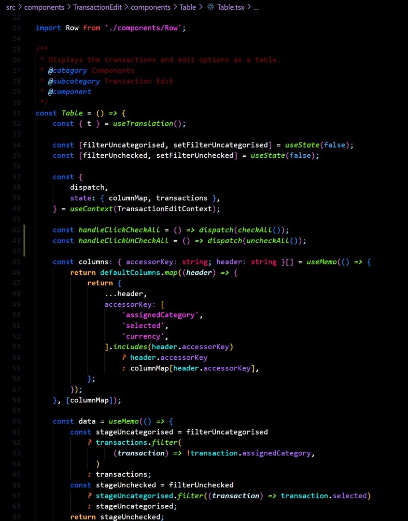
In the case of the Transaction upload, having a single context gives us the advantage of staging the original raw data in a shared state, whilst small updates are made one at a time to rows within the table. The column mapping also lives in this state and is accessed at render time by the table to identify which piece of data to show in each cell.
One downside I must admit is that because the types of each column in the CSV cannot be known, each cell interprates it’s data as string | number | null | undefined which caused no end of headaches trying to maintain type-safety. The transaction rows were typed as as follows { [key: string]: number | string | null | undefined } so when the column mapping says that “description” can be found on the key “Transaction Desc”, it has no way of knowing what that will correspond to, and has to be ready for it to be undefined, an invalid number etc.
Category Matchers
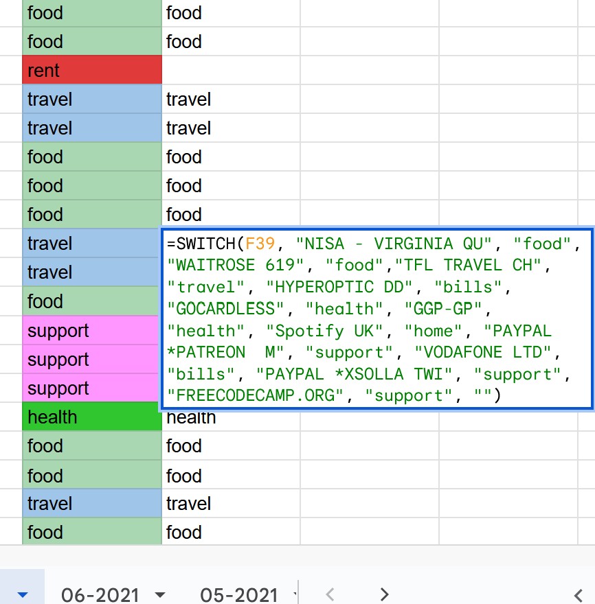
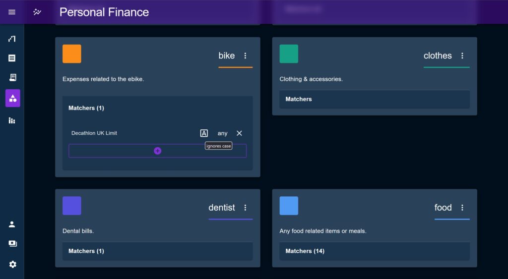
Back in the days of the Old Excel Sheet, I got so tired of manually categorising transactions that I began writing a switch function to identify common strings in the descriptions. As you can imagine this got wholly unwieldy almost immediately and was one of the key motivating factors to building this system.
The equivalent this time round was to have an entity associated with Categories called a Matcher. Each Matcher has a string, which it uses to create a regular expression and evaluate each description at runtime and attempt to auto-assign a Category. The user is presented with the option to match the beginning or end of the string, a partial (global) match, or the whole string, and can choose whether the matcher is case sensitive.
For those transactions not able to be auto-matched the user could use an Autocomplete to find and select an appropriate transaction. These would be indicated by a little orange dot to draw the user’s attention.
Transaction ‘Quick Add’ Drawer
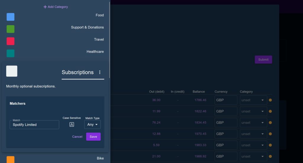
It became quickly apparent that creating Matcher’s primarily needed to happen during the upload phase, as this is when users will sit with the transactions open and when they will notice that their local Tesco Express shows up as “TESCO STORES 6257” and could easily be matched with a Matcher set to: text = ‘tesco’, case = ‘ignore case’, and match location = ‘match anywhere’.
Having to leave the upload modal and loose any staged data, navigate to the Category page, add a matcher Matcher, then come back and start again was clearly not practical every time this happened.
To solve this, a slide-in drawer was added to present a minified view of the list of Categories and allow users to add a Matcher (or edit/remove one if they notice a bad match) without ever leaving the submission modal.
When the user clicks on a transaction description, the modal opens with a compact list of Categories, then when the user clicks a Category, the sub-menu for matchers opens and pre-populates with the description and a set of default values for the other fields. This was all made with the idea of minimising the effort required to create a Matcher, in theory as little as three consecutive clicks.
Lastly, once the Matcher was created, the drawer would close and re-scan the entire dataset to try to perform an auto-match on all Transaction. So in our Tesco example, when I add the missing Matcher it will then auto-categorise all Transactions from that same shop.
The goal of these features was to try to bring the number of manual categorisations to zero, as an aspiration.
In reality, there will always be anomalous Transactions and things like online retailer transactions that will have to be manually identified by the user etc. However an insight drawn from The Old Excel sheet is that a majority – often a vast majority – of Transactions were form the same places and looked very similar.
Issues with the table library re-rendering
Another challenge I ran into was with Tanstack React Table. Nothing against React Table; its still my go-to for most use cases and I really appreciate its headless nature (after having to deal with the non-headless AG Grid at work), but I think this was definitely the wrong usecase for it.
On several occasions, most notably when I introduced the MUI Autocomplete selector for Categories, the table would get into a render loop. Adding in memo’s helped, but often just pushed the problem elsewhere. I started moving cell rendering out from the column definition and just manually identifying the column type which was a tad messy.
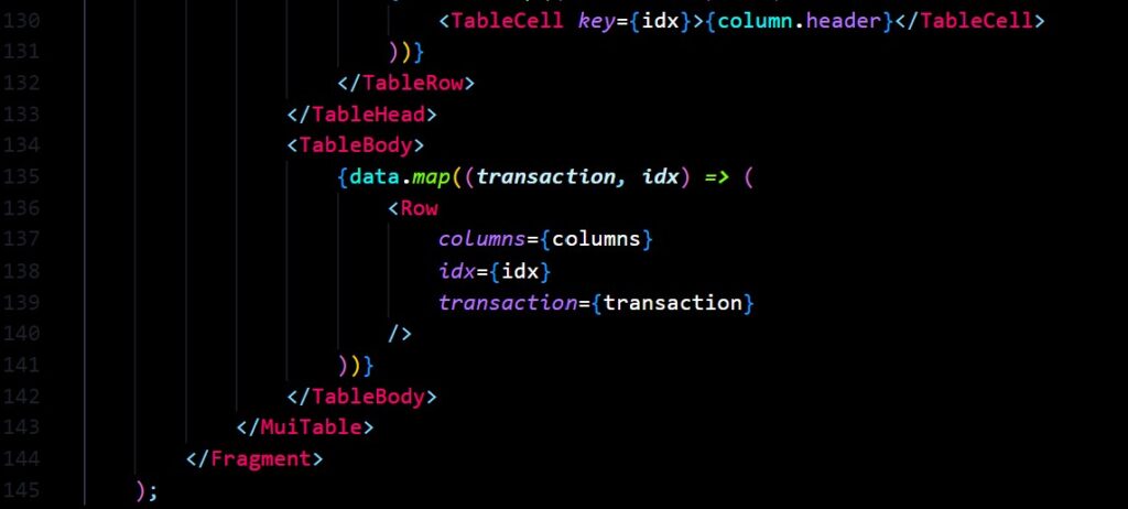
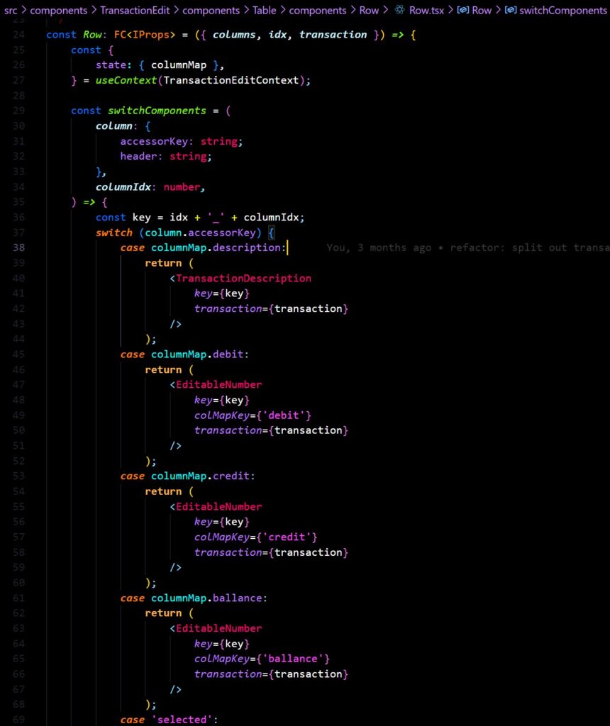
In Phase 2 I removed React Table entirely and create a ‘switch component’; a component who’s only task is to render one of a series of sub-components constituting the table cells. The table would still use a column definition like React Table, but instead of using the library itself, the switch would choose a cell type to render based on the column name.
Questions about data recall
Aside from being ‘the place where you upload Transactions’, the Transaction page had a bit of an identity crisis as it wasn’t initially clear what its purpose should be.
There was nominally an idea that it should show historical Transactions, the most recent first, but this was in conflict with the application state which may have a historical range loaded which was not the most recent. Should the page load up its own list of Transactions, just to have something to show? Should it override the cashed Transactions in state? This problem wouldn’t be properly addressed until the creation of the useTransactions hook, and associated conditionallyRefreshTransactions thunk action later in Phase 2.
The page ended up with a date range selector which would default to the past month, but also a Slider range control. Quite honestly I can’t remember how or when each came about but there was no clear idea which should do what.
The app was originally built around loading up the entire set of historical transactions from the database at once to perform analysis on (see ‘Mistakes’ below), but this was clearly not performant or scalable in the long run.
The Scenario System
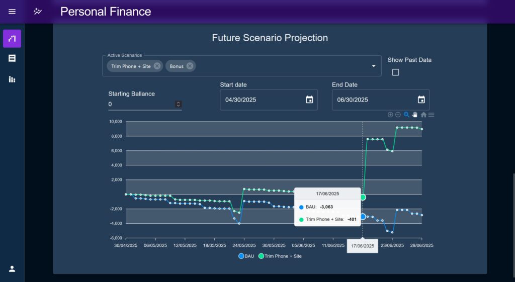
The scenario modelling system was the first big ticket item I wanted to make, intended for the dual purpose of extrapolating past trend data into the future, and positing “what if” style variations to test the long term effect of hypothetical spending / saving actions and events.
At the time I found myself saving for a deposit to buy a house and was not only interested in when particular targets would be met, but wanted a better way to estimate what eventual running costs would look like over time. As an illustrative example, at the time (early 2023) there was a lot of fluctuation on interest rates so the purchase price had to be balanced against what the repayments would look like as it was entirely possible that I could afford the deposit but then be unable to manage the resulting monthly payments. I was unable to take one number as a ‘hard cap’ to target.
The initial idea was to have two halves to the Scenario system; past data would be used to extrapolate a trend line of how the current status quo is expected to continue, while a future ‘anomalies’ system would allow the user to imagine future changes and compare their results.
As it turned out, extrapolating a base trend line from historic Transaction data automatically proved to provide too many false positives to be useful. One unusual one-off purchase would throw the trend line way off, so this idea was mostly shelved.
Instead, I decided to just use the forward projection capability for everything and ignore past data for the time being. If the future projection capability was good enough then projecting from the current status quo wouldn’t really add any value. Also, the idea of just projecting past trends into the future is imprecise and makes allot of assumptions about how the user’s real life works.
Scenarios, Schedulers, and Transactors
The scenario system works around an entity called a Scheduler. Schedulers, represented by a series of classes based on the same base class define a single type of transaction (roughly corresponding to Categories but not constrained to them). These are then composed together by a system like the Future Projection chart to define a series of changes to a starting value over time.
The Scenario system was designed to be extensible, but initially focused on the Future Projection chart, which does exactly this; it defines a start date, a starting value, and an end date. Between these two dates it maps one or more Scenarios in order to create a line per Scenario representing the account balance through the time period, which would then be compared together.
How Schedulers are used to create transactions
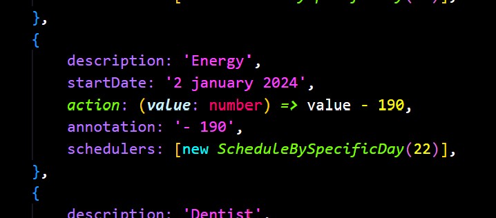
Schedulers all contain an action function called a Transactor who’s purpose is to modify a given starting value, representing a single transaction, and is usually just a simple add / subtract. In this section “transaction” refers to a single date produced by a Scheduler, telling the runner when to modify its base value.
Schedulers expose a series of common methods which allow the Scenario to generate a series of transactions across a date range. These methods allow the runner (like the Future Projection chart) to query a single transaction to see if it is valid for a given date, or to generate a range of transactions within a given time period.
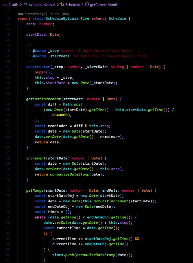
Scheduler’s date attribute
Schedulers are all initialised with a date which defines their base starting date. In repeating Schedulers this defines a starting date from which to continue a repetition from, if the Scheduler is not a repeating type, the date defines when that transaction occurs. Most of the accessed methods then also specify a ‘start date’, and some specify an ‘end date’, which are used to get a single transaction or a list of transactions for a range.
OK lets break all that down, imagine you’ve setup a weekly Scheduler to represent a weekly food spend, maybe you have its Transactor set to randomise the result a bit to mimic slightly varied spends across a month. You could set its start date to be a Monday from three months ago, and set it to repeat every 7 days.
Now, when you begin a Scenario in the middle of this week (lets call that Wednesday the 5th) to run for two weeks until Wednesday the 19th, you would generate a list of transactions which would yield a list of dates of Monday the 10th and Monday the 17th, instead of on each Wednesday (the 5th, 12th, and 19th) which is what we would expect if we were simply counting 7 days form the start.
In this case, the Scheduler will have looked at its date as the original start date, repeated forwards until it found the method’s start date, then counted each date which occurred until it passed the method’s end date.
Scheduler methods
Not all methods exposed are used by all Schedulers, simply because their different behaviours have differing requirements, the ones marked with asterisk’s (*) are the ‘main’ methods and shared by all:
increment*: Takes a start date (defined by the caller), increments it by one step, and returns the new date. This is used extensively by other functions to generate a range of values by stepping forward one increment at a time.getRange*: Takes a start and end date and produces a list of transactions which fall within those dates (inclusive).getMonthRemainder*: Returns a list of transaction dates for the remainder of a calendar month based on a start date argument.getLastIncrement: Used exclusively byScheduleByScalarTime. Takes a start date and tries to find the most recent valid date based on the internal start date and step size, stepping forward until the most recent date before the requested start is found.getCurrentMonth: Used internally. Gets a list of all transaction dates for the whole calendar month in which the start date is found.getMonthTotal: Used internally. Returns a list of a month’s worth of transaction dates based on a start date by incrementing a JS Date by 1 month.
The types of Schedulers created for this initial build-out were as follows:
Schedule by scalar time
This is probably the most versatile and commonly used Scheduler. This represents any repeating value which repeats based on a set amount of time, for example “every 13 days”.
This Scheduler is instantiated with a start date, representing the first point in time from which this date applies, and a step, representing the time period over which to create dates.
Schedule by Specific Day
This Scheduler takes a day of the month and repeats that on a monthly cycle (e.g “every month on the 20th”). Aside from Scalar Time this is anticipated to be the most useful scheduler as it can be used to represent repeating bills and costs that maybe occur randomly but accounted for at the end of the month.
Schedule by Day of the Week
This Scheduler takes a day of the week, specified as a zero-indexed number, or a small string (‘mon’, ‘tue’, ‘wed’, thu’ ‘fri’, ‘sat’, ‘sun’) and repeats on that day every week.
There is an option to provide an “nth day” parameter which would skip dates depending on the number provided. E.g. specifying 2 would execute on every second day. The intention with this was to replicate the functionality found in calendar applications where you could specify for example “occurs on the 3rd Friday of every month”.
Schedule by Event
This is the ‘one-off’ scheduler, representing a single transaction at a single point in time. Most of the methods exposed simply perform a check to see if a given date falls within the 24hr period defined by this starting date.
For example, the getRange function will return a list with one date in it, the class’s start date, if the date falls within that range. This is just to maintain compatibility with the other methods as it is acknowledged that using this class will be rare.
It should be noted that this class only takes a single date, there was an idea to create another class which would take in a list of specific dates but this was never implemented as there was little need for it.
Integrating Past Data
There was a vague idea early on that the Future Projection chart could integrate historical transaction data in order to compare a projection line against a real trend. The idea was that that a Scenario could be setup, placed to start somewhere in the past (for example the beginning of the year), and compare the accuracy of the trend line produced as it extends into the future.
As the feature developed I somewhat shelved this idea. There’s still provision in the code to bring the historical data back, but requires more work to really be useful and more than just a gimmick.
To be useful, the feature would have to save a future projection in order to recall it later and compare against transactions which have happened since. In this case, a user could set an intention at a particular point and then actively compare progress towards a specific goal as time goes on.
Real World usefulness
The really powerful part of the Future Projection chart was not so much holding oneself to account against a past goal, but the fact that it would dynamically change and respond to whatever today’s staring number is. Its use-case as a test bed for future plans is its strength, not setting an intention and holding oneself to it later on, a function that would later be filled by the Budget system.
Another way to look at it is this; if you had set an intention in the past but something unexpected came up in reality and through you off that plan, what use is seeing the old projection of how things used to look vs having the chart adapt in real time and set a new vision going forward?
Indeed, for my own personal use, the ability to pitch different scenarios against each other turned out to be the entirety of the value; I wasn’t using it for serious budgeting, I was using it to play with the overall trend.
While saving as much as possible for my deposit, I was faced with a sense of guilt when spending money on anything that wasn’t deemed absolutely necessary, a sort of ‘austerity mindset’ imposed on my own life that’s just not helpful over long stretches of time, life can’t be permanently on hold just to reach a goal x percent faster. But how should I think about essential vs non essential spending?
In one such example in early 2023 I was looking to buy an e-bike conversion kit (within UK legal specification) to upgrade my old folding mountain bike, which at the time would have cost about £420. I was struggling to gauge the relative cost, I agonised back and forth about it about it. Was it worth it? Should I just wait? The almost 0.5k cost had me very hesitant, if I was aiming for say, a 20k savings goal then that’s a whole 2.5%! Could that really be justified right now? Should I just wait, for the greater good?
I setup a Scenario to reflect me real earnings / outgoings as accurately as I could, I then forked it and added a Scheduler representing the ebike kit. I loaded both the “ebike” and “status quo” Scenarios into the Future Projection chart and splayed them out for a year.
The effect was jarring. Yes the initial dip looking a couple of months ahead was noticeable, but the eventual point of reaching the savings goal was only moved the slightest amount. That looked like a big dip right now, a ‘reckless setback’ that was surely not justifiable! just shrunk into the horizon as the x-axis grew, to the point where the lines barely looked different.
To make sure I wasn’t being biased I played around, bringing the end date closer, pushing it out further, but it made little difference in the long run. All of this completely re-framed the purchase in my mind. I bought the kit, installed it and it completely changed my life at that time.
The point of this anecdote is to illustrate the sense of perspective that I was ultimately aiming for with this project. Looking back the purchase would have been justifiable even if it was 5 times the cost, I could not believe how much I had hesitated, but this is the difference between real long term planning, and something that feels right to do now.
ORM
For the back-end setup this time round I wanted to create a truly headless API following as many best practices as I could to support a suite of front end consumers. In the post thus far I’ve outlined the web app front end, but I also had a stretch goal of creating a smaller React Native mobile version and a “proper” desktop app with Electron (or similar) to ensure the API was truly a microservice.
I had been using a lot of object relational modelling (ORM) frameworks such as SQLAlchemy at work and really wanted to try out a JavaScript framework in the form of Objection JS, which is built on-top of the query builder Knex JS.
I’d actually used Objection before with the Float Tracker and Scratch Card Tracker, but when these were made in 2021 I hadn’t quite got the idea of what an ORM was yet, the implementation was messy and didn’t make real use of Objection.
Comparing Objection to other ORMs
Data agnosticism
Something I really appreciated with Objection this time around is how database agnostic it is. With other ORM’s I’ve worked with you had to be very precise in specifying column type definitions and were often somewhat vendor-locked by having to use a specific dialect package. Perhaps if you were working on a more complex collection of databases than a bog-standard Postgres instance and SQLite this challenge would arise again, but I found it a huge relief to not have to worry about getting specific column types right.
Custom methods
A pattern I’ve picked up from other frameworks is to create custom methods directly on the model to encapsulate repeatable pieces of query logic. For instance, normally I would like to create a little utility to output a JSON serialisable object, in order to customise the response format in multiple consistent ways. In other frameworks I’d have a method called something like toJson() on each model (inherited form a custom base class), in which I could omit ID columns, change the column names, standardising the date formats etc.
It took me a while to cotton on to this, at first I was trying to modify internal values using the methods $beforeInsert, beforeInstert, $afterInsert, and afterInsert, but this is of course not the right way to do it.
Another thing I tried which was incorrect was to use the columnNameMappers static property to modify the way the model represents itself. This is not wrong per say, but doesn’t achieve the same as my custom JSON functions. For example, I’d need to interact with an ID column in the route handler logic, but then didn’t want it exposed to end-users. The result was a combination of somewhat unwieldy mapping objects that I could be abstracted to a separate functions.
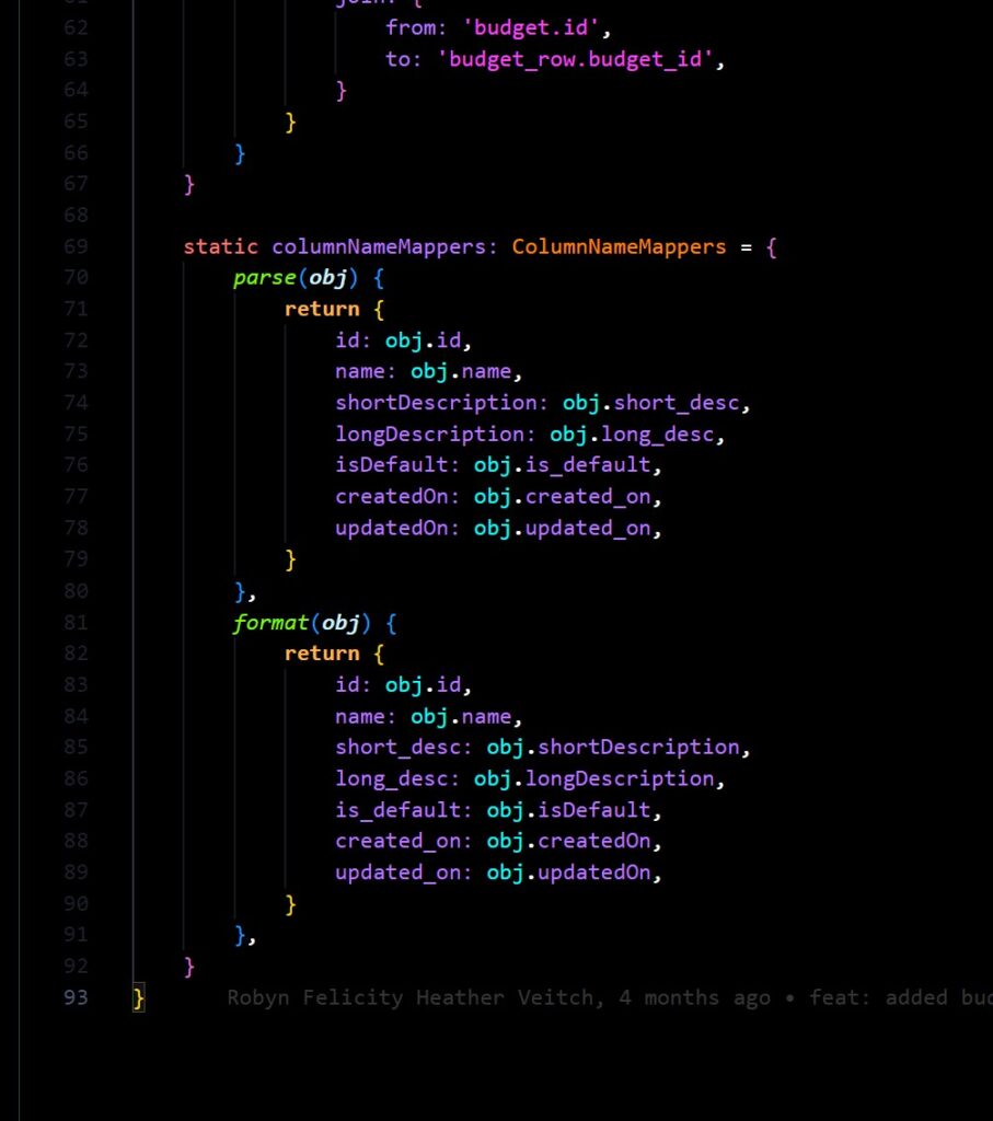
Relationship definition
One thing I do very much prefer Objection for is the way it handles relationships. Objection’s relationMappings property is simply a delight to work with, it takes the often times thorny issue of complex SQL relations and joins and makes it readable and extensible. The verboseness of which you can specify a ‘from’ and ‘to’ column on a particular join, and the conveniently named relationship types are so easy to work with. I also enjoy having the ability to name joins to selectively use them later, it adds a layer of clarity to what data you expect that sometimes other frameworks just don’t give you.
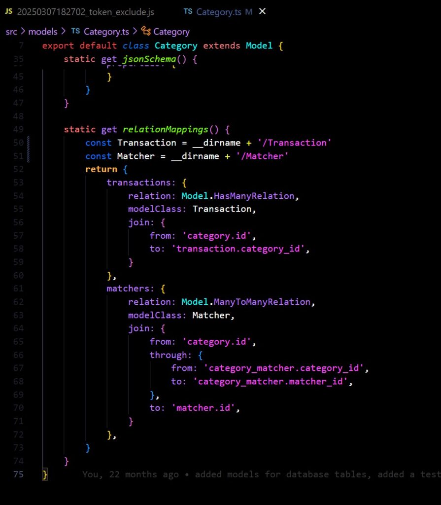
Database Schema Design with Knexjs
Knex is called a “query builder” but I suspect that’s just because there isn’t really a convenient name for what Knex actually is. In conjunction to Objection’s models, Knex offers a powerful array of static and instance methods to tun SQL queries very succinctly.
However, one of the more powerful things Knex does is manage the underlying database connections, and provides the ability to migrate and rollback changes incrementally (read about migrations here), as well as providing seed data. Knex migrations are worth looking into in detail, for my use-case I leveraged them to build out features incrementally, allowing me to know straight away if something I’ve introduced is going to cause problems with the stable system as it stands so far.
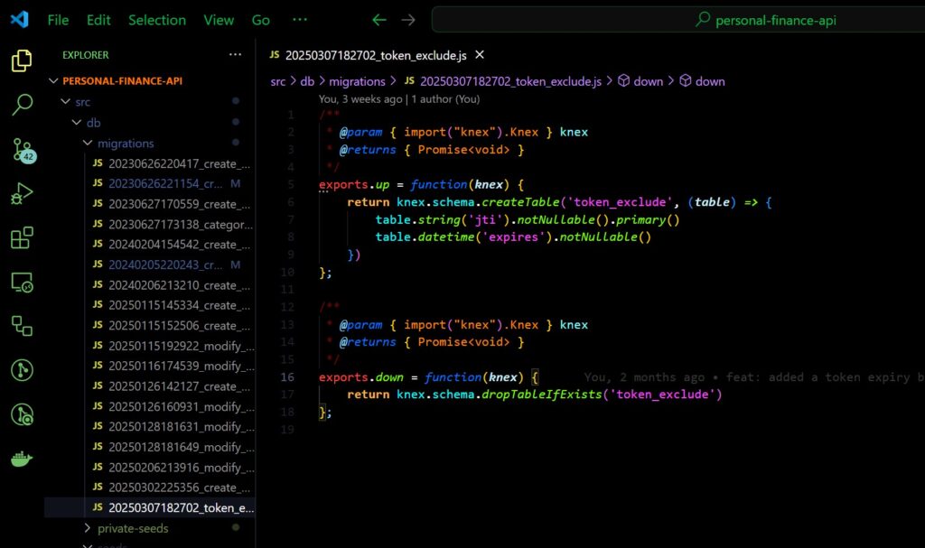
Again I feel the need to compare to other frameworks. Some ORM’s I’ve used also have the ability to populate a database with their table schemas, using the model definition as a template to create the tables. Often this is in one “big bang” and can be a headache if you need certain dependencies to load in a certain order, and obscures when a change to the “schema” (in reality just the model) occurred. For that reason I don’t really consider using them for this purpose to be production worthy, as you never know what you’re going to get from ‘under the hood’.
By contrast, Knex migrations emphasise small, incremental changes, which (if you’re using it correctly) should always be backwards compatible with older versions of your tables. Combined with the ability to have seed data, this means you can really quickly – but in a controlled manor – tear down and spin up database instances for testing, which I found invaluable while trying to move fast and build out the backed.
I was also conscious that this is really the first of my projects that I personally want to use long term. The fact that Knex migrations are so safe and can be rolled forward and back means that I can be confident that my “mini production” environment, running on my local machine, will never encounter issues when I continue to build on the app and I’ll never need to start over and re-enter data.
Response Standardisation
Something I’m very keen on is the need to standardise API response formats for a variety of reasons, but mostly to make sure that the server has the ability to define response success messages and error codes, allowing the front end to handle failed requests elegantly.
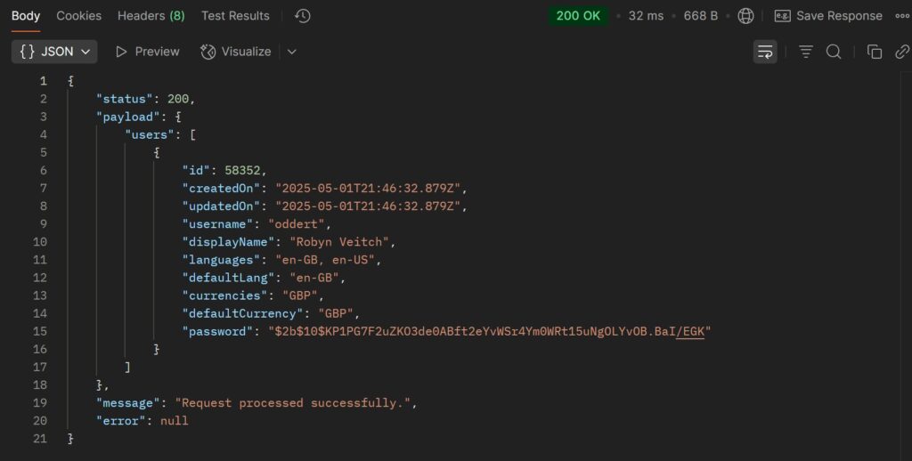
The response structure is as follows:
req+res: The express JS request and response objects. Request is presently unused but placed as passive provision.payload: Any response-specific data under a single key.message: An end-user readable message describing the action taken.statusCode: The HTTP status of the response as a convenience when debugging more than anything else.error: Optional short-form error code pinpointing the type of failure.
In the case of an error, the message attribute becomes the human-readable error message. Read more about errors in Error Standardisation bellow.
In the past, I had used a set of standard response function in Python apps which allowed me to set a series of default responses keys and overwrite them. The idea was that, although it may seem silly to have a 404 and 409 response function when really any could be used, the fewer attributes that had to be specified at run-time the better, as it reduced potential for failure and made the route handler code easier to read.
A big part of what made this work was named arguments in python, in JavaScript I had to settle for argument lists and passing “null” where I wanted to use a default. I think next I’ll move them to use a single argument with an object, and rely on Typescript to require some attributes and conditionally override others.
Linting to underpin QA
This deserves it’s own post but I firmly believe that a robust linter setup is absolutely mandatory to write clean and performant code.
It also has the benefit of rapidly speeding up development time. By utilising IDE integrations, you can write incredibly messy code, paying no attention whatsoever to formatting, trigger a document format, and have clean, standardised, predictable code, which allows you to get to the value far quicker than putting in all those pesky like breaks yourself.
I use the ESLint: Fix all auto-fixable problems command provided by my IDE with the appropriate plug-ins, its always the first command when I click Ctrl + Shift + P to open the command menu and completely formats the document in line with a robust set of standards extended form the AirBnB config. The action of doing this is so ingrained and is such muscle-memory at this point I find myself doing it even on word documents.
I like this particular config because it’s rules and auto-fixes are very well written, and its good at doing things like truncating lines that are too long, and adding trailing commas to allow quick attribute list re-ordering, making complex function chaining look somehow intuitive and obvious.
Linters are not just there to provide standardised code and let you be lazy, there’s a testing strategy theory that I subscribe to that depends on them.
The Testing Pyramid
Kent C Dodds runs a fantastic blog with a range of invaluable insights into automated testing, which have provided a signifiant contribution to my team’s automated testing strategy. In this post he outlines the rational behind The Testing Trophy; a diagrammatic way of thinking of different types of tests intended to replace the older Testing Pyramid.
The Testing Trophy not only places much greater emphasis on integration tests than end-to-end or unit tests, but also crucially posits that linting and static code analysis underpins all testing. Linters allow you to identify a majority of common bugs and fix them directly within the IDE including many potential security risks and bad-practices.
Far from the perception that some more junior engineers may express – including myself in the past – that linters are like nagging parents trying to slow you down and get in the way of The Real Work, I firmly believe that with the proper workflow and tools in place, a robust linter setup actually increases the pace at which you can work.
Linters make things like unused and undefined variables, incorrect method calls, missing syntax immediately unavoidable and work to rid you of the ‘silly’ bugs that stand between actually writing the code and executing it all the way through. A good set of linter rules make your code predictable meaning that the time taken to even think through how you will make a change is reduced, the same way that walking up even steps is var easier and faster than uneven or misshapen ones.
This is broadly speaking why I also think that Typescript should be the default for any JavaScript project unless it is absolutely not viable. In regular JS you must deal with types, with arguments that have a particular shape, values which have multiple types, potentially omittable values and so no. The difference with using Typescript well boils down to the fact that you just can always just “see” what these things are better.
Building with Typescript from the ground up is like making a promise with your future self, that what you are defining now is accurate and reflects how things will be implemented. It removes the need to consciously remember what each bit does, where a function is used, what arguments it expects to receive, effectively pouring all that out into an “external brain” which handles much of it for you.
This also helps build documentation automatically. Documentation is another absolute must for me and removes so much effort from development time, even if it is nothing more than inline doc-strings and function annotations. Personal Finance is setup to automatically create docs with JSDoc, which is great but useless if the inline doc-strings are not well thought through. Ultimately the number one person helped by doc-strings is you, after you’ve long forgotten what you were thinking when you built whatever it is you’re looking at.
As the expression goes, When does code become “legacy code”? As soon as you have written it.
Component Framework
That DIY aesthetic
I’ve taken a complete 180 on the concept of component libraries / component frameworks.
If you read other posts of mine such as The Float Tracker you’ll hear me not just criticise the framework I was using, but condemn the very concept of a component framework. I would say “they’re all terrible, I don’t think its possible to make one that doesn’t introduce needed friction and badly opinionated components.” and “why should I let someone else do what I can do myself“.
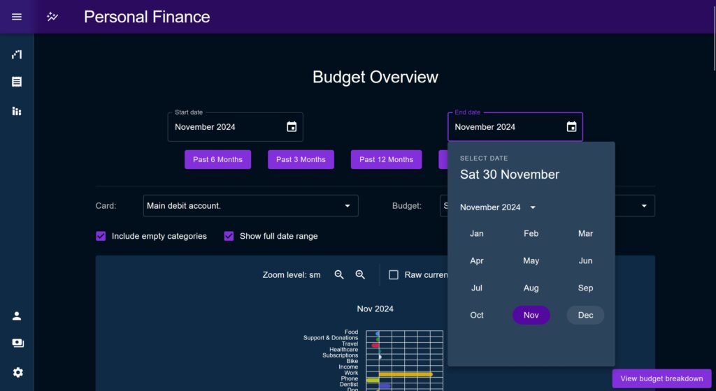
There’s certainly a time and a place do something yourself, but not only does that begin to drag, it becomes very difficult to maintain to a high standard. It is very difficult to manually style components and account for every edge case, and be consistent about hover effects, and everything else that is needed to create something which looks professional enough to meet modern standards for “enterprise quality” application design.
I’ll take this moment to reiterate that the type of app design I’m talking about here is not objectively better. This is not about trying to make The Best App, just about the quality expectations of an internal enterprise app.
A criticism I might have levied back in 2022 was that “component frameworks will just make everything look the same and give it a sterile corporate feel”. In this, I would have been somewhat right! Component frameworks do need to be heavily customised in order to look unique to suit your style, but in this case “sterile corporate feel” is sort of what we’re aiming for here.
No rough edges allowed
15 years ago, the idea of MUI’s Autcomplete – which combines the utility of a filtered search menu and a drop-down list with sorted content and developer-defined matching strategies – might have been an advanced novelty only seen on large websites that were willing to invest in good developers. Now, my local kebab shop’s menu site has them.
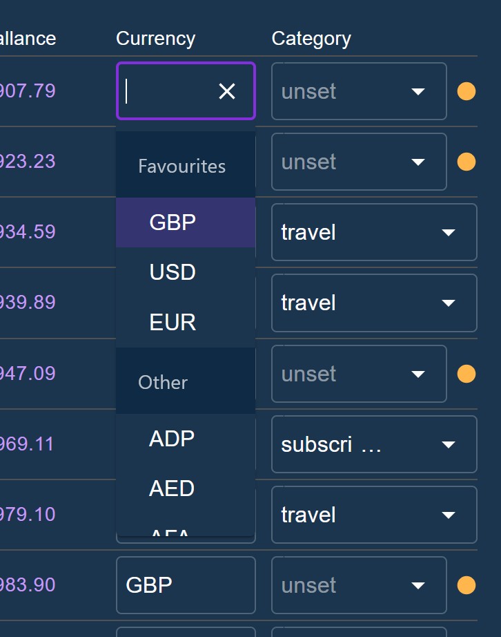
There is a degree of complexity and user experience that is just expected of applications now. Sure, it would be a fun challenge to implement every single utility of a component library yourself as a challenge, but little UI glitches and styling issues that are likely to show up simply bring down the look and feel of applications which you do not want in a professional context, to say nothing of additional time.
In terms of theming, maintaining a large corpus of styles in a large application easily becomes unwieldy, and other tricks that my fellow devs use to get around writing CSS, such as building everything with Tailwind, is simply unprofessional in my opinion.
Material UI
For all of these reasons I’ve used Material UI as the backbone of this project.
MUI is an implementation of Google’s Material Design and I like its wide range of useful utilities, strong theming system, and it offers a wide range of customisability to adapt it to a given use-case. The widespread adoption makes it ideal too as there is a large community to get help from and raise issues fast.
Side note: if you look closely as you’re browsing the web, you’ll notice a surprising number of websites using MUI, usually with only a few small ‘tells’ such as the collapsing input labels which act as placeholders when the input is empty.
Most real-world uses-cases of MUI seem to disable some of the more “Googly” effects such as the ripple effect when clicking on elements, but it has been my observation that it is sometimes useful to leverage the association most people have with the Google suite of products by leaving that stuff in, it makes them thing your product appear slightly more established and refined due to bias transfer.
Yes, no framework is perfect, frustrations and limitations are inevitable, but to my mind if you are set on making a solid production-ready app to a high standard, they are mandatory, along with a well thought through design system.
Phase 1 Retrospective
I always like to include a retrospective section in my portfolio posts, a chance to say what went well, what I might have avoided if I was doing it again, and also to comment on the wider context in which each piece sits.
In this case, I’m going to continue working on some of the ideas outlined throughout the post, as well as a backlog of other vauge, early ideas not mentioned here.
As I mentioned at the beginning, at this stage in my career I see less value in showing off little apps, favouring instead proof-of-concept’s and learning that doesn’t necessarily produce an output. This application was intended to be a single, continually evolving demonstration piece of the type of work I do out of sight, and so therefore it makes sense that any new ideas be reflected here, rather than on a new project each time. For this reason, “Phase 2” doesn’t really have an end state and so wouldn’t really be suitable for a retrospective.
On the other hand, the stuff I’m here calling “Phase 1” very much did exist in a particular context, and did have an end point. I’ve therefore included a retrospective section here to talk about my reflections on it, and what lead to the shelving of the project until Phase 2.
What Went Well
The Future Projection system worked for its purposes
Despite how harsh I’ve been about the Scenario modeller system, it was certainly a success. Yes I took the long route to get there; about 70% of the application work was not needed to get to the point of producing the forward projections, but the work to make it extensible and adaptable is still solid and will be useful with future features.
The use-case I mentioned regarding the ebike purchase was in reality only one of many times I used the Future Projection chart to aid my thinking and plan ahead. And regarding the idea of holding oneself to a plan produced, I did manage to create projections which eventually turned true, so that’s a mark in favour of it.
The Upload system is solid
Despite all the trials and tribulations, the work put into getting the upload system to where it is paid off significantly in Phase 2.
When developing features we try to test and use our systems as we go along, but there’s nothing quite like approaching a system as a real user to get a task done, it changes the mindset you’re in and forces you to look at it in a different light.
When the time came to try an actually input over a years worth of transaction data I found the upload user journey worked like a charm, despite hesitation that I would discover it worked in theory but not in practice.
Yes I identified bugs and improvements to address in Phase 2, but the overall goal of making the upload as smooth and as easy as possible was achieved. In fact, it made me frustrated at the process of downloading CSV’s from my online banking, which was now clearly the slowest part of the whole process by far.
Focus on MVP
When I eventually got my various goals in focus and shook off my apprehension about its future state I had a second wind which enabled me to really focus in on what parts of the various features mattered and which could wait, and where I should simply put in passive provision for a later effort.
I think that if I had managed to achieve this clarity right from the start potentially I could have saved time and not gotten as fed up with the system as I did.
The reason there was such a gap in development phases, leading the the Phase 1 / 2 divide in this post, is that by the time I had my future projection MVP I lost interest in the rest of the app. Every time I thought about going back to it it just felt overwhelming, like an area of the office which has been a dumping ground for “stuff to sort later” for so long that the thought of starting to tackle it creates a bloated feeling of overwhelm.
What I Would Have Done Differently
Not having a product plan / milestones
Despite what said above about how good it was to narrow in on specific MVPs, the time taken to ge tot that realisation was still a signifiant slog. I started building this project with the idea that once the upload and scenario system was in place, charts and analysis and visualisations and what not would simply leap from holes in the ground. That having the golden source data so easily available would lower the barrier to building features.
In reality, the effort required to overcome various challenges in the Upload and Scenario Modeller somewhat burned me out on the project, I was sick of looking at it.
Yes, later on the above assumption proved correct; the effort to get these parts right paid off significantly, but I think if I could have focused on a leaner product earlier I might have achieved my goals faster and had patience left to build of the rest properly.
Delaying the decision about how the data life cycle works
Through most of the build of the application I did not commit to a solid idea of how the whole data lifecycle of past Transaction data would work.
As touched on, the application would load up all historical Transactions on the initial page load which suited some use cases but not most others. I procrastinated on the decision of how to create a more dynamic load, and so hindered the development of these features. I was worried about potential performance hits if every component re-requested a subset of transactions, and was unsure how to handle multiple components looking for different time slices.
Changing to a more dynamic load would have had (and later did have) implications for all sections of the app, but it was clearly non-negotiable as overtime the older transaction data would bloat the application, and slow it to a halt.
It took until Phase 2 to really sort it out by way of implementing the useTransactions hook and the idea of the ‘transaction window’. While this took extra work its quite an obvious solution when you look at it in totality, I should have made this call earlier.
Using Create React App
RIP Create React App my beloved.
I have only respect for the authors and the bootstrapping they have provided for so many projects over the years. When I first started out building React apps outside of CodePen back in late 2017 I was bamboozled by Webpack and the whole idea of development environments, CRA provided an accessible on-ramp which enabled me to carry on building.
Despite not being officially shelved until a year or so after this project started, it was clear that CRA had stopped receiving updates for quite some time and was not fit for purpose even then.
This caused no end of problems upgrading the base boilerplate. Not only was there a complex web of dependencies to try to upgrade as far as possible, but CRA itself includes a series of utilities that get installed directly in the project, and were incompatible with later versions of the dependencies. These had to be manually reverse-engineered and then modified, or bypassed completely.
In particular, fixing the automated testing config almost killed me. I ended up bypassing the CRA testing config, no doubt missing out on some useful functionality, but it was the only way to get unstuck after a most frustrating weekend.
Phase 2 (Dec 2024 / 2025)
Motivations
The ugly duckling project
I confess I had this project hanging over me at since it’s soft abandonment.
I 2023 I bought a house, meaning that Personal Finance, for the Scenario / Future Projection use-case, had functionally achieved it’s purpose. Whilst this is of course a good thing, it made the idea of going back and putting in the effort to do something with even less appealing.
After Phase 1 I would return occasionally to do the odd bit of work on it but quite frankly the system, in its half finished and clearly flawed state, was an embarrassment. So I tried to burry it and move on.
I told myself that I didn’t need to do anything with it, that I should avoid acting on the sunk-cost fallacy. Yet under my floor boards I heard it beat louder and louder, plaguing my thoughts, a rhythmic drum that wormed its way into my thoughts. Would its abandonment mean I don’t follow through? Have I lost my ability to actually do this type of work, outside of the day job?
OK maybe these questions are a little dramatic but it was annoying me. The task of adapting it was not going to be easy, and on top of that, the various struggles I had with the system had put me off, just thinking of how to turn the project around made me feel a sort of bloated malaise.
A portfolio reevaluation
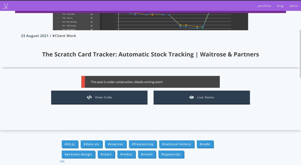
2024 was a good year for me overall, but very intense and very difficult at times. The bad bits got so bad at times that I began to re-evaluate my portfolio and CV, asking what would happen if I needed to jump ship. I found it was in a poor shape. The last project listed was The Scratch Card Tracker which had no content, just a placeholder message and a couple of images. It was three and a half years old at this point and while it was still pretty good, was clearly a far cry from the quality of work I do now.
My most recent project, the Tickler System, was good but had many of the same issues as Personal Finance given the later was the starting point for the former, so it was also not ready for show-and-tell hour.
And so the frustration finally boiled over, in December of 2024 I became laser-focused on PF. I setup a Trello checklist and unloaded everything that was obvious and outstanding into it, and prepped myself for an intense sprint. While this task list is not exactly a fully built-out JIRA project, it was suitable enough to create a solid conveyor belt of tasks and milestones to “hard burn” through (as we now like to say at work due to my obsession with The Expanse in 2024).
Budget System
Thinking backward instead of forwards
A key part of this new revival was the Budget System, which would prove to provide a better backbone for the entire app than anything else created thus far.
When I was building out Phase 1 I was personally focused on the task of saving every penny I could to save for a deposit. In effect you could say I was in a ‘looking forward’ mode, only interested in potential futures on the way to this goal.
Coming in to this revival for Phase 2, I found myself settled for just over a year in my new place, comfortable in my spending habits, but wanting to know a lot more about what those habits comprised of, in order to plan better for the future. I was therefore much more focused on the task of analysing past transactions, and utilising the accumulated data in the system much more than the scenario system did. In this sense I was now ‘looking backwards’.
The Budget System leverages the existing Category entity heavily, effectively just defining a set amount of expected spend per Category, per month. These expectations are then retroactively applied across historical Transactions to find how those Transactions perform in versus the expectation.
When most people think of a “budget” they think of a forward looking thing, a commitment to themselves or others about what will be spent and where in the future. In this case Budgets could certainly be used for forward planning, but are primarily intended for retroactively analysing spend “performance”.
This was done to serve two main purposes:
- Explain why a savings goal was missed / overshot, to take learnings forwards (find a more economical source of apples and drink less Tango).
- To use this retrospective to create a real-life forward facing budget if desired. I.e. the more the Budget could be refined to fit past data trends, the better it would represent an accurate prediction of future spending.
Budget Breakdown vs Overview Distinction
An important idea early on was to split analytics to separate long-term trend analysis out from more detail focused drilling down. This was based on a personal observation about what kind of psychological headspace a user would be in for each of these tasks and therefore the importance of separating each.
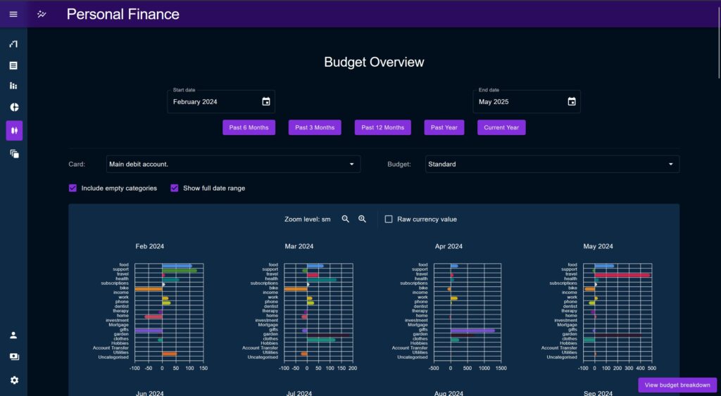
Two pages were created to capture this: the Budget Breakdown and Budget Overview pages, where Breakdown would provide in-depth analysis, while Overview would provide a longer-term view.
It was clear from the beginning that interplay between these two pages would be important. A switch button was used in the bottom right of each screen to allow the user to quickly jump from one to another while preserving the selected date range. There was an idea to combine both pages and have the Breakdown functionality appear as a side-panel on the Overview page, but this was deemed to be a low priority ‘gimmicky’ feature and largely not needed due to the switch button.
Breakdown Page
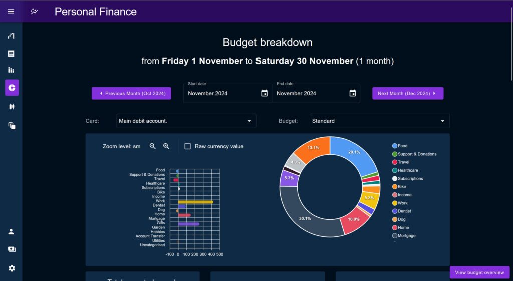
The Breakdown page came first and was primarily intended to be used for analysis on a single month’s worth of transactions, but can be used across a multi-month period if desired.
Breakdown is focused on deeply interrogating the performance of key metrics. It provides various tools to identify outliers and anomalies, potentially to explain them away.
Headline Charts
At the top of the page are two leader charts, the Percentage chart and the Donut chart.
The Percentage chart shows a positive / negative discrepancy per Category, across the time period vs the Budget. It is intended to be the primary starting point for a deep-dive investigation, directing the user towards any obvious outliers.
The percentage chart allows the user to display spend by percentage of allotted budget, or by raw cash amount vs the budget. This allows users to look at the data more horizontally as a large cash overspend may be a small percentage and vice-versa, the user would have to be judge of what is important.
The Donut chart shows how each Category totals against the overall spend, again this is mostly just to put spends in perspective vs the overall Budget.
Transaction Preview Plane
This is a pop-up window which opens when the user clicks on a series on a percentage chart, providing a filtered table of the all the Transactions of that particular Category contained within the time period.
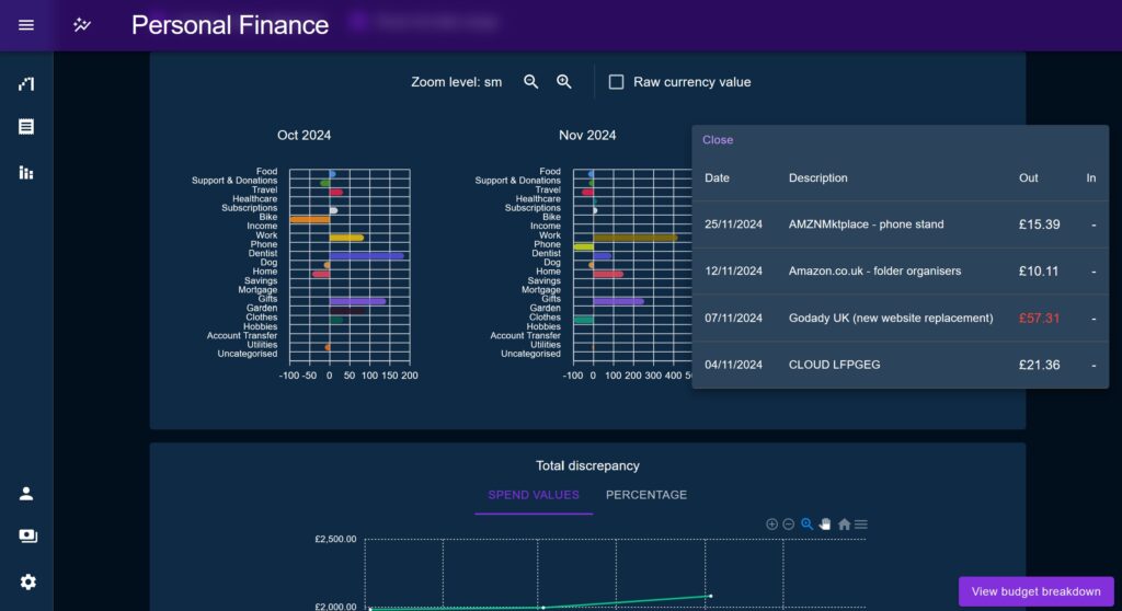
It highlights any transactions which fall outside of one standard deviation across all values, which proved to be a useful way of identifying most anomalies, without making assumptions on the specifics of what counts as “normal” for a given Category.
This aims to speed up the process by which a user can find unusual transactions and outliers to explain large discrepancies.
Glance Cards
Glance Cards are little snippets showing a single high-level metric ‘at a glance’. Examples include the ‘largest overspend by percentage and currency amount’, ‘total spend’, ‘total expected vs actual spend’, and ‘number of categories over Budget’.
Glance cards are primarily intended to build a narrative and act as commentary on the spend performance. They are all driven by the same standardised data format, provided by a higher order component, keeping compute times to a minimum.
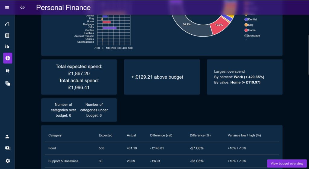
Table view
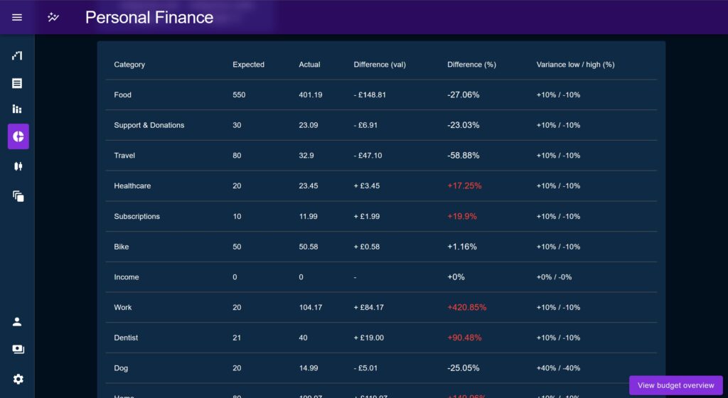
The table shows effectively the same data as the percentage chart but all in the same row. The table highlights Categories which fall outside the user-defined acceptable variance, whilst also displaying that variance to the user.
This allows the user to identify ‘problem’ areas but also to dismiss false positives, for example if a category is only a little bit out of its accepted variance that may be deemed not actually an issue.
Aggregate charts
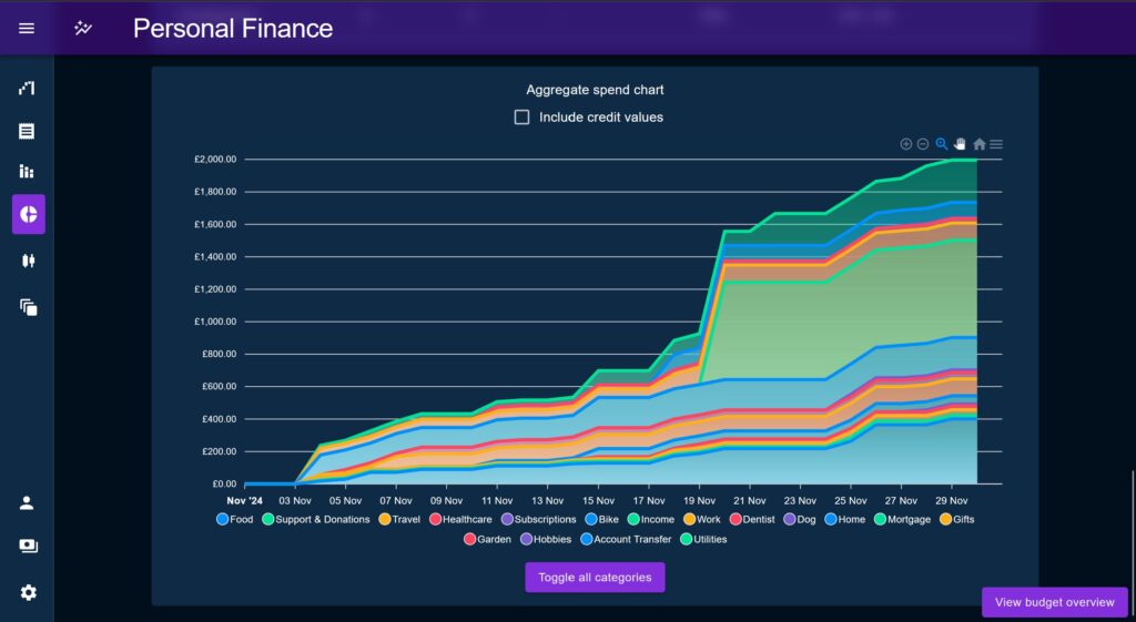
These are a series of charts that show how various metrics (similar to the ones used by the Glance Cards) accumulate over time.
Overview Page
By contrast to the Breakdown page, the Overview page is intended for longer date series, defaulting to the past 13 months (to include a complete year plus the current month). Like Breakdown, Overview shows metrics calculated against a month long step across the selected time period to find and observe variations.
The idea behind providing this view is that, yes individual months may contain discrepancies from the target, but what is the impact long term? Does each month need to be perfectly balanced and self-contained? Is a metric like ‘spend on gifts’ under budget for most of the year but with a large spike at a holiday season? Probably not something to worry about.
The Overview page is less interested on explaining away anomalies than it is at looking at a broad spectrum of spending to find commonalities and differences through time.
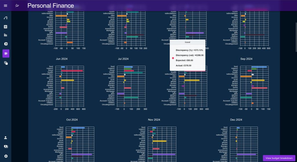
In the example of a gift budget that spikes at certain times of the year highlights the contrast provided by the Overview page vs Breakdown; Breakdown allows us to place anomalies under a microscope – and implicitly indicates that all anomalies are bad – Overview instead places these anomalies in a context which may change the way the user looks at them.
Where the Breakdown page asks the question “how and where did this result come from?”, the Overview page asks “What is the trend of these numbers? What is meaning of the trajectory?”
Percentage Charts
The Percentage Chart used in the Breakdown page makes a reappearance on Overview, but this time serving a time-based view, placed next to an array of other percentage charts to show change over time.
The calculation is the same showing a positive / negative against each Category, but this time the charts are much smaller and intended to highlight consistent large discrepancies vs areas where a Category discrepancy rebalances.
Aggregate Charts
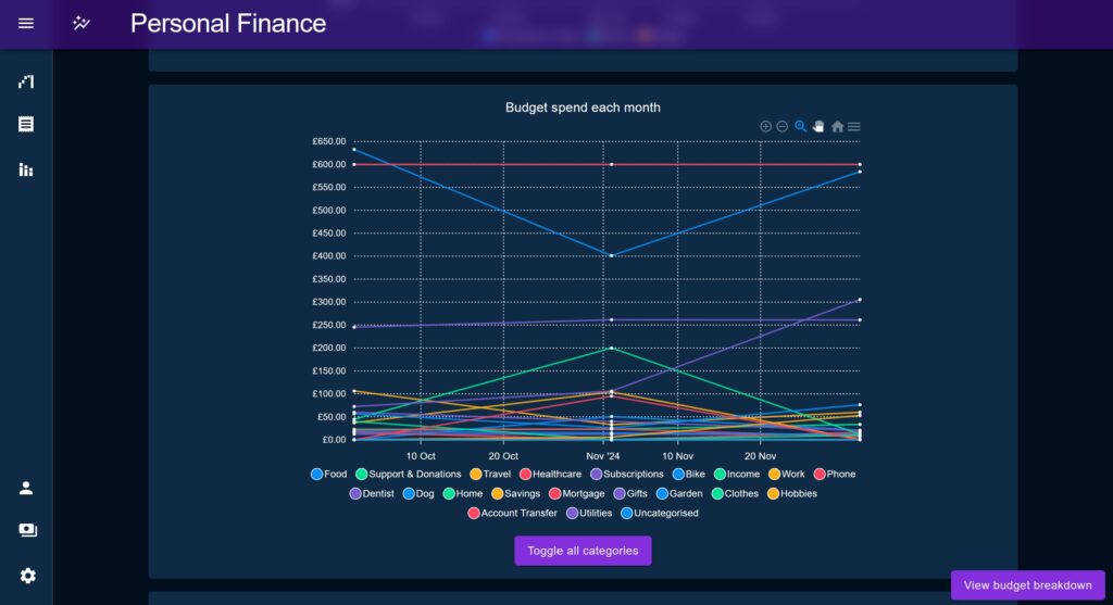
Overview has its own set of aggregation charts, showing similar data to before but this time focusing on trend difference between months, rather than how the data accumulates.
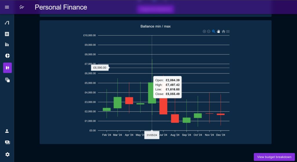
Open / Close / High / Low
This chart was created to show a total value for the purpose of gauging a trend line, but taking into account fluctuations throughout the month, on pay day for example. It does this by using a candlestick to show the value at the beginning and end of the month, the trend up or down, and the minimum / maximum values.
The purpose of the min value is to help the user to create a comfortable buffer in the event they are drawing near zero (or in overdraft) during the month.
A Standardised Breakdown Data Type
While designing the first chart on the Breakdown page I realised the same computed data series could be used across various charts, either directly, or as a starting point to reduce another chart’s data transformation compute. The datum would hold calculated values of performance relative to budget, but is also combined with other attributes such as the Category’s assigned colour, in order to minimise lookup times.
The standardised datum contained these attributes:
colour: Allows us to associate a Budget’s Category’s identifying colour back on chart series’.categoryId: Allows a chart to query the category if needed.- categoryName: Holds the category name for when it was needed for a chart series (prevents each chart having to look it up each time).
budget: The budgeted spend amount for the time period (multiplied by however many months were in view at a time).spend: The actual spend value for this category across the time period.diffFloat: The difference between budgeted amount and the actual spend value as a number (positive for overspend, negative for underspend).diffPc: A value representing the actual spend as a percentage of the allotted budget.variance: Two numbers denoting the accepted underspend and overspend, as a percentage of the budgeted amount. Percentages are used instead of spend amounts as no readjustment is needed if the user changes the budget value.
Acceptable Variance
In various sections of the Budget pages an overspend / underspend ‘out of bounds’ flag is added per Category, based on spend versus the acceptable variance defined by the user. The idea of this variance metric was to try to allow the user to quantify what amount of variance was cause for alarm / cause for note.
In almost all cases an underspend or overspend is expected; it would be strange to spend exactly what your budget specified month after month, and would defeat the need for a finance tracker really.
Typically, most people would see an underspend as a good thing; so long as it doesn’t mean you’ve forgotten to pay a bill then saving money is good, right? But consistently spending under a budget value could cause issues if it means that the budget is no longer accurate and should be adjusted.
Overspends are mostly considered bad for obvious reasons; but how much of an overspend really matters? For example, if I’ve calculated my transport costs to be a particular amount, they might fluctuate during the year as I take more trips when the weather is nice, or less when I’m ill and avoiding going into the office, so long as it balanced out over time there is no cause for alarm.
On the other hand, my fixed-rate mortgage should be exactly the same each month, so if I get charged any amount other than the exact amount I expect that would cause alarm.
Percentages vs Raw Values for Anomaly Detection
In many parts of the Budget pages we alternate back and forth between displaying anomalies as percentages vs float amounts.
With a metric like food and drink spend – especially if you include treats like takeaway food in there – you might expect an amount of currency over/under spend, up to a hard maximum. This might not be a large percentage discrepancy if you’ve already budgeted a large currency amount.
For costs like monthly subscriptions, you’d want to be aware of price increases but the actual currency amounts may be very low (at least for me). A £10 a month subscription going to £11.99 is the difference of £1.99 which is minimal, but represents an almost 20% increase which I may find not worth it over time and decide to trim my commitments.
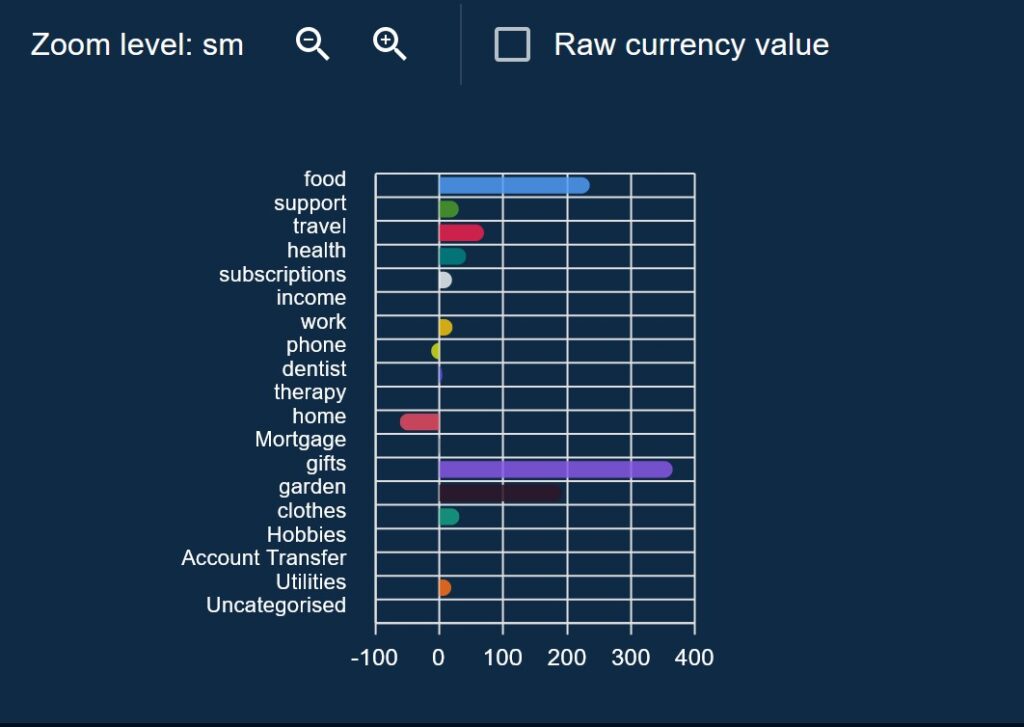
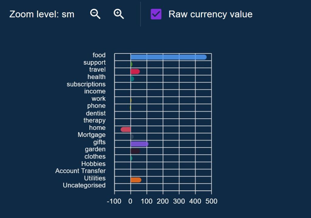
For the Budget Percentage Charts on both Budget pages, I made sure to allow the chart to toggle between percentages and float amounts, with some interesting outcomes. Sometimes what looked like big anomalies turned out to be trivial amounts of money in reality, other times subtle shifts in monthly commitments were hidden under small currency amounts.
This also allowed vastly outsized but expected anomalies to be safely ignored. For example, it seems my entire family have birthdays in May which makes the percentage overspend go through the roof on that month, but for other times in the year its very low. I can switch from percentage to a float amount and then use the actual spend value to determine if I’m happy with the amount spent.
On the Breakdown page this percentage discrepancy might show up as a bit bright warning, but then on Overview you’d see this contrasted against much smaller spends throughout the year.
State Management
Personal Finance uses the latest Redux standards which involved a couple of shifts in my thinking, namely relating to the use of thunked actions and Redux Saga.
Thunks replacing Sagas
In the beginning I was using a Saga observer pattern to handle most complex actions, based on a standard we were using at work. This involved handling all API calls by triggering a handler saga per request which would then perform error handling, multiple response cases etc.
Later on, thunk actions replaced all of these as I found there were annoyances to do with the way that Redux Saga ties in with Redux Toolkit and issues with type inferences with Typescript. When yeilding the result of a promise funciton call, in my case API calls, the sagas were unable to automatically infer the type of the response. Mostly though, thunk actions are just easier to use when you need to compose multiple together and are much easier to trace errors from.
I think there’s probably still a place for Redux Saga, but for the vast majority of every day tasks, Redux Toolkit can handle everything within itself and without the drawbacks of Sagas
I’ve not migrated the early sagas as I think its an interesting showcase to have the side-by-side, but for later Redux Actions I exclusively used thunks.
Cached Query Pattern
The cached query pattern is a simple but useful for manually controlling the request / re-request of data in situations where RTK query is not appropriate.
Firstly, we define a top-level store key which represents one entity or data type, for example one for Categories, one for Budgets, one for Transactions etc. Next, we include the following keys within that area as a starting point:
loading / loaded: To indicate the status of the load query.response: The raw section of the API response object which holds the item, useally an un-ordered array.timestamp: A millisecond timecode of when the last refresh was completed.- Various ordered lookup objects: Depending on the entity type, I like to post-process API responses into one or more ordered lookup objects, for example a key-value lookup by ID.
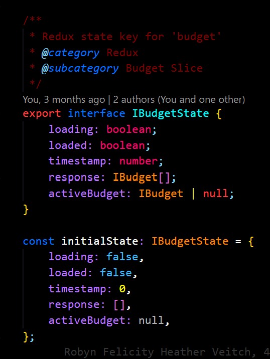
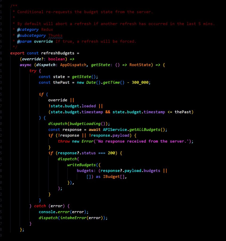
This pattern isn’t suitable for everything, but I’ve found it especially useful in the past to handle caching of data where sporadic lookups will be required. By creating a series of ordered ‘lookup’ objects the application can be used to very slightly increase initial load times for the purpose of saving lookup time later when components need to dynamically query from state.
This is based on anecdotal and studied evidence that suggests that users are far more likely to notice lag during the runtime of an application, vs a slight increase in initial load. By doing the work upfront we can benefit from the fastest possible dynamic lookup by using objects with the entities ordered by ID, name, relationship to other entities etc.
To implementing caching, dynamic hooks and thunk actions are created such as the one demonstrated here, which block re-requests within a particular cache period unless the component specifically requests to force a refresh.
Now of course, this assumes that dynamic lookup is necessary. If an entity does not require this kind of treatment it is still far better to use RTK query. In my case, all entities on Personal Finance fall into one of two camps; those that benefit from this treatment such as Category, Transaction, and Budget, and those that don’t need to be dynamic at all because they’re not expected to change all that much, such as Card.
The Transaction Window & Transaction hooks
The solution to the question of how to dynamically load transactions mentioned in Phase 1 was to define a small starting window to load up, and then to allow individual pages to conditionally re-request a range of transactions using one of two strategies:
- Th Blunt Option: A new time range could be defined and the whole list of transaction re-requested.
- The Expand Option: The time range could be expanded, and transactions queried to ‘fill the gaps’.
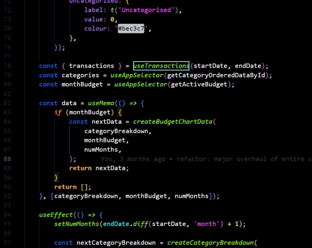
This was labelled “the transaction window” and was intended to be a half-way stop between simply re-requesting a range of transactions on every page change, and loading everything. Which strategy was used depends on the type of component is requesting them.
Some components are intended to be smaller consumers of data, subscribing to a small range of transactions, but potentially conflicting with other components on the same page which have totally different ideas of what they want to do. In this case, two components could request two separate ranges of data and the smallest start date would be combined with the largest end date to create the transaction query.
For example, perhaps today is a day in August and the window defaults to May – July. Component A may be contented with this and find its date range within this range, in which case a refresh would not occur. Component B however wants to see April – May only, in which case it would create an action which would expand the window to April – July, pushing out the start date but maintaining the same end date.
In the second query method, the Blunt method, a larger page-level component such as one of the Budget pages could take control of the Transaction Window range and set it to a range of it’s choosing, before sub-components attempt to expand the window. This is used mostly at the page level to clear out stale data, effectively resetting the window.
This is handled by a combination of manually calling the Transaction request thunk, and the useTransaction hook.
useTranaction will take a date range and conditionally perform two tasks. Firstly, it queries Transactions from the Redux store within the requested range, secondly it dispatches a thunk action which will potentially expand the Transaction window if one of the dates lays outside the current settings.
Application Design
“Modules” idea
On of the original ideas for the application was a series of composable “modules” which would be arranged by the user on the home page to create a sort of dashboard.

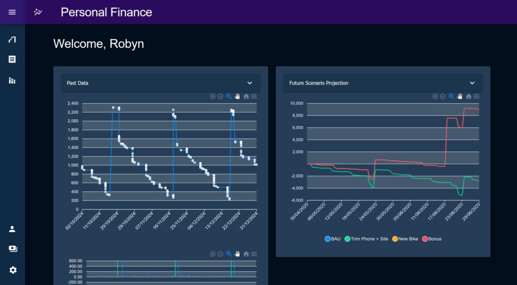
The Future Projection chart and Past Data charts were built as ‘Modules’ and could adapt to being displayed as a small tile or re-used to for the full page layout variants of each’s corresponding page. In their Module form the main chart would be shrunk, the controls simplified and hidden behind an MUI Accordion, and the layout tweaked to remove padding, margins and extraneous elements which may distract from the main content. There was an idea that the various elements of the Budget pages could be split out in this manor, the components themselves were already designed to work together after all.
One of the big issues which halted the continued use of this idea was data re-computation; if Modules had to be self contained they had to perform their own data processing, and if many modules were doing the same processing then redundant compute time would potentially increase massively.
Potentially the issue of data re-computation could be solved by moving more components to query their data from a React Context as opposed to receiving it via props, this would allow the various Budget page components to work the same on the home page as on the Budget pages. However another issue arises about how much each chart would make sense in isolation, without the context of other elements found on the Budget pages. For example, the two headline charts on Budget Breakdown are designed to work together as a starting point of a deeper investigation, does this still make sense without the rest of the data? Or will they just look a bit stranded?
I think the eventual solution will be a compromise between the two; we can reuse ideas from various places in the app and Modularise them, but I think these new modules will have to be built as their own thing and not the literal component used in another section of the app.
The idea of dashboards such as this one are always appealing to developers, but I know from my own experience of them in a banking context that just throwing metrics at a wall and making “cool” visualisations is not nearly as valuable as taking time to think through and create one or two really impactful designs and do them well.
Overall layout
In terms of the actual layout and design of the application we’re not breaking any new ground but I wanted to highlight a couple of features I was pleased with.
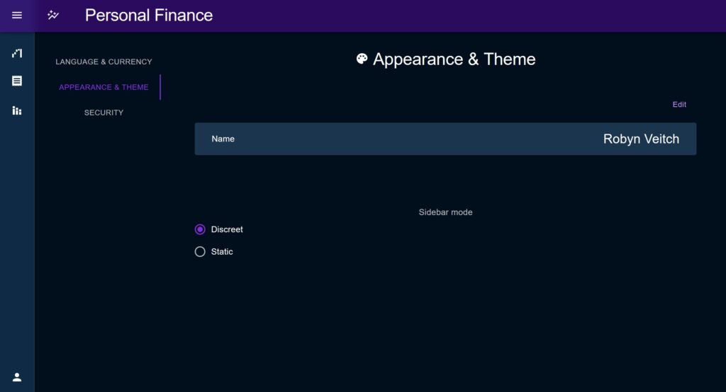
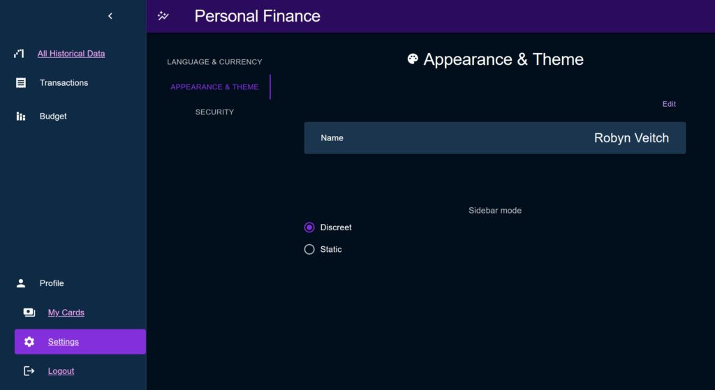
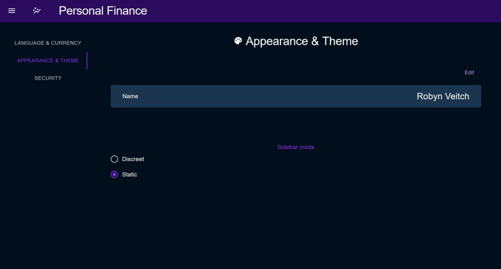
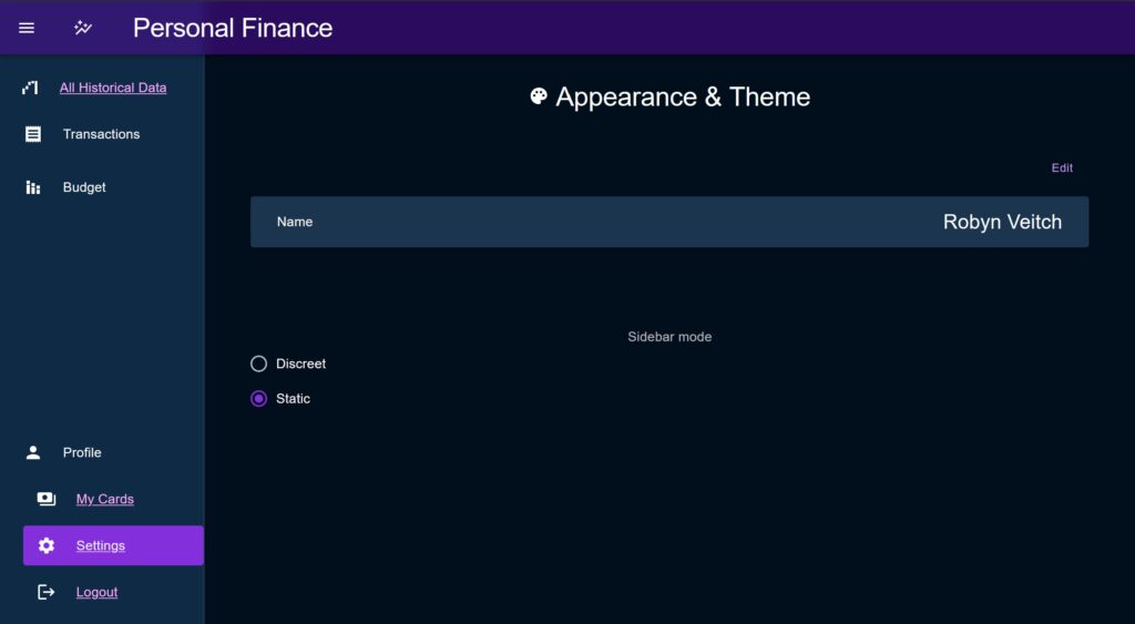
The original layout was just single full pages with a static header containing the title and a hamburger menu which contained just a list. In Phase 2, a new set of sidebars were implemented utilising the same underlying dynamic layout but with a choice of how that sidebar would behave.
Discreet Layout
The ‘Discreet’ style sidebar is the default. When closed it shrinks to show only a set of icons for each menu section. For sub-menus, if the icon is clicked the sidebar will open out, shifting the content to the side, and then close again when the user makes their selection. When closed, a Tooltip is used to display the full title on hover.
Static Layout
In ‘Static’ mode, the sidebar opens above the content of the page, and when closed disappears entirely to give an un-obstructed view.
Common Dyanmic Menu
The underlying menu is driven dynamically by a common datastructure which then drives the content allowing for quick changes. This data structure allows each item to either render a link or a sub-menu which will display as an accordion, as well as setting its icon, title, etc.
Sub-menus can be set to default to open or closed, allowing the developer to play with the space available. There is a top and bottom section to group items towards the top of the menu or the bottom to make full use of the space available.
The purpose of this type of layout is also to allow passive provision for other elements to be grouped within the sidebar sub as popup menus, modal triggers etc, making it truly a dynamic part of the application instead of just a ‘list of links’.
When the transition was made to this new menu type, the old static list of page links was changed to better group pages under mode top-level titles for the purpose of aiding navigation but also to ensure that if / when the sidebar grows it avoids clutter.
Previous layout
- All Historical Data
- Budget Breakdown
- Budget Overview
- Manage Budgets
- My Budgets
- Manage Categories
- Categories
- Upload & View Transactions
- Transactions
New Layout
- Top:
- All Historical Data
- Transactions
- Upload & View
- Categories
- Budget
- Budget Breakdown
- Budget Overview
- My Budgets
- Bottom:
- Profile
- My Cards
- Settings
- Profile
‘Acrylic’ Dark Theme & Phase 2 Theme Redesign
A dark colour palette was chosen to be the default this time round, simply to make better use of a range of Category colours but also to ease the burden on the eyes when closely scrutinising data. Inspiration was taken from the “Acrylic” design theme, namely in the header where a soft semi-transparent blur is used.
In Phase 1 I was a bit too timid with my choice of palette and was consistently bugged by contrast issues, namely the ‘primary’ purple colour against the soft blue background. In Phase 2 I severely strengthened and boldened each of the colours, and defined a new ‘secondary’ colour (used in areas of notification and element highlighting) in the form of this light blue.
When selecting the new colours I looked to create a slightly neon vibrant aesthetic, partly to follow current industry trends, partly to imbue a sense of energy that was sorely missing with the old duller, more matted colours. I was also by websites like GitHub that use the same effect to emphasise contrast.
Lastly, I was very keen to choose a “good” white colour; I have dyslexia and find that some website’s dark mode has very bright text on very dark backgrounds which makes the letters quite sharp and much more difficult to differentiate from one another.
An invaluable site to aid in this redesign was MUI Theme Builder by Brian Reynolds https://bareynol.github.io/mui-theme-creator. Its a little out of date so should be used as a guide rather than a full theme-builder-exporter, but is still really helpful. When I am staring new projects, I wouldn’t just export the config and plug it in, but instead start with a blank theme in my project, test out ideas, and incorporate them into that.
ResponsiveLayout higher-order component & the useContentWidth hook
As part of my commitment to consistent style and layout I wanted to create a higher order component (HOC) to be used to layout any full-sized piece of content on a page to a set of standardised sizes.
The ResponsiveContainer HOC provides a simple wrapper for page content and adjusts its max-width and min-width to ensure that the content is not too small on narrower screens, and not too large on wider screens. To compliment this, I introduced a custom hook, useContentWidth, which would evaluate the screen with and provide a few outputs to determine what size content could be, which ResponsiveContainer used under the hood, but can also be used stand-alone.
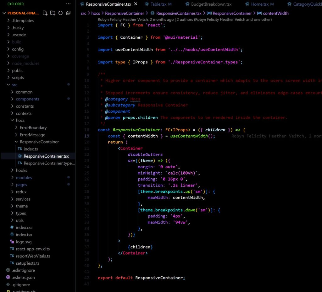
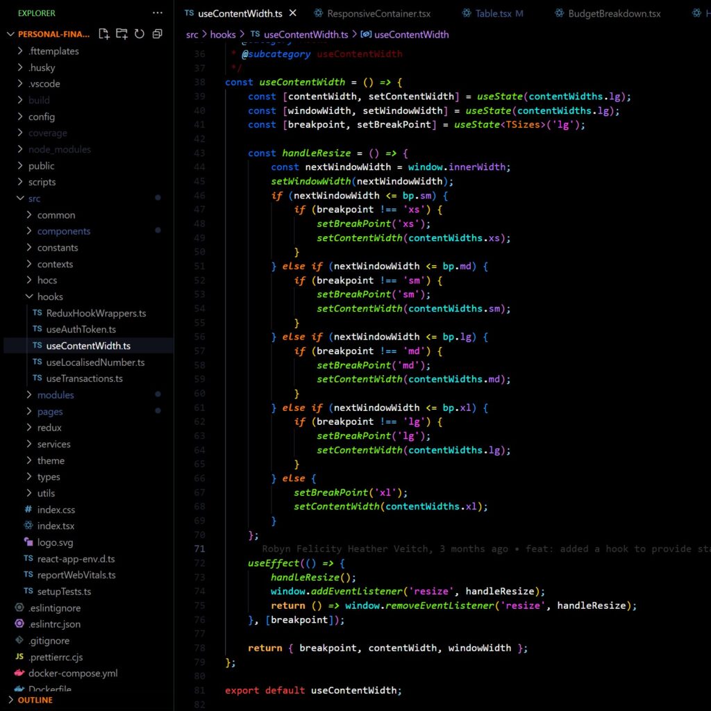
The hook uses MUI “breakpoints” to provide a standardised set of widths in response to the screen width. I have a particular bug-bear for continually shifting “truly responsive” layouts; you don’t need to have a dynamic layout for every screen, instead I think it is better to define rough boundaries for where each size should be used and work to those, which is the idea behind both of these utilities.
The hook has several outputs to be consumed:
breakpoint: One of the values “xs”, “sm”, “md”, “lg”, “xl” used internally to define the steps at which the screen size triggers a new content width setting.contentWidth: A number value for the current content width.windowWidth: The current window size.
Common list layouts
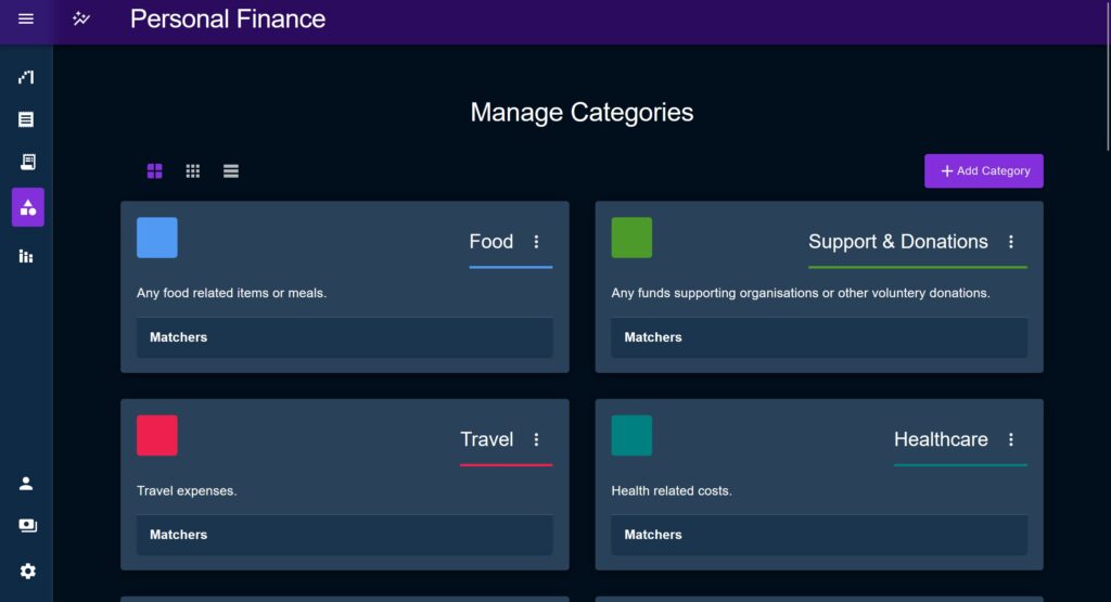
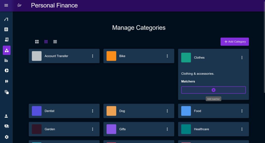
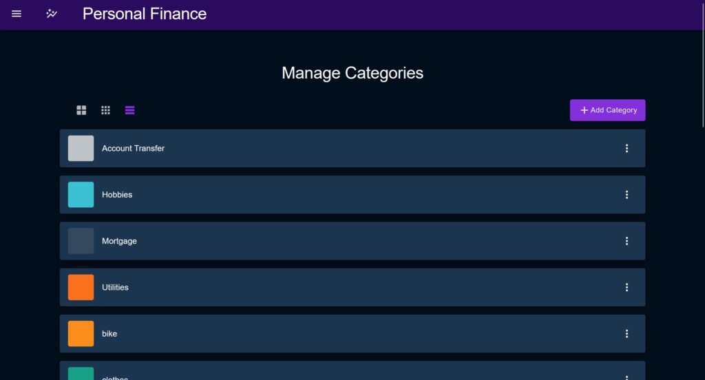
Another utility that helped speed along development was a common list utility comprising of a layout component, to render the list / grid items, and a set of controls.
The list layout allows the parent component to chose which layout options are allowed, as some might not be appropriate to some use-cases, but also holds the state as the behavior of the items in the grid itself may also need to change, as demonstrated by the Category page here.
Error Boundary
Two Error Boundary strategies were used as part of this boilerplate, the first being a higher order component placed at the root of the project and taken from the React doc’s suggested implementation. This component is intended to be a fallback and only used to avoid white screen errors in places where a manual catch has been missed.
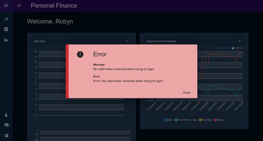
The preferred method of catching errors is with another higher order component, the ErrorMessage. ErrorMessage and the associated ‘error’ state capture errors thrown and display a standardised error modal anywhere in the app.
The error messages themselves consist of these pieces of information which broadly link into the standardised API response format from earlier:
title: The top-level title broadly stating what has failed.message: The user-readable description of the error, intended to provide the user with actions to try next or context to understand why this has happened.error: The short-form error code or message intended to help the maintainer narrow in on where the error originated.timestamp: The time the error was produced.
In addition to this, the stack trace is also captured but is not presently displayed.
The error state can be manually triggered from within the application, or automatically invoked by way of the intakeError thunk. intakeError is an action which first attempts to identify the type of error and then customises the error model behaviour based on what it is. It then attempts to pull out relevant information using a cascading list of sources, writing this information to the state. This process looks like this:
- First, the thunk tries to match a network error as there are specific authentication actions we want to take here:
- If the user has authentication has expired, we don’t display any error, other logic will have provided the needed redirects and token refresh attempts.
- If the error originated from the back end, we want to extract the error details sent by the API as part of the standard response format.
- If the server has sent a HTML response, it is likely that NGINX or perhaps the network has failed. We try to identify a HTML response and manually set a ‘network error or server failure’ message.
- If none of the above is true, but the error is still an AxiosError, then we pull out the expected Axios error response format.
- Next, if the error is not a network error but is still a standard JS error we pull out what details we can, overwriting a set of default messages.
- Lastly, if for whatever reason the thunk has been invoked with something other than a JS error (for example an incorrectly thrown promise), we display just the default ‘something went wrong’ message.
JWT authentication
For this boilerplate I decided to go with a JWT based authentication system, due to popularity amongst enterprises for internal API federation, and horizontal scalability as a stateless authentication system. In particular I was keen to leverage the token refresh pattern to allow a user to return after a brief break and be automatically re-authenticated.
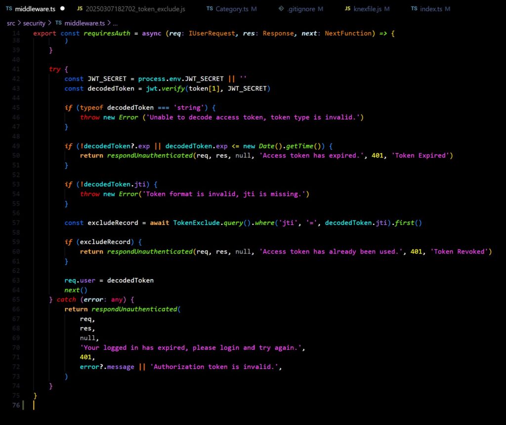
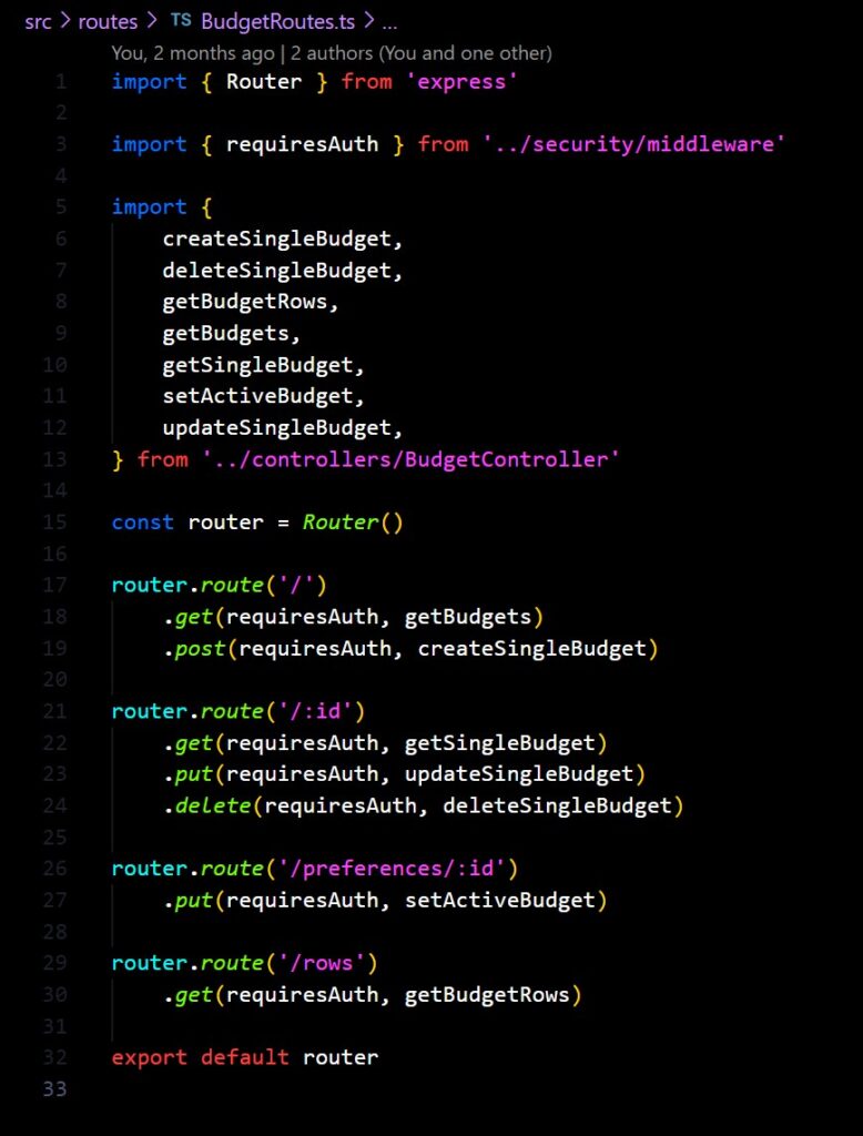
I admit I was sceptical at first. As I setup the various parts of the auth system it felt a bit too close to violating the rule that had been drummed into me when learning about auth; “don’t implement auth yourself”. However, by following an established pattern and making sure to use robust remade solutions wherever I could – in particular where encryption / decryption is concerned – I could be assured that I was safe as I was really just composing prebuilt elements, same as any other auth implementation.
A series of util files were created to wrap the encode / decode functionality as well as for hashing passwords. An Express middleware was created that could be added to any protected route and would check the validity of the auth token, injecting user details into the ‘request’ object for the endpoint to use.
Auth token refresh was implemented by defining a second, longer lived token, which can not be used to interact with the API but can be used once to query a fresh auth token, within a window of about a week. To solve the risk of token replay attacks a exclude table is used holding IDs of revoked tokens, when a refresh token is used its unique JTI ID is placed in this table. On subsequent attempts to use the same refresh token and for the main auth token on every API request, the JTI is checked against the exclude table and the request is rejected if it is found to be revoked. A cron job is used to clear out expired tokens from the blacklist table once a day.
The useToken hook provides a series of functions to handle the conditional re-querying of the authorisation tokens on the front end when the user’s auth has expired. On the application’s mount it first attempts to retrieve and valid a stored token from localstorage, if this fails it attempts to invoke the token refresh logic, and only if that then if it fails will it direct the user to login again.
A boundary component wraps pages that require the user to be authenticated before using them. If the auth state is unconfirmed, the boundary will redirect the user to login.
An auth ping is periodically used to check the authentication status prior to making any request which may be bounced due to an expired token. This provides another opportunity for the token refresh logic to be invoked and allow subsequent requests to succeed.
Lastly, a lockout flag is used to ensure that multiple token refresh attempts are made at the same time. Because of the mitigation on replay attacks, multiple attempts to use the token refresh endpoint with the same refresh token will trigger a ‘hard’ failure on any of the subsequent requests meaning that the user will receive a 401 unauthenticated and need to login again, even though they had a refresh token.
Implementing an auth system also allowed the defining of “cards”, representing a single account or cash pot, to which all transactions could be tied.
This solved a major issue with the Phase 1 implementation where the question of how to deal with multiple pots was left unanswered. I had floated the idea of combining multiple accounts into the same view, trying to make the application understand transfers between them, allowing it to ignore savings account transfers for example, but this was impractical vs just making sure that switching between accounts was easy.
You’ll note that in the seed data I’ve included a Category called “Savings” (or “Account Transfer” in some cases). This is a mirror of a Category I use to fence off intro-account transfer and ignore it in analytics. Most of the time my account transfer transactions are just moving money to a savings account.
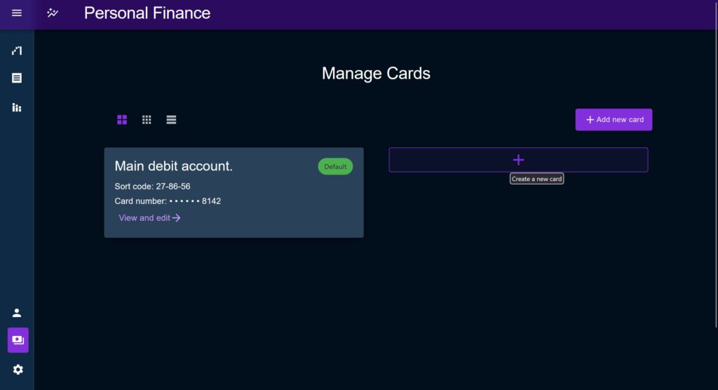
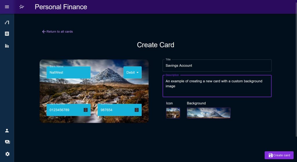
Localisation
Something I was really keen on getting right this time is localisation.
To claim that this is a “production grade” app while not supporting multiple locales and currencies simply wouldn’t make sense. Yes, enterprise organisations will typically only support one or two languages that they use internally (unless they are truly global), but to my mind the extra work needed to make an application localisation-compatible invalidates any excuse for not doing it.
Intl browser utility
If you have not already heard of this browser utility I’d highly recommend you check it out as soon as possible. Stabilised in the last 5 years by the looks of it, the Intl utility provides a range of localisation static functions natively within the browser.
Number Format
One of the most useful Intl utilities for Personal Finance is Intl.NumberFormatter, which allows you to transform large numbers and currency values to a language and currency specific native format.
For example, in the past if I had wanted to display a large currency value I might have used a function with a large regexp to insert commas into a large float value, capped the number of digits after the decimal, then tacked on a currency icon at the start, and called it a day. But this is inadequate as it has a few problems. Firstly, not all languages use decimals and commas in the same way, secondly there are right-to-left languages that may be in use, and thirdly the currency symbol is not always placed at the “start” of the number, some currencies place it at the end.
By using Intl.NumberFormat I can pass in a locale, a currency, and a number, and get a nicely formatted, correctly localised response every time.
For Personal Finance I created a custom hook, useLocalisedNumber which exposes two functions, currencyLocaliser, and numberLocaliser to be used within components to auto-transform numbers based on the user settings for Language and the currency denoted for the transaction (or from settings).
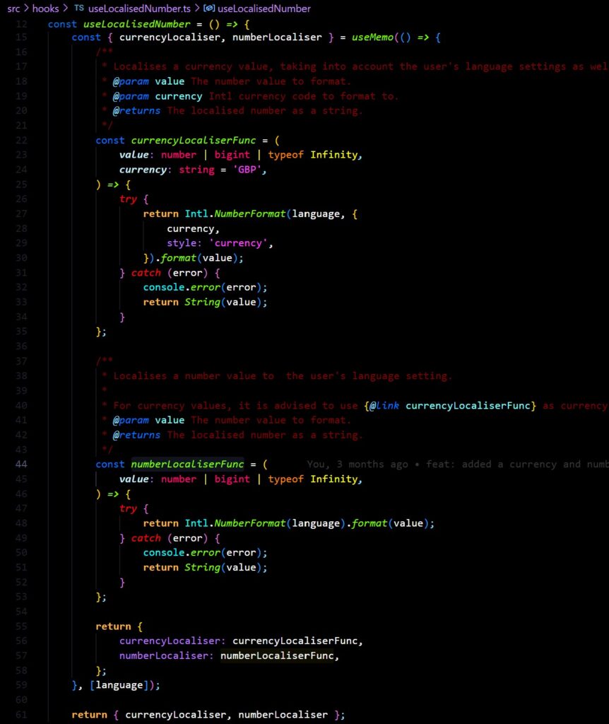
Locales
The package locale-codes provides a useful list of both language codes but also local codes, allowing the user to select between, for example, en-GB and en-US. This turned out to be important to use versus a hard-coded list of locales, as the format of the numbers produced by Intl.NumberFormat will depend on the specific locale, not just on language which I encountered when I tried to use the standard list ISO 639 codes.
I18next
Translations for all text contained within the app are provided using I18next and the React plugin, react-i18next. The delightfully named ‘t‘ hook provided allowed you to easily inject alternate text content depending on the users settings, meaning true translations can be provided by developers rather than clunky browser auto-translations.
While only UK English is provided to start (alas I am only a monolingual Brit), the setup allows anyone wishing to extend it to simply add a new translations file.

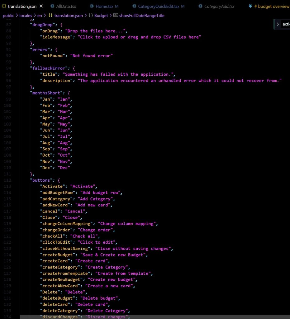
The layout of the translation file uses a combination of text grouped by entity (e.g. Category or Matcher), and common share text pieces. Sometimes a short-hand code is used, other times a “literal” key is used, where the key corresponds directly to the English spelling. To try to formalise this system I created a contribution guide within the README.md but almost certainly there are better ways of handling it.
Dockerisation
I decided that this time I would not be hosting a demo version of this project due to lack of good hosting options but also from a risk perspective; I don’t want people to try to plug in their real financial data and to be liable for it.
While I have no interest in commercialising a publicly available production application, I still wanted to design a hypothetical deployment strategy as part of making this a realistic demonstration project. I wanted a way to say “this is how it would be productionised if I wanted to”.
I also wanted to have my own long running version to use day-to-day, a “mini production” which I would maintain like a production release but is just running on my local machine for me.
Lastly, because I wanted to have the front end be potentially just one version amongst other cross-platform implementations, I didn’t want to have a single demo project which grouped the Web and Service together too tightly. Having a single demo would be nice but would require prioritising the current Web app which I might later decide against.
Using Docker with the default Postgres image was the natural choice to conveniently package the various components, without requiring a user to install additional dependencies on their machine.
Backend
Dockerising the backend was relatively easy to start with, but I had a lot of trial and error to find a way to satisfy two desires:
- 1. How to support the three build modes I had defined, “development”, “staging”, and “production”.
- 2. How to reduce the build steps by using a single docker-compose file for the API and database.
Many initial attempts used multiple docker-compose files and the docker merge capability which produced some bizarre results, namely grouping my API and database under an Auto-generated container name.
Next, I had to consider when to run Knex migrations. On one attempt my combining both the Postgres image and my own API image meant that the Knex migration was attempting to run prior to the database starting up and therefore failing the build process. The reason for this was that the build process was only interested in waiting till the container was up, and didn’t care that the database itself was still booting.
Seed Issues
Another unexpected issue was with he seed files I was using to re-build the database each time, it turns out that Knex runs seeds in alphabetical order based on the file name. This was causing issues because SQLite doesn’t care about constraints like foreign key columns but most other databases of course will; I it was necessary to make sure and insert the Card before the Transaction that references it etc.
This was solvable by making new seed files using the Knex seed command using a template which would inject a millisecond date code, ensuring that this would dictate the order of execution, not the entity name.
Lastly, there was some confusion about how to handle Date formats in Postgres but most of these were solved by switching to ‘datetime’ columns and adding a bit of extra config to the Knexfile.
Web Front End
The initial idea for the front end was to have a build placed inside a static folder on the API as part of my bid to just have one docker compose file, but this never quite felt right for a couple of reasons:
Firstly, it violates the microservice pattern by combining front end with back, it introduces a versioning issue as it becomes hard to remember which has been committed. Yes there are ways around it but see the next section for why I was hesitant.
A bigger problem was that the API router could not differentiate what was a static file request, and what was an API request. Yes I could have prefixed all static resource URL’s with /static/, but that would have then introduced issues using it in any other environment and I just wasn’t really up for doing that.
An example of coupled front-ends from work
On a project at my work there was a need to incorporate the build of some applications into another app due to the time it would have taken to approve entirely new separate apps (or properly integrate them). This would involve building the sub-app, and then committing the build as a static part of the codebase of the host app.
To try to do this as elegantly as possible I devised a method of creating ‘build IDs’; unique identifiers created at build time which would be written out to a .txt file within the build as a form of traceability. After this the builds would then be placed within a folder of the host application called “ecosystem-apps” which then had sub-folders for each environment.
When making changes a pull request would be opened on the application’s repository, another would be create on the host app’s repository. The two would then be linked by mentioning the build ID and adding hyperlinks. This worked for what we needed and did – in theory – provide the traceability needed for secure change release control, however it is a far from perfect solution.
Because both repositories are tied together but still separate, reversing changes proved to be difficult. Then, if there was a feature awaiting sign off on an ecosystem app project, it may be completely unrelated to all the other apps of the host but will still block the change releases as the host app needed to maintain its own linear sign-off release train. In other words if one app was still in test but not ready to go, the rest also had to wait. It was possible to only build for one environment at a time but it very quickly became difficult to tell which build for which app was then subsequently built into which environment on the host.
It was an effective solution to resolve the dilemma we had at the time but I would not recommend it if it can be avoided.
Static file server
The solution of course was to simply find a static file server solution using Docker. Its Docker silly.
Following some online guides I created an NGINX image and adjusted it slightly; most tutorials had the build copy everything from the source project into the server, I changed it to just take the output build/ folder.
Lastly there was – no presumably no-ones surprise, not least my own – a CORs issue. The NGINX image had a set of server headers which it attached to each response, namely Sec-Fetch-Site, and Sec-Fetch-Mode. I added a custom nginx.conf file and overwrote these headers but it turns out you can’t overwrite server headers by default, instead this little snippet must also be included.
Et voila! A containerised web app, and a containerised API bundled with it’s own Prostgres database.
AI Integration
Of course something else has changed since early 2023.
A new swath of new AI technologies have sprung up based on the transformer model, first galled “generative AI” and now just “AI” and have seemingly appeared integrated into everything.
I have another blog post brewing about my thoughts on the current moment; how we talk about, think about, and fantasies about “AI”, a term I put in quotes not because I reject it, but because right now I think its best understood as an exercise in branding.
Many commentators including myself, both working in a “tech” field and otherwise, have avoided saying too much at any given time about AI / Gen-AI, partially because by the time we’ve finished writing the context for the post is out of date, but partly also because (at least in my case) we don’t want to make the wrong bet. We hold back on being to certain or too strong in an opinion for risk of saying something that will look widely naive, or overly pessimistic, or lacking in some other future facing analysis, in 2 / 5 / 10 years time.
In the case of Personal Finance, I’m somewhat in the position of being unable to avoid ‘making a bet’. As a supposed flagship portfolio piece my including or not including AI features is inherently a statement. Do I build an AI feature into it, and risk it looking in 5 years like I jumped on a temporary fad, ignoring the politics and climate at play in five years time? Do I avoid building one, and then look like I missed the boat, took my finger off the pulse, acted stubbornly, and tried to ignore an inevitable change?
From my experience being involved in building NatWest Group’s internal general use AI assistant ‘Aiden’ it would have been relatively easy to tie in various LLM API’s, build a Retrieval Augmented Generation (RAG) system and provide user insights, maybe chain these together to build an ‘agentic flow’ like Aiden has. I thought about creating a little applet marketplace, with pre-formed prompts (ChatGPT calls these “GPTs”, Aiden calls them “Aidlets”), and allowing users to make reusable prompts.
But as soon as I imagined the little sparkle emoji button – the consensus iconography to represent the current “AI” brand, the little chat bot window popping up to offer some unsolicited opinion, the cutsy name I’d have to give it, and all the added visual noise I simply couldn’t justify it.
Even if it ‘worked’; i.e. provided some added functionality and effectively showed off that I can navigate this type of design, it would have felt too much like a gimmick to warrant putting my name on it.
Automatic Commentary Generation
However, I did still want to have my cake and eat it too. So I asked myself what a hypothetical AI integration could do and some way of testing how this might look in order to have at least say I had done it. I honed in on the idea of automatic commentary generation as this felt like the most appropriate and de-risked form of LLM integration.
Personal Finance is really just about looking at data in as many different ways as possible. Its guiding design principle is an idea to build a theoretical user-friendly OLAP cube, letting the user tossing it in the air, bounding it off the wall, lick it etc. just to see how the data looks from all angles.
On commentary generation, it is presently up to the user to decide what the data means. PF does not offer any targets, savings tips, suggestions to move money, criticisms for ‘bad’ behaviour, or anything else that might constitute commentary, because that would be pushing an opinion (or opinions) on a user, and making assumptions about what they value.
I think that integrating an AI assistant or any kind of AI analysis along this line would ultimately violate this principle and would create a monotone perspective that would get tin the way of the user rather than helping them.
I did have the rather amusing idea of an “AI council”; I thought that if I could get a range of LLM systems with different “perspectives”, or maybe a range of performance metrics on different types of analysis, I could then pitch them against each other and provide a chorus of perspectives to help the user generate ideas. Unfortunately this isn’t really feasible given the costs and energy waste considerations, but also because I don’t think the various systems on offer do too much different in terms of performance on this type of task.
Despite this, I was still curious about how a current LLM system would respond to the task. I loaded up the following prompt (which maybe isn’t the best but I think is an OK starting point) and gave it to a range of LLM services. I won’t post every result but have included this one from Google’s Gemini 2.5 Flash model as I think its a good representation of the types of responses I got.
I included 3 months worth of anonymised data but have only included the first few rows bellow to save scrolling.
LLM Prompt
You are a financial advisor bot. You are designed as part of an application called Personal Finance.
Personal Finance allows users to upload transaction data exported from their online banking applications and provides a range of analytical tools to allow the user to explore their data from a range of perspectives.
Personal Finance is oriented towards insight and commentary generation, helping them to explain the "why" behind what is happening.
You will aid the user by generating analytical commentary. You will keep your responses formal and speak with a trustworthy tone.
You will comment on the supplied input and try to find useful patterns. You will try to spot insights that the user has missed.
If you do not find anything worth commenting on say so; do not just speak for the sake of speaking.
If it is useful, ask the user follow-up questions to gain additional insights.
Do not tell the user things they may already know.
The user will provide their exported data in CSV format bellow.

USER INPUT:

id,currency,cardId,userId,date,transactionType,description,debit,credit,ballance,createdOn,updatedOn,categoryId,categoryName
8deb4842-23c9-4d75-9521-b132ea9337ad,GBP,be913800-df3b-4285-803a-88e971fde8f3,dc4b572d-1be4-412f-b99a-4cc947e9f048,1752006522807,DEB,NorthernRail,2.3,0,1013.4,1752006522807,1752006522807,b6945bdd-04b6-4df9-9530-1e1a9ce273c3,Travel
c458ab9c-13b8-42b6-adab-9cc1ccdacbc2,GBP,be913800-df3b-4285-803a-88e971fde8f3,dc4b572d-1be4-412f-b99a-4cc947e9f048,1751920122807,DD,CTAX,65,0,1015.7,1752006522807,1752006522807,11002146-43f2-45a8-91f8-f718b5f34de3,Utilities
1bd22e58-9804-4242-9f3a-1886766ec911,GBP,be913800-df3b-4285-803a-88e971fde8f3,dc4b572d-1be4-412f-b99a-4cc947e9f048,1751920122807,DEB,CEX LTD - new Pokemon game,42.95,0,1080.7,1752006522807,1752006522807,3d84b0a8-f4b2-4464-96ac-43e8babd2156,Hobbies
7c13eed4-5e5a-4a9f-ae24-0c9222bd2438,GBP,be913800-df3b-4285-803a-88e971fde8f3,dc4b572d-1be4-412f-b99a-4cc947e9f048,1751920122807,DEB,Spotify Limited,11.99,0,1123.65,1752006522807,1752006522807,7364d968-1058-48dc-bdbb-c8268a97bdf5,Subscriptions
b70b071a-0684-42e8-a042-22b2520b829c,GBP,be913800-df3b-4285-803a-88e971fde8f3,dc4b572d-1be4-412f-b99a-4cc947e9f048,1751660922807,DD,SHELTER NAT CAMP,12,0,1135.64,1752006522807,1752006522807,4b8614e2-4f8d-41e2-8d62-7163eefa6812,Support & Donations
...
LLM Response
To provide a comprehensive analysis, I will process the provided transaction data to identify key spending patterns, income, and any notable trends.

Financial Overview and Spending Analysis

Your transaction data provides a clear snapshot of your financial activity, highlighting key areas of expenditure and demonstrating a consistent income stream.

Income

You received one payroll deposit of £1987.35. This appears to be your primary source of income within the provided dataset. There are also two incoming payments categorised as Gifts from "Brother" (£12.99) and "MUM" (£37.00), likely reimbursements or contributions for joint gifts.

Key Spending Categories

Your expenditures are spread across several categories, with a notable concentration in a few areas:

    Food (£462.68): This is your most significant spending category, accounting for approximately $\text{47%}$ of your total debits. You frequently shop at major supermarkets such as Tesco, ASDA, Aldi, and Marks & Spencer, along with smaller local Co-op stores. There are also entries for "PARK SERVICES CAFE" and "MUSEUM CAFE VISA", indicating dining out or leisure-related food purchases. Given the frequency and value of these transactions, this area presents the most significant opportunity for potential savings.

    Travel (£49.35): This category primarily consists of frequent, small debits to "NorthernRail" (9 transactions totaling £21.70) and a single larger expense for "UBER *ONE" (£4.99). The recurring NorthernRail expenses suggest a regular commute or frequent short-distance travel.

    Gifts (£188.70): You have a substantial number of transactions related to gifts, with descriptions indicating purchases for various family members and friends. These include items from Amazon, Oxfam, CEX, British Red Cross, Sue Ryder, Pets at Home, Greggs, and a whisky purchase. This suggests a generous gifting habit.

    Utilities (£192.19): This category includes regular payments for "CTAX" (£65.00 each on two occasions), "Energy bill" (£110.00), "SKY INTERNET AND BROA" (£53.29), "Home Insurance" (£15.78), and "DIRECTLINE INSURANCE" (£17.40). These are essential fixed or semi-fixed expenses.

    Support & Donations (£30.80): This category includes donations to "SHELTER NAT CAMP" (£12.00) and "SUE RYDER DONATE" (£10.00), as well as "NON-GBP PURCH FEE" (£0.50), "NON-GBP TRANS FEE" (£0.11), and "FREECODECAMP.ORG" (£3.95), the latter appearing to be a recurring subscription or donation to an educational platform.

    Hobbies (£54.94): You have two notable transactions in this category: a new Pokemon game from "CEX LTD" (£42.95) and a movie from "AMAZON" (£9.99).

    Healthcare (£6.76): This includes a "BOOTS/619" purchase (£4.36) and a "BOOTS 619 (floss)" purchase (£2.40).

    Subscriptions (£23.98): You have two identical "Spotify Limited" direct debits, each for £11.99. This indicates a recurring monthly subscription.

    Mortgage (£600.00): A significant direct debit for "Mortgage" is present. This is a substantial fixed expense.

    Home (£11.95): A single purchase for an "Amazon.co.uk - replacement vacuum cleaner filter" falls into this category.

    Bike (£20.81): A purchase of "AMAZON MKTPL - new bike tires" is recorded.

    Phone (£16.20): A direct debit to "EE" is noted.

    Clothes (£10.00): A single purchase from "BARNARDO'S 2931 - better coat" is present.

    Dentist (£20.00): A single payment to "Dentist" is recorded.

    Garden (£57.44): This includes "OXFAM - various gardening" (£19.27), "Thompson Morgan - seeds for new year" (£18.98), "AMZNMktplace - the expanse season 4" (£12.80), and "CASS ART" (£25.20). The "the expanse season 4" purchase seems miscategorised here and might fit better under 'Hobbies' or 'Entertainment'.

    Dog (£10.99): A purchase of "AMZNMktplace - dog treats" is noted.

    Work (£0.89): A small debit to "CLOUD LFPGEG" is recorded.

Noteworthy Patterns and Insights

    Frequent Small Transport Costs: The recurring "NorthernRail" transactions (9 instances) suggest daily or very frequent use of this service. While individual amounts are small, they accumulate to a notable portion of your travel expenses. Analyzing the dates may reveal a consistent commuting pattern.

    Significant Gifting Expenses: Your "Gifts" category is quite active, with numerous purchases for various individuals. While generous, this is an area where conscious budgeting could be applied if you are looking to reduce discretionary spending.

    Potential for Food Savings: Given that "Food" is your largest expenditure, reviewing your grocery habits, exploring meal planning, and comparing prices across different supermarkets could lead to considerable savings. The presence of multiple "Park Services Cafe" and "Museum Cafe" transactions also suggests opportunities to reduce spending on prepared food or dining out.

    Recurring Subscriptions: The Spotify subscription is a regular outgoing. While not a large sum, it's worth regularly reviewing all subscriptions to ensure they are still providing value.

    Utilities and Fixed Costs: Your direct debits for utilities, mortgage, and insurance are significant fixed costs. While these are often difficult to reduce significantly in the short term, it can be beneficial to periodically review providers to ensure you are on the most competitive tariffs.

Recommendations for Further Exploration

To gain deeper insights, you might consider:

    Monthly Budgeting: Categorize and total your expenses on a monthly basis to see how your spending aligns with your income over a longer period.

    Setting Spending Targets: For categories like "Food" and "Gifts," establishing a monthly budget can help you manage these discretionary expenses more effectively.

    Reviewing Recurring Charges: Periodically check your bank statements for all recurring direct debits and subscriptions to identify any services you no longer use or that could be obtained at a lower cost.

By understanding these patterns, you are better equipped to make informed financial decisions.
The response was decidedly vindicating.
I’d be keen to hear other people’s thoughts on this response and the prompt that I used, but in my opinion this is not a useful output.
I acknowledge that the prompt could probably be greatly improved, so I’m not taking any points off for things like the list of spending categories for instance, as perhaps some part of my prompt suggested to do this, but I will be specifically focusing in on the commentary which is mostly provided towards the end of the response.
On ‘travel’ I was disappointed that it did not recognise that the “Northern Rail” trips were not a commute, instead it just said ‘hey maybe keep an eye on that’. Same with ‘food’, there was no analysis of average spends per shop, just a generic ‘you seem to spend allot on this maybe think about that’. All throughout the commentary there were attempts at providing savings tips, but these suggestions offered little substance and assumed that outgoings reductions are the main goal.
Assumed aggressive saving strategy
On that idea of saving at all costs, I was quite surprised that it targeted gift spending as somewhere to reduce outgoings. I’m no financial advisor but I imagine that if I was and a client was comfortably in budget and had a “generous spending habit”, I would not see this as a problem that needed rectifying unless specifically requested to find any ans all savings possible.
Its line “While generous, this is an area where conscious budgeting could be applied if you are looking to reduce discretionary spending.” that had me most bemused. Hey nice naturism there buddy, but have you unconsidered making Line Go Up instead?
Opportunity for deducing context missed
There were a few ‘traps’ in the data that I was mildly hoping the LLM would pick up on and account for. For example, I’ve included a transaction at about lunch time most Saturdays at some museum or park based on my own habit of attending a sketching group most Saturdays.
I was hoping that the LLM would ‘figure out’ that this is likely a trend that will continue and is based on a regular outing such as the aforementioned regular meetup. There were also other takeaway food transactions inserted that I deliberately inflated the cost of, hoping that the system might say something like “I see that you tend to spend money on lunch most Saturdays, I’m assuming that this is a social outing that you’re not going to change? However I think its notable that you spent as much in 3 months on that as you did one time getting food delivered from ‘Pizza 50 miles away’. Maybe there’s more local restaurants that do the same thing for less?”
I tried to give the LLM permission to ask follow-up questions, perhaps it would ask about things like that and tailor its response, but in my experience they tend to ‘speak when spoken to’, responding to the last message you send with as close to a complete answer as they can give, not suitable for the kind of back-and-forth I wanted.
Lastly it finishes out with generic financial advice you might give to a child receiving pocket money for the first time.
Assumed values (or lack thereof)
This is really the key point here; I don’t begrudge the system for just summarising what it sees, commenting superficially on it, and wrapping up with spending tips, that’s effectively what I asked for by not specifying any goals or values or motivations.
In essence what else was it supposed to do? Take a really strong stance that I should invest more on riskier sources? Berate me for not eating out more often and enjoying life? Tell me that I could really afford to be giving more to charity so what’s this about a new air fryer and vacuum cleaner filter? Try to predict future societal events and tell me to stockpile bike tyres because its predicted a war starting that will affect the place where they mostly come from and make prices go up? Tell me that the financial system will collapse and your money won’t mean anything in 40 years time anyway because they economy will be radically different so maybe stop worrying about anything long term?
Ok I’m being a bit facetious here but the point is that there are infinite little calculations we’re constantly doing, maybe not even consciously, that affect our values and habits and influence ‘how the data looks’ that an automatic system – designed to be somewhat middle of the road by the vendor – just isn’t going to do.
Yes a better model could probably perform much better at analysis the patterns, but would be no more useful about finding meaning in the data without the context that the user would bring, with whatever mindset they happen to be in. For example, a better model might be able to perform the kind of reasoning I described with the Saturday lunch costs, but would that add anything? I already know that happens. I’m the one that does it.
I’m not ruling out that an AI system could provide any value at all, but at the moment it would be yet another case of making the use case fit the tool rather than the tool to the use-case.

