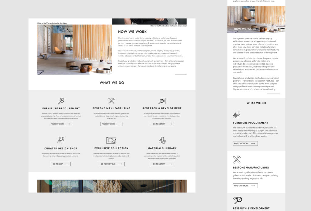
Following on from the MoodBoard system, as part of the Matter of Stuff site redesign, I implemented new pages using a fully customisation page editing system to give the team full control over their content.
When the Matter of Stuff core team set out to design their site, they wanted an outcome that reflected the bespoke, high-end, and established company which they had built over the past season.
They needed something which not only perfectly reflected the company they are now, and could be updated instantly to reflect changes dynamical, given the rate of expansion, events, new flagship pieces etc that they engage in.
In other words, they needed a site that would keep up with their pace, without having to wait for a developer to be available. Customisability and agency to control every aspect of the design was imperative, with one word at the centre of everything; control.
Working with the visual design created by Daniel Stout, a freelancer at Matter of Stuff at the time, I suggested using the Guttenberg Block system on their WordPress instance and fairly recently been adopted by WP as the default editor.
The result was a custom made series of 20 WordPress Blocks, created with the Block Lab library. These Blocks, which included a mixture of basic components (headings, paragraphs, page breaks etc) and custom layout sections.

This system would be reusable enough that creating new pages or radically re-arraigning a page layout could be done in minutes, without needing to worry if everything conformed to the Matter of Stuff design style.
Every Block had as many options as possible for customisation of not just all of the content, but also all aspects of layout and display.
Most Blocks had the same basic features to ensure consistency in editing with Block-specific features added on top.
For instance, most blocks featured a wrapping element which defined the element’s position in the document flow. Then, there would be a container to provide the layout for the actual content (unless the contend is full-sized), CSS flexbox was prioritised over grid using patterns of cascading pairs. That is to say that, if four elements are in a row, this would be two flex boxes nested inside another flex box. This meant that mobile layouts were usually intuitive but also allowed MoS to swap the left-right top-bottom alignment of each “level” of content as show bellow.


With the Dual Image Block, the team could enter a ratio using a set of standard formats (e.g ‘2 : 1’, ‘3/5’, ‘2 |4’) where my code would sanitise the inputs and use them with flexbox to change the ratio of each image accordingly.

While exploring options the team did discuss the option of building the site with a page-builder like Elementor.
I advised them to take this option given that I was able to replicate all the core aspects of customisation they would be looking for without having to pay the annual fee for the editor.
In addition, page-builders are a great and accessible options for people who don’t mind a bit of compromise; there will always be design ideas which the framework does not support and, the majority of the time, there is a perceptible feel that the result is “off the shelf”.
For a company like Matter of Stuff, we agreed that, short of fundamental technological limitations, no compromise should be accepted.
Nothing should feel pre-packaged.

