Hold, Store, Display

A project to design a new method of storing and displaying an item for the Arkwright Scholarship program.

As my year group was starting fifth year of high school, Eastwood was given the opportunity to engage fourth year students in a scholarship program.

At the time, there existed the possibility of myself and the other new fifth years also being permitted to take part. Later this idea was rejected, but whilst waiting, I made some progress on the brief given as part of the application process.

The Arkwright Logo.

The brief was very simple, intended for interpretation as much as deliverable outcome, to design an object, no more than 1.5 x 1.5 meters to hold and/or store and/or display another object.

The only other requirement was that a working prototype, or at least a proof-of-concept had to be manufactured and documented.

image of an arm holder
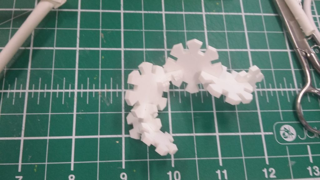
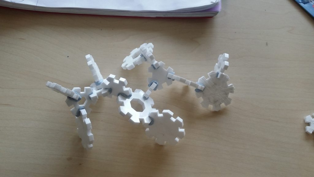
Design Idea Two uses a micro-suction-cup material to hold a range of flat-backed items while idea one utilises a shape-memory polymer to be fully flexible in use (pun intended).

At the time, this was for me a wonderful chance to apply some new material knowledge and to express and actualise some ongoing ideas which were relevant to my work at the time. Specifically, it was at this time that I was becoming interested in the meaningful impact of product design and moving from a mode of ‘design-for design’s-sake’ and designing products to make a 50th percentile middle class suburban person’s life more comfortable.

image of a tree-shaped design
Daruma dolls originate in Japan and are used to remind oneself of a goal to be achieved at some point in the future. One of the doll’s pupil-less eyes is painted to represent the doll always keeping one eye on you to make sure you stay true to the goal. Once you have achieved the goal the second eye is painted and the doll becomes a reminder of the journey.

I tried to inject some of this thinking into the ideas by making four of them (designs 1, 2, 4 and 5) adaptable and/or modular, making one (design 3) orientated towards personal reflection and individual-base and one designed to be aesthetically contemporary but aimed at lower cost markets.

I was in the mid development phase for one other the three ideas I wanted to take forward when we were informed that the scholarship was cancelled. I developed idea five through to a prototype and may pick up on some of the others, specifically ideas one, three and five at some point as I believe there is potential in them for a unique design solution.

Tri-D Chess Set

A replica of a common background prop in the Star Trek series created for my brother as a gift.

A break from my usual design format, this board was created over a month for my brothers Christmas present after he took an interest in the prop seen often throughout multiple series of Star Trek.

images from various 'star trek' series as reference
A collection or reference images used to try and inform the re-design.

The board first appeared as a plot device on the original series in the 1960’s but generated fan interest amongst fans, later appearing mostly as background set decoration. Toy boards were sold but are exceedingly rare today, as a result I undertook the task of researching what documentation I could find and designing aspects of the construction and ergonomics.
CAD drawing to develop dimensions
Using a mixture of research data, anthropometric data and design choices, a layout which was function and aesthetically consistent with the original was designed.
fitting the base during manufacture
Using a mixture of research data, anthropometric data and design choices, a layout which was function and aesthetically consistent with the original was designed.

The frame was originally going to be made of tubular steel, forged in my high school’s workshops into the desired curve. After bending the first tube, this proved too time-consuming and so a wooden frame was jig-sawed. The base was cut to resemble Starfleet insignia imagery.

The boards are laser cut polymethacrylate sheets with ‘white’ squares represented by a rastering effect. The small 2 x 2 boards are mounted on tubular aluminium as they are intended to move. The unit assembles with no screws, slotting into place.

game board acrylic detailing
Board details near the end of assembly.
second presentation shot
The final design laid out on the dining table for Christmas morning.

This was a fun project even if the design was somewhat prescript, I feel it gave an appreciation of craft-based design at a time when I was focusing on engineering methods and hypothetical design.

If I were to do this project again or make more as part of a series I would like to change the way the mini boards attach given that they are not as robust as I would like, relying on adhesives and also, I would have liked to pursue the metal frame beyond the minor forging I was able to do.

Lighting Exploration Project

A year long exploratory project for Advanced Higher Art & Design exploring perceptual relationship with nature through a semiotic analysis in the context of lighting design.

Art and Design, as opposed to the engineering-based Product Design, focuses less on tech-based skillets or problem-solving as it does on theme exploration and expressive content with theoretical frameworks applied. I started with a basic idea to explore the geometry and regular patterns in the natural environment, evolved from the abandoned theme of ‘capturing motion’; exploring movement in form.

lighting tests in the dark room
Images from some initial dark room experiments on form development.

This interest in geometric form in nature morphed into an exploration of what certain patterns and shapes mean to people, observing the boundary between organic form and the more geometric patterns which often underpin them and how this can be used loosely as a method to explore a broader conception of ‘nature’ and the built environment.

Given the long timescale format, I decided that I wanted to introduce a more technical element of my own accord, learning over the course of the year to use Arduino and constructing multiple prototypes and methods of lighting and interfacing with light. This foundational knowledge in code laid the path to my later interest in JavaScript and other technologies.

a triangle-based prototype
A collage of images from the ‘triangles’ development route.

One particular branch of exploration which interested me was this exploration of triangular formations. The triangle or triangular-pyramid provides a repetitive tiling structure but the angles of 30 and 60 degrees added an element of rapidly expansive complexity (akin to polygons in CAD modelling) which opened a great many possibilities in a short amount of time.

In addition to Arduino controlled lighting, polymorph plastic played an integral role in the projects outcomes. Polymorph is a polymer with properties very close to polymethacrylate that can be moulded at around 60 degrees, allowing it to be melted down and moulded over and over again. As it turns out, it also has great optical properties as well.

final presentation board
The final outcomes in various scenarios showing the Arduino controller and capacitive touch panel.

The final design was a range of units, designed to be placed apart as part of a set, which function as sculptural pieces as well as mood lighting and manipulation. The units are lined with RGB LED’s to diffuse light across their bodies, hooked up to an Arduino controller and optional control panel.

Several programs were written for different effects. Capacitive touch and proximity detection was used whereby the Arduino could detect electro-magnetic interference near a circuit and respond. Once program had the panel respond to toggle colours on and off on touch. Another detected user’s proximity to an individual unit and lit the rest up like a ‘heat map’, in response to the relative position.
The idea was that, with more psychological user research, the units could read the users mood and respond with an appropriate stimulus colour.

Torch CAD Specification & Graphics Package

Higher Graphic Communication ‘Thematic folio’ produced to sharpen my technical competency and visual presentation capability in final year high school.

The Thematic Portfolio is essentially what other institutions would call a technical package, a fully detailed CAD package with supporting parts list and promotional material.

We were asked to choose a physical product to reverse-engineer, build in CAD, and then create a brand identity around. I was excited to use this as an opportunity to expand my Autodesk Inventor skills and build a strong brand image around the product.

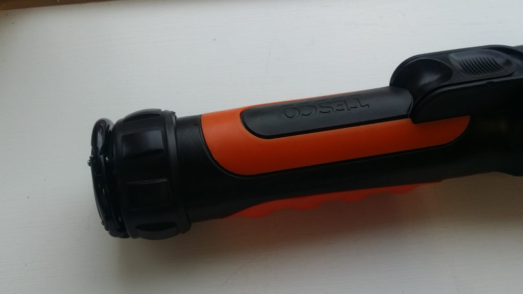
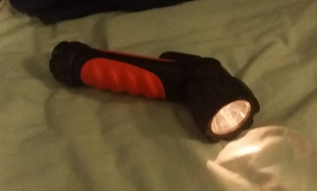
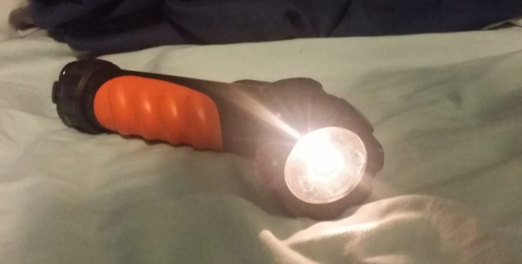
I choose this Tesco torch with a rotating head that can be tilted 90 degrees. Given it’s rotating mechanism, features following or arrayed around the cylindrical body, and detailed components, I felt it was a good challenge for my skill sets at the time. If I had wanted to I could have omitted detail such as the orange detailing, the clip, or the bulb assembly and still met the requirements of the brief but insisted on including these details for the sake of it.

The thematic is, in essence, a full visual display portfolio for our chosen product where we act as though the product is of our own design and we must now visualise and communicate it to a client, manufacturer and customer.

This folio is comprised of three components:

  1. A fully annotated technical package including parts sheets.
  2. Rendered CAD assemblies and exploded views.
  3. Promotional posters and leaflet.
torch CAD model
A render of the assembled torch.
torch CAD model exploded parts
An exploded view of the torch
specification sheet for model parts
Fully dimension-ed part sheet
promotional leaflet
The leaflet showing faux-company details
promotional posters
One of the posters produced.

The fictionalised ‘Nitor’ was presented as a utility device for both home use and the outdoors (in reality the torch was far too fragile to do either). The graphic presentation was based around plays on the idea of folding and direction changes.

This was a chance for me to play with some new graphic techniques including layered transparency and a form of flat design used for the icons. The text affect attempted to evoke the imagery of an eclipse.

CCV Interface

A very early project to engineer a desk table with built in computer interface extension.

This project, developed over the summer of 2013, was one of the first ever long-form, self-directed projects I undertook. A small, movable work table with a reflected PC display extension and touch capability. It was built on the open source software Community Core Vision (CCV).

community core vision software
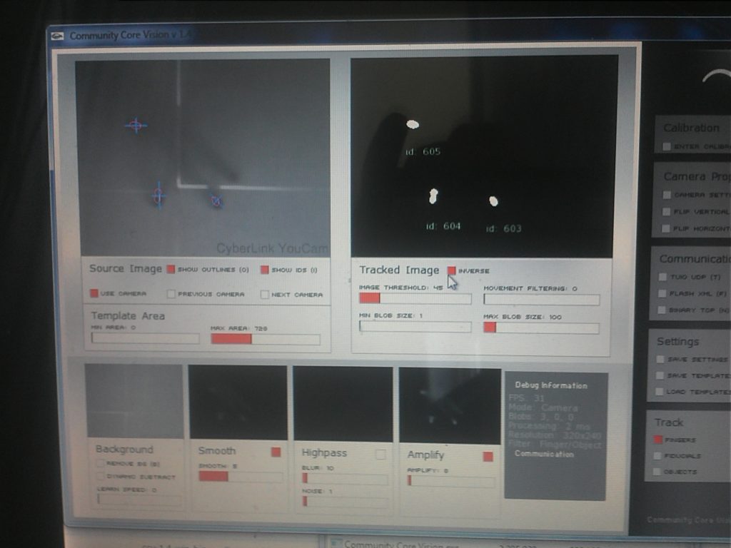
The main interface for CCV, on the left is the raw infrared image, the right shows the filtered image and registered touch points.

CCV is an open source software designed to interpolate data from an infra-red camera for use in this kind of project. The above image shows data from an experiment before the LED arrays were even introduced (i.e. working only with ambient IR light), already the software can detect ‘clicks’.

a disassembled and modified webcam
The final camera assembly after modification.

The device works by flooding the display sheet of polymethacrylate with strips of infra-red light via IR LED arrays. A small standard webcam is housed inside, modified to block visible light and pick up IR radiation. The IR light is even throughout the sheet until something comes into contact with the surface, at which point light deflects into the camera. The camera is in continuous use by the CCV software.

testing a prototype for the ccv table
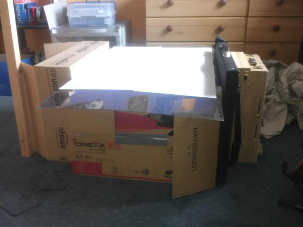
Throughout development and testing, several mock-ups were setup to simulate different conditions such as the amount of outside light pollution and camera / projector distance tolerances.

To design the casing, I created a minimalist but aesthetic form, inspired by the set design of one of the Star Trek movies. The display is created by linear setup of a projector reflecting off a mirror. The table has to encase the projector reflection assembly and camera with minimal light bleeding in so avoiding a ‘blocky’ aesthetic was a challenge.

an exploded view of the components
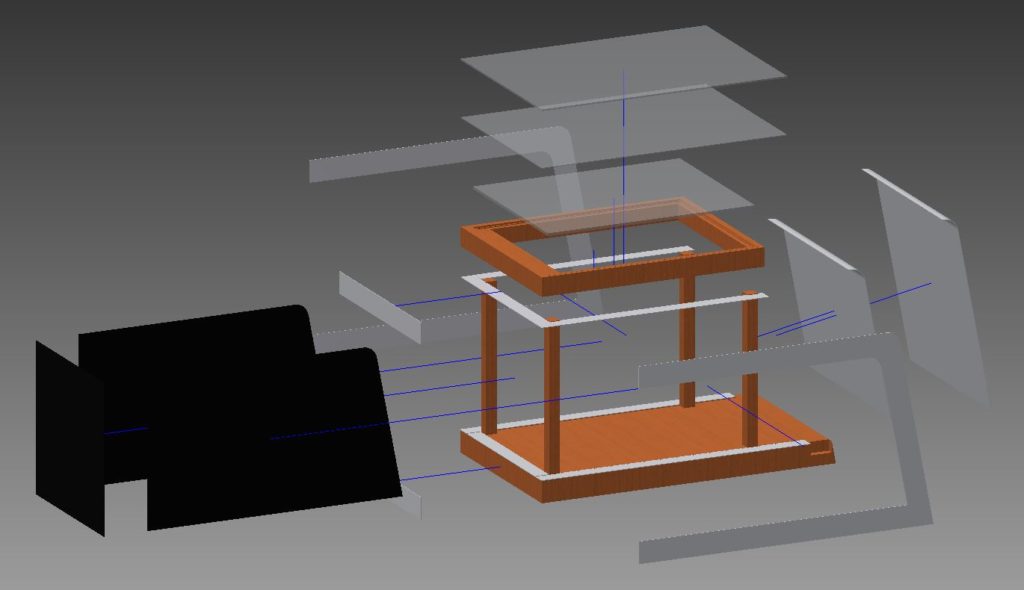
The exploded CAD model, designed as a reference for the real-world build.

A full assembly was designed with a wooden frame clad in sections of polymethacrylate to give a smooth aesthetic in line with trends at the time. The table was designed with home / workshop manufacture in mind; I did intend to make it only opting not to due to cost and storage constraints.

In reflection I realised that I had, for the longest time, brushed away this project because of a restrictive mindset I was in at the time; this has no particularly beautiful renders or SQA-style presentation sheets. However, on closer analysis, I am very satisfied with how this project came out; the design was ready for manufacture, the projector camera assembly was working, acting as a proof of concept, and much was learned about electronics, interface software and engineering techniques which would serve useful later on.

Polymat

Polymat: Kitchen Grip Assistance is a silicone grip mat designed to tackle issues involved in the kitchen where the user cannot properly grip an item which will otherwise slide about.

For the first Unit 7 project we were asked to consider the concept of a multi-generational kitchen in the context of human-centred design. Minority groups including the disabled and elderly are often if not completely overlooked in design with a great many products promising to cater to their needs being ‘gadgety’ attempts to make a quick dollar.

demonstrates the progressive steps of cooking and washing with one arm
Alex demonstrating basic cooking and cleaning functions with the main use of one arm

Less than a quarter of people with physical disabilities are born with them, working with Alex (in the images above) we explored the idea of how even a minor impairment (in his case the depleted ability of the left side of his body) can greatly affect the manipulation of kitchen equipment. In particular because a lack of ability to stabilise an item leads to it sliding around.

I became interested in the idea of onset impairment or impairments that will go away eventually (eg broken limb). The market is full of gadgets and products ranging form the genuinely innovative to the obstructive and absurd.

basin development models

I focused primarily on the kitchen sink, as washing dishes proves a key point of importance to food preparation, looking to create a responsive basin which provided variable resistance to pressure. The idea is that, where sliding objects becomes an issue, the user will simply push harder and the basin will grip the object.

modelling the silicon samples
developing CAD models of the samples I wanted to test, I was able to use a two-stage moulding process at great speed

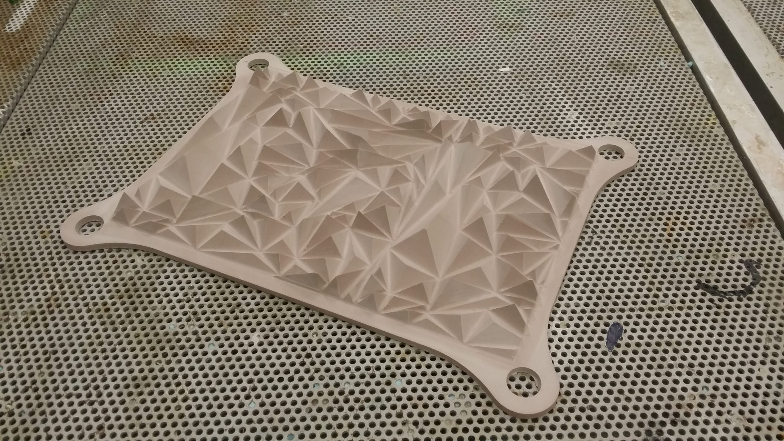
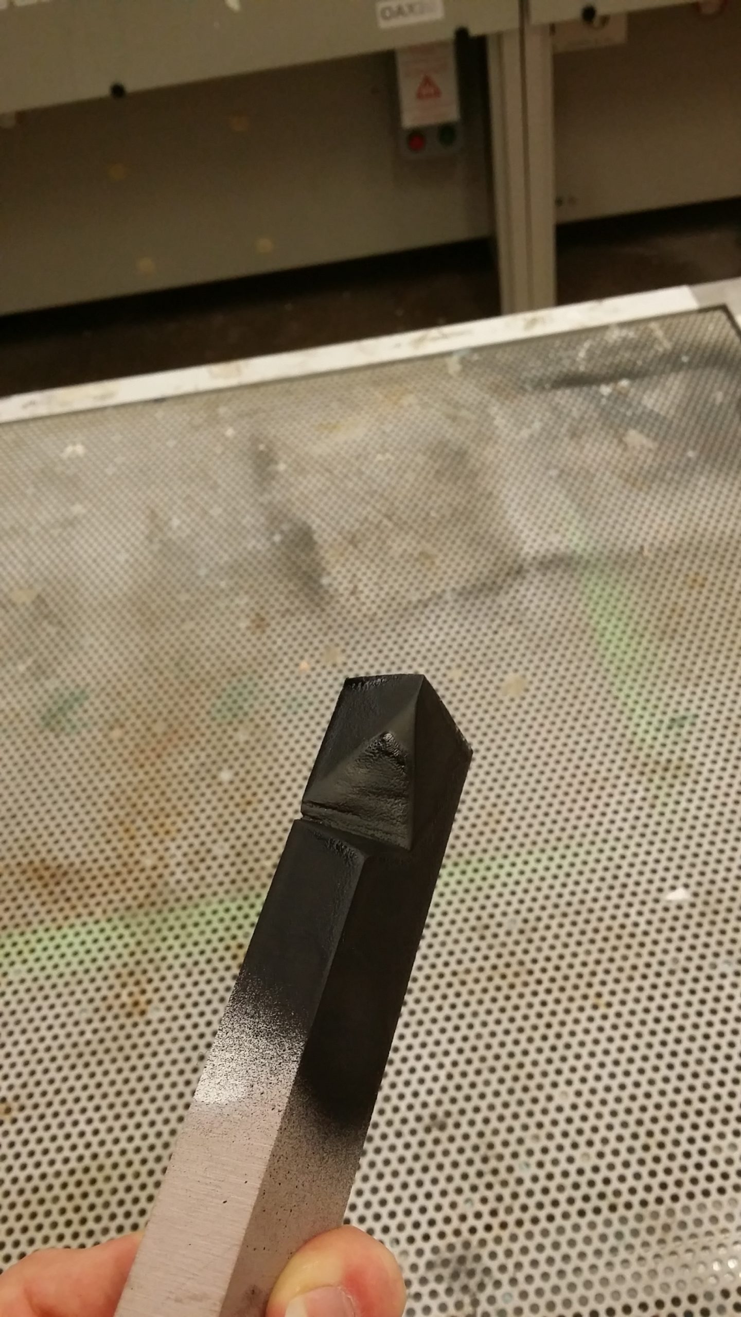
I needed a final appearance model to communicate the idea appropriately. The silicon samples served as proof of material properties but could not be cast at the right scale within time and budget constraints. I CNC routed the model in one piece with laser cut polymethacrylate adding detail underneath. A rubber spray was applied to create the correct surface effect.

polymat model in situation
final appearance model being shown in-sittu

This idea developed into a silicone mat with a variable texture surface designed to provide a range of friction across as large a range of items as possible. Many sample patterns were designed, 3d printed and cast to settle on the optimal pattern.

model topdown view
Second Final Presentation Board

A final ‘looks-like’ model was produced largely by CNC milling, Laser cutting and painting with a silicone rubber. It was unfortunately deemed too costly to cast in the target material.

Reflecting on the project I wonder how imaginative the solution actually was. Visually striking perhaps but does it not simply add the plethora of Gadgets? Would users actually consider using it after or before impairment? Was there actually a change to the kitchen ‘System’? Did I play it safe?

This project especially was a chance to consider my position in relation to design, whilst I am more than happy with the outcome I find it imperative to recognise what this product is not, and what future outcomes must try harder to incorporate.