
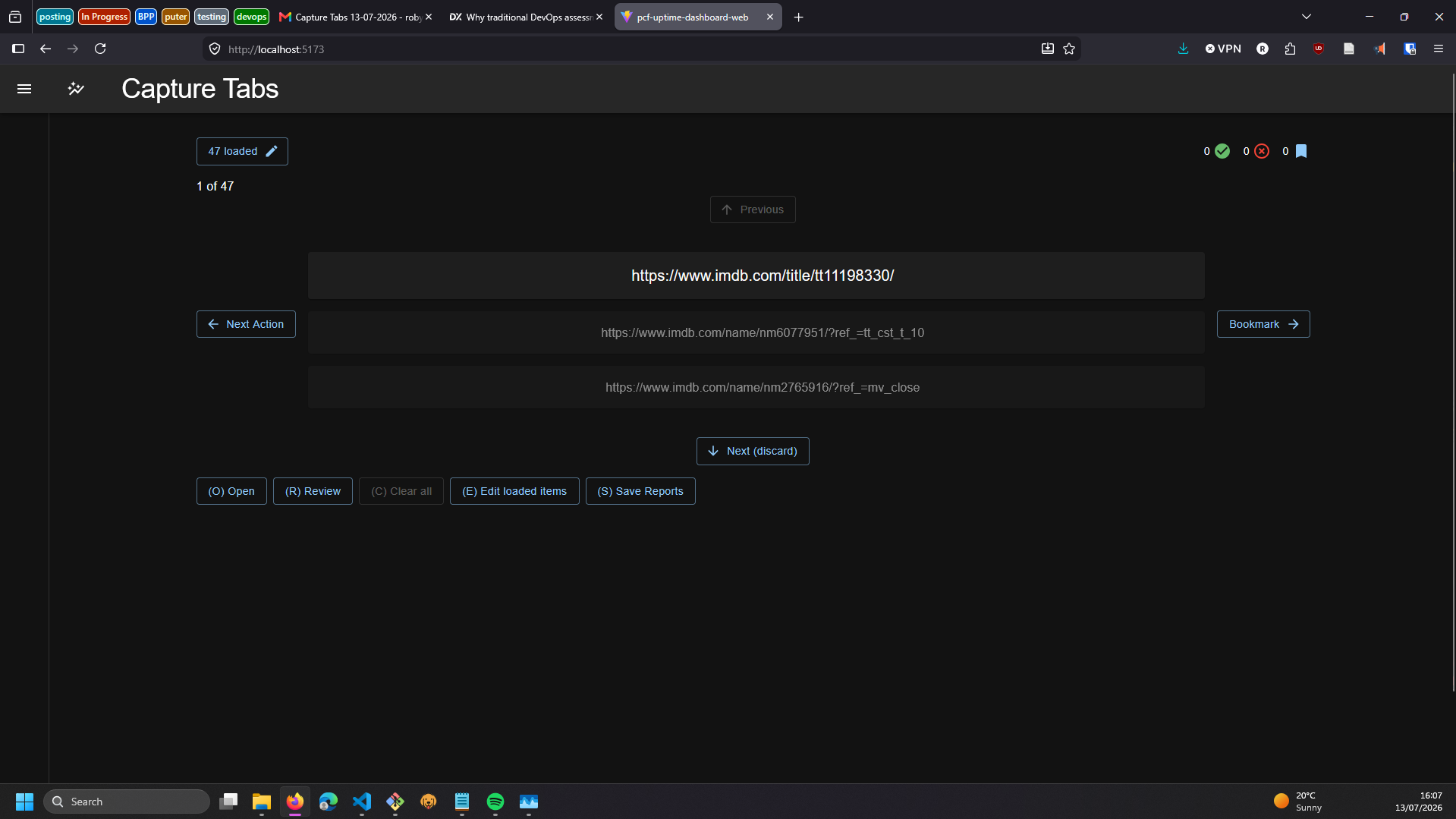
A little intermezzo addition to the portfolio, Capture Tabs is a little offline tool which presented some really interesting design challenges to solve a tricky process problem.
The application intakes a list of URLs exported by a web browser and presents them one at a time to the user for processing into Next Actions or dismissed following the model of Getting Things Done from David Allen.
Built in a single day, the purpose of the app is to take a large collection of open tabs and quickly burn down to get through the list as quickly as possible.
Capturing “stuff”
I don’t typically go in for self-improvement or time management books presented in listacles alongside “The Guide to Not Giving a Fuck for the Perplexed”, usually less because I find the content to be wrong but more because I don’t think you need to spend 100 pages describing time blocking.
That said, there’s one book that I think almost anyone should treat as required reading, Getting Things Done. Even if you only read the first part (of three), which presents the main concepts and ideas in 55 pages, you can get the main points enough to implement and benefit from it. Part 2 goes into detail on concepts and presents toolkits then Part 3 involves more case-study like anecdotes.
The very high level idea behind GTD is to ensure that all concerns in your work or life are Captured into lists which contain a psychological context, and then to ensure they are reviewed at the appropriate time. You may have heard of the term “external brain” which is also used heavily by GTD, the idea of getting as much admin tasks out of your head as possible in order to create a better psychological space for dealing with things. The more RAM you are using to just track life’s many nuances in your head the less you have available to actually do anything.
I believe that most people have some mixture of parts of GTD in their lives already, you can’t make even a basic to-do list without some degree of defining a task and breaking down Next Actions. The reason I’d recommend almost anyone to read GTD is how it refine these elements, equip you with new tools, and just tie everything together a bit more.
Something I really like about GTD is how non-prescriptivist it is about how you should implement it. On questions such as: what lists you use, how you store them, how you prioritise what to work on next, how to define your values, and so on, are all up to you. GTD gives you tools you can use if you want but leaves the specifics up to you.
A key concept is ‘Capturing’ things you come across which have some sort of relevance to you. Capture involves processing things you come across to make a decision one where it should sit in the system. Does it need actioning? Are there multiple Next Actions? Might you need to reference it in the future? Can it be discarded? Arguably the most important step, if you’re not capturing things then you don’t have sight of them, and they may come back to bit you.
Phone Tabs
Something that has emerged for me over the past three years of using a GTD-like system is that allot of “stuff” takes the form of tabs open on a web browser, often on a mobile device.
This presents a couple of problems for a weekly review. The first being that I find my tabs filling up really quickly, often growing to 300+ on my phone, and almost never bellow 50. The sheer number leads to them getting skipped which then snowballs as the rate of opening tabs continues but closing them doesn’t keep pace.
The next is that there is a diversity of content, some stuff requires actioning, others are news items that I’d “like to get to”, some recipe research, some shopping tabs I’m not sure I’m done with, and so on. This mixture of contexts adds a stickiness to dealing with them as I find my mind context-switching as I take each in turn, its so easy to get sucked in to each. The browser becomes a sort of messy workstation desk, lots of open threads just laying around, each important when you look at them but not so urgent that they need to be dealt with right this second.
Lastly, the mobile interface doesn’t lend itself to bulk actions. Processing tabs on a phone is a slog, there’s a lot of swiping and tapping, all while staring a small rectangle, its slow and doesn’t feel good which makes it worse once you emerge and realise you’ve still got 240 to go. Its frankly a demoralising experience.
Loosing Tabs
While tabs can be made to persist on desktop browsers and almost always persist on mobile, there exists the possibility of loosing them. What feels like a pretty stable list suddenly gets wiped and you sit there feeling a fool for not ‘dealing with this sooner’. Browsers are getting better at backing up and versioning bookmarks but I still find restoring the tab state to be nearly impossible, not all closed tabs show up on the browser history.
On desktop this risk is particularly acute; if you have multiple browser windows open and close one, those tabs are lost. If you believe you have only one window open and close it, expecting that that browser will remember its tabs, you get a nasty surprise upon realising you had previous broken out a tab to a new window and forgotten about it, and now all those other tabs are lost. A frustratingly direct reminder that tabs are not properly captured, they cannot be relied upon to always be there like a bookmark is.
Processing Captured Items One Thing at a Time
When processing captured items there are three basic rules:
- Process the top item first: This is to avoid ’emergency scanning’, in which items perceived to be lower in urgency now are ignored and create repercussions later.
- Process one at a time: Don’t get distracted by easier to process items, don’t allow the difficulty of making a decision lead your eyes to wonder off down the list. Discipline is needed to actually clear your capture list and ensure everything gets the attention it deserves.
- Never move anything back to the “in tray”: Pretty obvious, if you allow something to return to an in-tray it will never leave.
Application Design & Design Brutalism
With these guidelines we have a very basic brief for what I’d need to do to improve this process.
- Remove as much friction as possible processing each tab.
- Enforce that each tab must be dealt with sequentially.
- Enforce that a decision must be made on each before moving on.
- Get this process, whatever it looks like, off the phone.
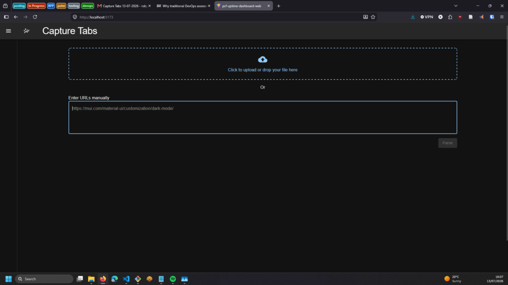
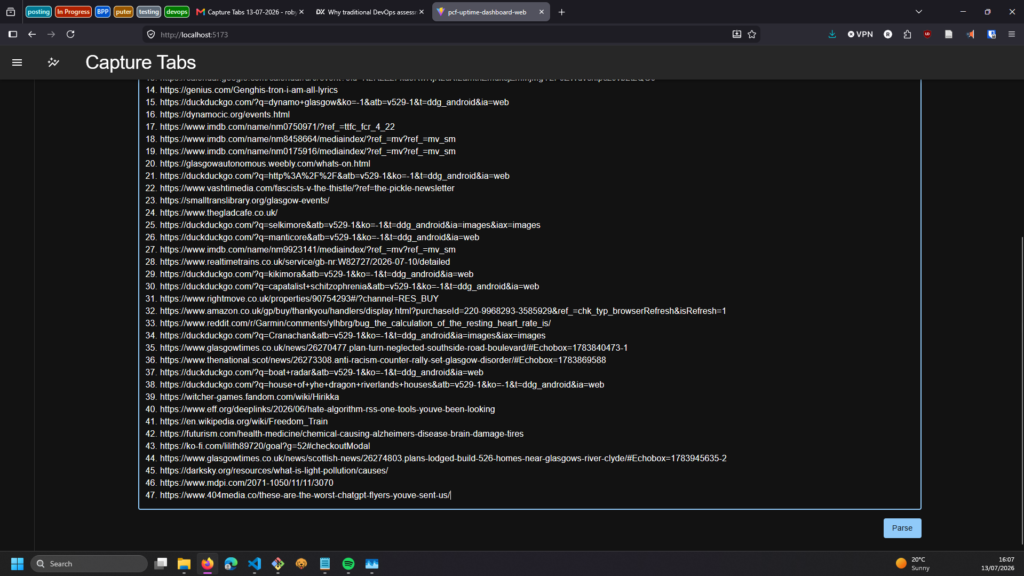
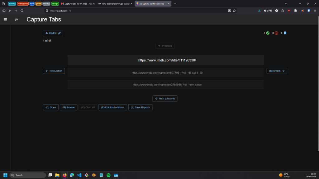
Using a plain text list of links exported from a browser which the application attempts to regexp match links on, the application presents each link in large lettering on the main page with arrow-key controls to decide what to do with it. Four additional links are shown, two positions previous and after in the list, just to provide a bit of context where the cursor is in the list after it was found a single link felt somewhat disconnected.
The user can traverse the list with the up and down arrows on their keyboard or using corresponding buttons on the screen to traverse the list. When clicking down to view the next item that item is automatically dismissed unless another action has been taken, there is no way to progress without doing something.
Linear Processing
This interaction design serves two design objectives: one the one hand it enforces the GTD sequentiality that’s needed for ‘correct’ capturing, but it also reflects the fact that most tabs can probably be dismissed (in my experience), they stick around because they can, not because there is necessarily anything to do. Having ‘dismiss’ as the default action forces you to consider “is there any value to this? do I need to do something here”.
A status bar at the top presents some statistics to indicate how far through you are in order to avoid getting lost in a seemingly endless list. A progress indicator and index number show your position while icons feed back how many have been dismissed or actioned. Whilst technically redundant these are intended to give a feeling of progress and add visual interest.
Brutalism
A topic for a later manifesto blog post, I am increasingly considering the topic of design brutalism, a term that a precursory DuckDuckGo search tells me has been utterly bastardised into a cutesy blocky bold-bordered but otherwise conventional aesthetic but that I’m going to reassert here as a sort of anti-UX philosophy of simplicity.
Its not that I think UI’s should not be complex – in fact I really like effective compact UI which packs lots of tools in – but that modern UI / UX has completely abandoned consideration of the user. Viewing the user / customer as a problem to be solved rather than an honoured guest we insult the intelligence of the public with slop-troughs full of inane drivel, intrusive popups which assume you have the object-permeance of a goldfish, aggressive tutorial click-throughs that practically reach out of the screen to place a hand on-top of yours and guide you to what the developer wants you to do, rather than what you want. All of this is under a blur of cumulative layout shifts and a general feeling of fragility that so many sites seem to exhibit these days.
Websites today feel like a challenge, systems that have their own intention and are in an adversarial relationship to you. “Here, idiot, let me show you what you need to click on. Oh you want to read the article in peace? Sure honey but first I need you to open this menu first.”.
With this app I wanted to really challenge myself to embody simplicity or interactions; nothing happens without the user initiating it, when something happens there are no perceived side-effects, acting like a pure state-machine. There is a complexity which facilitates different ways of interacting with the system for the sake of speed, but there is no fluff, no extraneous explanations, actions are anticipated and accounted for but not forced on the user.
Keyboard first navigation
One of the big ideas was a keyboard-first design approach intended to allow the entire stack to be processed without moving one’s hands off the keyboard. I considered making the app a command-line interface but for the sake of speed and some interaction elements I wanted to include I decided to go with a web-page.
Each action you can take is bound to a key event listener and replicated with a corresponding button on screen. The main navigation buttons exist alongside the items being reviewed for semantic consistency, while all other actions are held in a little action tray at the bottom of the screen.
A focus was placed on the ‘number of keys’ to do something. The ideal is that a given action has a single key-stroke but where this is not available we still try to keep the interaction points to a minimum.
Take for example the two modals, one to log a Next Action, the other to log an item to be bookmarked and optionally attach a Next Action. In each case the text area is focused on load and a submit with the enter key completes the form component (I know right, a lost art). To select a bookmark an Autocomplete is used which tries to resolve a prior-held bookmark but will also allow a free-text submission. The last five bookmarks to be used will be displayed as buttons at the top with a corresponding number key event listener, allowing the user to avoid typing entirely.
Imagine you are working through some tabs and get to a cluster of articles to read asap, opened together one day from a long Bluesky thread. Each item requires two keystrokes, a Left Arrow to open the bookmark manager, and a ‘1’ to save to a folder named ‘Priority Reading’. One item is connected to a topic you’ve been meaning to write to your councillor about, you click Left Arrow, then Tab to go to the next-action box, write a note saying “add to project to email X about Y”, hit ‘1’ and you’re done.
All of this can be done entirely with the mouse as well, but imagine how many times you’d have to lift your hand over to the mouse and back again for each of these steps if proper keyboard navigation was not implemented.
Drawbacks & Potential Future Improvements
Link Previews
I go back and forth on whether implementing a link preview, for example as described in this post by Andrej Gajdos where a primary image and web title are loaded would be a good thing. Aside from the complexity of implementing such a feature well, the argument against doing this is that being able to view the content of the page incentivises getting sucked in and trying to deal with it straight away.
However on balance I think that at least having readable titles would help a lot, the alternative is that the user is incentivised to open tabs fully (using the ‘o’ key) which somewhat invalidates the argument about not getting sucked in.
The Bookmark problem
The biggest issue I ran into was getting bookmarked items into an actual bookmark list. Current browsers are pretty good at backing up, exporting, and importing personal data like bookmarks, namely in order to make it as easy as possible for people to switch their main browser, resulting in fairly decent inter-operability between browsers.
However, the problem is that most of these are built with a one-time import / export or full backup, they often wipe all existing bookmarks when restoring from a JSON or HTML file.
I use Firefox due to: its 2026 and if you’re still using Edge or Chrome you need to take a very long look at yourself. Firefox allows easy import / export but as far as I can tell there is no way to re-import without wiping all the existing data. There is an API which extensions can use, perhaps this is a future feature I could use.
Further to that even if I had access to the browser’s API there would be more work to do to handle interactions like creating new folders and placing them in the tree, renaming and deleting accidental bookmarks.
Workaround
So if we can’t direct access to the bookmarks in the app, what’s the next best thing? And specifically, how do we stay as close as possible to the design goals of simplicity, minimal clicks etc?
The application holds a record of bookmarks which have been entered in the free-text field, caching them in local-storage. These are effectively just names, they don’t need to correspond to an actual browser bookmark, the user could for example use it to group items of a similar Next Action project, or use a shorter name they know corresponds to a folder.
The current solution is to include a “report” modal which lists all actioned items, truncates the URL’s so there’s enough to identify them but retain focus on the Next Actions note. A clickable area made as big as possible is placed on each row to make opening them as quick as possible, if there are no items in a particular category that subsection will be collapsed.
The Bookmark section is prioritised and features a few novel features, namely the fact that it records when a click has happened and re-sorts the list based on the bookmark’s name. All of this is to anticipate that at some point the user will have to sequentially open each link into a new tab and interact with the real bookmark manager there.
Lastly, a CSV download is also available for integration with other applications and to have a backup record given that there is no persistence of any data.